You are using an out of date browser. It may not display this or other websites correctly.
You should upgrade or use an alternative browser.
You should upgrade or use an alternative browser.
WWDC13 Thread of iOS 7 & Mac OS X 10.9, where a whole new world's developing
- Thread starter celebi23
- Start date
trudderham
Member
Wonder if they thickened it to look slightly better on a non-retina iPhone Budget, eh?
Well TBH it does look a little better on the non-retina iPad mini. Still prefer the lighter font though :/
I was afraid of this change-up all the way back when they first showed iOS7.
The sad truth is that on retina displays, the sexy sleek thin typefaces look gorgeous. On a regular non-retina display, they're hardly legible. Plus Apple still seeks to please all their ease of access agendas and the thin fonts are not that hot with poor eyesight.
I for one wish they'd go back to the thinner variant.
Bold text was off by default, it's still a different font system wide. Bold makes it worse.For those of you that hate the new text, just go to general > accessibility and turn 'bold text' off. Voila!
trudderham
Member
For those of you that hate the new text, just go to general > accessibility and turn 'bold text' off. Voila!
It's already turned off for me.
Edit: beaten!
Leona Lewis
Banned
Erm, that's not the issue. The font is altogether different (Helvetica Neue Light to Helvetica Neue Regular).For those of you that hate the new text, just go to general > accessibility and turn 'bold text' off. Voila!
jts
...hate me...
Erm, that's not the issue. The font is altogether different (Helvetica Neue Light to Helvetica Neue Regular).
I think it's Ultra Light to Light. Regular is thicker.
Anyway I'm in! On my iPad mini. No UDID registration at all.
Pizza Luigi
Member
You get some, you give some. Every time I want to change volume, the Spotify app crashes
I was afraid of this change-up all the way back when they first showed iOS7.
The sad truth is that on retina displays, the sexy sleek thin typefaces look gorgeous. On a regular non-retina display, they're hardly legible. Plus Apple still seeks to please all their ease of access agendas and the thin fonts are not that hot with poor eyesight.
I for one wish they'd go back to the thinner variant.
But there's only two non retina devices that even support iOS7. Surely they could just make those versions have the heavier font
It's not a case of bold versus regular, they've switched fonts.For those of you that hate the new text, just go to general > accessibility and turn 'bold text' off. Voila!
Beta 2: Helvetica Ultra Light
Beta 3: Helvetica Neue Regular
jts
...hate me...
LighttttttttIt's not a case of bold versus regular, they've switched fonts.
Beta 2: Helvetica Ultra Light
Beta 3: Helvetica Neue Regular
catapult37
Member
Have they fixed the thing were you can't press the button to accept a network security cert? That by itself forced me back to ios6 after beta 1.
chickdigger802
Banned
It's not a case of bold versus regular, they've switched fonts.
Beta 2: Helvetica Ultra Light
Beta 3: Helvetica Neue Regular
well, i guess there will always be a reason to jailbreak!
jts
...hate me...
iPad mini + iPhone 5 both with iOS 7 betas. No UDID reg. FYI.
Also, I went with beta 2 on the iPhone for full UltraLight appreciation. It's a piece of history after all. Will probably update later today.
Digging it so much, and really what has been said it's true. Photos and even videos don't do it justice.
Slightly concerned on how it gives the A5 a run for its money.
Also they have to fix some low-res imagery on the "icons fly to the home screen" (and vice-versa) animation(s). Really sticks out.
Lord Error
Insane For Sony
New icons for ios7 must be 120x120 probably to help with that a bit.Also they have to fix some low-res imagery on the "icons fly to the home screen" (and vice-versa) animation(s). Really sticks out.
Does anyone know if parallax is the only thing that's disabled/changed when you switch the 'reduce motion' in accessibility? I've noticed that it now properly un-zooms background image if you enable reduce motion, so you see full image as you've set it.
edgefusion
Member
This font is too thin!
This font is too thick!
Now I know how goldilocks felt.
This font is too thick!
Now I know how goldilocks felt.
Phoenix
Member
Helvetica Ultra Light at the final version or i'm not buying an iPhone.
Guess you aren't buying one.
infiniteloop
Member
iOS 7 Beta Suggests iWork, iLife iOS Apps May Soon Be Free
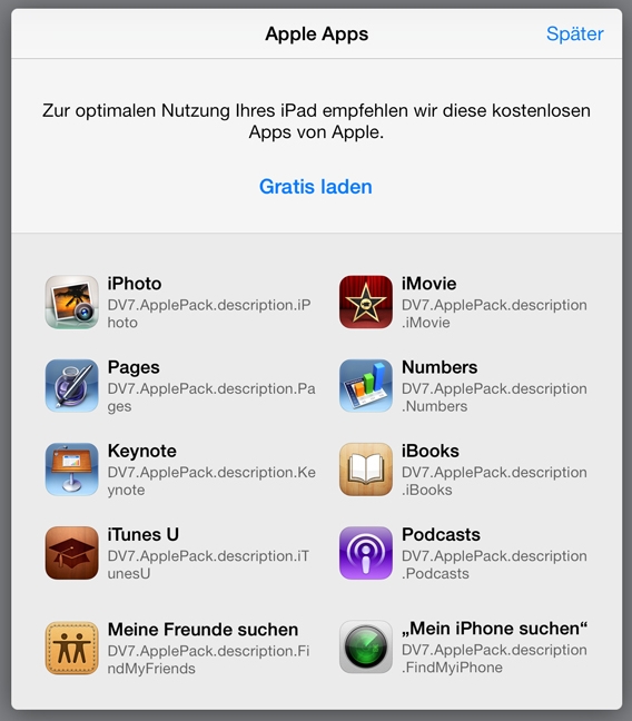
A welcome screen discovered in the iOS 7 beta suggests that Apple's iWork and iLife iOS applications may be available for free when the OS launches this fall, according to German site ifun
Treefingers
Member
The font change is great. In fact I hope they change the home screen font weight as well. Helvetica Neue Light for anything other than titles sucks.
badcrumble
Member
Nice. That'd be smart.
I'm curious to see what sort of updates iWork is going to get.
edgefusion
Member
Is it just me or is there a stronger shadow under text on the home screen now? Still not quite enough to be useful, but more.
Is it just me or is there a stronger shadow under text on the home screen now? Still not quite enough to be useful, but more.
Yes, definitely.
I hate the new font too :-/ The change to Neue Light was probably my favourite thing about iOS7.
Liu Kang Baking A Pie
Member
Typography expert Erik Spiekermann criticized iOS7's thin fonts, and I bet that made Ive feel bad.

Typography expert Erik Spiekermann criticized iOS7's thin fonts, and I bet that made Ive feel bad.
I love the "they don't read, they only look/see surfaces" bit. That was exact problem with the original betas. Beautiful, but not nearly as readable.
That said, for some reason, I liked the thinner font in Messages and the Safari address bar. Everywhere else though, I think it's better this way.
Lord Error
Insane For Sony
No question about it, ultra light font for normal text is simply a design wankery. There's no case to make for it other than "it looks cool". It doesn't take a professional typographer to tell you that, all it takes is an average 50-something who's started to lose eyesight a bit. It's not like Apple at all to make something like that.
CrunchinJelly
formerly cjelly
When I first installed iOS7 beta I thought the phone got hot pretty fast. Turns out, they turned on bluetooth for me in the process. Gee thanks.
Bluetooth is on by default. That's why. Current Bluetooth uses like zero battery when not in use.
Bluetooth is on by default. That's why. Current Bluetooth uses like zero battery when not in use.
What do you mean by "current bluetooth"? It cooled down after I turned it off.
What do you mean by "current bluetooth"? It cooled down after I turned it off.
If you have an iPhone 4S or 5, iOS 7 uses the new Bluetooth LE/SMART protocol which doesn't drain resources unless you actually use BT features.
edit:
People complaining that the clock wasn't shown on the lockscreen when playing music, doesn't your screen do this? Mine does..

(fades between them)
Also neat glitch for temporary clutter freedom from stock apps:
http://www.cultofmac.com/234989/ios-7-glitch-makes-stock-apps-vanish-video/
Treefingers
Member
It didn't do this last beta.People complaining that the clock wasn't shown on the lockscreen when playing music, doesn't your screen do this? Mine does..
(fades between them)
The Real Abed
Perma-Junior
Eh. I liked it thinner. I'm viewing this image on my iPhone to see how it will look and the thinner text looks better on Retina to my eyes. I can see the bold being important on a non-Retina display, but on Retina, I like the thinner text. I also notice that the taskbar thing at the top has smaller elements all around on iOS 7 vs. iOS 6.
Edit: Also, looks like Mavericks is also updated. Beta 3 time!
Edit: Also, looks like Mavericks is also updated. Beta 3 time!
I liked the older setting app better too. The new one's grey looks too blue(probably just optical illusion though).
Updated to dp3 mavericks. Looks like they may have changed the black background for pop up menus and the white for modal sheets. Unbelievable but it runs even smoother than dp2. Fastest OS to ever run on my MacBook (it started out with Leopard preinstalled).
Updated to dp3 mavericks. Looks like they may have changed the black background for pop up menus and the white for modal sheets. Unbelievable but it runs even smoother than dp2. Fastest OS to ever run on my MacBook (it started out with Leopard preinstalled).
thezerofire
Banned
everything has been much better in beta 3 until right now, where my phone refuses to respond to anything. doesn't turn on, doesn't charge, doesn't show up in itunes. anyone know what's going on?
If you have an iPhone 4S or 5, iOS 7 uses the new Bluetooth LE/SMART protocol which doesn't drain resources unless you actually use BT features.
edit:
People complaining that the clock wasn't shown on the lockscreen when playing music, doesn't your screen do this? Mine does..
(fades between them)
Also neat glitch for temporary clutter freedom from stock apps:
http://www.cultofmac.com/234989/ios-7-glitch-makes-stock-apps-vanish-video/
It should definitely hide the controls by default though, my leg has skipped songs now too many times when a notification lights the screen up
jts
...hate me...
Yes.I am on beta 2, without developer account. Can I upgrade ota? I do not get to access my imac for a couple of days, so need to be sure before I start...