CassidyIzABeast
Member
Who are the weirdos thumbing down a design video? Sad stuff.
Really! I love it.
Uhh, that's one of my other favorite console designs, lol.
I got no love for the SuperFami.
Exactly. I love the sleek, minimalistic, monolithic design.
It's a box, so its shape is simple. It's made entirely of brushed aluminum (that is, all of its surfaces are the same material), so it's elegant.no it isn't
Exactly.I love those things too. I just think those ideas are poorly executed in this case.
Love the look of the console. Simple, elegant. Like the monolith from 2001.
Makes about as much sense as the people that like the Gamecubes design.
bad logo thoIt's a box, so its shape is simple. It's made entirely of brushed aluminum (that is, all of its surfaces are the same material), so it's elegant.
In my opinion. you should either go all out with a simplistic/minimalistic design, or make something entirely unique. The XB1 looks like a half-measure to me.
Exactly. I love the sleek, minimalistic, monolithic design.
Who are the weirdos thumbing down a design video? Sad stuff.
With the difference of GameCube being an awesome design but the Xbone not.
Xbox One is a design disaster. What a bland product. It's certainly the last thing about the console I'd be making a "meet the makers" video of, lol.
I love both of them, but for very different reasons. I think they're both really good at they aesthetic they were going for.black flat tech device >>>> purple lunchbox
black cube >>> glossy thingblack flat tech device >>>> purple lunchbox
Xbox One is a design disaster. What a bland product. It's certainly the last thing about the console I'd be making a "meet the makers" video of, lol.
I think it went like this:
"we need somewhere for the discs to go in and everywhere else needs to be where the heat comes out."

Who are the weirdos thumbing down a design video? Sad stuff.
Organic? Magical? Oh my lawd ..
I don't really like the XB1 design much, but I'd still consider it miles ahead of the 360 slim. And PS3 superslim while we are at it.I dont think it's as good of a design as the 360 slim
yeah the 360 Slim is tacky technogadget crap. The original 360 is way better.


I love simple and elegant designs, but the XB1 is not that. The mid-way split and different surface materials prevent that.
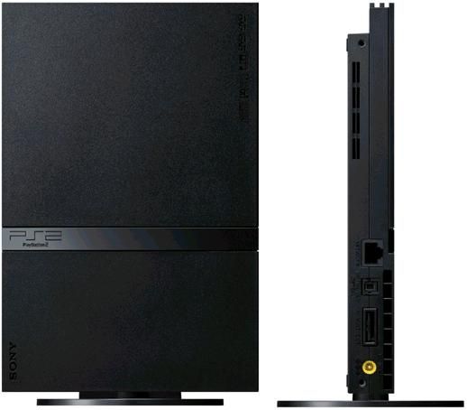
This is simple, elegant and monolith-like:
Ehh, I'm tired of everybody aping Apple's lingo.Nobody should be shocked by this type of talk. All designers and design teams talk like this for real. Nothing wrong with being excited and inspired by your product and design.
It does look sexy, I'll give it that. I love minimalist/simplistic designs.
I dumbed it down, because it's a load of fucking PR bullshit with buzzwords like "Rocket Science", "magic", "liquid black".
Not the best design for sure but a "disaster" is pretty damned hyperbolic. Maybe you need to look at console designs over the years and realize that 99.9% of the designs are awful. Including MS's own original Xbox, Wii ,PS2, fat PS3, ultra slim PS3 , Nintendo 64, Sega Master System and TG16 for some of the ugliest looking ones.
yeah the 360 Slim is tacky technogadget crap. The original 360 is way better.
Not right down the center. Xbox One is an aesthetic abomination.

Who are the weirdos thumbing down a design video? Sad stuff.


") and the typical rectangular shape
and the typical rectangular shape