We need a Zelda discussion topic after the latest news on the specs. 
Revolution.
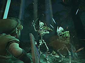
Ok now that we know revolution won't even be in the same league as PS3/360, do you guys think Nintendo will risk doing a realistic Zelda next-gen? It's going to look horrible compared to the competition. I can already see the comparisons with next-gen Ico (graphics comparisons of course. Zelda gameplay is king bitches). Wind Waker still looks awesome to this day and imo it's all because of the style.
I think it's going to look a lot like wind waker but link's model will be different.
Gamecube/Twilight Princess.

Right now I'm 100% behind moving it to revolution. It's not going to have next-gen physics, AI, huge natural environments (... *weeps*) so it shouldn't be hard to get it out late 2006. And this way we can have two rev Zeldas, realistic one near launch (TP) and the cell-shaded one later on. By the time the 2nd Zelda hits PS3/360 will be pushing out amazing stuff and cell-shading would be the only way for Zelda to look good. Of course that could happen fall 2006 (heavenly sword?) too so it might not matter. :lol
It's too late to change TP though. Anyway I can wait an extra 5-6 months for a better looking version of TP, what about you?
Revolution.
Ok now that we know revolution won't even be in the same league as PS3/360, do you guys think Nintendo will risk doing a realistic Zelda next-gen? It's going to look horrible compared to the competition. I can already see the comparisons with next-gen Ico (graphics comparisons of course. Zelda gameplay is king bitches
). Wind Waker still looks awesome to this day and imo it's all because of the style. I think it's going to look a lot like wind waker but link's model will be different.
Gamecube/Twilight Princess.
Right now I'm 100% behind moving it to revolution. It's not going to have next-gen physics, AI, huge natural environments (... *weeps*) so it shouldn't be hard to get it out late 2006. And this way we can have two rev Zeldas, realistic one near launch (TP) and the cell-shaded one later on. By the time the 2nd Zelda hits PS3/360 will be pushing out amazing stuff and cell-shading would be the only way for Zelda to look good. Of course that could happen fall 2006 (heavenly sword?) too so it might not matter. :lol
It's too late to change TP though. Anyway I can wait an extra 5-6 months for a better looking version of TP, what about you?
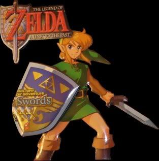


") But both games share the same art style of course. I love that picture BTW. Link just looks so über-cute on it. Where's the Zelda counterpart?
But both games share the same art style of course. I love that picture BTW. Link just looks so über-cute on it. Where's the Zelda counterpart?