Spyxos
Member
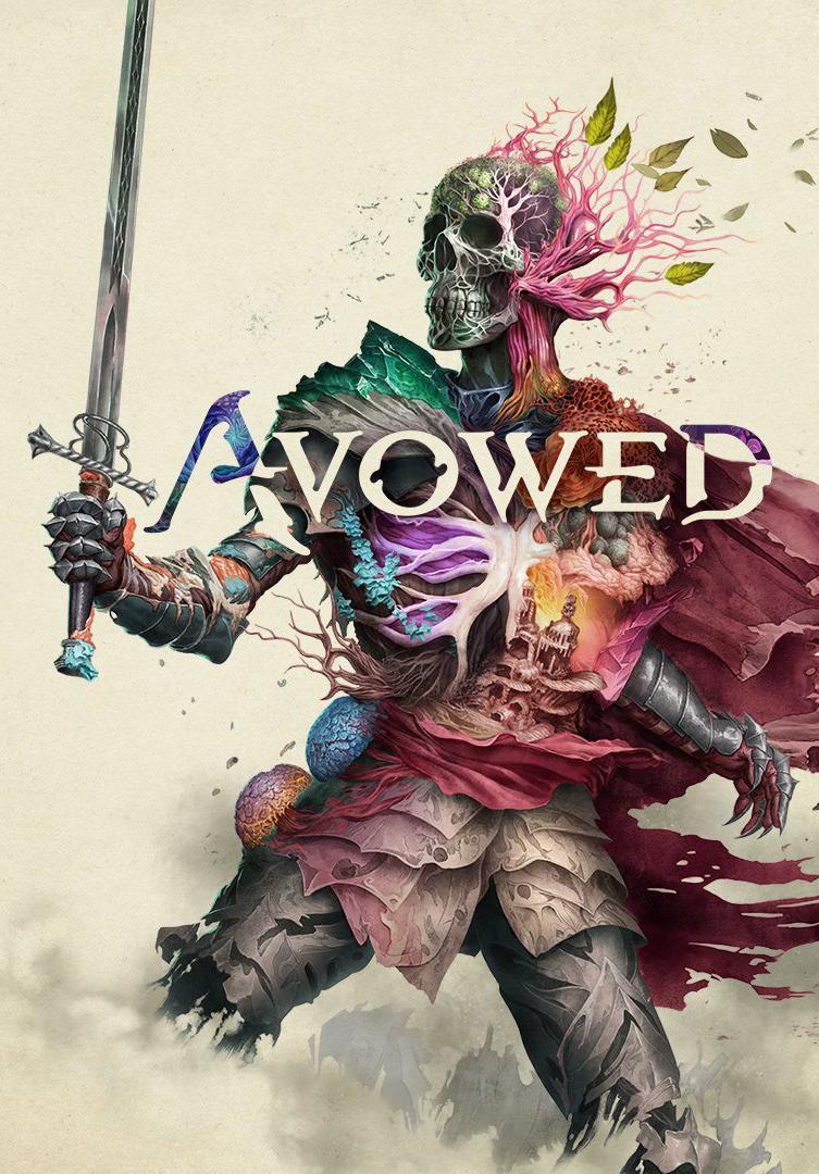
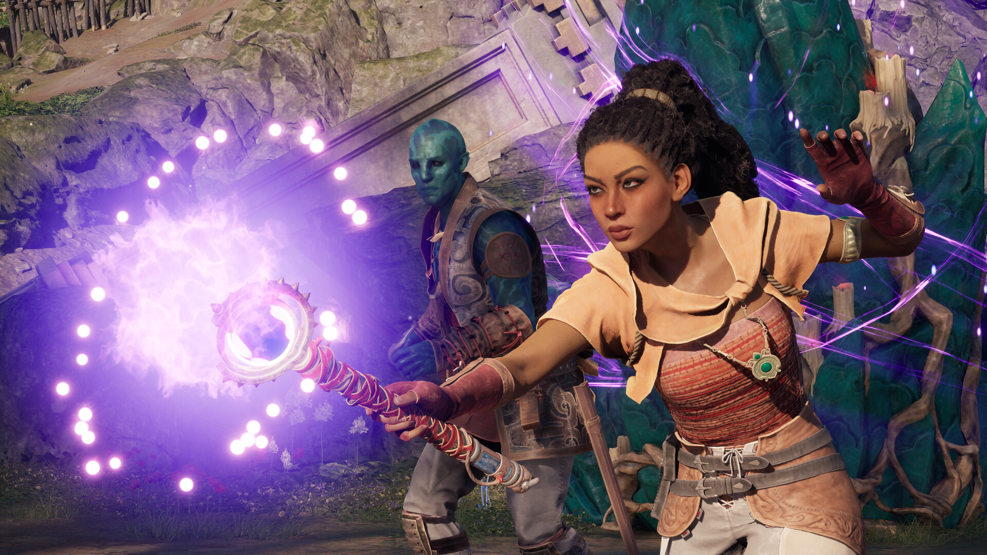
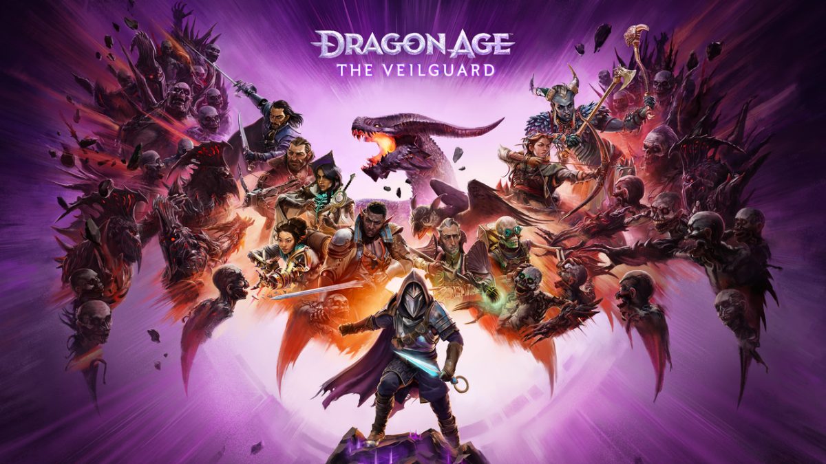
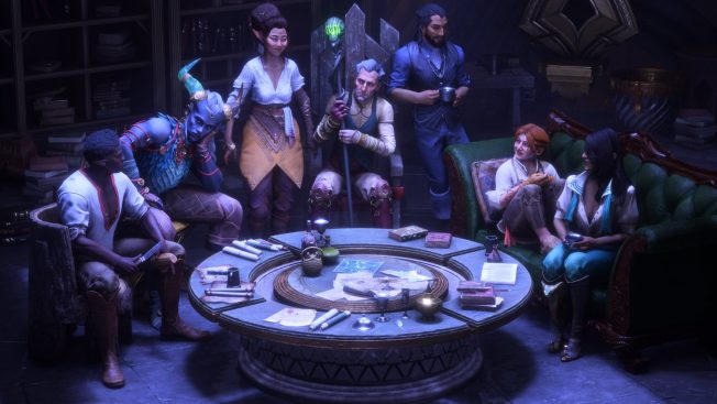
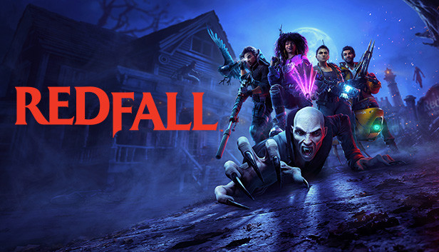
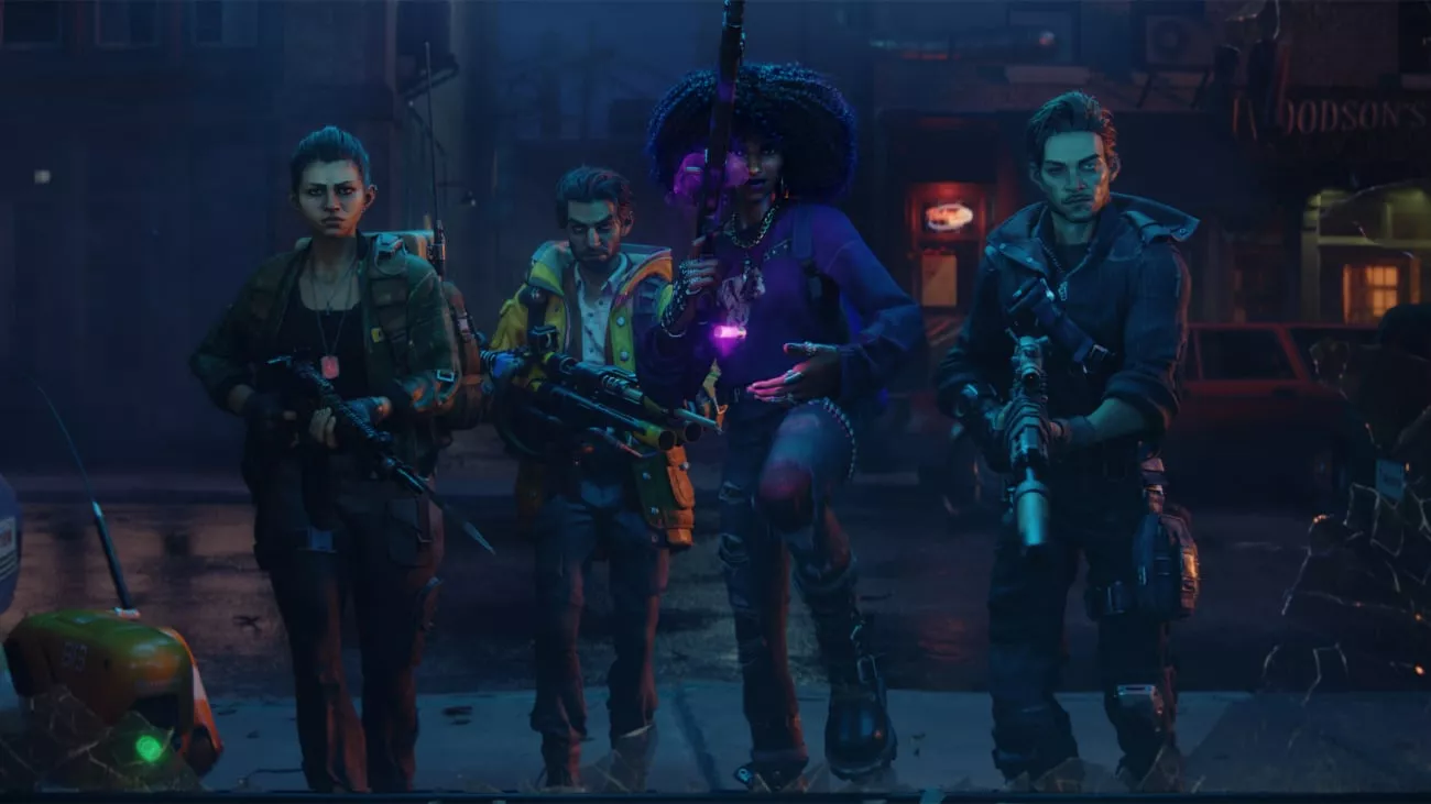
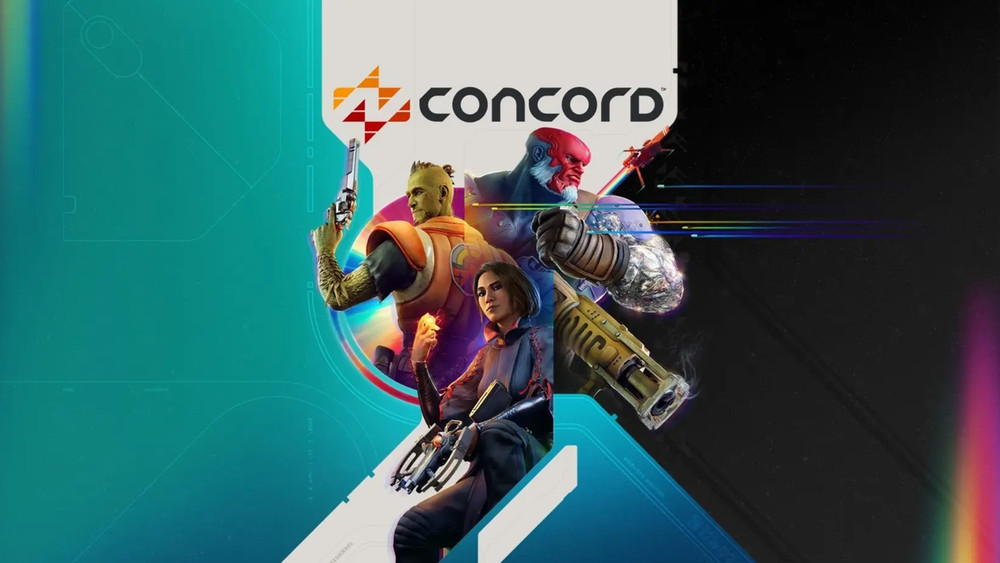
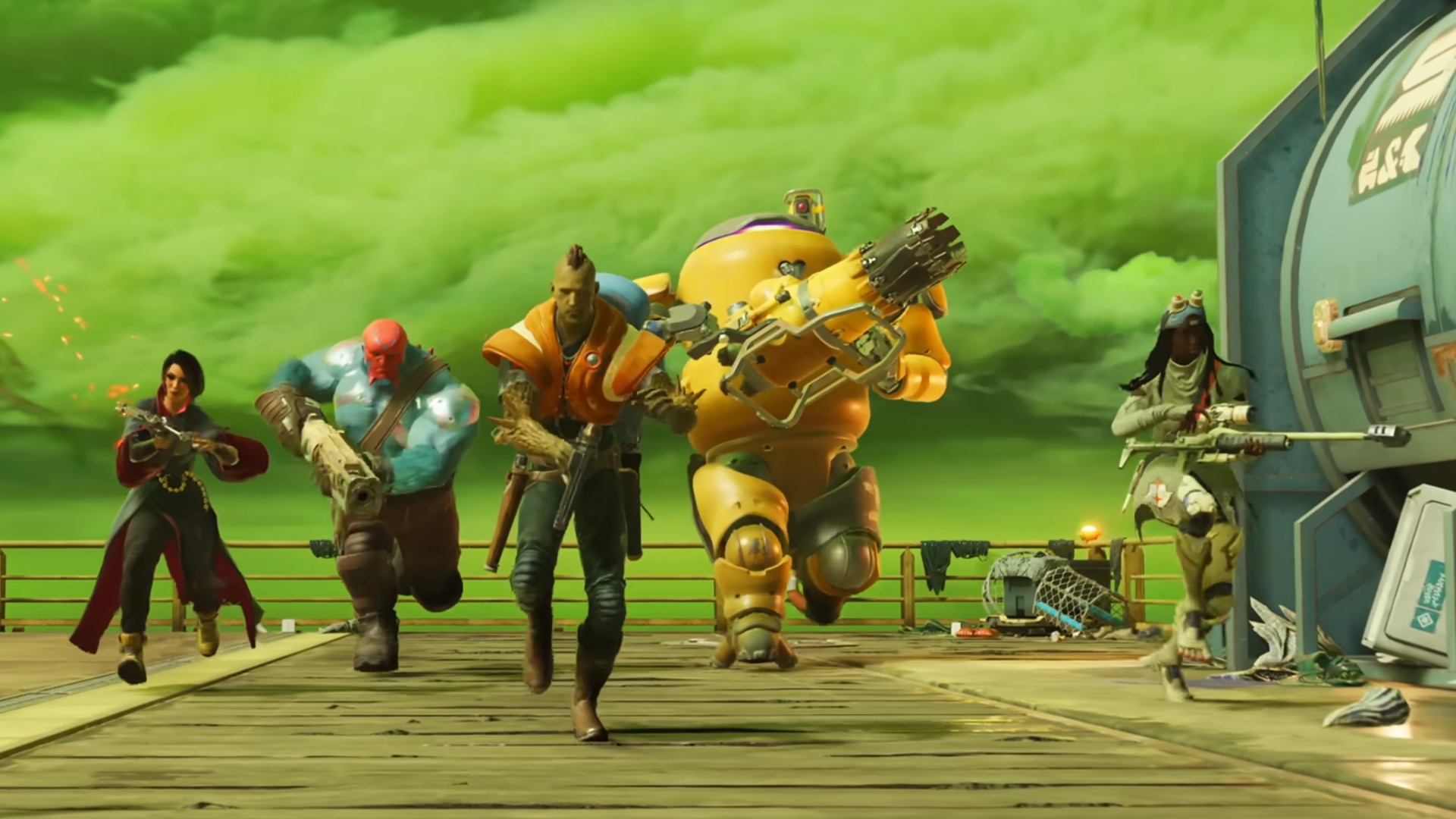
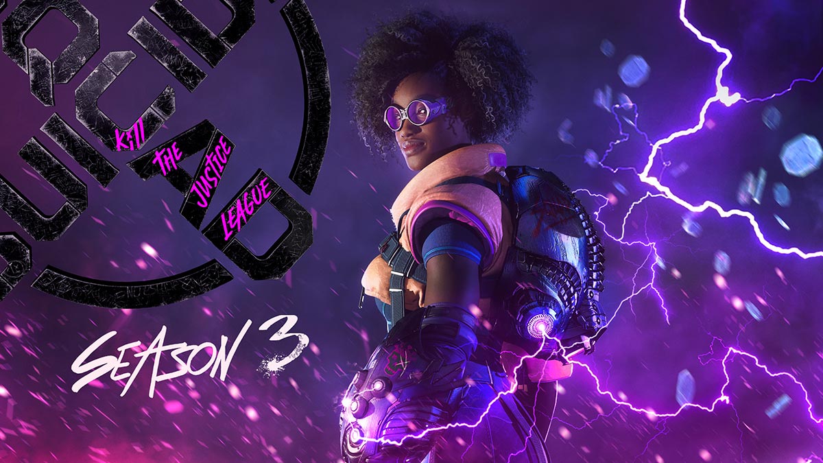
Of course, they are totally different games, but they all look the same to me. They don't have any features that stand out. Everything is a colorful chaos that I can hardly distinguish from each other. If someone told me that all these characters and worlds were made by one and the same studio, I would believe it immediately.
How do you see this?

How do you see this?