• Hey, guest user. Hope you're enjoying NeoGAF! Have you considered registering for an account? Come join us and add your take to the daily discourse.

Are those really different games? They all look the same to me.

MujkicHaris

Member
*Most* of the modern games post PS3/360 generation look the same. Why? It's not about the saturated colors. It's called PBR or Physically based rendering.

It has one simple goal - simulate a realistic behavior of a light "physically" interacting with a surface. While PBR did advance the photorealistic rendering by a large quantity, it introduced a problem. It does its job so well that diffuse textures lost the importance in visual hierarchy. Why? Because PBR is a model of lighting. And every model has a structure and this structure will in return be present in every single game that is using it.

Prior to PBR, there wasn't a model. Each developer and artist had their own idea or model on how to do rendering. Some relied on normal mapping heavily, some on specular while others relied on painting the detail in the diffuse texture. Others used photos. Which, in my opinion, was a good thing because it gave us a wide range of styles and even multiple types of realism.

With PBR this is very hard because its rendering equation influences the final result too much and everything is unified to the point that there are PBR charts that explain the physical properties of common materials. And these charts are used by all the games. So, mud or metal will interact with light the same or similar in all the games with PBR. Some games don't even use complex diffuse textures at all and the surfaces still look realistic. Things will only get worse once a superior method gets performance boost and that is full ray tracing.

This is a similar problem to how Netflix does their production. They have their own model or a set of guidelines on how to make content for the platform. That's why all Netflix-produced stuff looks the same or at least have similar color grading.

Of course, there are other factors like the industry using commercial engines instead of in-house solutions, unified communities of devs that share knowledge and follow trends, universities influencing the "correct" way to make games etc.


I personally hate PBR and I will never use it in my games. I even prefer pre-PBR era of games.


pFQ4PUv.png

Image source
 
Last edited:

Holammer

Member
There’s been always trends in video games. All bad. Remember “brown is real”? Oh, the 360 glory days…
games-thread-bald-white-guy-protagonists.jpg
At least they were attempts to create a cool character and ethnicity was deliberately made vague for the widest appeal possible. Even if it was lazy, it was still better than the aggressively ugly character design of today.
Similar thinking had early He-man designs look like a carbon copy of Conan with a deep tan and black hair, but Tom Kalinske (later SoA CEO) stepped in and told them to give him a lighter skin-tone and blonde hair. A genius business decision that made him stand out.
 

mitch1971

Member
Its the style of the times, I suppose. It's the same with the same old muddy browns and greys of yesteryear, too.
 
*Most* of the modern games post PS3/360 generation look the same. Why? It's not about the saturated colors. It's called PBR or Physically based rendering.

It has one simple goal - simulate a realistic behavior of a light "physically" interacting with a surface. While PBR did advance the photorealistic rendering by a large quantity, it introduced a problem. It does its job so well that diffuse textures lost the importance in visual hierarchy. Why? Because PBR is a model of lighting. And every model has a structure and this structure will in return be present in every single game that is using it.

Prior to PBR, there wasn't a model. Each developer and artist had their own idea or model on how to do rendering. Some relied on normal mapping heavily, some on specular while others relied on painting the detail in the diffuse texture. Others used photos. Which, in my opinion, was a good thing because it gave us a wide range of styles and even multiple types of realism.

With PBR this is very hard because its rendering equation influences the final result too much and everything is unified to the point that there are PBR charts that explain the physical properties of common materials. And these charts are used by all the games. So, mud or metal will interact with light the same or similar in all the games with PBR. Some games don't even use complex diffuse textures at all and the surfaces still look realistic. Things will only get worse once a superior method gets performance boost and that is full ray tracing.

This is a similar problem to how Netflix does their production. They have their own model or a set of guidelines on how to make content for the platform. That's why all Netflix-produced stuff looks the same or at least have similar color grading.

Of course, there are other factors like the industry using commercial engines instead of in-house solutions, unified communities of devs that share knowledge and follow trends, universities influencing the "correct" way to make games etc.


I personally hate PBR and I will never use it in my games. I even prefer pre-PBR era of games.


pFQ4PUv.png

Image source

PBR happened during the PS4/Xbox One generation not the 360/ps3 though
 

EverydayBeast

ChatGPT 0.1
What allowed such crappy games? Last gen games were evaluated on things like story, gameplay, developers made "shovel wear" of course generation after generation. Luckly most gamers are able to avoid these trash games thanks to modern day reviews.
 

JimboJones

Member
I've seen worse, feels like anytime I go onto app stores theres about 50 apps that look like Honkai Star Rail or those other Hoyoverse games.
 

simpatico

Member
If you look deeper than just they key art and a few select screenshots it's easy to tell them apart. That said I do think all of them have bland art direction that's generic at best, and blue with purple is definitely the trendy look this gen.

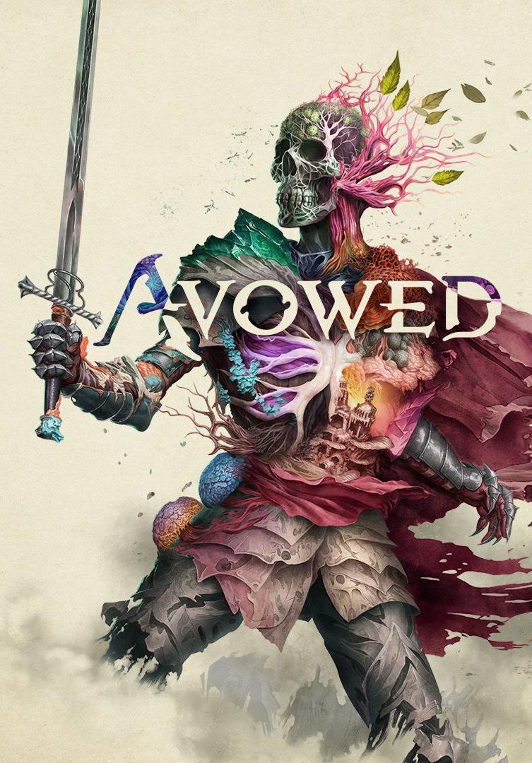
Avowed in particular is so disappointing because the Key art is fucking awesome IMO
Avowed-667927838-large.jpg

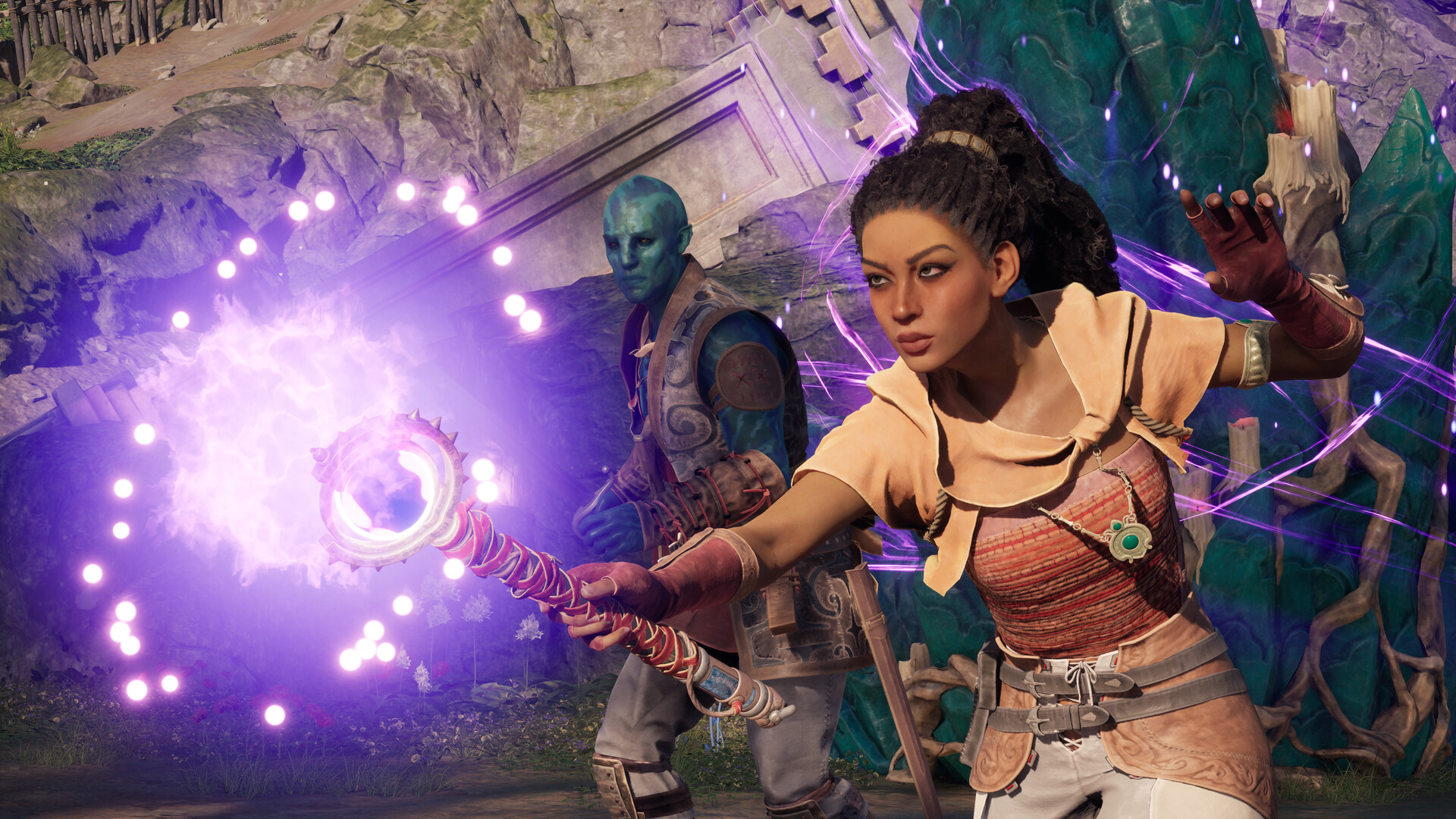
But then you look at the actual game and it just looks aggressively generic.
In black and white or with a recolor. The pastels give away their intentions.
 
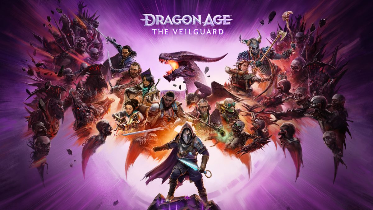
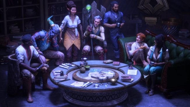
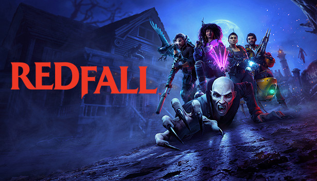
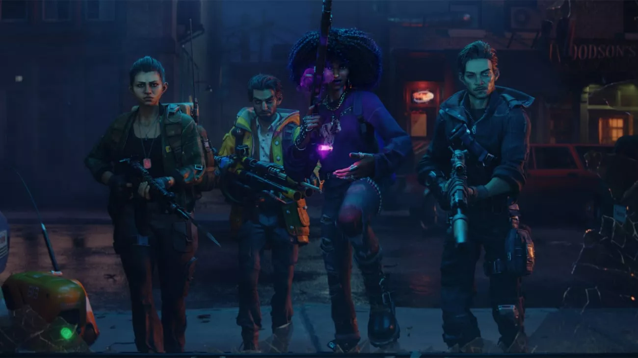
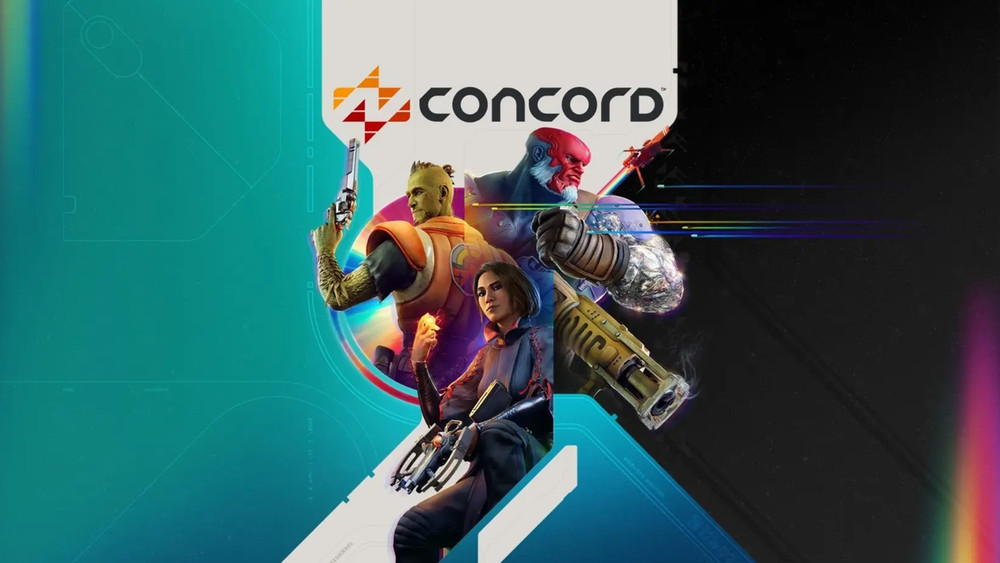
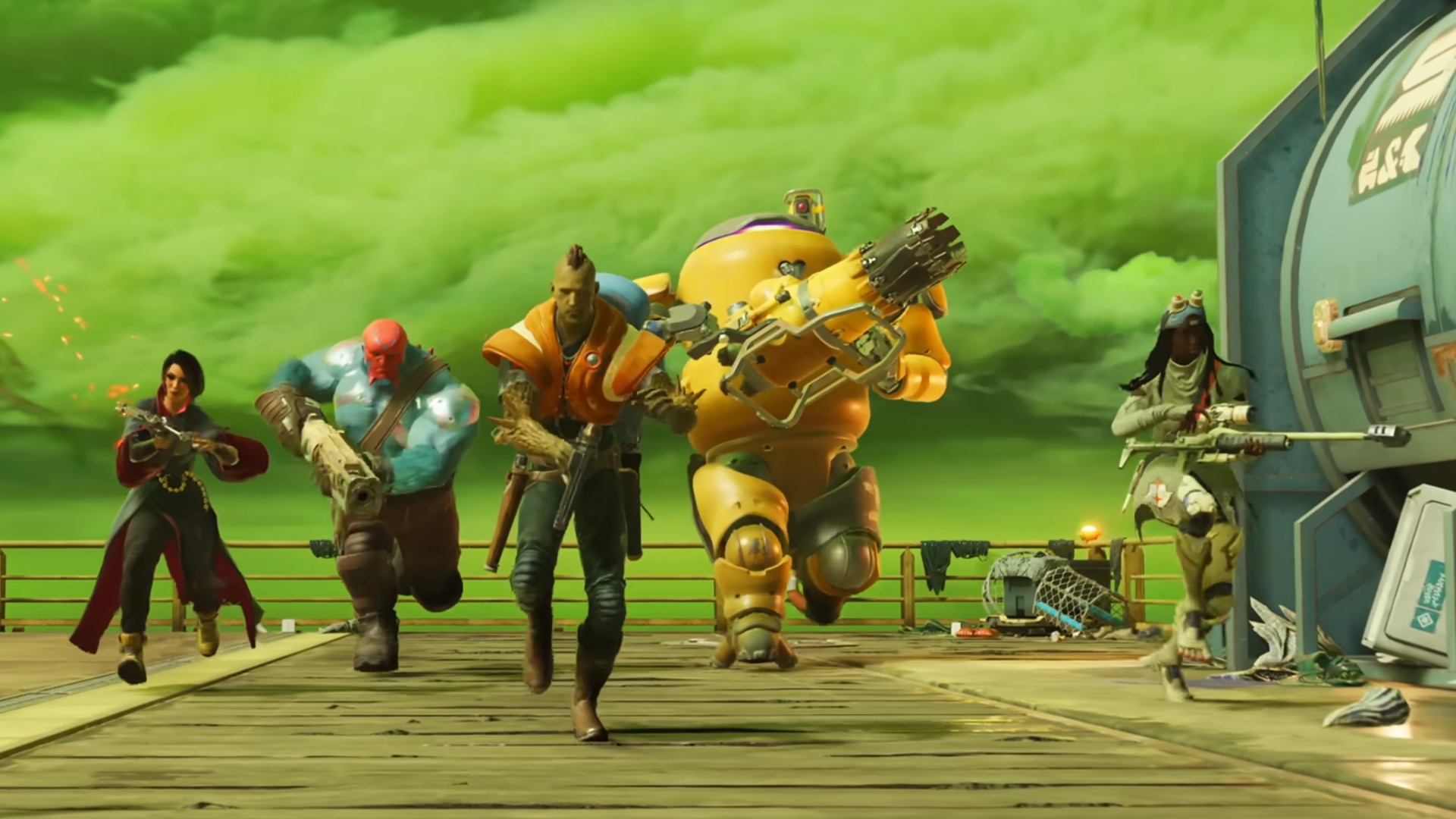
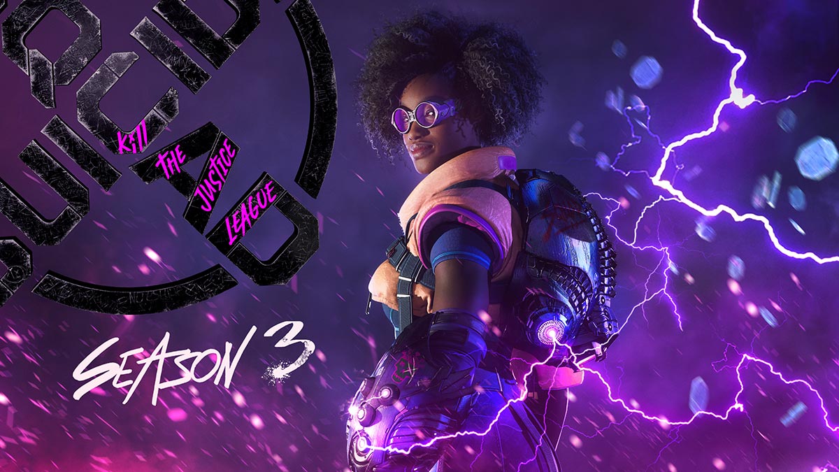
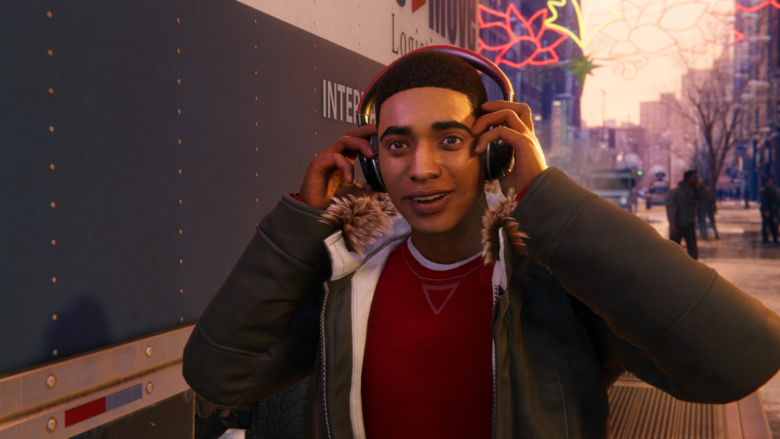
Of course, they are totally different games, but they all look the same to me. They don't have any features that stand out. Everything is a colorful chaos that I can hardly distinguish from each other. If someone told me that all these characters and worlds were made by one and the same studio, I would believe it immediately.

How do you see this?


capsule_616x353.jpg


ss_429bef4d49d33166174e2e9c66619b15c1b1f89d.1920x1080.jpg


dragon-age-veilguard-eacom-coming-soon-16x9.jpg.adapt.crop191x100.1200w.jpg


da-dreadwolf-key-features-rally-vg-16x9.jpg.adapt.crop16x9.652w.jpg


capsule_616x353.jpg


redfall-charakter.jpg.webp


concord-hat-einen-katastrophalen-start-auf-steam-hingelegt-cover66c8f97a3d6b2.jpg


concord-gameplay.jpg


suicide-squad-share.jpg


this-screengrab-of-the-hud-from-suicide-squad-kill-the-v0-r6hef2eqzgbc1.png
Those bright glowing pinks, greens, blues and purples that look out of place in every scenario are a requirement for any current gen game.
 

KXVXII9X

Member
I don't mind the art styles and character designs at all, but I wouldn't mind not seeing purple for a while.
 

Rickyiez

Member
Frankly, I’ve felt this way about 99% of the games that have come out in the last 5 years. Not even just the ones that people like to dunk on.

The only fresh games I’ve played in recent memory are indie games, Astro Bot, and a small handful like Metroid Dread and Baldur’s Gate 3.
99% of Western games . FTFY

Meanwhile from the East

Black Myth Wukong
Stellar Blade
Elden Ring
Granblue Fantasy Relink
Final Fantasy 7 Rebirth and FF16
RE4 Remake
Dragon Dogma 2
Metaphor Refantazia (soon)
Street Fighter 6
Gatcha games like Genshin , ZZZ , Wuthering Wave (it has fun in it without spending any money)

TBH not all of the Western games looks the same as the woke games , credit to Space Marine 2 , Cyberpunk 2077 , Alan Wake 2 and Diablo 4 .
 
Last edited:

unlurkified

Member
Hey, if you love the color enough to make your hair that color, you better believe that you’re gonna be looking for ways to incorporate it into your daily life.
 

fatmarco

Member
There’s been always trends in video games. All bad. Remember “brown is real”? Oh, the 360 glory days…
games-thread-bald-white-guy-protagonists.jpg
This image literally has the same character 3 times lol (Starkiller in "Force Unleashed 2" x2, and "Force Unleashed 1" x1).

I guess another issue is most of these characters are associated with, despite being part of a "trend", great games. This list is mostly made up of Fight Night Champion, Doom 3, Dead Space 2, Black Ops 1, Infamous 2, GTA IV, Witcher 2, Halo Reach, Killzone 2, Mass Effect 1, and Bulletstorm (with TFU 1 and 2, Turok, DA2 and Bionic Commando being the more iffy ones).

So trends are eternal, yes, but there are trends that lead to great/ iconic games, and then there are trends that lead to the slop we experience today.
 
Last edited:

thief183

Member
To be fair... if you put the souls games all together they blend kinda well too... I still bought all of them and I'll kep doing it.
 

PeteBull

Member
There’s been always trends in video games. All bad. Remember “brown is real”? Oh, the 360 glory days…
games-thread-bald-white-guy-protagonists.jpg
Those were xbox glory days, their most succesful console, tons of exclusives, high quality ones at that, both first party, and even 3rd party deals, they managed to basically get a draw with playstation right after sony's most succesful console gen aka ps2.
Think of it as sylvester stallone's rocky going 15 rounds with world champion w/o being knocked out cold.

Nowadays xbox would kill to be even half as competetive as back then :p
 

Robb

Gold Member
This really throws me back to the “why is every game brown with a piss filter” threads of the PS3/360 days..

It’s just trends I guess.
 
Top Bottom