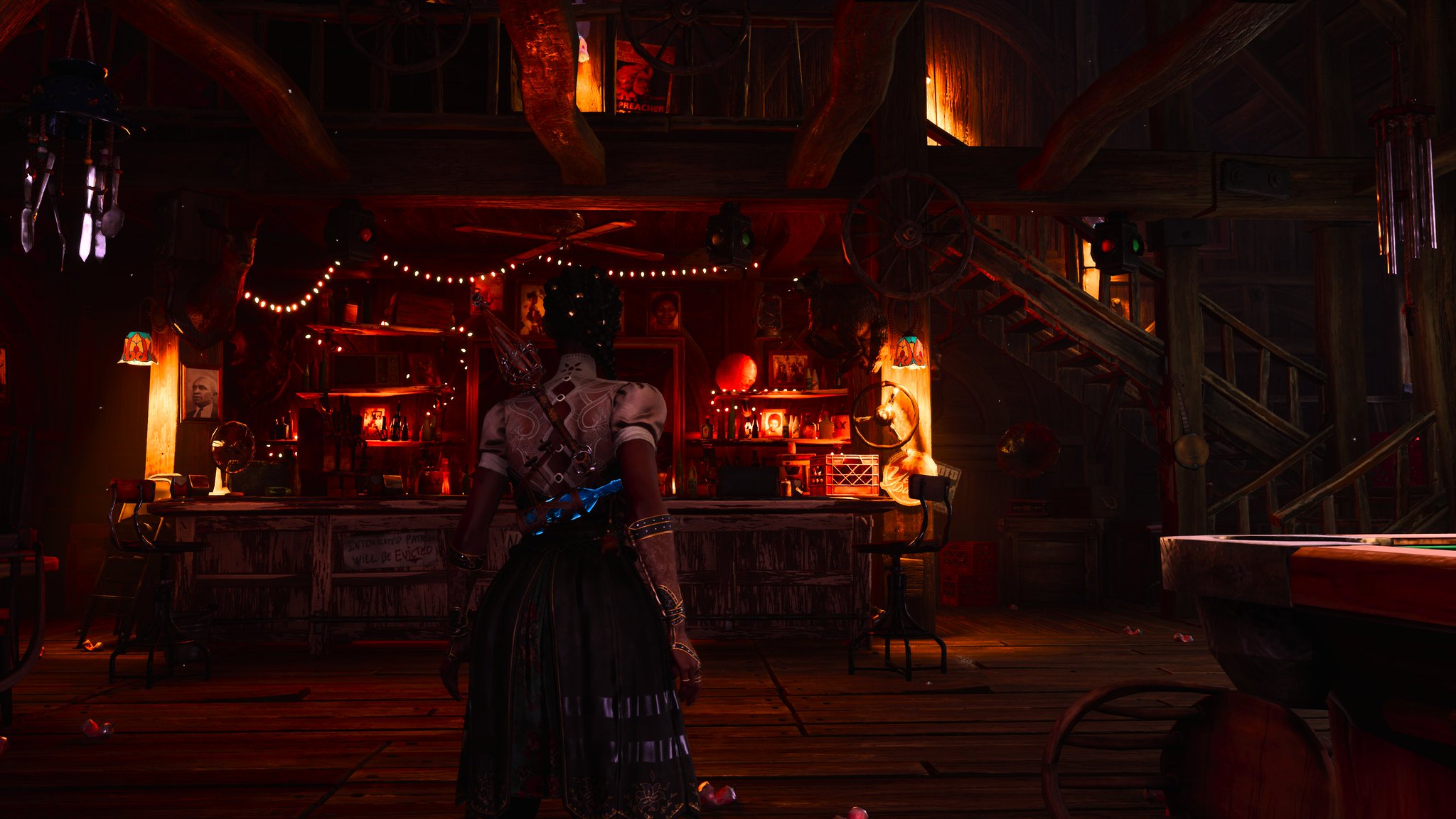
One thing is exaggerated art style. South of Midnight feels different. It looks like they didn't create the models with a proper scale. The grandma character holds something with a candle at the start of the game, and it looks atrocious. It's enormous and completely out of place.
Also, doors are massive for no reason, and other objects are at a proper scale. The fences at the start of the game are extremely thick and make the character look tiny by comparison.
Psychonauts 2 has exaggerated proportions, but everything makes sense and fits with the scale. This one is just sloppy.
The lighting is good, though. I agree with you. It looks good with HDR, etc. But the game design is insanely dumb and generic.
Don't get me wrong, when the game was revealed I loved the art style, and it's good. Just underbaked and not built in a way that it works.
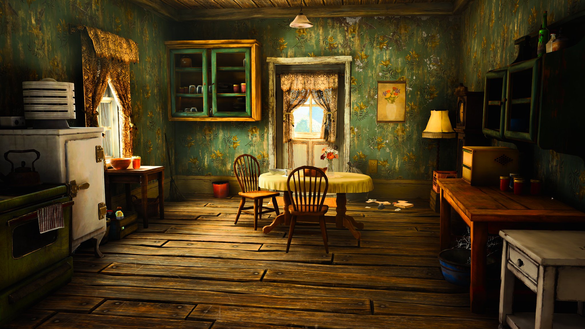
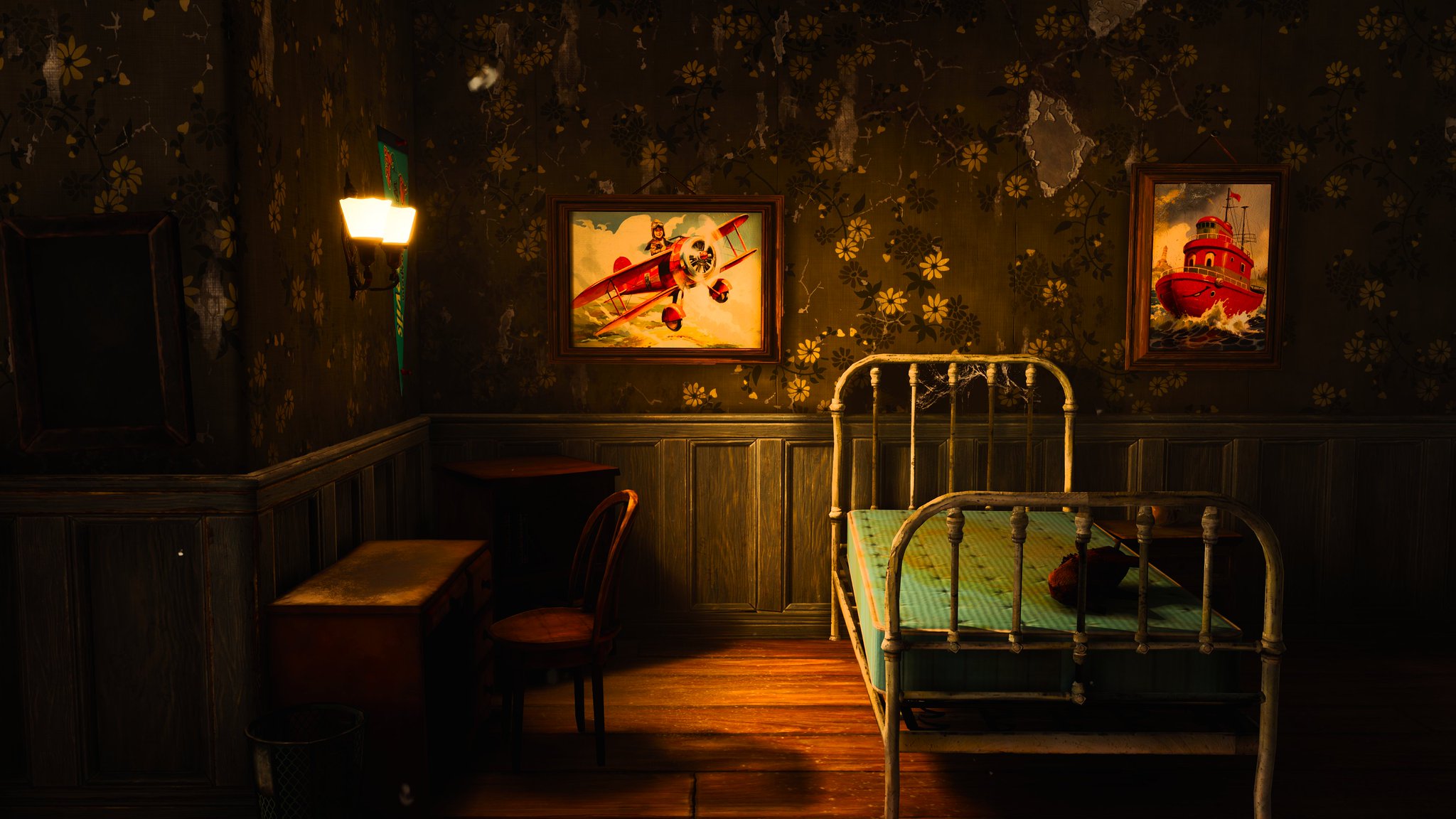
Look at the size of this window.
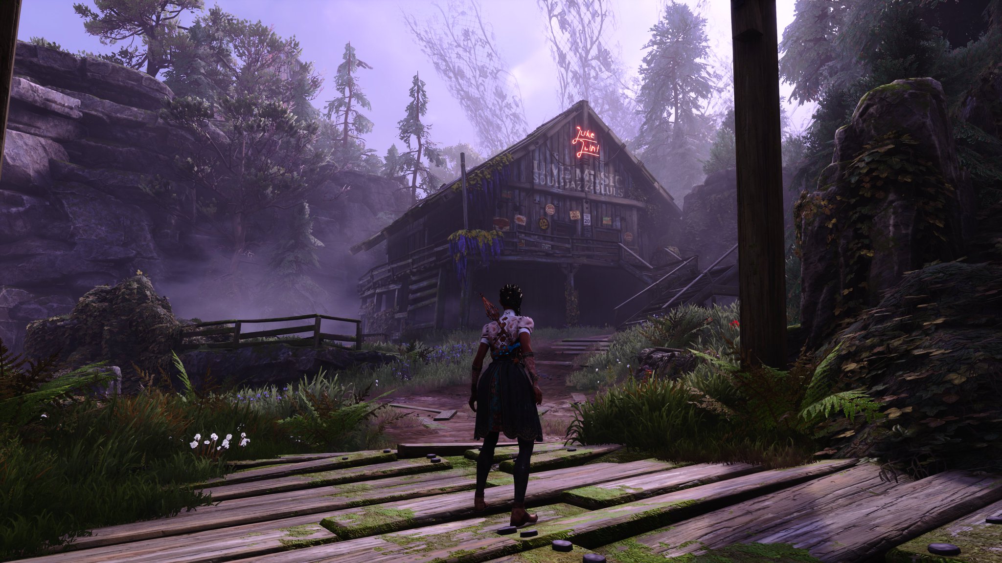
Look at the size of this fence compared to a semi-adult human.
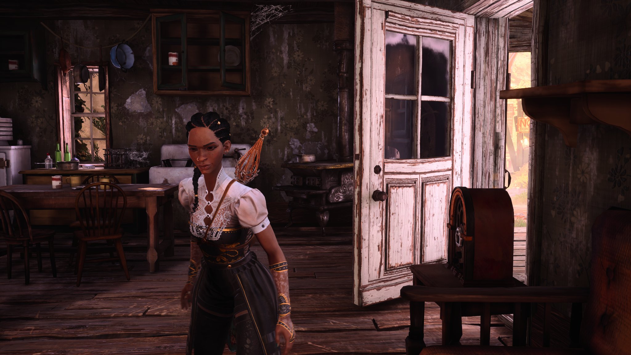
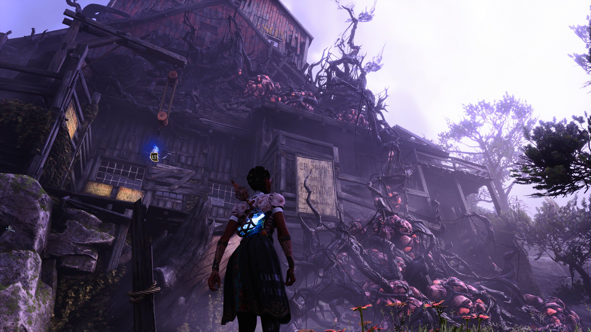
Look at the size of this lamp and how she's holding it.
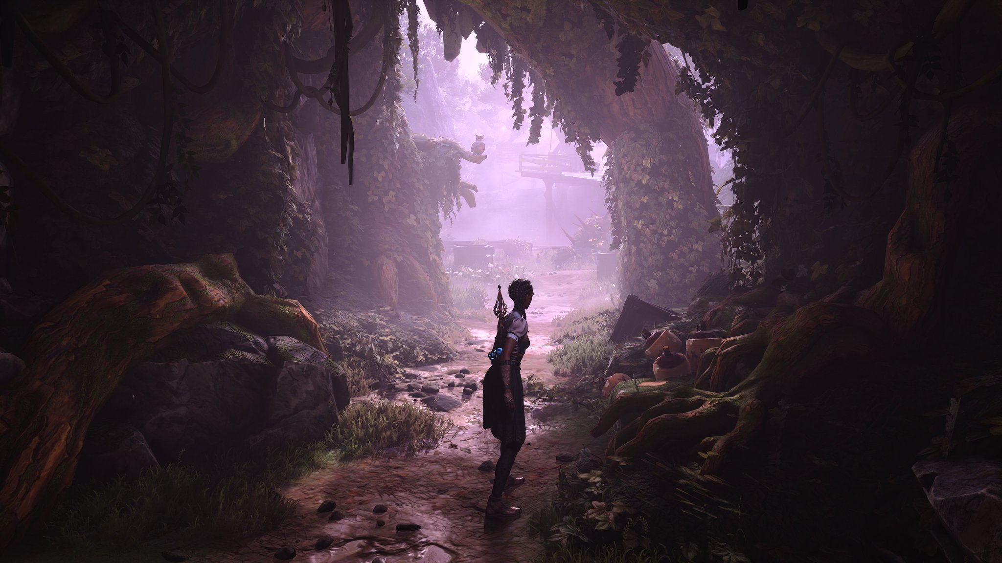
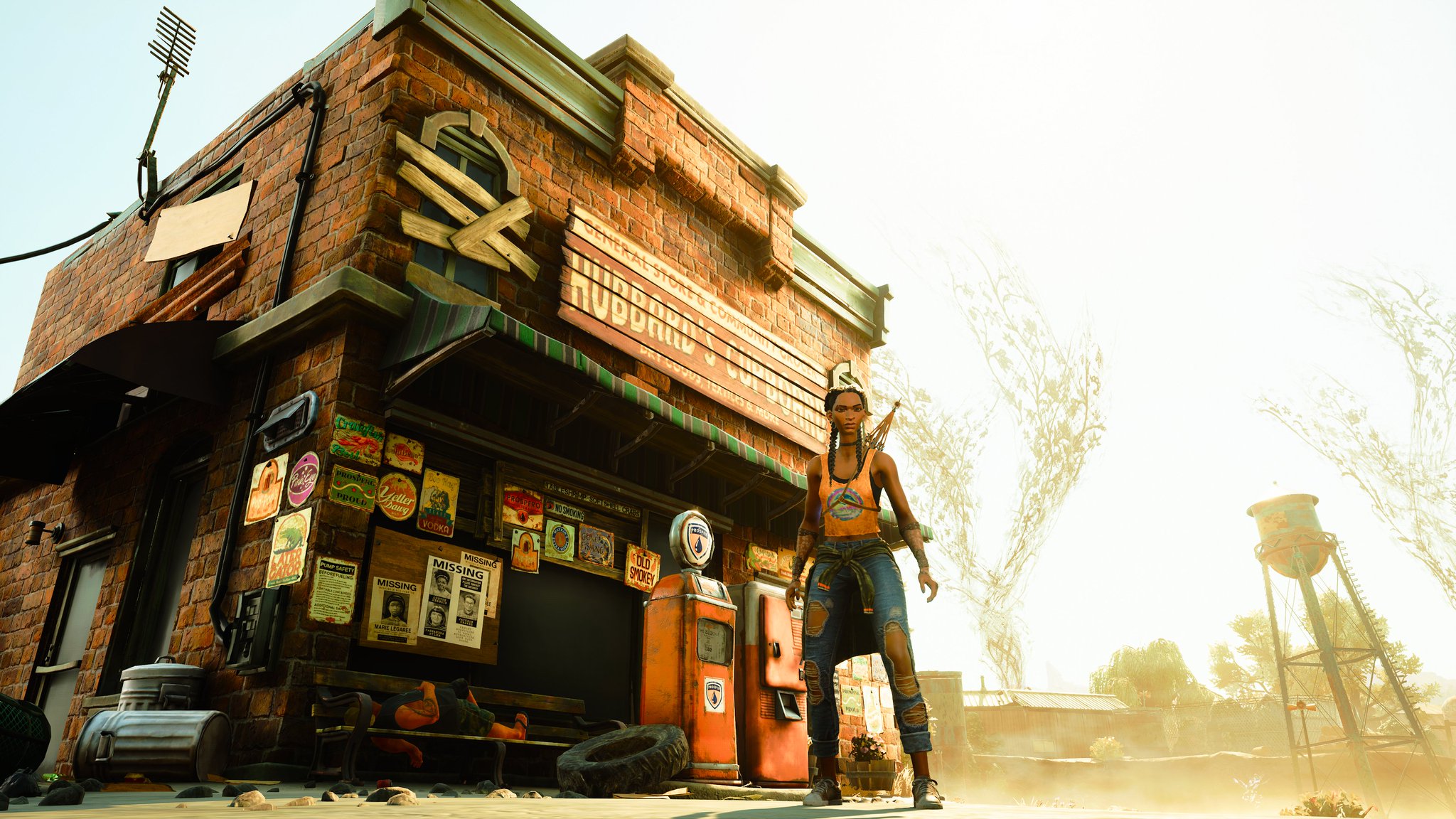
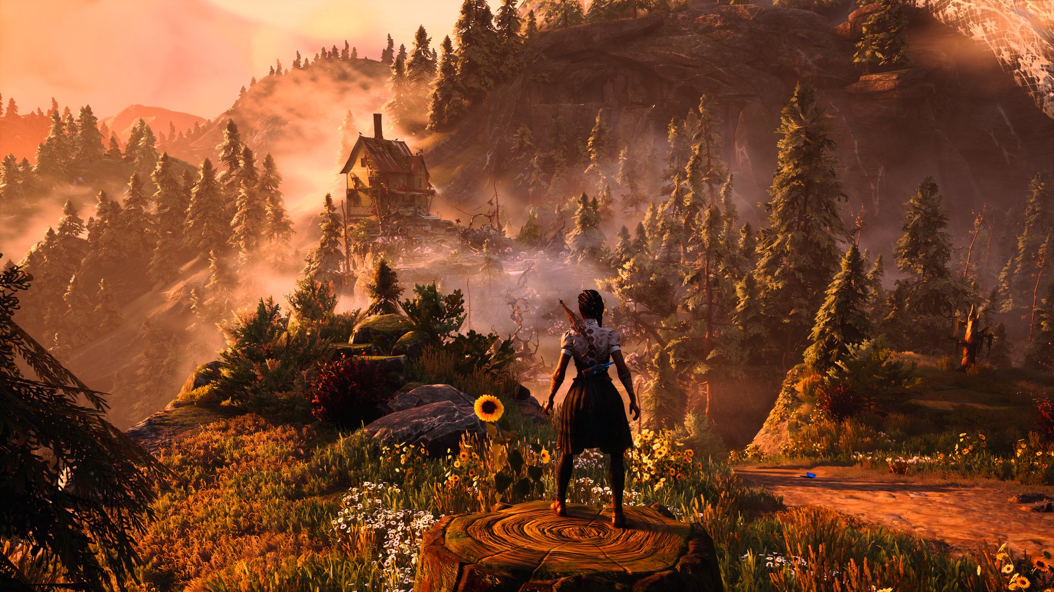
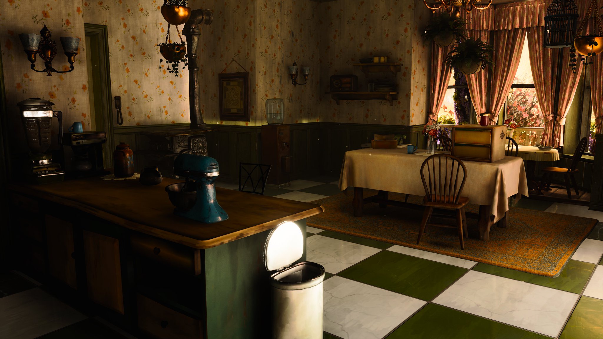
And this isn't for everything. This is just at some odd places where the character doesn't fit the proportions. I can understand exaggerated art styles, but this doesn't seem like it. Looks like an indie developer not making stuff with a clear vision from the start and not having time to adjust things later on.
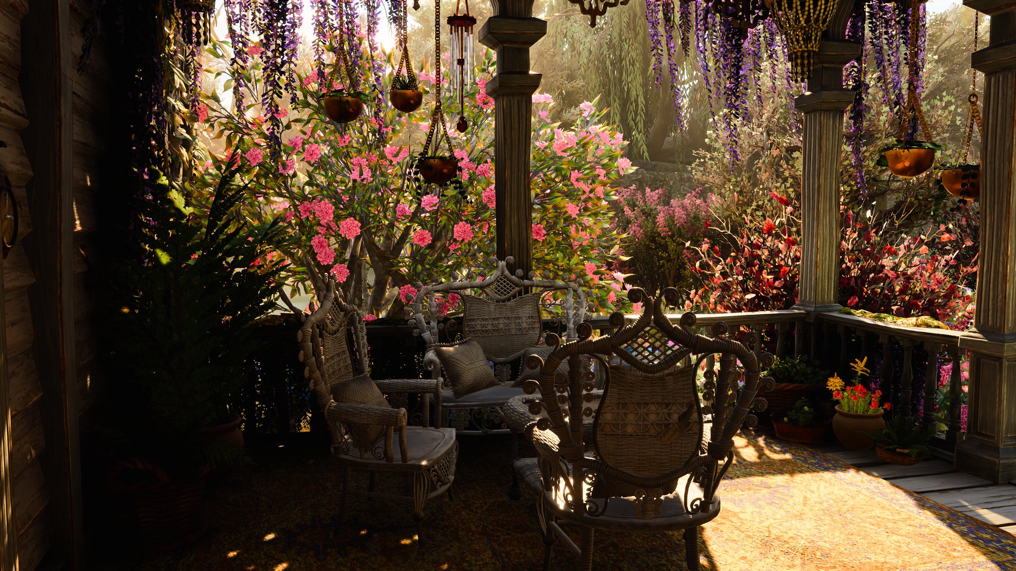
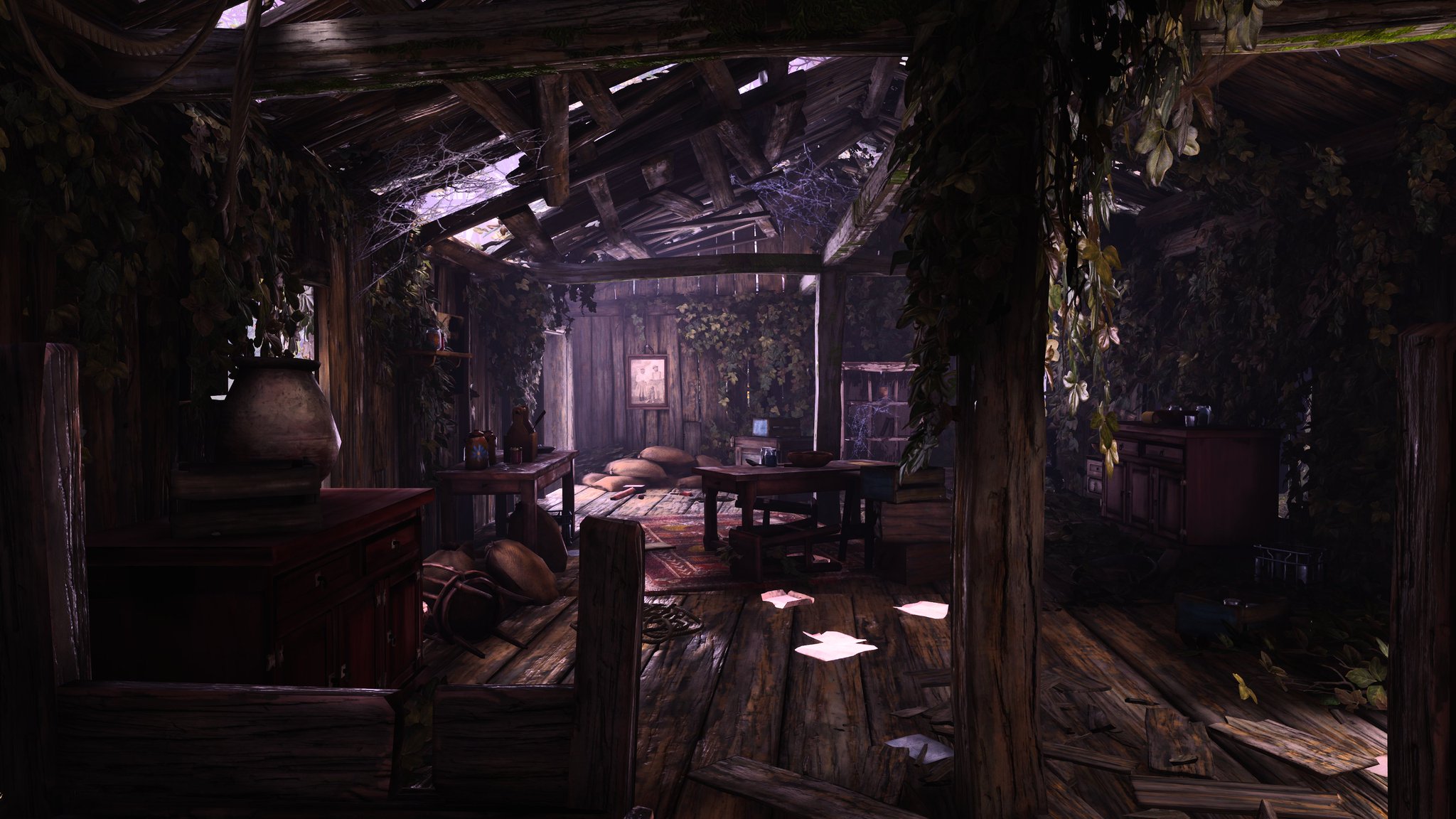
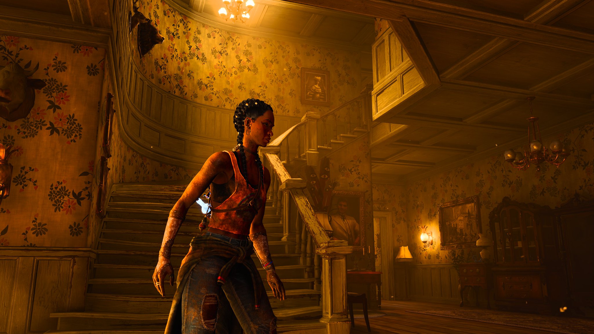
Here, for example, it looks fine.
")


 )
)


 ) enjoy the work on graphic and visual art .