-
Hey Guest. Check out your NeoGAF Wrapped 2025 results here!
You are using an out of date browser. It may not display this or other websites correctly.
You should upgrade or use an alternative browser.
You should upgrade or use an alternative browser.
Arts & Farts
- Thread starter Dreweyes
- Start date


Awesome work Timo. Do you apply the india ink (whatever) after the watercolours are dried? How much post-processing? I really miss the times when I was able to do watercolours. The colours are so strong and alive.
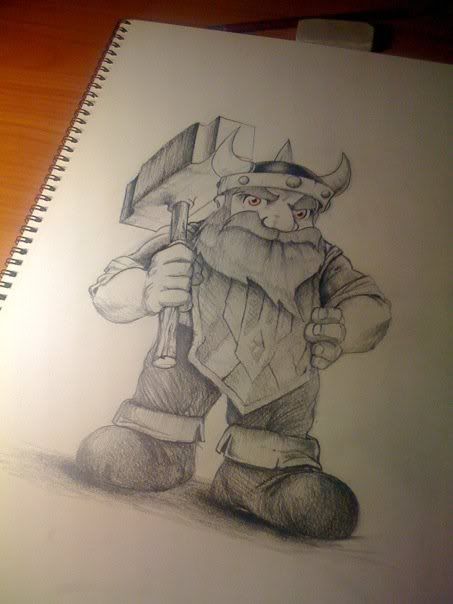
Here's a little piece I did in school. I'm still way off in PS colouring, but I'm getting there I guess. I really don't have any clue how to effectively use layer properties or masks :/

Here's a little piece I did in school. I'm still way off in PS colouring, but I'm getting there I guess. I really don't have any clue how to effectively use layer properties or masks :/


DM_Uselink
Member
Timo: Very nice set of drawings with watercolor. I can recognize them as yours without looking at your name.
vio: Welcome! Nice atmosphere and rendering of the skin.
zoukka: Good studies, I like the portrait drawing, it has a good value range.
This is a ink sketch that I scanned and messed around in Photoshop with.

I posted this in the SSF4 thread a few days ago, but I'll post is here as well.

vio: Welcome! Nice atmosphere and rendering of the skin.
zoukka: Good studies, I like the portrait drawing, it has a good value range.
This is a ink sketch that I scanned and messed around in Photoshop with.
I posted this in the SSF4 thread a few days ago, but I'll post is here as well.
mysticwhip
Banned
Does anyone know if doing 30 & 60 second figure drawing helps with learning anatomy?
I've been doing alot over the past weekend on posemaniacs, sometimes I feel like it's helping other times it seems like a waste.
I've been doing alot over the past weekend on posemaniacs, sometimes I feel like it's helping other times it seems like a waste.
mysticwhip said:Does anyone know if doing 30 & 60 second figure drawing helps with learning anatomy?
I've been doing alot over the past weekend on posemaniacs, sometimes I feel like it's helping other times it seems like a waste.
It does help. Doing quick sketches improves your perception of the silhouette and proportions of the models. Keep it up.
Question. What kind of sketch/concept groups people here use. I could use a place that has a weekly challenge of sorts to just improve on my skills regularly. CGsocietys sketch section seems pretty dead...
Thanks in advance.
DM_Uselink
Member
Zoukka: A good amount of my drawings are creature designs for the Creature of the Week activity at Conceptart.org. They also have weekly character activities amongst others.
DM_Uselink said:Zoukka: A good amount of my drawings are creature designs for the Creature of the Week activity at Conceptart.org. They also have weekly character activities amongst others.
Oh ok, my classmate draws there too. Maybe I'll join. The restrictions are kinda loose there, but what can you do.
hookedonritalin
Member

Not sure if the text works.
Monocle
Member
Unsolicited suggestion: I'd try rearranging the text, and maybe altering its size. It might work better in a less uniform configuration, where either it emphasizes the fragmented theme of the image or winds off into the background. You could even play with the opacity and see if it works as a quasi-subliminal layer of texture. Right now the stark crispness of the letters distracts from your composition by pulling the eye away from the pathways formed by all the interesting contours. Contrast can be a dangerous thing when it doesn't support the other elements in a piece.hookedonritalin said:http://fc00.deviantart.net/fs70/f/2010/069/6/e/Lost_by_redcancer_.jpg
Not sure if the text works.
Or, you know, you could just remove the text completely. :lol
hookedonritalin
Member
Thanks for your feedback! Yeah, I tried all your suggestions out, still didn't work. Text is now gone :lolMonocle said:Unsolicited suggestion: I'd try rearranging the text, and maybe altering its size. It might work better in a less uniform configuration, where either it emphasizes the fragmented theme of the image or winds off into the background. You could even play with the opacity and see if it works as a quasi-subliminal layer of texture. Right now the stark crispness of the letters distracts from your composition by pulling the eye away from the pathways formed by all the interesting contours. Contrast can be a dangerous thing when it doesn't support the other elements in a piece.
Or, you know, you could just remove the text completely. :lol

Here's another piece, albeit a minor one:

Monocle
Member
They're both great. The top one is much improved with the text gone. Looks like you made the right choice there. I have to say, that green is pretty brave. I would have hesitated to use such a neon chroma, but it totally works.hookedonritalin said:Thanks for your feedback! Yeah, I tried all your suggestions out, still didn't work. Text is now gone :lol
http://fc02.deviantart.net/fs71/f/2010/069/6/9/Lost_by_redcancer_.jpg
Here's another piece, albeit a minor one:
http://fc04.deviantart.net/fs71/f/2010/069/3/8/20_by_redcancer_.jpg
You've got an appealing style and I especially like your compositions. Something about the circle motif in the second piece hits the spot. I think it's the way the tire rims react to the large circle in the middle, and how the man's suit cuts across it to basically kick you in the face. But in a good way. It anchors the whole image in the manner that text from the first piece couldn't quite manage. Now that's contrast done right.
hookedonritalin
Member
Thank you for the kind words and your in-depth feedback, Monocle. Much appreciated!
Metroid Killer
Member
I could easily imagine printing out the stuff you've posted in this thread and hang it on my wall. So many incredible pieces!hookedonritalin said:Thank you for the kind words and your in-depth feedback, Monocle. Much appreciated!


dr_octagon
Banned

Two friends of me formed a band and made a new video involving chatroulette
Clit The Klein - Every Body (Listen Up!)
Clit The Klein - Every Body (Listen Up!)

hookedonritalin said:Thanks for your feedback! Yeah, I tried all your suggestions out, still didn't work. Text is now gone :lol
http://fc02.deviantart.net/fs71/f/2010/069/6/9/Lost_by_redcancer_.jpg[/ IMG]
Here's another piece, albeit a minor one:
[IMG]http://fc04.deviantart.net/fs71/f/2010/069/3/8/20_by_redcancer_.jpg[/ IMG][/QUOTE]
These pieces look great! What kind of techniques do you use to make them?
hookedonritalin said:

Wow. That's incredible.
Raging Spaniard
If they are Dutch, upright and breathing they are more racist than your favorite player
New GAF, new art ")
I've always wanted to toy around with Zbrush, and eventually i managed to make something a little more complex than the average monster face starting from a simple sphere (i opened the program for the first time this January!)...
This is my first *serious* Zbrush work, it's based on the Gourmandise Demon from the game Helldorado....
I hope you like it, feel free to critique and give me suggestions guys (i have LOTS to learn from y'all)!

Oh the tag says Gourmandise Demon in Italian, just in case you're wondering...
This is my first *serious* Zbrush work, it's based on the Gourmandise Demon from the game Helldorado....
I hope you like it, feel free to critique and give me suggestions guys (i have LOTS to learn from y'all)!
Oh the tag says Gourmandise Demon in Italian, just in case you're wondering...
From the conceptart.org challenge hence the stupid borders.
EDIT: woops forgot it could be considered NSFW. Sorry.
http://zoukka.vuodatus.net/
EDIT: woops forgot it could be considered NSFW. Sorry.
http://zoukka.vuodatus.net/

Arcipello said:finished this image a while before xmas but wasnt able to put it online until now. it was for a workshop and cover image for ImagineFX magazine. thankfully i could do anything i wanted aslong as i created a step by step workshop on the image. so i chose to do a more surreal image all about beauty and how it is not eternal.

just wanted ArtGaf to know ive uploaded the HD video of myself creating the above image, never done one of these before so im quite happy with the results
edit : had to hide the video since the magazine it was for is still on sale in some countries
Raging Spaniard
If they are Dutch, upright and breathing they are more racist than your favorite player
Dunno if anybody cares, but I'm going to be dropping in on the artcast of my friend and fellow EA concept artist Brandon Dayton in about 40 mins:
http://www.artcastnetwork.com/channels/brandon-dayton-drawing-live/
First time doing this, so it should be fun
http://www.artcastnetwork.com/channels/brandon-dayton-drawing-live/
First time doing this, so it should be fun
sixteen-bit
Member
SHOBU JA!DM_Uselink said:I posted this in the SSF4 thread a few days ago, but I'll post is here as well.
i love this.


mysticwhip
Banned
Ive been using George Bridgeman's constructive anatomy and it's helping, I think!
DM_Uselink
Member
_dementia said:SHOBU JA!
i love this.
Thanks! Hope she's as fun to play as like in 3rd Strike.
Hope you guys don't mind me commenting a bit on some of your images.
Arcipello: I got to see it the other day and it was cool watching your process. Lovely work (same for the new piece you posted on Deviantart)
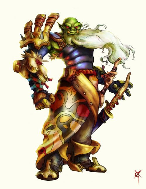
Raging Spaniard: Nice character piece. Got some Dudebro influence on there
 I like the cloth around the lower body.
hookedonritalin: I like the textures in you work.
Chao: I know this person, but I can't remember who it is. It's at the tip of my tongue. In any case, it is a lovely portrait.
Exarchos: It looks good so far, I'm sure it'll look better with textures added.
dr_octagon: Nice seeing Rolento in SF4 style-art. I would just say that adding a bit more definition on the arms and perhaps blurring a bit on the hand that is spinning the stick would improve the image.
Mdk7: Pretty disgusting, in a good way of course. I like seeing 3d work in here.
zoukka: Very stylized figures. I like the one entitled kakkaa on your site. The mask hanging from his chair is a nice touch.
Nice work in here everyone, some really inspiring stuff!
I've really been enjoying painting in photoshop lately and I have a piece I will post here once it's done. I did have a question about the size of a canvas relative to what the size of the final image would be - I recall a matte painter saying that paintings with a high level of detail should always be painted much larger than their final form. So if I'm doing a piece that I want to be a 1920x1200 wallpaper, how big pixel-wise should my canvas be in PS? Thanks!
I've really been enjoying painting in photoshop lately and I have a piece I will post here once it's done. I did have a question about the size of a canvas relative to what the size of the final image would be - I recall a matte painter saying that paintings with a high level of detail should always be painted much larger than their final form. So if I'm doing a piece that I want to be a 1920x1200 wallpaper, how big pixel-wise should my canvas be in PS? Thanks!
EatChildren
Currently polling second in Australia's federal election (first in the Gold Coast), this feral may one day be your Bogan King.
Second ever 3D model (first was a barrel ). Made using XSI. I'm a total noob at this shit so I'm just learning as I go. As I said, the second ever model I've done, following concept art nabbed off Martin Shapev's online portfolio (met him while doing a mod sometime ago).

It's an industrial blowtorch, WIP. Goal is to get it up and running in Source. I managed to get the barrel working, not that it was hard, but I was proud to have my first ever model and texture get into a videogame engine successfully.
). Made using XSI. I'm a total noob at this shit so I'm just learning as I go. As I said, the second ever model I've done, following concept art nabbed off Martin Shapev's online portfolio (met him while doing a mod sometime ago).
It's an industrial blowtorch, WIP. Goal is to get it up and running in Source. I managed to get the barrel working, not that it was hard, but I was proud to have my first ever model and texture get into a videogame engine successfully.
EatChildren said:Second ever 3D model (first was a barrel
http://i40.tinypic.com/21cfe55.jpg[img]
It's an undustrial blowtorch, WIP. Goal is to get it up and running in Source. I managed to get the barrel working, not that it was hard, but I was proud to have my first ever model and texture get into a videogame engine successfully.[/QUOTE]
If you'd like some constructive criticism that might help you in the long run:
I think you might have some problems getting that into source. You have a ton of n-polygons, that is polygons with multiple edges (when they should only have 3). You might have to triangulate it before you export it.
Also, I would advise against using boolean or csg subtract operations when making any models, but especially for games. For the barrel vents, you should take a cylinder, delete faces for the holes, and then fill them. That will keep your barrel in quads.
Finally, for the body, you should have those cuts use edges that go all the way around the body. These are known as edge loops, and are generally a good way to go for any type of modeling to avoid n-polygons.
Otherwise, looks good! Good luck!
my name is ed
Banned
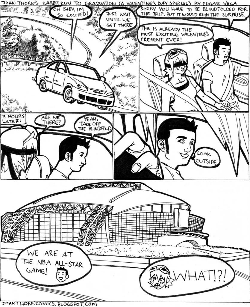
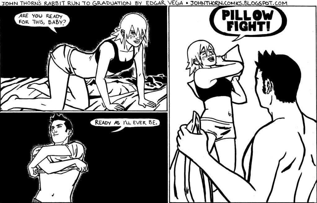
Oh man, I havent posted in a long time. Due to computer troubles. Here are some of my more recent comics
EatChildren
Currently polling second in Australia's federal election (first in the Gold Coast), this feral may one day be your Bogan King.
ianp622 said:If you'd like some constructive criticism that might help you in the long run:
I think you might have some problems getting that into source. You have a ton of n-polygons, that is polygons with multiple edges (when they should only have 3). You might have to triangulate it before you export it.
Also, I would advise against using boolean or csg subtract operations when making any models, but especially for games. For the barrel vents, you should take a cylinder, delete faces for the holes, and then fill them. That will keep your barrel in quads.
Finally, for the body, you should have those cuts use edges that go all the way around the body. These are known as edge loops, and are generally a good way to go for any type of modeling to avoid n-polygons.
Otherwise, looks good! Good luck!
Excellent excellent excellent. Thanks dude. Do you (or anybody) have any good links to learn about modelling for game environments? As I said I'm learning as I go so I did use a lot of booleaning to get my ridges, and if this is the wrong way to go I'd love to learn the right way.
dr_octagon
Banned
@DM_Uselink - thanks for the advice, your work is really good
Always lots of great stuff in this thread.
Always lots of great stuff in this thread.
Raging Spaniard
If they are Dutch, upright and breathing they are more racist than your favorite player
Some newer stuff, including super duper old stuff I did for Tiger Woods 07 Wii :lol


Did all the env. textures here, including coming up with some new grass solutions (loved the fur in Shadow of the Colossus, so I tried to make our grass have a similar look)

Took one of the courses and re-did all the buldings, these are Maya caps and show the after and before stages


And some golf clubs. Happy with these cause the textures sizes are tiny (256's I think)

Did all the env. textures here, including coming up with some new grass solutions (loved the fur in Shadow of the Colossus, so I tried to make our grass have a similar look)
Took one of the courses and re-did all the buldings, these are Maya caps and show the after and before stages
And some golf clubs. Happy with these cause the textures sizes are tiny (256's I think)
mysticwhip
Banned
Finished with Bridgeman, it helped me a bit, but I think Andrew Loomis' Figure drawing for all it's worth will propel me a bit further since I now have a basic understanding of the bones and muscles. Anyone have any experience with Loomis' books?
Raging Spaniard
If they are Dutch, upright and breathing they are more racist than your favorite player
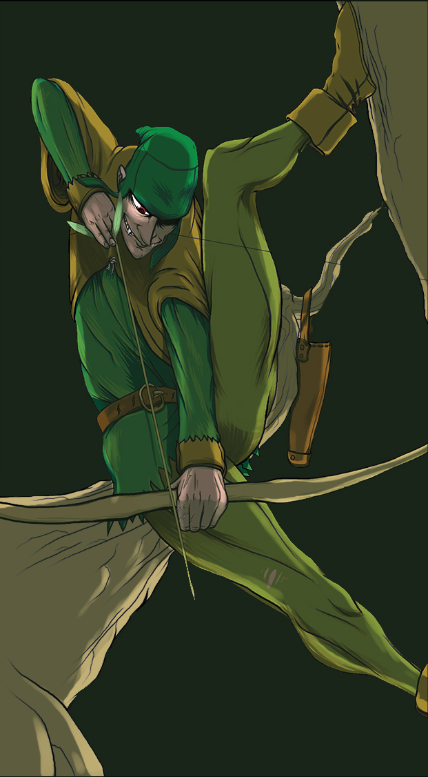
zoukka said:Robin Hood...
Looks pretty good, although I have some suggestions, so if you dont mind I did a little drawover.
My thoughts:
-Your pose is really great, but youre missing out on a better 3d effect by not having his limbs move into space more (and his shins are way too small when compared to how long his thighs are). It seemed to me like his left leg would look better if it was towards us, so I moved it to the foreground. Now you also have a nice foreground element that frames the character better
-As a train of thought you dont want to chop of extremities at the joints, which is what happens with his other leg, so I extended the image and kept the leg going to its resting spot
-His bow and the tree trunk very doing a weird tangent esque parallel line thing going on, you usually want to avoid stuff like that so I changed that up some

Great job though my notes are pretty minor all in all. Its hard to get such a good pose that reads well like this one.
Some new stuff from me:


