-
Hey Guest. Check out your NeoGAF Wrapped 2025 results here!
You are using an out of date browser. It may not display this or other websites correctly.
You should upgrade or use an alternative browser.
You should upgrade or use an alternative browser.
Arts & Farts
- Thread starter Dreweyes
- Start date
DM_Uselink
Member
Thanks Chao.
Raging Spaniard
If they are Dutch, upright and breathing they are more racist than your favorite player
Finally done, now I can move on to something more medieval and painterly (thank God, lol)


arter_2
Member
Hey guys I just Graduated the School of Visual Arts with a Computer Art degree. I like to do traditional work but lately it has all been Computer Animation modeling, rigging, and animation. Here's my senior thesis it took about 2 years to completely and was mostly done by me. I hope you all enjoy it.
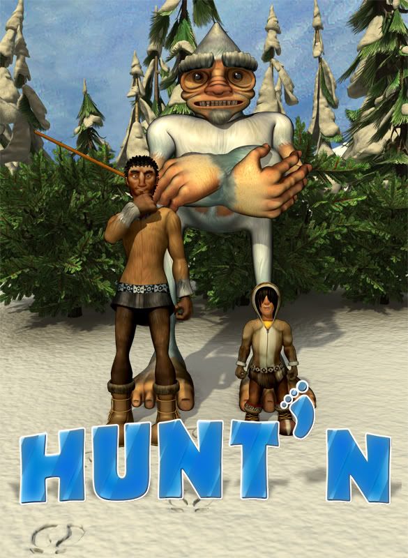
http://www.youtube.com/watch?v=B1EIG14b5s8

http://www.youtube.com/watch?v=B1EIG14b5s8
hookedonritalin
Member
Dude, great thesis! Lots of variety in the animation, which is probably one of the most important things to show in a short. It was also a fun watch, good stuff. Coincidentally, I've been actually thinking of pursuing computer animation in a post-grad program, but I have yet to take some animation classes in my last year. Seeing as how you're done now, I suppose you're at that stage now looking for jobs. Good luck on that dude, hope you feel confident with this short film.arter_2 said:Hey guys I just Graduated the School of Visual Arts with a Computer Art degree. I like to do traditional work but lately it has all been Computer Animation modeling, rigging, and animation. Here's my senior thesis it took about 2 years to completely and was mostly done by me. I hope you all enjoy it.

http://www.youtube.com/watch?v=B1EIG14b5s8
arter_2
Member
hookedonritalin said:Dude, great thesis! Lots of variety in the animation, which is probably one of the most important things to show in a short. It was also a fun watch, good stuff. Coincidentally, I've been actually thinking of pursuing computer animation in a post-grad program, but I have yet to take some animation classes in my last year. Seeing as how you're done now, I suppose you're at that stage now looking for jobs. Good luck on that dude, hope you feel confident with this short film.
Thanks man for your kind words. I'm glad ou enjoys it and noticed all th minute details. I'd have to say if you wanna just do animation and not learn all the other techincle stuff your best bet is to go to animation mentor. It's an online animaion pogram taught by industry animators. Big studios like dream works and blue sky take people staight out of the program. Yes, I am Looking for a job bit not as hard as I should be. I'm currently refining my reel and finally resting a bit college was a crazy amount of work. Good luck man the cg word is a small family so keep me informed on your progress I'd be more than willing to help or point you in the right direction
NakedCosmonaut
Member
vitaminwateryum
corporate swill
Raging Spaniard
If they are Dutch, upright and breathing they are more racist than your favorite player
Starting a new 3d thing, heres the concept and the first wip


Oh and some life drawing


If any of you care, I post these on my blog first: http://xgarcia.blogspot.com/


Oh and some life drawing


If any of you care, I post these on my blog first: http://xgarcia.blogspot.com/
MetalAlien
Banned
did more work on it... coming along.


hookedonritalin
Member
Beautiful illustration, dude.NakedCosmonaut said:
Witchfinder General
punched Wheelchair Mike
Does anyone have some good resources or techniques for practicing drawing heads + faces? I've been drawing people forever and have taken a figure class as well, but there are intricacies to the face that I just don't have nailed down. Links, book recommendations, or just any tips would be GREATLY appreciated... Thanks fellow art people!
Witchfinder General
punched Wheelchair Mike
Dechaios said:Does anyone have some good resources or techniques for practicing drawing heads + faces? I've been drawing people forever and have taken a figure class as well, but there are intricacies to the face that I just don't have nailed down. Links, book recommendations, or just any tips would be GREATLY appreciated... Thanks fellow art people!
Hmmmmm, my best advice is to threat the head/face like a landscape; understand and study the troughs, the valleys and the hills that make up a head. Also, draw a lot of human skulls. Once you understand our bones you will understand the structure needed to produce a convincing facsimile.
I'm now doing pretty much all of my work directly in PS and after poking around on the Wacom site, I'm wondering if I should upgrade from my Bamboo Fun to an Intuos4 tablet.
I don't know, though. The descriptions make the Bamboo seem like more of a casual tablet for stuff like photo editing, not so much for digital artwork. Contrast that with the Intuos4 details which make it sound like a much more precise tool, better suiting for drawing/painting. I plan to do quite a bit of digital stuff in the future, is anyone able to provide some insight as to whether it's worth making the switch? At this point I'm just a hobbyist, but it's turning into a pretty serious hobby.
I don't know, though. The descriptions make the Bamboo seem like more of a casual tablet for stuff like photo editing, not so much for digital artwork. Contrast that with the Intuos4 details which make it sound like a much more precise tool, better suiting for drawing/painting. I plan to do quite a bit of digital stuff in the future, is anyone able to provide some insight as to whether it's worth making the switch? At this point I'm just a hobbyist, but it's turning into a pretty serious hobby.
vitaminwateryum
corporate swill
Does anyone know some good sites for some 3D modeling tutorials? I'm not starting my modeling / animation classes until around winter and would like to get a head start.
Raging Spaniard
If they are Dutch, upright and breathing they are more racist than your favorite player
Sorry for basically reposting what I type on my blog, but I dont know who checks it, lol
OMG! Polygon explosion! Those bamboo rods sure add up, damn

Tomorrow I'll be doing some cleanup. For the most part I'm happy with the polycount since not one element is super detailed, its a matter of just having a lot of elements in the scene, and thats fine. I know it needs one more thing though, I'm thinking about having some fished out creature hanging by the big tusk on the side, but it cant attract too much attention ... so I'll have to think about it.
Other than that, the modeling phase is mostly done, I do have to re-do some mapping though, and after that its texture time! Hoping to have this done before the end of the coming week
OMG! Polygon explosion! Those bamboo rods sure add up, damn

Tomorrow I'll be doing some cleanup. For the most part I'm happy with the polycount since not one element is super detailed, its a matter of just having a lot of elements in the scene, and thats fine. I know it needs one more thing though, I'm thinking about having some fished out creature hanging by the big tusk on the side, but it cant attract too much attention ... so I'll have to think about it.
Other than that, the modeling phase is mostly done, I do have to re-do some mapping though, and after that its texture time! Hoping to have this done before the end of the coming week
Bioshocked
Member
Prax
Member
I feel like I haven't posted in here forever!
Zozobra, I guess it depends on what size of Bamboo tablet you have? I think the Bamboo works pretty well for most purposes, especially if it's the medium or larger sized tablets (it should be on par with the discontinued Wacom Graphire line from what I know--I used it for a long while to make decent stuff, and so have a lot of other artists).
I switched from a small Graphire 2 4"x5" or something like that to an Intous 3 6"x8", and that made a HUGE difference in comfort while colouring on the computer. The Intuos line also has a really nice feel, and if you want to get into getting more painterly effects, its sensitivity and detection of tilt/angles are much better for that. The Intuos 4 tablet also has that cool rotation wheel to rotate the canvas in programs, and other convenience bells and whistles (e.g. programmable buttons, touch strips). It's just really pricey!
I'd say, just like any other hobby or passion, it depends on how much you want to invest into it. Your Bamboo will serve you well for a long time, but the Intuos is definitely the better tablet, although you may never use all of its features (I know I still don't!). For me, it was worth it because I was seriously getting hand cramps from colouring so much on a small tablet, and I want to get more seriously into digital colouring anyway.
Anyway, I've been pretty busy with school, so I haven't really drawn much that is of amazing quality, but I have made many doodles, so here are the "gooder" doodles that i later added some fast colour to (which by the way, were mostly made while on the bus traveling to school and such!):
More concrete character designs for a project I'm working on with my cousin. We're going to try to do a collaborative web-comic of some sort. Yes, they look like generic magical anime girls for now...


Another original character with uniform design partially inspired by the new Fire Emblem custom character.

And a series of drawings of original male characters. The reoccurring male in each of the images is named Heimdl. Hopefully I'm keeping him consistent enough that you can tell it's the same guy despite hair and clothing changes.


I also did some fanart so my cousin could practice inking with them:
My favourite Naruto characters minus Gaara. XD

Hopefully when I FINALLY graduate and get my masters degree, I can get back to more serious drawing!
Zozobra said:I'm now doing pretty much all of my work directly in PS and after poking around on the Wacom site, I'm wondering if I should upgrade from my Bamboo Fun to an Intuos4 tablet.
I don't know, though. The descriptions make the Bamboo seem like more of a casual tablet for stuff like photo editing, not so much for digital artwork. Contrast that with the Intuos4 details which make it sound like a much more precise tool, better suiting for drawing/painting. I plan to do quite a bit of digital stuff in the future, is anyone able to provide some insight as to whether it's worth making the switch? At this point I'm just a hobbyist, but it's turning into a pretty serious hobby.
Zozobra, I guess it depends on what size of Bamboo tablet you have? I think the Bamboo works pretty well for most purposes, especially if it's the medium or larger sized tablets (it should be on par with the discontinued Wacom Graphire line from what I know--I used it for a long while to make decent stuff, and so have a lot of other artists).
I switched from a small Graphire 2 4"x5" or something like that to an Intous 3 6"x8", and that made a HUGE difference in comfort while colouring on the computer. The Intuos line also has a really nice feel, and if you want to get into getting more painterly effects, its sensitivity and detection of tilt/angles are much better for that. The Intuos 4 tablet also has that cool rotation wheel to rotate the canvas in programs, and other convenience bells and whistles (e.g. programmable buttons, touch strips). It's just really pricey!
I'd say, just like any other hobby or passion, it depends on how much you want to invest into it. Your Bamboo will serve you well for a long time, but the Intuos is definitely the better tablet, although you may never use all of its features (I know I still don't!). For me, it was worth it because I was seriously getting hand cramps from colouring so much on a small tablet, and I want to get more seriously into digital colouring anyway.
Anyway, I've been pretty busy with school, so I haven't really drawn much that is of amazing quality, but I have made many doodles, so here are the "gooder" doodles that i later added some fast colour to (which by the way, were mostly made while on the bus traveling to school and such!):
More concrete character designs for a project I'm working on with my cousin. We're going to try to do a collaborative web-comic of some sort. Yes, they look like generic magical anime girls for now...


Another original character with uniform design partially inspired by the new Fire Emblem custom character.

And a series of drawings of original male characters. The reoccurring male in each of the images is named Heimdl. Hopefully I'm keeping him consistent enough that you can tell it's the same guy despite hair and clothing changes.


I also did some fanart so my cousin could practice inking with them:
My favourite Naruto characters minus Gaara. XD

Hopefully when I FINALLY graduate and get my masters degree, I can get back to more serious drawing!
Did this for an interior design/decoration competition at my school.
The main criticism seems to be that it's too cluttered... but at the same time, all we get to present to the judging committee is this A2 board; we don't get to explain it, or present an additional concept developmen/design proposal book to accompany it.
To that end, I tried to squeeze as much info onto the board, while still making it legible/easy enough to follow. What do you guys think?
(competition hasn't been judged yet).

Arcipello said:finished this image a while before xmas but wasnt able to put it online until now. it was for a workshop and cover image for ImagineFX magazine. thankfully i could do anything i wanted aslong as i created a step by step workshop on the image. so i chose to do a more surreal image all about beauty and how it is not eternal.

finally able to show this "making of" type video http://www.youtube.com/watch?v=WaBid_f5jrs
figured art gaf would be interested
Arcipello said:finally able to show this "making of" type video http://www.youtube.com/watch?v=WaBid_f5jrs
figured art gaf would be interested
Cool... I have that issue of that magazine. Great work man.
Looks like a very painstaking process though.
Uninformed armchair critic here: I have to agree it does seem a little cluttered, since everything's white and sleek or transparent nothing really sets one part of the room out from the other it looks like a bunch of lines and curves at first glance. Even the girl is in white.
Arcipello said:finally able to show this "making of" type video http://www.youtube.com/watch?v=WaBid_f5jrs
figured art gaf would be interested
Oooh, yes, very interested, thanks for letting us know.
Prax, thanks for you response but I did a bit more research and bought a large Intuos4 about a week ago.
Prax
Member
Zaptruder said:Did this for an interior design/decoration competition at my school.
The main criticism seems to be that it's too cluttered... but at the same time, all we get to present to the judging committee is this A2 board; we don't get to explain it, or present an additional concept developmen/design proposal book to accompany it.
To that end, I tried to squeeze as much info onto the board, while still making it legible/easy enough to follow. What do you guys think?
(competition hasn't been judged yet).

Here are some suggestions from my point of view:
- the images you chose have a lot of lines in them, so you need to balance that with a super plain background that won't add more lines, because right now, the poster as a whole looks confusing. A plain white background would help.
- the images are already very busy, so it's hard to see the text on the images. Consider using white text boxes/labels to put the text on. Or, consider not having the labels on the image, but in the gutter spaces (may require to make the images a bit smaller)
- I see you';re trying to label different things in the images with numbers. The transparency and colours you chose make the numbering look hidden. I think the outline around the numbering also makes it look confusing. Maybe try a contrasting colour (like the orange in the girl, or red in the shelf item), make the numbers thicker, or use a non-serif font?
- for the different finishes, it would help if you rearranged the text and finishes so it more closely aligns to one another. I am pretty confused about the 112,233,456 numbering you used here, and am I supposed to be matching filled circles versus unfilled circles? Don't make it hard for your audience to decode your legend! Rearrange the finishes to sort them by company (e.g. first column all by Wilburforce, other 2 columns by Crosby). Then number each finish 1-9 in order. Then make the legend to match that order.
Hope that helps!
Prax said:Here are some suggestions from my point of view:
- the images you chose have a lot of lines in them, so you need to balance that with a super plain background that won't add more lines, because right now, the poster as a whole looks confusing. A plain white background would help.
- the images are already very busy, so it's hard to see the text on the images. Consider using white text boxes/labels to put the text on. Or, consider not having the labels on the image, but in the gutter spaces (may require to make the images a bit smaller)
- I see you';re trying to label different things in the images with numbers. The transparency and colours you chose make the numbering look hidden. I think the outline around the numbering also makes it look confusing. Maybe try a contrasting colour (like the orange in the girl, or red in the shelf item), make the numbers thicker, or use a non-serif font?
- for the different finishes, it would help if you rearranged the text and finishes so it more closely aligns to one another. I am pretty confused about the 112,233,456 numbering you used here, and am I supposed to be matching filled circles versus unfilled circles? Don't make it hard for your audience to decode your legend! Rearrange the finishes to sort them by company (e.g. first column all by Wilburforce, other 2 columns by Crosby). Then number each finish 1-9 in order. Then make the legend to match that order.
Hope that helps!
Those are very valid criticisms... unfortunately, a few concerns dictated those choices...
- the board isn't flat; the samples are real and the images are raised by 7mm... they stand out from the background sufficiently. I just tried the white background; causes it to lose a lot of dynamic feel especially in the legend area.
- I didn't want the design feature numerals to overwhelm the images; in fact I wanted them to blend in, until the viewer made the choice to look for them. Are you able to find them all, or not really?
- Probably my biggest bugbear, and not something I would've done without some additional factors causing me to do that... i.e. they're real samples, so their height and my ability to cut them dictated their placement to a large degree. But ultimately, I think you're right... this is just one of those cases where the arrangement of the numbers and samples were an afterthought; I had arranged the sample set physically beforehand, then only thought to seperate them into the suppliers (because the JH Wilberforce supplier will provide $250 to the best use of their materials).
Thanks for the feedback. Ultimately I agree with the assessment that it is too cluttered, and yes even confusing in the case of the 1,1,2,2,3,3,4,5,6 arrangement of the samples...
But given the functional requirements of the competition/project, I think I would've only really changed one thing; used a larger floor plan, that wasn't to scale (for some reason I was stuck on using a standard scale like 1:20, 1:50, 1:100... no more), and use that floorplan to replace the cluster of 4 smaller perspectives.
That would've reduced the number of lines on the board so to speak, and provided me a lot more room in the sample/legend area to work with.
vitaminwateryum
corporate swill

A friend asked me to make him something big enough to put in his room so he gets a 12"x24" print of this
DM_Uselink
Member
I posted this in the BlazBlue thread. This is going to be in the inside jacket of BlazBlue: Continuum Shift.
Pretty cool, never had anything published.

Pretty cool, never had anything published.

blizzardjesus
Banned

Poster I did for a friend that runs the gaming/anime club at BuffState.
Hey guys, I'm working on my Biomedical Illustration undergrad, here are some of the works I did over the last year. Not all too comfortable with digital media yet, but getting there 
"Dogfish Shark's heart" - Digital Line Work, Illustrator CS4

That's actually a small part of the full project itself, which involved doing a whole plate of a dissected Dogfish Shark. My teacher and class really dug the final product since we were given complete creative freedom in terms of layout and design, however everyone (including myself) felt the actual Dogfish Shark itself was far too sketchy for a final version. One day I'll get around to fixing it.

One thing that we always have to bare in mind (as is true for a lot of artistic fields) is who our audience is. Is this for the scientific/medical community, or for mass consumption? In this case, I was envisioning this as something inside a middle-school level science textbook.
"Dogfish Shark's heart" - Digital Line Work, Illustrator CS4

That's actually a small part of the full project itself, which involved doing a whole plate of a dissected Dogfish Shark. My teacher and class really dug the final product since we were given complete creative freedom in terms of layout and design, however everyone (including myself) felt the actual Dogfish Shark itself was far too sketchy for a final version. One day I'll get around to fixing it.

One thing that we always have to bare in mind (as is true for a lot of artistic fields) is who our audience is. Is this for the scientific/medical community, or for mass consumption? In this case, I was envisioning this as something inside a middle-school level science textbook.
Witchfinder General
punched Wheelchair Mike
New one.


Here's a link of the above painting with its sister/companion painting installed: http://www.stevekim.com/2010/07/milepost-5.html
chumps said:
Love this
Just taught I'd share this with people starting out or just looking to refine their skills
theartcenter.blogspot.com I love Rad's work

http://golddiggerbaby.deviantart.com/#/d2pixel
Done while I was recovering from a hand injury.
theartcenter.blogspot.com I love Rad's work

http://golddiggerbaby.deviantart.com/#/d2pixel
Done while I was recovering from a hand injury.
Raging Spaniard
If they are Dutch, upright and breathing they are more racist than your favorite player
Almost done with this, aaaaalmost


Neverender
Member
Man I wish I had the skillz that you guys have. I'd love to be able to create something good enough to hang in my home.
Raging Spaniard
If they are Dutch, upright and breathing they are more racist than your favorite player
All done. Onto an art test I got today 


Wow...great job man.arter_2 said:Hey guys I just Graduated the School of Visual Arts with a Computer Art degree. I like to do traditional work but lately it has all been Computer Animation modeling, rigging, and animation. Here's my senior thesis it took about 2 years to completely and was mostly done by me. I hope you all enjoy it.
http://www.youtube.com/watch?v=B1EIG14b5s8

