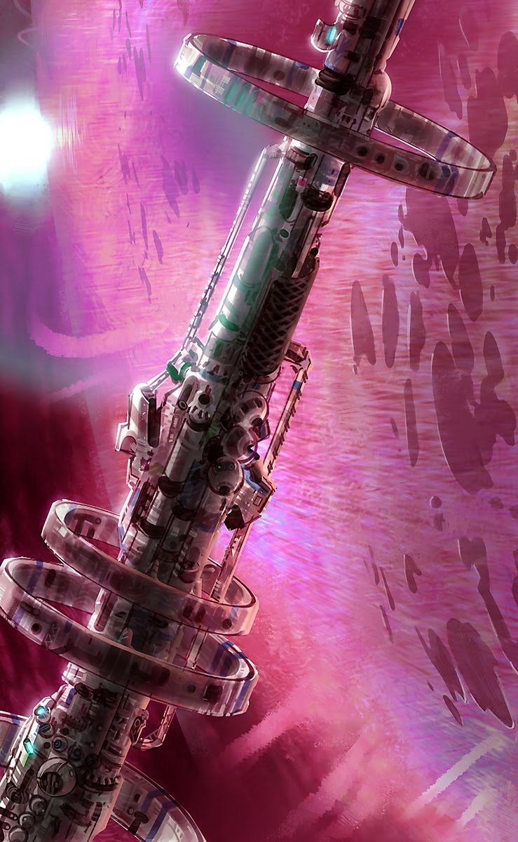
Any chance you could apply the dots as a seperate layer texture like the grime on the bottom panels, and have the textures simply rotated and mirrored at random to reduce the appearance of tiling?
Also it's near concrete, but looks like its got a slightly metallic mix in there.
Any chance you could apply the dots as a seperate layer texture like the grime on the bottom panels, and have the textures simply rotated and mirrored at random to reduce the appearance of tiling?
Also it's near concrete, but looks like its got a slightly metallic mix in there.
If I apply the dots as a separate layer it would require twice the polygons. Right now the top and bottom concrete blocks have two different textures, even if the actual concrete "noise" were the same. That's because I didn't spend the time changing it, but I've done that now.
As for the metallic mix, it's probably because of the way it reflects light (way too strong in certain areas). I've toned down the specular map (for the reflections) so now it's all slightly muted, which I think makes it a bit more concrete-like. Still needs some fixes.
Has anyone had any experience with the online courses at schoolism.com?
I sort of stumbled on to it and now I'm thinking about taking the Digital Painting with Bobby Chiu course when space becomes available. I'm a little apprehensive about dropping $1,000 on something like that, though.
Edit: Actually, I think it might be better to ask what some of the more well-regarded online courses/schools are for digital painting, particularly if you want to get into concept art-type stuff. Thanks guys.
Since you asked for some critiques on your sketch, I guess I'll oblige Bare in mind I have no idea how much training you've had (which likely depends on your age).
What needs work:
- Be careful with color over-saturation in your drawings. Link's tunic is almost too distracting due to the hue of green you chose (which is borderline neon, at least on my monitor).
- As long as we're talking about color, also be sure that colors in the foreground and background aren't too similar, especially if said foreground is (in the drawing) a few feet infront of the background. Link's hair is practically the same color as the brick wall behind him, which makes the two blend together at first glance.
- This is just more of a personal thing, but I find Link's quadriceps to be awkwardly bulgy and defined. Specifically the Vastus Medialis* on both legs (the muscle that's just above and to the left/right of the knee). I think toning down their outlines will help alleviate that a bit.
- With regards to the shadows under Link's feet, I would make them a bit darker directly under his boots, more so on his right foot. Reason being is because his outline almost makes it look like you pasted him onto the background, rather than it looks like he's standing in it. Darkening the shadows a bit more under his feet would help make him look more planted on the ground, and less like he's floating in some scrapbook version of Hyrule
What's working:
- The composition is great, I especially like the open space in the upper left of the drawing. It's a reasonably busy sketch, that open space gives some good breathing room for the viewer.
- Leaving the grass behind Link less detailed was a good move. This is basically Foundation Drawing 101 stuff, but it's always good to leave the background less detailed than the foreground, since that's where you want the viewer's attention to be. I would actually suggest greatly reducing the black outlines on all the bricks in the background. You definitely don't need to outline every single individual brick. A little suggestion goes a long way, all you really need to do is suggest a cluster of bricks here and there.
- It's slight, but I do appreciate that you have a somewhat-apparent light source on Link, it doesn't look like you randomly added highlights (although make sure to put more defined highlights on his hair, shield and sword ).
Overall it looks to be a solid piece if you keep going at it, my biggest gripe is just with the intense color. If you wanted me to make a closing bullet point, here you go:
- Kick the saturation down a couple notches
- Lose some of the extreme detail in the brick wall background and Link's legs
- Make the shadows/highlights more defined overall (have a definite light source)
Hope that helps, keep at it man
*
I'm a Biomedical Illustration major, in case you were wondering why the hell I bothered to type what that muscle's name was, heh.
Incredible work Sammy, the second shot in particular.
Whats your process like? I see some stuff that could be interpreted as photo ref, but Im not sure. Either way, the comps and colors are always really well balanced.
Incredible work Sammy, the second shot in particular.
Whats your process like? I see some stuff that could be interpreted as photo ref, but Im not sure. Either way, the comps and colors are always really well balanced.
Thanks glad you dig , I actually have 2 video workshops that Jason Manley and his crew help put together over at TAD. It's cool having them at the studio down the street from my apartment. The 2nd DVD is still in production, but was fun to do. Mostly wanted to show how to go from chicken-scratch thumbnail to final concept.
Luckily I've had the last year, and this coming year to teach out at Gemini-School and wrap my brain around art classes. But it's sweet there we can play with Legos, and I can focus more on what each student finds their inspiration in and cater concept to stuff they want to do.
I don't really care so much for using photo-texture in personal sketches, it gets really boring having to do that kinda' stuff for clients. But ehhh, it's industry standard and certainly trains the eye a lot!
I've found that i can compress the butt out of work as I go to mix colors digitally like digital photography does, also the sharpening tool works to dry up artifacts around edges. But I do take tons of pictures and keep bulking the inspiration folders to keep feeding the mental library. Never hurts to sit back and do some studies of a picture in the sketchbook, trying to get better about doing that as well as watercolors.
The bad news is that "tests" never end, especially in times like this : /
But it's all worth it if you get to see how you mesh with an art-director and find a team you'd be inspired in. You got a knack for optimizing art assets, I got a soft-spot for good low-poly stuff like that --- I was never able to wrap my head around that kind of 3d work
Zozobra, thanks! It's still in production, 'cause it's way way long. Like a 20 hour digital-paint sped up, but it's good I get to cover lots of techniques I was able to think up. So that will be good for me keeping food in my mouth since I got laid-off last year, I've just been scrambling to get the 'folio beefed up and contracts secured. Sucks I haven't been settled 'cause I wanted to do some dudebro stuff, but maybe next indyGAF project :]
Yeah personally I love art tests. Its a good way to get out of my comfort zone and try new stuff that, if done well, goes directly into the portfolio. The more the merrier.
So you're freelancing right now? As Im in full blown job search mode I'll hit you up with any openings that I find, or get rejected for
Yea, I'm trying to expand my comfort-zone. Time to master watercolors, doing small contracts would be fun as well as freelancing for more indy-games is really fun. Mostly keeping the fire in the belly, I like sketching. It's always nice when I get the occasional PM from someone who wants to model a concept and I can bust out a quick ortho sketch.
I <3 you Solaris, let me frolic amongst your unexplainable bullshit:
Are there any digi-speedpainters here on the NeoGaf? It would be cool to get some speedpaints going for motivation and practice at digital mixed-media.
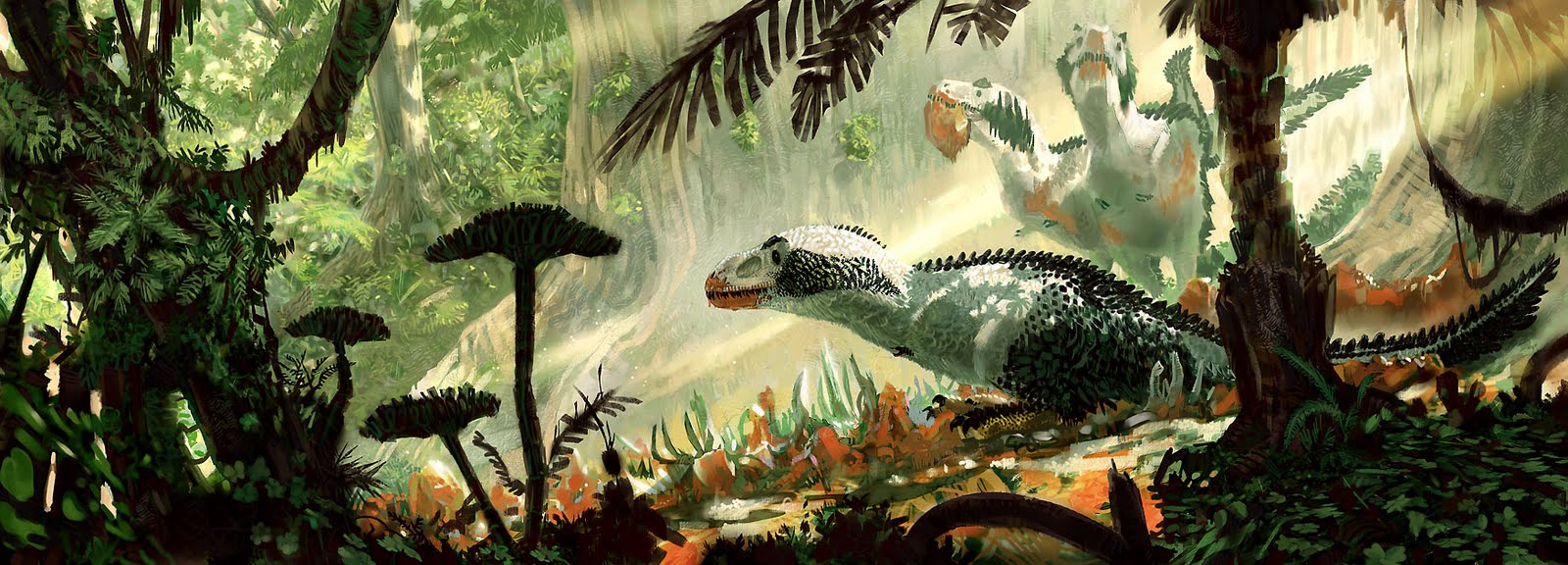
here's somewhat of a process tutorial I did in my sketchbook of coloring up that dino:
step 1
I got a lighten layer going on top of a cropped in section of that sketch. As well as some photo reference I took at an intersection of some cool matted conifer trees. Using the sharpen tools and filters helped me clear up an otherwise enlarged and blurry section of the dino's bust.
step 2
A multiply layer let me sketch in and explore the range of colors I wanted. Multiply layers kinda' act like watercolors or markers, but will really darken any values you have underneath. So it helps to keep the sketch bright otherwise you can get crushed blacks or darken your image too much.
step 3
At this point I usually end up flattening the image to start digi-painting. I don't worry about getting muddy since I can polish any mud out, but a flattened image lets me adjust things. Color adjustments will always add more saturation, so just fine-tune what you have to make it sing. if it gets too saturated you can always sketch in gray tones of the same value.
step 4
I needed to add something into the foreground so I didn't end up with some stupid floating head. Looking at more owl photos helped me get a better idea of the subtleties in their patterns. an overlay and color-dodge layer let me add in a sunset, then I sketch more colors in to blend it. At this point I mostly just shrink a brush down, take the tapering off and sketch away like a color-pencil while trying to preserve some of the more appealing brushstrokes.
Sammy, your work is great. I've always loved dinosaur drawings/paintings (what little boy didn't?), but your stuff is really fantastic. They're much more warm and "alive" than the technical study drawings you'd find in a typical dino-encyclopedia. I'm working at an illustration degree right now, and your stuff is a really great inspiration for me to keep working and getting better.
Yea paleo-critters are real easy to flatten out. I guess it's that struggle between trying to make so much logical "researched" sense, and trying to depict natural-history. Though history always seems much more appealing when there's an art-direction and mood to go along with it.
I try to remind myself that I'm mostly dealing in pseudo-science and romance, since so much interpretation goes into fleshing one of these beasts out. practice is practice.
good luck with your illustration, Gilby. I never got to study much of that, so kinda retracing my steps. But it really seems like thumbnails area a secret ingredient. that and a damn attention-span for fleshing out an image.... attention-spans is harrrrd!
I'm currently attending Anime Banzai, a fun little Convention here in Layton. It's my first time selling prints so it's been a bit of a learning process to experience firsthand what sells and what doesn't. From what I can see, especially for smaller venues like this one, is that you should have a healthy collection of fanart ready. Yesterday when I cam home I printed some old Chrono Trigger images and today I figured I could benefit from a few prints of a Final Fantasy X-2 piece I did a few years back.
So, came home, opened the file and went "ugh, no way". I remembered that this was one of the first pieces I had ever colored on the computer, and it was with a mouse ... nevermind that it shows a lack of Photoshop knowledge. Curiously I opened the file with the pencils and surprised myself by not only how well they held up, but how much BETTER they were than anything I have penciled in years! So, I figured I had a couple of hours before bedtime, so some quick colors over the old pencils would probably be an improvement over the old art.
And heres the old image, for reference
I printed a couple of these. A large one at 13 by 19 inches and a regular one at 8 1/2 by 11 inches. Hopefully they sell, but if not then at least I have a new piece to show around
Good luck, from what I recall on anime/comic cons most fans want headshots or full figure shots. This would make a better cover for a FF theme sketch book or something. Sketch books are always good to sell at conventions if you can print some up at Kinko's or some other source.
It's always embarrassing looking back at old PS colors.
Mostly doing my paleo-reading to keep the edumacation up to speed in the paleo-illustration world. Here's an Oviraptor, baby T-Rex, and a Fremen[/quote]
Ditto? Just photoshop or some other digital media program?
Good luck, from what I recall on anime/comic cons most fans want headshots or full figure shots. This would make a better cover for a FF theme sketch book or something. Sketch books are always good to sell at conventions if you can print some up at Kinko's or some other source.
It's always embarrassing looking back at old PS colors.
It's something that will happen eventually, but as of now theres no rush. The print ended up not selling, but it was a pretty great attention getter and conversation piece, leading to other sales
Ended up making good profit, about $680. Not bad at all for a local convention.
Mostly prints, that Shadow of the Colossus piece sold really well, as did this old Chrono Trigger piece.
I also did sketch commissions for like, 5 bucks, which is dirt cheap if you ask me, but I upped the price incrementally if they wanted inks, more characters, etc. I cant take myself seriously enough and be like "A SKETCH FROM MEEE IS THIRTY FIVE DOLLARS, KID" Id rather draw while im there so really, if you pay me 5 bucks for thirty minutes of my time youre doing me a favor, better than sitting around doing nothing, you know?
About half the haul is from my wife, who was selling her squids and t-shirts, also some prints. We make a good team since our art styles are pretty different.


") Thanks!
Thanks!


")
 ).
).