• Hey, guest user. Hope you're enjoying NeoGAF! Have you considered registering for an account? Come join us and add your take to the daily discourse.

Arts & Farts

Mik2121

Member
Here's a screenshot of a work in progress model I'm working on today (well, I started yesterday but I'm only working on this one at home and I have to go to school so I don't have that much time ;(...)

FwmBy.jpg


Still got some normals to work on and I will also add cables around (not many, don't wanna clutter this prop) and then I will start working on the diffuse and specular maps. Pretty low poly model, but it should work fine on what I'm working on.

Also sorry for the aliasing all over the place. As I said, it's a screenshot and 3DSMax doesn't have anti-aliasing on the viewport :p
 
Mik, thats an awesome model man. I just got into the 3D modeling shiz and boy, do I have a newfound appreciation for modeler's work now. We're using Maya, and its a pain in the ass to use. I'm very curious as to how it holds up to other programs 3DSM or Zbrush
 

sammy

Member
Kodiak, yea totally. I mostly did some scrounging for ref of the hen to see what they look like in their patterns. I've got hundreds of pictures of my father's taxidermy in different lighting, makes good feather practice :D
Though I need to explore more realist referencing methods. Often I'll gaze into my archive of inspiring junk, but I have some friends that do a good job of composting many photos together into a solid image. Then work from that as a boost into a realist style work and take liberties wherever you can make things look better, seems to work well especially if you're doing historical stuff.

I'm pretty fond of Staedtler pencils, Alucrid. Been spending a lot of time with them lately to exercise the drawing skills. But I'm still looking for more good tools, the Staedtlers are soft so I end up smudging the darker values around.

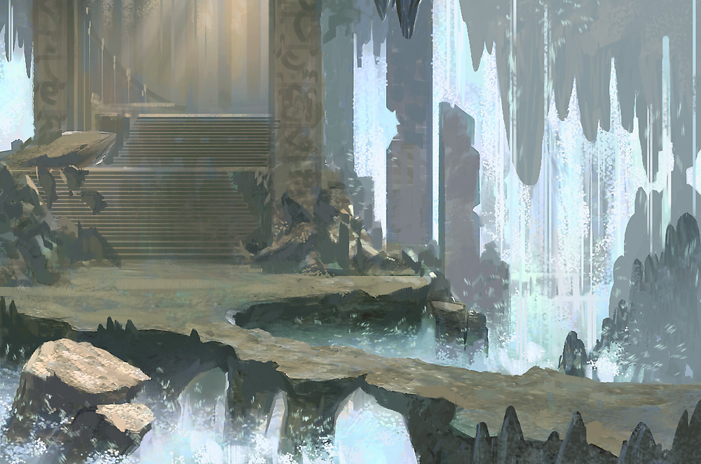
A sketch of ruins I was doing as a demo for my students on how to shotgun-wedding some color into a B&W image.
tplroom.jpg
 

Raging Spaniard

If they are Dutch, upright and breathing they are more racist than your favorite player
Had another art test last week :)

I thought this was a good chance to show some interesting process stuff, so first off here is the screenshot they gave me to work with. It's amazingly helpful to work off of 3D captures because it helps ground the whole piece down, answers any perspective issues you might have and sets the location of lights and shadows. If you have access to any 3D package I highly recommend laying out a simple 3D scene for you to paint over.

base.jpg


I had a few design parameters to work with. I'm not going to disclose those because thats not really my business. By the end of about 3 and a half work days, this is what I ended with.

forest_ruins.jpg


I also made an animated .gif showing the progression. You can see that first and foremost I tried to set the mood, what was visible in the highlighted area and then I moved from the inside out. That way my focal point stayed clear and I could concern about adding detail without stressing about whether the viewers focus would shift. Later I added some vines and foreground elements to guide the viewer a bit more clearly.

forest_ruins_progression.gif


With concept pieces, even when they're more polished as usual, you still have to keep in mind that these are not really illustrations. Concept pieces need to convey not only the mood you'll experience while playing the game, but also the view, the camera, the gameplay elements. In this piece its all very simple, but you get the idea that the player is not supposed to leave that path and for the most part the view is not obstructed (the big rock in the foreground being an exception but animating it with some parallax movement in mind would ensure it doesn't block the characters on screen).
 

Xun

Member
Raging Spaniard said:
Had another art test last week :)

I thought this was a good chance to show some interesting process stuff, so first off here is the screenshot they gave me to work with. It's amazingly helpful to work off of 3D captures because it helps ground the whole piece down, answers any perspective issues you might have and sets the location of lights and shadows. If you have access to any 3D package I highly recommend laying out a simple 3D scene for you to paint over.

http://ragingspaniard.com/images/blog/base.jpg

I had a few design parameters to work with. I'm not going to disclose those because thats not really my business. By the end of about 3 and a half work days, this is what I ended with.

http://ragingspaniard.com/art/environments/forest_ruins.jpg

I also made an animated .gif showing the progression. You can see that first and foremost I tried to set the mood, what was visible in the highlighted area and then I moved from the inside out. That way my focal point stayed clear and I could concern about adding detail without stressing about whether the viewers focus would shift. Later I added some vines and foreground elements to guide the viewer a bit more clearly.

http://ragingspaniard.com/images/blog/forest_ruins_progression.gif

With concept pieces, even when they're more polished as usual, you still have to keep in mind that these are not really illustrations. Concept pieces need to convey not only the mood you'll experience while playing the game, but also the view, the camera, the gameplay elements. In this piece its all very simple, but you get the idea that the player is not supposed to leave that path and for the most part the view is not obstructed (the big rock in the foreground being an exception but animating it with some parallax movement in mind would ensure it doesn't block the characters on screen).
Sweet work dude!

I know a lot of people in the industry work like that, but I've never actually tried it myself.

I'll have to give it a try...
 

zoukka

Member
1284632334_img-d41d8cd98f00b204e9800998ecf8427e.jpg


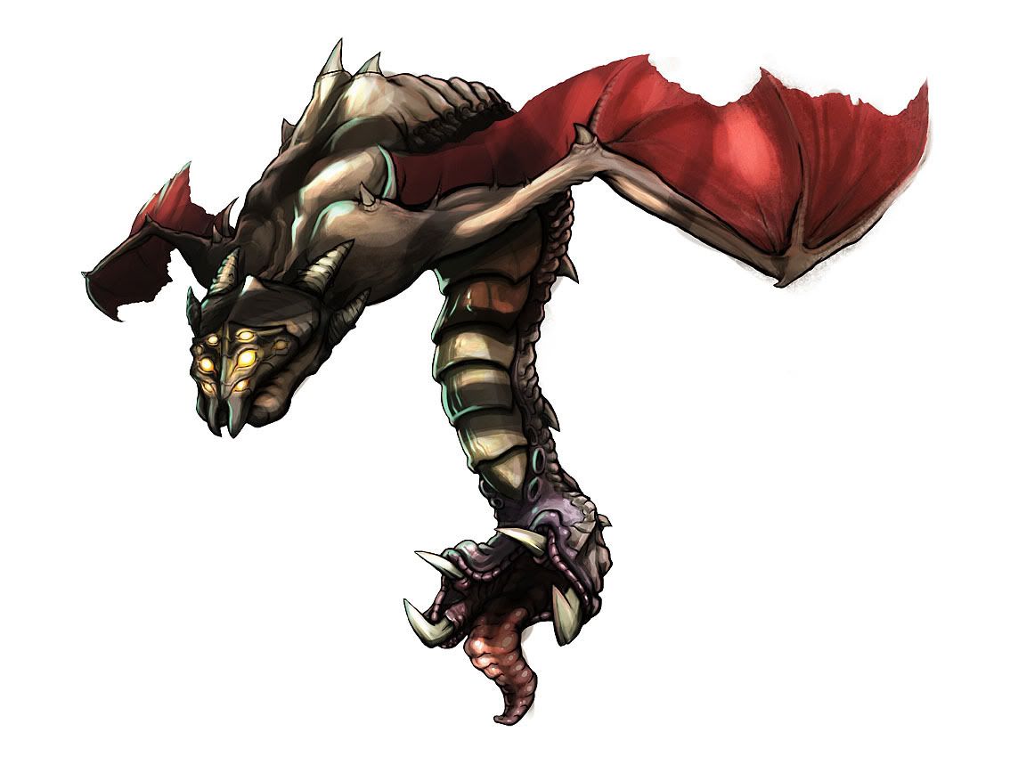
Did this for fellow Starcraft GAFfers. I've rarely done this intense digital rendering, but it's fun for sure. I really gotta practice it more.
 

Raging Spaniard

If they are Dutch, upright and breathing they are more racist than your favorite player
zoukka said:
http://mediaserver-2.vuodatus.net/g/6/68488/1284632334_img-d41d8cd98f00b204e9800998ecf8427e.jpg

Did this for fellow Starcraft GAFfers. I've rarely done this intense digital rendering, but it's fun for sure. I really gotta practice it more.

That came out nice! I was gonna explain how I think you should push the tonal range more. You had a great thing going with that secondary light source at the tail of the creature and then kind of stopped suing it ... so to explain myself better I did a quick paintover (also changed the color of the light to a more interesting one)

zoukka.jpg


Sorry if this bothers you! Its a niece piece :)
 

zoukka

Member
No worries. I'm aware that the piece was a bit too murky. It's a side-effect of overdoing it I guess. And the side light used to be blue, but I thought it would look too far out or something.

This all comes from my inexperience with the medium still. Each piece I do I learn something completely new. Like adding that secondary light to the back and tail gave the piece SO MUCH more depth and believability.
 

Raging Spaniard

If they are Dutch, upright and breathing they are more racist than your favorite player
zoukka said:
No worries. I'm aware that the piece was a bit too murky. It's a side-effect of overdoing it I guess. And the side light used to be blue, but I thought it would look too far out or something.

This all comes from my inexperience with the medium still. Each piece I do I learn something completely new. Like adding that secondary light to the back and tail gave the piece SO MUCH more depth and believability.

I hear ya, Ive been going through the same process myself lately. Now every piece I do has a main light and a smaller secondary light that comes from the opposite side and adds some color.

A friend of mine from the college days, Peet Cooper, who is now a Senior Artist for Diablo 3 (oh fuck Im namedropping, blagh) uses this for like, every one of his pieces, you can check his blog here.

He did these two in a live session at Blizzcon, pretty good examples, 1hr each"

Fallen1_Blizzcon3.jpg


Fallen2_Blizzcon.jpg


http://peetcooper.com/

Well, for that 2nd one, the secondary "light" is just rounding off the edges with black, but its the same principle
 
Raging Spaniard said:
Had another art test last week :)

I thought this was a good chance to show some interesting process stuff, so first off here is the screenshot they gave me to work with. It's amazingly helpful to work off of 3D captures because it helps ground the whole piece down, answers any perspective issues you might have and sets the location of lights and shadows. If you have access to any 3D package I highly recommend laying out a simple 3D scene for you to paint over.

I had a few design parameters to work with. I'm not going to disclose those because thats not really my business. By the end of about 3 and a half work days, this is what I ended with.

I also made an animated .gif showing the progression. You can see that first and foremost I tried to set the mood, what was visible in the highlighted area and then I moved from the inside out. That way my focal point stayed clear and I could concern about adding detail without stressing about whether the viewers focus would shift. Later I added some vines and foreground elements to guide the viewer a bit more clearly.

With concept pieces, even when they're more polished as usual, you still have to keep in mind that these are not really illustrations. Concept pieces need to convey not only the mood you'll experience while playing the game, but also the view, the camera, the gameplay elements. In this piece its all very simple, but you get the idea that the player is not supposed to leave that path and for the most part the view is not obstructed (the big rock in the foreground being an exception but animating it with some parallax movement in mind would ensure it doesn't block the characters on screen).

Awesome environment man; this is probably one of the best I've seen from you. I like the idea of using the 3D capture as a base. The nice cast shadow from that branch on the ground plane is a nice touch. If there is a bit of light filtering from the top, perhaps you can indicate that a little more?
I need to post some work soon!
 
zoukka said:
Did this for fellow Starcraft GAFfers. I've rarely done this intense digital rendering, but it's fun for sure. I really gotta practice it more.

Cool design, I dig that your using the ink outline in conjunction to the digital colors, it's a nice mix. I agree with Raging, if you bump up the contrast in some parts it will help it pop out more.
 

Loxley

Member
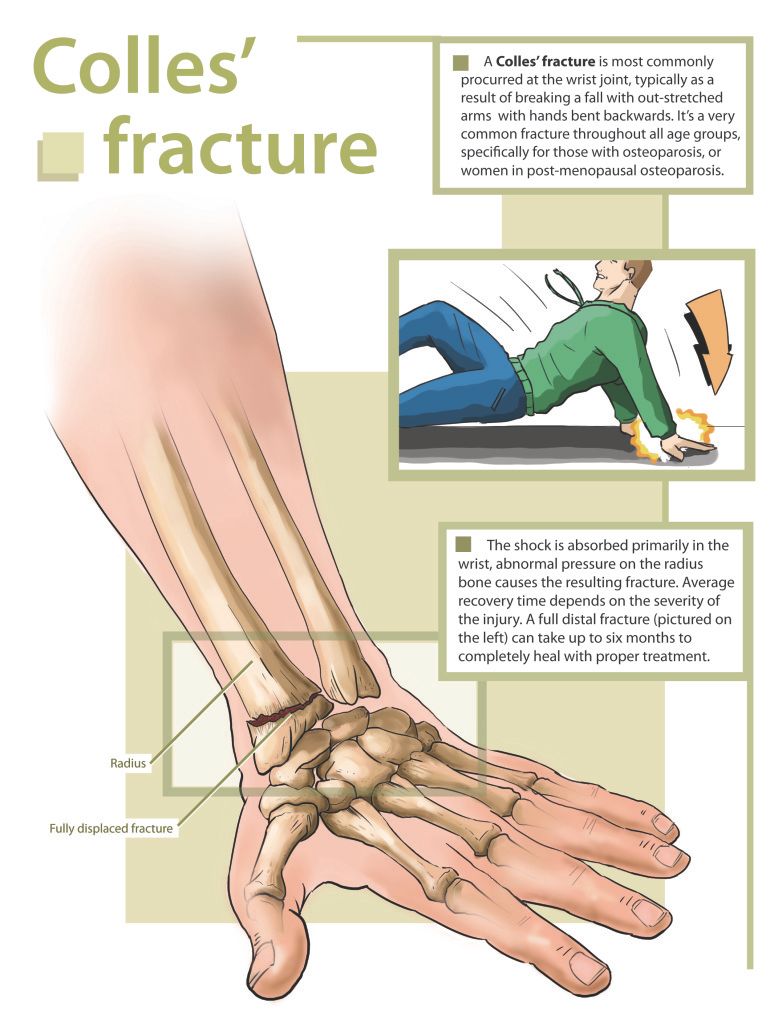
My latest "finished" piece for my Advanced Biomedical Art Methods 1 class. The basic objective was to clearly visualize a fracture (our professor gave us a few options) for a pamphlet or information sheet that would be given to a patient. For the record, a few of the greens in the image became quite a bit more saturated when I uploaded the image for some reason. Ah well.

Dyer_B_BMA353FALL10_Project23-1.jpg


We haven't had our usual class critique on these yet, so this is just my first pass on this assignment at the moment :) I've never rendered bone in Photoshop before (we're just learning the ropes of digital painting this year) so this was actually relatively challenging for me :lol Really fun assignment at the same time too though.
 
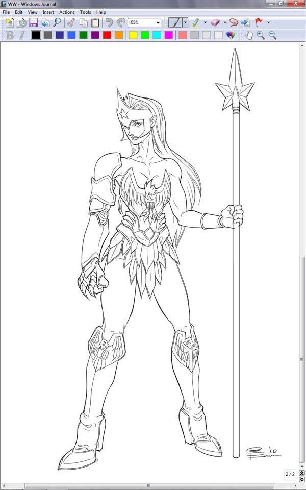
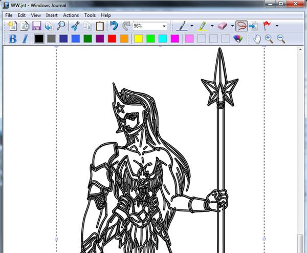
I've been hooked for the last couple of years on drawing on my Tablet PC during work meetings with MS Journal, which is a note taking program that comes with every copy of Windows (except for the Netbook retard Home verisons) since Vista. I just turn the handwriting recognition off, which if you do a drawing with lots of strokes, will choke your poor system.

This is something I did during marathon meeting session yesterday, with a little cleaning up afterwards. It was just after reading the Wonder Women heading back to the boob tube thread. I love sketching with Journal because it's fluid like raster apps, but is a vector app!

WWsm.jpg

WWjnt.jpg


Yes, my figures need work, but I spend all day doing product design, so I don't get to do serious practice for those...
 

zoukka

Member
1288876166_img-d41d8cd98f00b204e9800998ecf8427e.png


My first illustration where I blended photos into the artwork. Quite fun, but maybe not my thing really. Speeds up the process tremendously though.

Not much of the original photos are seen under the "paint".
 

vio

Member
Xun said:
Nice piece man.

Although I think the eyes could be tweaked a bit like so.

sdzpfd.jpg

I used a reference photo, an her eyes didn`t look that dark to me. But i like what you did. Thanks
 

MrBig

Member
halp gaf I haven't drawn a person before and don't know how to draw hands.
49er3.jpg

No refs

Doesn't need to be detailed, its going to be a few inches big and printed onto a shirt.
 

dmshaposv

Member
MrBig said:
I haven't drawn a person before and don't know how to draw hands.

No refs

Why would you not use a ref if you've never drawn before? Photograph yourself or ask someone to photograph you in that position as a visual ref. Drawing anatomy purely from imagination is difficult even for people who have been drawing since they could hold a pencil.
 

Zozobra

Member
What is the consensus in terms of starting a digital painting in B&W to establish values and then adding colour afterwards compared to blocking in colours right from the beginning? I've seen artists do it both ways - I guess I'm just wondering what might be a better approach for a novice digital painter?

And can anyone recommend any good tutorials for adding colour to a B&W image?
 

Raging Spaniard

If they are Dutch, upright and breathing they are more racist than your favorite player
Zozobra said:
What is the consensus in terms of starting a digital painting in B&W to establish values and then adding colour afterwards compared to blocking in colours right from the beginning? I've seen artists do it both ways - I guess I'm just wondering what might be a better approach for a novice digital painter?

And can anyone recommend any good tutorials for adding colour to a B&W image?

If you want to learn how to paint and how to color ... then paint in color.

The method of coloring a grayscale image is done by people who have really good value range, so once you get there its worth exploring it.
 
I'll post some random non finished just messing around digi stuff.

My reaction when DK returns was announced:
77006_513622265611_91000747_30467385_6512251_n.jpg


WIP: Will eventually finish. Started as a SSF4 cover art but Im sooper lazy and I have yet to even make his head band go in front of his shoulder....:
RYU.jpg


and some weird tradigi that is completely artifacted but I don't wanna rescan it.
61327_512933984931_91000747_30448949_5313378_n.jpg
 
Konqueror K.Rool
KonquerorKRoolTS.png

Full disclosure: I'm not a fan of the 'Country' series (though let's not start that argument again:lol ) and even less of King K.Rool. I've always particularly hated his design. So here's 'Konqueror K.Rool', the idea being that instead of a 'King' (Bowser already fills that role) K.Rool is a conquistador-type that invades Donkey Kong's jungle home. And I toned down that godawful bloodshot eye.
 

Quote

Member
Ajemsuhgao said:
This IS NOT mine, but I figure maybe one of you might recognize the art style or something, or maybe the painting itself.

Really want to know who the artist is that did this picture...
If you're looking for the artist still, it's Greg Simkins. I'm pretty sure this is part of a Block28 series.

I have this shirt by him
4415.jpg


He does some crazy stuff.
 

sammy

Member
awesome K. Rool, NakedCosmonaut :D

getting the lifedraw itch, sometimes it's fun with just a pencil and eraser to practice and fail a lot. I guess the fail is the learning part... But you get some keepers and a better feel for the human form

spiderlife5.jpg
 
xdugrn.jpg


Did this really quick with a mouse; Just as a general idea of a sort of eerie swampland lagoon thing. I'm getting a wacom tablet in a week or two so this was just a result of my impatience.
 

Keikaku

Member
I'm studying digital art at DigiPen right now, so I'll get in on this :D

I worked as an accountant/salesguy until a little over a year ago, so everything I know about art I pretty much learned at DP. Any crits are welcome so long as you're not a total butt about it. I know I have a lot of improvements to make :lol

Long 2nd post to follow!
 

Keikaku

Member
This was a homework assignment. We had to do it in 3 hours from blocking in, values, refining, etc. It's a self portrait and it was supposed to be in grayscale. The nose might look a little wonky but I broke my nose years ago and, under certain lighting well . . . :lol
1zcii35.jpg


The following were 20-30 minute sketches, just to keep us in practice.
fly8fo.jpg


2cpajcl.jpg


This last piece is one in a (hopefully) ongoing series of concepts that my friend and I are using for practice. Each week we have a theme and we do a digital sketch on said theme. Her theme was "A ninja in some kind of action pose". This one took about 2 hours, including research. I'm not fully happy with it, so I'll be revisiting it (adding a background, changing/fixing the anatomy on the ninja, general refining, etc.)
2n1wfm.jpg
 

Zozobra

Member
Keikaku said:
This last piece is one in a (hopefully) ongoing series of concepts that my friend and I are using for practice. Each week we have a theme and we do a digital sketch on said theme. Her theme was "A ninja in some kind of action pose". This one took about 2 hours, including research. I'm not fully happy with it, so I'll be revisiting it (adding a background, changing/fixing the anatomy on the ninja, general refining, etc.)

If you're doing that sort of stuff for practice/fun, I'd recommend checking out CGHUB and ConceptArt.org if you haven't already - nice communities and they have activities of that type on a regular basis. You'd likely be able to get crits on your work as well, if you so desire.
 

Keikaku

Member
Zozobra said:
If you're doing that sort of stuff for practice/fun, I'd recommend checking out CGHUB and ConceptArt.org if you haven't already - nice communities and they have activities of that type on a regular basis. You'd likely be able to get crits on your work as well, if you so desire.

Thanks for the advice! A friend of mine here at school also clued me onto cghub.com but, to be honest, it's a little intimidating for me to post on there. There are so many amazing artists that putting my stuff up there makes me feel like I'm really . . . I dunno . . . being pretentious maybe?

Still, I'll make an account and get started. Getting roasted the first few times should make me better quick.

Thanks man!
 

Keikaku

Member
Timo said:
awesome_painting.png

Good to see the thread alive again.

Dude, that's sweet! Is that watercolor or acrylics? If it's digital, can you give me some tips on how to achieve that look?

EDIT: You added a bunch more images in there, but I'm talking about the portrait :D
 

Timo

Member
Keikaku said:
Dude, that's sweet! Is that watercolor or acrylics? If it's digital, can you give me some tips on how to achieve that look?

Watercolor man. I could never tell you how to get that look digitally, if you find out let me know, hah.
 

Jayge

Member
adelante said:
Finished up this piece for threadless couple days ago, called it A God Gone Baroque...I'm obsessed with rococo motifs :D

ca4h8.jpg
Is it up for voting yet? I haven't been on recently. I feel the need to purchase this.
 
Top Bottom