You are using an out of date browser. It may not display this or other websites correctly.
You should upgrade or use an alternative browser.
You should upgrade or use an alternative browser.
College Football Offseason: FEAR THE TREE (and other non-threatening PC mascots)
- Thread starter bluemax
- Start date
- Status
- Not open for further replies.
Squirrel Killer
Member
Sounds like he could've used a couple of nice fall Saturday afternoons at a stadium or something to lighten his mood.I had a buddy in med school who I bought season tickets off last year and the next 2 years. Sadly he had a mental breakdown attempted suicide and dropped out. So looks like I'm on the stubhub/ scalper train with you
bucknuticus
Member
So this Purdue shirt exists:

When i was younger I remember seeing a similar shirt at an OSU game, involving Brutus and a Michigan cheerleader and it said Ann Arbor blows on it.
BertramCooper
Banned
:lolSPN
And in a semi-related story:
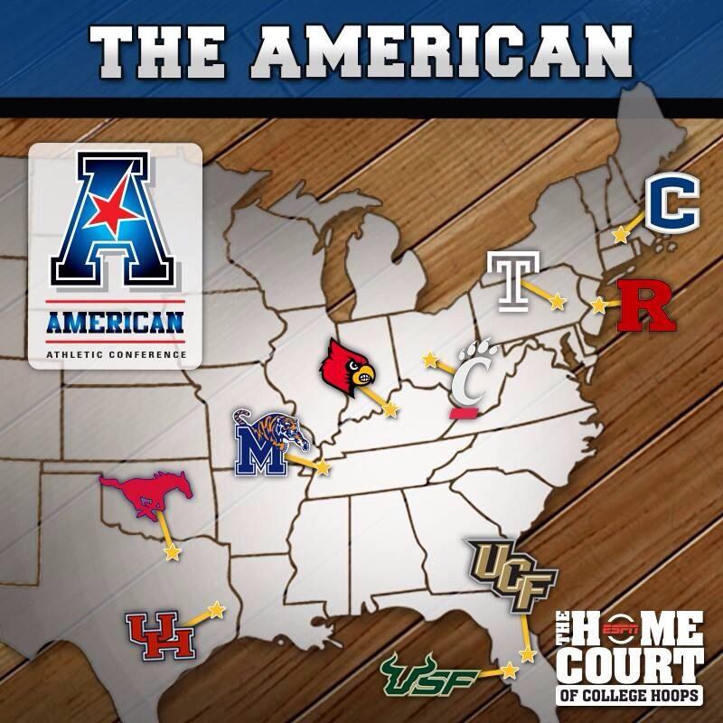
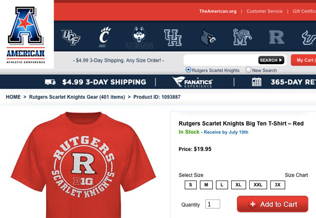
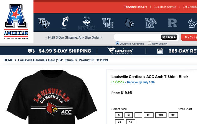
The American Athletic Conference website is selling Big Ten and ACC gear
And in a semi-related story:
The American Athletic Conference website is selling Big Ten and ACC gear
So this Purdue shirt exists:
If we had any Purdue fans here, they'd have to take that Purdue character's O-face.
Let's just make Cyan a Purdue fan.If we had any Purdue fans here, they'd have to take that Purdue character's O-face.
bucknuticus
Member
I saw a TCU fan in another topic earlier today, we need to draw him here.
BertramCooper
Banned
that logo is so bad
Yep.
It's horrendous in pretty much every conceivable way.
Here's a salt injection
Urban and OSU turns in Florida for a recruiting violation.
edit: for mre, sorry, Clay Travis has spread his evil seed, and now somehow wrote this for MSN
Urban and OSU turns in Florida for a recruiting violation.
edit: for mre, sorry, Clay Travis has spread his evil seed, and now somehow wrote this for MSN
bucknuticus
Member
Here's a salt injection
Urban and OSU turns in Florida for a recruiting violation.
edit: for mre, sorry, Clay Travis has spread his evil seed, and now somehow wrote this for MSN
Yeeeeeeeeeeeeeeeeeeeeeeeeeeees
Clay Travis? *spits*Here's a salt injection
Urban and OSU turns in Florida for a recruiting violation.
edit: for mre, sorry, Clay Travis has spread his evil seed, and now somehow wrote this for MSN
Here's a salt injection
Urban and OSU turns in Florida for a recruiting violation.
edit: for mre, sorry, Clay Travis has spread his evil seed, and now somehow wrote this for MSN
I'm so conflicted. I hate Florida and Urban, but the enemy of my enemy is my friend.
bucknuticus
Member
Clay Travis wrote an entire article about a bump violation?
an alleged one via "sources"
Clay Travis wrote an entire article about a bump violation?
Nick Saban laughs at bump violations.
Nick Saban laughs at bump violations.
I wonder what Bielema thinks of this.
Nick Saban laughs at Nick Saban violations.
fixed
fixed
Touche.
fixed
He doesn't have time for that shit.
Why is the star stretched out that way?Yep.
It's horrendous in pretty much every conceivable way.
This makes me fear for the new Big 12 logo that's in the works. If it's anything like the rest of the conferences decisions over the last 3-4 years it'll be terrible.
Why is the star stretched out that way?
This makes me fear for the new Big 12 logo that's in the works. If it's anything like the rest of the conferences decisions over the last 3-4 years it'll be terrible.
"Gradients. Gradients everywhere!"
I just *know* they're gonna try to find some way to incorporate the number "10" into the logo. Fuck this conference."Gradients. Gradients everywhere!"

Urbz says "Waaaaaaaaait one minute, my heart is exploding I didn't turn in Florida, someone in the Department did without me knowing about it!"
Clay Travis with Mud on the Face, though the fact remains that OSU turned in Florida.
“It is absolutely not true that I turned in the University of Florida,” th Ohio State coach said in a text message to The Dispatch.
Clay Travis with Mud on the Face, though the fact remains that OSU turned in Florida.
BertramCooper
Banned
So it appears that the Ohio State Athletic Department is finally switching over to the new primary logo.
However, they did some badly-needed refining of it.
Before:

After:

I still think they should have dropped the script entirely, but thank the Lord they at least cleaned it up.
However, they did some badly-needed refining of it.
Before:
After:
I still think they should have dropped the script entirely, but thank the Lord they at least cleaned it up.
So it appears that the Ohio State Athletic Department is finally switching over to the new primary logo.
However, it appears they did some badly-needed refining on it.
Before:
After:
I still think they should have dropped the script entirely, but thank the Lord they at least cleaned it up.
Old was better, but the changes they made were an improvement to the one they initially announced.
Yup, what buck posted below was better.
bucknuticus
Member
This is still a better logo:

BertramCooper
Banned
Old was better, but the changes they made were an improvement to the one they initially announced.
As someone who works in graphic design, I understand why they wanted to change it.
The interior white spaces in the old logo look really, really bad in small applications, especially on clothing. This allowed them to simplify the script, which makes it much easier to work with on a smaller scale.
However, I think dropping the script entirely would have been the better solution. It's recognizable enough that it doesn't really need a script.
Doesn't a lot of their merchandise only have the block O anyway? I see a lot of hats around here, and I don't remember seeing script before or after this.I can understand why they took it out, but it was like UGA's logo redesign. It was all for merchandise and because it's an easier look across multiple forms of media. I get it, but I don't like it as much as the old.
Pristine_Condition
Member
The horror of an Aggie Wedding:
http://www.youtube.com/watch?v=4I00hTSXuEU&feature=youtu.be
No.
Words.
http://www.youtube.com/watch?v=4I00hTSXuEU&feature=youtu.be
No.
Words.
BertramCooper
Banned
Doesn't a lot of their merchandise only have the block O anyway? I see a lot of hats around here, and I don't remember seeing script before or after this.I can understand why they took it out, but it was like UGA's logo redesign. It was all for merchandise and because it's an easier look across multiple forms of media. I get it, but I don't like it as much as the old.
Yeah, the plain Block O is probably used as much - if not more - than the O/script logo.
The OSU Athletic Department is really inconsistent when it comes to branding. I guess one good thing is that it results in a really wide variety of looks and merchandise, but I wish they'd streamline their overall graphic identity.
The horror of an Aggie Wedding:
http://www.youtube.com/watch?v=4I00hTSXuEU&feature=youtu.be
No.
Words.
Why are they wearing jerseys? This isn't a B1G wedding. Full Aggy and all that.
BertramCooper
Banned
The horror of an Aggie Wedding:
http://www.youtube.com/watch?v=4I00hTSXuEU&feature=youtu.be
No.
Words.
Congrats to the lucky brother and sister.
The horror of an Aggie Wedding:
http://www.youtube.com/watch?v=4I00hTSXuEU&feature=youtu.be
No.
Words.
I'm in a good mood right now, not going to click that and ruin my day.
LolI'm in a good mood right now, not going to click that and ruin my day.

We're going to need a gif of what happens at 13 minutes in.
Congrats to the lucky brother and sister.
They're not Tennessee fans...
Edit: Oh, hey, look guys. Our resident Purdue fan has checked in. Boiler Up, Cyan!
Awful. Awful awful awful awful awful awful awful awful awful awful awful awful awful awful.
Awful. Awful awful awful awful awful awful awful awful awful awful awful awful awful awful.
Wonder what Manziel's thoughts on that are?
Awful. Awful awful awful awful awful awful awful awful awful awful awful awful awful awful.
You should really watch the beginning and then around 13 minutes in.
Wonder what Manziel's thoughts on that are?
Probably the same as mine.
You should really watch the beginning and then around 13 minutes in.
Luckily, I'm slammed with work, so my masochistic side won't even get to sniff that video.
BertramCooper
Banned
I hope Texas replaces Mack Brown with Kevin Sumlin.
Pristine_Condition
Member
Top comment on the Texas Tech site on which I saw the video posted:
"I thought the second bridesmaid was gonna stop for some dinner when she saw how lush and green the grass was..."
LMAO
EDIT: Another good one:
"Reception menu:
LOL
"I thought the second bridesmaid was gonna stop for some dinner when she saw how lush and green the grass was..."
LMAO
EDIT: Another good one:
"Reception menu:
Twelfth man buttermilk with cornbread in it
Twelfth man Beans with cornbread
Twelfth man cream corn
Twelfth man Paula Deen's nanner puddin cup
Twelfth man baloney sandwich station
Twelfth man mixed nut assortment
Twelfth man Dr Pepper punch"
Twelfth man Beans with cornbread
Twelfth man cream corn
Twelfth man Paula Deen's nanner puddin cup
Twelfth man baloney sandwich station
Twelfth man mixed nut assortment
Twelfth man Dr Pepper punch"
LOL
bucknuticus
Member
WTF when did Purdue switch from Tigers to Boilers?
Tell us your thoughts on Joe Tiller's mustache.
What the fuck? Why would you get an official to serve as the minister?Lol
We're going to need a gif of what happens at 13 minutes in.
zyxwvu4321
Member
Nice. We're playing Virginia Tech again. Not so nice: the kids who will be freshmen for the first game are like 10 years old right now.
Guessing War Hymn...Lol
We're going to need a gif of what happens at 13 minutes in.
At this point I once again state that I went to A&M for grad school, and as such only drank half the kool-aid.
:jncAnother good one:
"Reception menu:
Twelfth man buttermilk with cornbread in it
Twelfth man Beans with cornbread
Twelfth man cream corn
Twelfth man Paula Deen's nanner puddin cup
Twelfth man baloney sandwich station
Twelfth man mixed nut assortment
Twelfth man Dr Pepper punch"
LOL
- Status
- Not open for further replies.