• Hey, guest user. Hope you're enjoying NeoGAF! Have you considered registering for an account? Come join us and add your take to the daily discourse.

COMICS! |OT| January 2015. So many variants you'd swear it's 1995 instead.

Kipp

but I am taking tiny steps forward
Future avatar potential for Kipp, Hellboy version of:


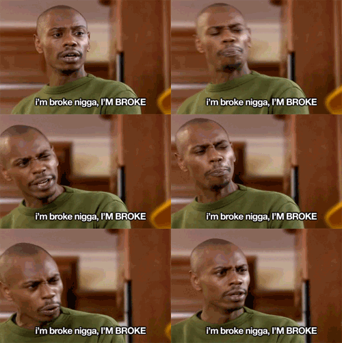
"Take no chances (no chances)
Stop freelancin' (right now)
Invest in your future,
Don't dilute your finances (uh huh)
401K, make sure it's low risk
Then get some real estate (how much?)
4.2% thirty year mortgage,
That's important, that's a great deal
And if you can't afford it,
Don't forge it on your last bill
Renting is for suckers right now
A dependable savings,
And you'll retire with money in your account.
Beast." - Kipp, 2015

Hahaha. Perfect.
I got a 4.0% thirty year mortgage pre-approved though. Booyah.
 

Rhaknar

The Steam equivalent of the drunk friend who keeps offering to pay your tab all night.
Everyone knows Cyclops was right.

More importantly #teamIlluminati

Cyclops+becomes+Magneto.jpg

I cant decide if this is the biggest ether ive ever seen in a comic book, or the Doom "you only have a baby because of me lol hold dat L richards" line is

Biggest ether comes from Doom to Namor in New Avengers.

I dont know that one
 

Boogiepop

Member
So, my comics shipped from IST, with the Hickman FF Omnibus 2, the back half of Exiles, and Turtles in Time! Now to just hope that ebay shop properly ships out the first Omnibus and everything goes fine.

Also, anyone have experience with Manga Studio Ex4? Got it off that sale where it was free that was mentioned in here (well, one of these threads) and I've finally gotten around to giving it a test. My previous graphics program was some super old version of Open Canvas I bought way back when. And yeah, this is taking some getting used to, mostly since I've been using the same program for so long. Right now the big issue I'm having is that it goes all pixely/checkerboard distorted when I go in too close. My method for now to clean up my kind of crummy work up to something slightly less terrible is to do the art by hand (since trying to do it on a computer just doesn't work as well for me at all and ends up looking sloppy and bleh), scanning it in and tweaking the contrast to crush out the natural not-quite-white greyness of the paper while still maintaining my shading, then creating an additional layer to digitally "ink." So since I don't have the best hand for doing stuff digitally right now, zooming in is crucial (also, I really should spring for a drawing tablet some time, but even when I had a laptop that was a tablet hybrid way back when for that express purpose I still sucked).

So yeah, any way to "turn off" that weird effect on the zoom in would be super nice. (It's not an image quality thing either since it's a sudden snap effect that the programs doing). Oh, and I have to say I'm super glad to see that the damn fill tool works right here and doesn't need to be babysat (OpenCanvas had this issue where if you just straight fill tooled things there'd be a clash with the brushes that caused some speckled white bits around the edges, and I could never find a better method than to create a lower layer solely for the purpose of coloring those damn pixels in), so maybe I'll actually be able to do color with this thing (though my godawful background drawing skills become a worry then).
 

tim1138

Member
love the flashback color/art correction for 1970s Neal Adams Batman. Now that scene makes sense!

BMINC_2_14_600-horz.jpg

The corrected panel of Dick and Tim jumping off the roof is like the most Burnham panel ever, it just feels like it should be in a Batman comic and is incredibly kinetic. The fill in panel looks extremely posed and almost unnatural, whereas with Burnham you can almost see Dick jumping/diving off the building. Burnham is criminally underrated.

ABS_INC_10_12.jpg
 
The corrected panel of Dick and Tim jumping off the roof is like the most Burnham panel ever, it just feels like it should be in a Batman comic and us incredibly kinetic. The fill in panel loops extremely posed and almost unnatural, whereas with Burnham you can almost see Dick jumping/diving off the building. Burnham is criminally underrated.

ABS_INC_10_12.jpg

All of Burnham's panels are so much better, he just picks better perspectives, better poses, better angles. There's another uncolored page on his twitter. Away from the computer so I can't post the original, but it was all four wide panels for no reason(the second panel has Batman moving in a narrow space with a bunch of black around it?), 4th panel has this kind of slanted view to focus on the background

B6pNaVaCEAAffZA.jpg:large


Burnham quickly handles the first two wide panels in two smaller panels up top, giving ample room for a VERY dramatic zoom-in on a shadowy Talia and the background, both being very clear to the reader at the same time, so he can use the same straight ahead angle. The zoom in on Talia as she speaks some evil shit with the crazy stuff in the background really sells the horror.

This is why its so important to have great artists on your comics. Everyone interprets scripts differently, and depending on the artists choice, the scene's context and impact can change pretty vividly for the reader.
 

tim1138

Member
All of Burnham's panels are so much better, he just picks better perspectives, better poses, better angles. There's another uncolored page on his twitter. Away from the computer so I can't post the original, but it was all four wide panels for no reason(the second panel has Batman moving in a narrow space with a bunch of black around it?), 4th panel has this kind of slanted view to focus on the background

B6pNaVaCEAAffZA.jpg:large


Burnham quickly handles the first two wide panels in two smaller panels up top, giving ample room for a VERY dramatic zoom-in on a shadowy Talia and the background, both being very clear to the reader at the same time, so he can use the same straight ahead angle. The zoom in on Talia as she speaks some evil shit with the crazy stuff in the background really sells the horror.

This is why its so important to have great artists on your comics. Everyone interprets scripts differently, and depending on the artists choice, the scene's context and impact can change pretty vividly for the reader.

Here's a crappy screen grab from my phone of the original page:

qTI2UhU.jpg


The original page has no flow because of the lack of uniformity in the panel size. The second panel just as easily reads as a small square in the middle of the page as it does Batman entering a dark room with the only light source coming through the door behind him. The difference in the last panel is night and day, in the original you can that yeah there's some bad stuff going down, but in Burnham's you can really see how bad the shit has hit the fan in Gotham.

Stuff like this is why Morrison is so picky about the artists he trusts and works with.

I don't understand, where are the two from and why are they different?
 

tim1138

Member
I don't understand, where are the two from and why are they different?

The color page I posted is by Jason Masters who did the fill in art on volume 2 of Inc, it's what originally ran in the book. The black and white page JC posted is Burnham's correction that is in the Absolute hardcover. He and Paquette went back and redrew the fill in pages from their issues.
 
Here's a crappy screen grab from my phone of the original page:

qTI2UhU.jpg


The original page has no flow because of the lack of uniformity in the panel size. The second panel just as easily reads as a small square in the middle of the page as it does Batman entering a dark room with the only light source coming through the door behind him. The difference in the last panel is night and day, in the original you can that yeah there's some bad stuff going down, but in Burnham's you can really see how bad the shit has hit the fan in Gotham.

Stuff like this is why Morrison is so picky about the artists he trusts and works with.

Its just lazy, defaulting to widescreen panels for no real reason. ESPECIALLY if you're just gonna leave 66% of it black and have this weird silhouette Batman doing...something that isn't very clear. Burnham does this in two small panels, gives you very clear information(Batman walking towards the door in panel 1, Batman entering the door in panel two, snapping the rifle), so he can give more importance to the Talia scene, who is narrating this section and the size of the panels give it a sense of importance that the uniform page doesn't. More importantly, he uses a wide-screen only when he deems it important, here to give a wide, full-on shot of the room with the screen, and then a zoom in with the same angle is a nice effect.

He also fills out more silhouette details of Talia that make her more recognizable in shadow. Her bust size, the Chinese dress straps on the shoulders, the way she wears her hair. Fill-in guy just draws a few stray hairs on black and calls it a day, it could be anybody sitting there, lol.

Don't mean to pick on Jason Masters here, but its this kind of stuff that separates the good artists from the great ones. Or at least, the good Morrison artists from the great ones, lol.
 

tim1138

Member
Its just lazy, defaulting to widescreen panels for no real reason. ESPECIALLY if you're just gonna leave 66% of it black and have this weird silhouette Batman doing...something that isn't very clear. Burnham does this in two small panels, gives you very clear information(Batman walking towards the door in panel 1, Batman entering the door in panel two, snapping the rifle), so he can give more importance to the Talia scene, who is narrating this section and the size of the panels give it a sense of importance that the uniform page doesn't. More importantly, he uses a wide-screen only when he deems it important, here to give a wide, full-on shot of the room with the screen, and then a zoom in with the same angle is a nice effect.

He also fills out more silhouette details of Talia that make her more recognizable in shadow. Her bust size, the Chinese dress straps on the shoulders, the way she wears her hair. Fill-in guy just draws a few stray hairs on black and calls it a day, it could be anybody sitting there, lol.

Don't mean to pick on Jason Masters here, but its this kind of stuff that separates the good artists from the great ones. Or at least, the good Morrison artists from the great ones, lol.

The last Masters panel is especially bad, it's literally just a disembodied wig floating in a chair, there isn't even a body to be silhoutted.
 

CBTech

Member
Ugh, I just recently finished buying Grant Morrison's run on Batman. Now they are going to make be buy Batman Inc. again for the better art.
 
ABS_INC_10_11.jpg


I forget the context for this one, but the Jason Masters one seems so...casual and laidback? I imagine this is a scene of escalating stakes so it should look that way. Burnham's top panel guy is FREAKING OUT, bug eyes, messed hair, coffee spilling. We can assume the second panel is Talia smiling, but the littttle snip of her Chinese dress covering her neck(again, man is master at details) visually confirms to the reader who it is. Gordon's body language in the third panel(leg raised, coat swaying as he rushes) combined with the low angle makes it look like he's rushing somewhere, while Jason Master's third panel is like, IDK, some casual stroll down a hallway maybe? Finally, Gordon's face is the end is a bit more "WTF!?" cuz something went missing.

ABS_INC_8_07.jpg


Here, Master's first panel has Dick hitting the guard in...the arm or the face, maybe? Its not specific? Burnham draws a burst of water to more easily highlight the impact. Second panel, Bunrham's discs look like they actually hit her, Masters second panel doesn't, and her accidental shots don't make as much sense, do they? Third panel, Burnham's attack hits harder, with LOTS of motion lines and a blood impact in direct path of the boot to show where the janitor's face was hit. Masters has Dick's boot flying over his head, lol. Master's guard is the background, might not even notice it where Chris' more middleground, immediately picks up the gun. Burnham's guard has a gimped right hand(the one he just hit) and shows him picking up the gun instead of doing some weird angle lining up the shot. Fourth panel's fire extinguisher has a SHITLOAD of little black, movement manga lines on in for maximum visual movement emphasis, guard looks really pained instead of just kinda goofy. Last panel on Masters guy looks annoyed; Burnham security guard close-up looks PISSED GET THE FUCK OUT OF THERE GIRL.

Also, there's another fun little detail of Burnham drawing the reflective ground, instead of just...grey. Also puts in more detail about the room; the elevators Talia/EVIL DAMIAN CLONE walked into, the tank is foreshadowing its future usage, the glass cases that will be broken. The discs throw have more lines from Tim's hand to emphasis the throw, the disc flies over the panel borders to connect the actions to each other in a neat visual way.

Might have to spring for this Absolute man
 

tim1138

Member
ABS_INC_10_11.jpg


I forget the context for this one, but the Jason Masters one seems so...casual and laidback? I imagine this is a scene of escalating stakes so it should look that way. Burnham's top panel guy is FREAKING OUT, bug eyes, messed hair, coffee spilling. We can assume the second panel is Talia smiling, but the littttle snip of her Chinese dress covering her neck(again, man is master at details) visually confirms to the reader who it is. Gordon's body language in the third panel(leg raised, coat swaying as he rushes) combined with the low angle makes it look like he's rushing somewhere, while Jason Master's third panel is like, IDK, some casual stroll down a hallway maybe? Finally, Gordon's face is the end is a bit more "WTF!?" cuz something went missing.

ABS_INC_8_07.jpg


Here, Master's first panel has Dick hitting the guard in...the arm or the face, maybe? Its not specific? Burnham draws a burst of water to more easily highlight the impact. Third panel, Burnham's attack hits harder, with LOTS of motion lines and a blood impact in direct path of the boot to show where the janitor's face was hit. Masters has Dick's boot flying over his head, lol. Master's guard is the background, might not even notice it where Chris' more middleground, immediately picks up the gun. Burnham's guard has a gimped right hand(the one he just hit) and shows him picking up the gun instead of doing some weird angle lining up the shot. Fourth panel's fire extinguisher has a SHITLOAD of little black, movement manga lines on in for maximum visual movement emphasis, guard looks really pained instead of just kinda goofy. Last panel on Masters guy looks annoyed; Burnham security guard close-up looks PISSED GET THE FUCK OUT OF THERE GIRL.

Also, there's another fun little detail of Burnham drawing the reflective ground, instead of just...grey.

Might have to spring for this Absolute man

I believe the first set of pages is when the school kids start attacking downtown Gotham, so shit had definitely gone crazy and freak out worthy.

In that bottom set of pages the room in the middle has a completely different layout between Masters and Burnham. The Masters page had the glass cases on the left, Burnham moved them one to the right and added the elevators and the tank.

My wife got me the Absolute edition as my anniversary gift this year, I can't wait for it to get here.
 

Bii

Member
Wow, the changes (to mirror that of the pencils) in the revised panels really makes a big difference. I'm interested in picking up this Absolute as well.

I've accrued nearly the maximum amount of vacation days I can sit on (85 vacation days!) and will have to start taking time off, otherwise, I accrue nothing and end up working for "free". I've been thinking about taking a day or two off here and there for the next few months, grab some books with me and lounge around at a coffee shop and catch up on my reading.
 

tim1138

Member
ABS_INC_9_08.jpg


Beryl looks so different between the two in the last panel that she may as well be a completely different character. In the image of the television, on the Masters page the guy on the left looks like he could be sad our maybe he just has a bad sinus headache and is holding his head. To be fair, Burnham's redo of that panel also had issues, the added puerile in the background kind of look like zombies.
 
What exactly does he setup in his Fantastic Four Run? Only the Incursion?

Potentially
the actual cause of the incursions
is stated in #600. More conclusively though there's a lot of callbacks in Avengers to Fantastic Four,
"I've already built one. I called it The Bridge". "It's called Sol's Hammer".

And
T'challa gets the ability to talk to previous Black Panthers
in one of the last issues of FF.

It's an amazing run of comics though, so everyone should read it regardless but thematically it really works well reading it before the Incursion saga.
 
The corrected panel of Dick and Tim jumping off the roof is like the most Burnham panel ever, it just feels like it should be in a Batman comic and is incredibly kinetic. The fill in panel looks extremely posed and almost unnatural, whereas with Burnham you can almost see Dick jumping/diving off the building. Burnham is criminally underrated.

ABS_INC_10_12.jpg

I also rather liked the third panel, Burnham draws them in silhouettes in iconic poses, Red Robin flying and Grayson with a circus acrobat leap, maybe coming out of a flip. Its a cool, simple little panel, compared to the more posed, elaborate one. Sometimes its just about a lot of details, but picking the right details to immediately convey a scene to the reader.

I also just like the visual consistency of the statue in the background and the crook hanging from the unbalanced scale on the right. Now I can tell it was a visual callback to an earlier scene.

batman-inc-4.jpg
 
Not to disrupt the flow of this dope ass talk on comic page construction but I'm fairly certain I just broke my ass flying over a bump on my bike. I mean I musta been pushin like 50 mph. Anyway so yea I should be pretty comatose next couple a days and get some comic reading done. Just thought I'd let you guys know!!
 

tim1138

Member
I also rather liked the third panel, Burnham draws them in silhouettes in iconic poses, Red Robin flying and Grayson with a circus acrobat leap, maybe coming out of a flip. Its a cool, simple little panel, compared to the more posed, elaborate one. Sometimes its just about a lot of details, but picking the right details to immediately convey a scene to the reader.

One of the biggest differences between those pages are the depictions of Grayson. Masters draws him like any other vigilante dude jumping around on rooftops, Burnham of course remembers Dick was an acrobat so his movements look graceful and are reminiscent of a gymnast. You're absolutely right, it's the little details that really make things pop and just look right.
 

Bii

Member
Not to disrupt the flow of this dope ass talk on comic page construction but I'm fairly certain I just broke my ass flying over a bump on my bike. I mean I musta been pushin like 50 mph. Anyway so yea I should be pretty comatose next couple a days and get some comic reading done. Just thought I'd let you guys know!!

I'm assuming a non-motorized bike? Because 50mph is pretty fuckin fast.
 

GAMEPROFF

Banned
Potentially
the actual cause of the incursions
is stated in #600. More conclusively though there's a lot of callbacks in Avengers to Fantastic Four,
"I've already built one. I called it The Bridge". "It's called Sol's Hammer".

And
T'challa gets the ability to talk to previous Black Panthers
in one of the last issues of FF.

It's an amazing run of comics though, so everyone should read it regardless but thematically it really works well reading it before the Incursion saga.

I really hope I habve enough money this month left to buy this one. Sounds amazing.
 

Kipp

but I am taking tiny steps forward
Oh my goodness. All these Burnham pages are blowing my mind. I wasn't looking at them too closely, because I still want everything to be relatively fresh when I get my Absolute in the mail, but man. Burnham is amazing.
And I'm one of the biggest Burnham fans there is, but even I was surprised at just how good he is when I saw him redrawing the same panels as some other perfectly decent artists. I mean, if you would've looked at the pages the fill-in artists did without having seen Burnham's pages, you probably wouldn't have thought they looked too bad. With Burnham's pages next to them though, they just look like trash.

So excited for this Absolute. Burnham is the best. Also a really cool guy, for what it's worth. Not a jerk like that Blacksad guy.

But yeah, thanks for posting those comparisons and analyses, guys. So awesome.
 
no offense to J. Masters or anything. Its just the kind of difference that separates the fill-in artists from the guys handpicked by the greatest mainstream comic writer in the world for the last leg of his longest ongoing and his next personal project.
 
Top Bottom