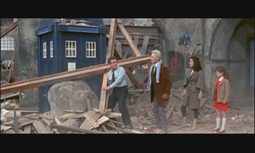
I added to that post, but they've definitely toned down the blue over the last few years. That photo was a fan-photo from Time of Angels/Flesh and Stone, the first episodes of Series 5 filmed. They graded it heavily in post production in series 5 by adjusting the colour tone of the footage shot to make it a bit less bright and primary, and in Series 6 repainted the prop. It's still a hell of a lot brighter than the RTD era one, mind.
The Moffat TARDIS is an interesting mix - the windows having that bold white outline around them is from the (non canon) 60s Doctor Who movie starring Peter Cushing (the first Who in colour), which Moffat had strong memories of. The 'T' shape in the windows is from the 70s version of the TARDIS.
The St John's Ambulance logo was added at the request of Mark Gatiss, who had strong memories of that. It only appeared on the first/second Doctor's TARDIS, and disappeared after that.
The bright colour... is all Moffat, I think. "The bluest blue, ever." It's also the biggest one, I think, dimension-wise. I really like it.
The RTD one is basically a redo of the original 1963 one in terms of colour and style, just without the Ambulance symbol.
7B would be the same as General OT except that we don't put 50th stuff in it.
We could always create it in the community. It makes it a bit 'harder' to find, but at least those who do find it will be sure to have noticed the rule.
I understand the logic, but we're a pretty smallish community in this thread - I really don't think it's that much to ask people to think before they post and apply the appropriate warnings and tags. Adding a warning to please tag your damn spoilers in the title/OP would be handy, too.