Orochinagis
Member
What'd they do to her face?
No porn actress body anymore.
What'd they do to her face?
Wierd face is wierdYeah, Cortana's stockier-locking in the remastered graphics... but what makes her look weird to me is she looks like she's missing two inches off her neck.

How can you be Darth Bob if you are Matt?Trust me, the stutter is real.

YORE SADThat place is pretty S A D though.
Cutscenes are stunning. I'm hype.
What'd they do to her face?
Yeah, Cortana's stockier-locking in the remastered graphics... but what makes her look weird to me is she looks like she's missing two inches off her neck.


How can you be Darth Bob if you are Matt?
so does 343 just hate the color purple or what
so does 343 just hate the color purple or what
I mean, it wasn't the best movie, not a great fit for Spielberg's talents, but eh

It'd be so much better with an Avs logo though.
Yeah. Bungie always had pretty low-fidelity faces and an occasional major screw-up (Halo 3 Hood), but Saber is just plain weird. In CEA, Cortana at least still had a Cortana-esque face, even if it spent most of the time trying to put on its best soffish impression. But everything they make from the ground up looks like a CEA PoA crewman, and that evidently somehow includes Cortana.Yeah, Cortana's stockier-locking in the remastered graphics... but what makes her look weird to me is she looks like she's missing two inches off her neck.
I'd attribute the new model looking bad (proportionally) to the fact that they most likely had to rig it for the old animations (like CEA).Yikes, how can her model look worse now than one ten years old.
I gotta agree, I don't think they're fans of the purple in halo. Most Covenant stuff is tinged blue, Cortana is now more blue, just look at the upcoming Halo 5 Midship. Looks completely blue.
I want to official trademark a move in Halo: CE that probably very few know of.
It shall be called the COWBOY.
You will see in time what it is and it will change the way you play Halo: CE forever.
Remember this post.
PS If you know what it is...Shhhhh
Isn't that the thing where you do the thing, and when you do said thing, the thing does a thing?
I will say it like this.
Its a move that makes you do a thing so that you can be more powerful. It is also NOT an exploit.
I would put it on the same level as button combos but much more awesome to witness.
I think I know what you're talking about. I think.
Can't wait to show off the Spartan jump kick.
Deal with it.

<3
The stuff of nightmares...
Yes.Spinning in air with a rocket? Might be a crouching jump 360 spin. I forget. Do I win?
I want to official trademark a move in Halo: CE that probably very few know of.
It shall be called the COWBOY.
You will see in time what it is and it will change the way you play Halo: CE forever.
Remember this post.
PS If you know what it is...Shhhhh

Don't make a Gaf a promise if you can't keep it.Deal with it.

<3
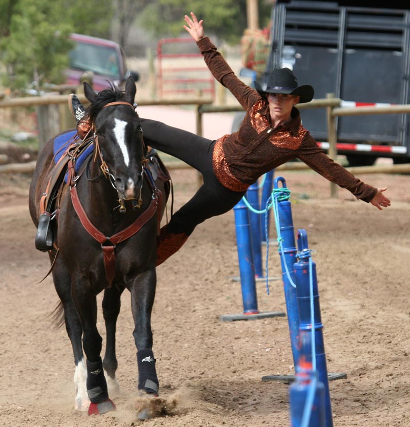
Here is a clue to the move and how amazing it is when you see it. It is a very skillful move which gives huge advantages at the right time.[/IMG]
Horses in Halo confirmed?
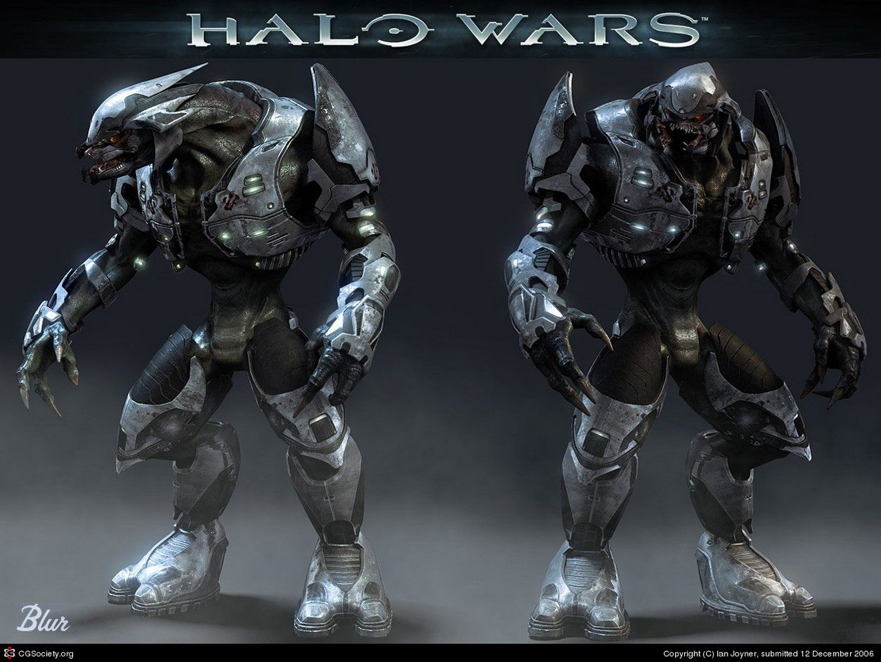
Really miss the original Elite armor designs. Wish they would go back to it or at least re-design them with aspects of the original in mind. the lack of armor on the arms were also really weird. Always thought the Halo War Elites looked like what the Halo 4 Elites would look like with the right armor design.Fixed Aspect Ratio Trailer: Special Remastered Anniversary Edition (NOW WITH WEBM)
http://a.pomf.se/esnsmz.webm


I dunno, I think there's room for both.Really miss the original Elite armor designs. Wish they would go back to it or at least re-design them with aspects of the original in mind. the lack of armor on the arms were also really weird.


I dunno, I think there's room for both.
The top image kinda looks like a funky robot though, rather than a scary alien...
Fixed Aspect Ratio Trailer: Special Remastered Anniversary Edition (NOW WITH WEBM)
http://a.pomf.se/esnsmz.webm
I don't want room for both. The Halo 4 Elite armor is ugly as hell. I'm cool with 343 experimenting with new designs, but that one's gotta go.I dunno, I think there's room for both.
The top image kinda looks like a funky robot though, rather than a scary alien...
Really miss the original Elite armor designs. Wish they would go back to it or at least re-design them with aspects of the original in mind. the lack of armor on the arms were also really weird. Always thought the Halo War Elites looked like what the Halo 4 Elites would look like with the right armor design.


Yeah, the arms of the Wars elites look pretty good. The torso however is really weird, they have massive chests and basically non-existent waists.That's why I made the edit with the Halo War Elite. Seems like a nice blend of the two.
The OG Halo 2 Elites had a refined minimalism to their armor which sadly we'll prolly never see as people overwork designs with modern toolsets.
I had forgotten how exaggerated the Elite models were though. Their waists are tiny.
Yeah, the arms of the Wars elites look pretty good. The torso however is really weird, they have massive chests and basically non-existent waists.
OT21Cortana got Zelllweger'd
It's because of the perspective. With the RTS camera pulled way back (comparatively), making a recognizable design requires a fair bit of exaggeration.
How so?They ruined the campaign scoring UI.

They ruined the campaign scoring UI.
They ruined the campaign scoring UI. It's not even warped correctly. Come on now.

They ruined the campaign scoring UI. It's not even warped correctly. Come on now.

They probably just wanted to make a whole new scoring UI to be compatible and consistent with all the games, not to mention one that works with the new rival stuff, etc. It's too bad it doesn't mesh better with the rest of the HUD, but oh well.They ruined the campaign scoring UI. It's not even warped correctly. Come on now.

