• Hey, guest user. Hope you're enjoying NeoGAF! Have you considered registering for an account? Come join us and add your take to the daily discourse.

Halo |OT 20| It really does feel like Halo

K

kittens

Unconfirmed Member
Reach medals are the best. Colorful, easy to read and remember without added text, big but not too big, stay on screen for the perfect length of time, etc.
 
oh wow....can't wait!!! HCE on Xbox Live....can't believe it's finally here.

I know. Before MCC was announced that dream was just a wet fart in the wind.

Still upset the Halo CE Anniversary pistol isn't chrome-ish/shiny like it use to be. I want my pistola to be mah bling.
 

Mix

Member
So we can turn off the medals for ourselves? It's not a game type setting?

oh

God I hope so.
tumblr_inline_mwq4qcweDP1rpavoc.gif

literally me rn
 

FyreWulff

Member
Yep, basically confirmed that it's based on the PC version - reflections and transparencies are just a little off in the same way, and it's got the objective mode icon in the corner. I wonder if that netcode was touched at all.

Maybe they increased the datarate.

Maybe.
 

Onikaan

Member
I know. Before MCC was announced that dream was just a wet fart in the wind.

A year ago we believed in Halo 2 Anniversary.

And see how our faith has been rewarded...

Halo: The Masterchief Collection. It's divine (wet) wind shall rush through the stars.
 
I went back to rewatch this preview that IGN did for the Collection, and there are these lines on either side of the screen in Halo 4 that scroll when you look up or down.

Has anyone noticed this before? It wasn't in the 360 version of the game, was it?

Edit: Nope, they weren't. Why was this added?
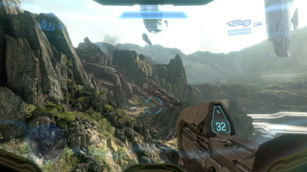
HUH...watched the vid and saw what you are talking about. I wonder if it was a glitch, because they only showed up when you zoomed in with your vizor. Right?

EDIT: Looks like it WAS there, it just stood out more in that video.

Example:
HALO4OMG.png
 
I think the answer to the medal issue is somewhere between 343 and Bungie's ideas. I actually think Halo 4 had a good idea in standardizing the designs of the medals because it allows them to blend in with the rest of the HUD / UI a little more seamlessly. The problem is that once you start giving out medals for everything, including "baseline kills" without any additional flavor, you suddenly have to clear up real estate onscreen for a lot more content than you realistically need to. Reach probably handled actual medal context distribution best, that is - medals can become more specialized and compartmentalized further down the skill pipeline, for example specific Killing Spree / Killing Frenzy / Running Riot medals for specific power weapons, while still keeping the context distribution minimalist and succinct on an on-spawn level. For example, not having to give you a specific kill medal for a "vanilla kill" clears up medals on a lot of engagements, as well as removing medals received for dying or refuting death - Comeback Kill, for example.

When you have medals specialized, it's a lot easier to account for them and you have to provide substantially less real estate for them. The one major exception involves mass multikills in an extremely short window of time (for example a laser collateral between two enemy vehicles, tank blowing away an entire fireteam, etc.) in which case it's dubious which multikill medals take priority on top of sprees, power weapon spree medals, etc. but that should naturally lend itself to be difficult (if not impossible) in a 4-8 second window provided the sandbox is balanced properly.

I do actually like the idea of restricting the medals to a core color palette with different flavor / accent colors per various gametypes (magenta for Extraction, for example) like how Halo 4 did rather than arbitrary colorations on multikills like Bungie did. It's just a matter of blurring the line between the two design philosophies enough that people are happy overall.

EDIT: Forgot to mention - there's also a lot of little details in the Bungie medals that ultimately serve to make the medal gallery a little too baroque when they're meant to take up a thumbnail's worth of size on your HUD, so simplifying the medals into their most basic possible designs would work wonders in the long run.
 

Impala26

Member
I like what I saw and it built up a lot of excitement, but the critical part of me must respond.

An added quirk about the Halo 3(and beyond) medals was that they were all on a single row and that the maximum amount of medals was equal to the width of the kill feed. This was to show you the most recent, relevant medals. The image below completely counters that. It looks like it will keep adding medals below older ones instead of pushing them out. I hope there is a test case where someone lines up 15 people and snipes through all of them to show that this will more than likely break the medal feed.
EmN5O7A.png


In addition to that, the medals aren't descriptive enough to tell me what is what. I can tell the first medal is a grenade kill. Second one, I don't know. Third, I don't know. Fourth is a double kill. Fifth is the same as the third. Sixth is a Killing Spree. Seven is Triple Kill. Eight is Extermination(I think). And I have no idea what the last three are. In addition to the medal feed, is it possible to get a Medal text feed? This would alleviate a bit of that issue.

Second is "From the Brink" which is "Get a kill with your shields down, survive. i.e. have shields begin to rechare again". It shows a shield symbol that's been shattered.

Third, Fifth, and Last ones are "Guardian Angel" which is basically the "teammate" equivalent of "From the Brink". It shows a shield symbol with a halo and wings above it.

Actually not sure what Eight is... it's NOT Extermination because that's what the Tenth one is. This makes sense given the hexagon typically denotes a "high-end" Halo medal: Killionaire, Perfection, Etc.

Ninth is "Revenge" which is kill the player that last killed you. It's a little devious smirky smiley.

The medals don't take a bunch to learn and ultimately become more intuitive than you might think.
 
I think the answer to the medal issue is somewhere between 343 and Bungie's ideas. I actually think Halo 4 had a good idea in standardizing the designs of the medals because it allows them to blend in with the rest of the HUD / UI a little more seamlessly. The problem is that once you start giving out medals for everything, including "baseline kills" without any additional flavor, you suddenly have to clear up real estate onscreen for a lot more content than you realistically need to. Reach probably handled actual medal context distribution best, that is - medals can become more specialized and compartmentalized further down the skill pipeline, for example specific Killing Spree / Killing Frenzy / Running Riot medals for specific power weapons, while still keeping the context distribution minimalist and succinct on an on-spawn level. For example, not having to give you a specific kill medal for a "vanilla kill" clears up medals on a lot of engagements, as well as removing medals received for dying or refuting death - Comeback Kill, for example.

When you have medals specialized, it's a lot easier to account for them and you have to provide substantially less real estate for them. The one major exception involves mass multikills in an extremely short window of time (for example a laser collateral between two enemy vehicles, tank blowing away an entire fireteam, etc.) in which case it's dubious which multikill medals take priority on top of sprees, power weapon spree medals, etc. but that should naturally lend itself to be difficult (if not impossible) in a 4-8 second window provided the sandbox is balanced properly.

I do actually like the idea of restricting the medals to a core color palette with different flavor / accent colors per various gametypes (magenta for Extraction, for example) like how Halo 4 did rather than arbitrary colorations on multikills like Bungie did. It's just a matter of blurring the line between the two design philosophies enough that people are happy overall.

EDIT: Forgot to mention - there's also a lot of little details in the Bungie medals that ultimately serve to make the medal gallery a little too baroque when they're meant to take up a thumbnail's worth of size on your HUD, so simplifying the medals into their most basic possible designs would work wonders in the long run.

Genuine question, how would you personally handle the medals on screen? Format and layout I mean.
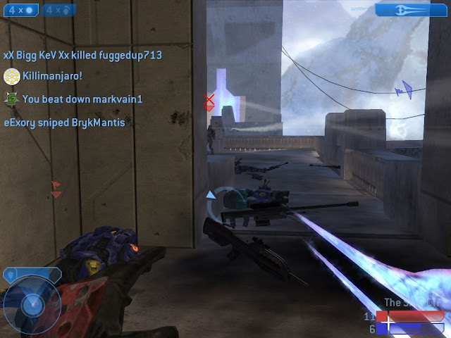
 
Increase the actual blast radius / splash, but not the splash damage. The current amount of splash damage (let's say x damage over an area of y) would be evenly distributed across the increased blast radius, meaning the average splash damage taken would be reduced, direct hits notwithstanding. However, the knockback (the outright movement / push effect, not the hit-point damage infliction itself) would be increased over the blast radius, meaning it'd be good for tossing around Warthogs or other light reconnaissance vehicles without outright destroying them, as well. Direct hits would still be instakills, allowing the Railgun to serve a dual-purpose role as an infantry killer and a vehicle harassment or movement infringement device without getting into an outright vehicle-destroyer role. Keep in mind that in this minimalist sandbox setup, there's no Halo 3 Brute Shot / Reach or 4 Concussion Rifle weapon in the sandbox, and the Railgun is intended to adopt that role, with the "self-blasting" elements of trick-jumping, etc. given to the Vector Grenades.

How does the Beam Rifle have the fastest killtime in the game if it is a two headshot kill?
 
Genuine question, how would you personally handle the medals on screen? Format and layout I mean.

I'll work on a mockup when I have the time, but my ideal layout would be pretty close to Reach's in terms of implementation. With increased screen sizes these days you might be able to squeeze out an extra medal or two onscreen at the same time, but their position in the killfeed above the motion tracker with the basic fade-in and fade-out and a single line of medals would work fine imo. If it ain't broke, don't fix it, really.

On the 343 side of things, I think standardizing color palettes for medals is definitely the way to go, and you can always try and organize the medals by design. That is, circular medals are directly related to kills (multikills, killing spreeds), circles with extra flourishes on the outside could be related to "flavor kills" (headshots, killing someone as they're sprinting, etc.), diamond-shape medals could have to do with objectives, and so on.

How does the Beam Rifle have the fastest killtime in the game if it is a two headshot kill?

I didn't have the space to clarify on the infographic, but it has the fastest killtime of a weapon that isn't an outright instakill. So obviously something like a rocket or point-blank Shotgun round will kill someone faster than two headshots, but versus weapons that don't always kill in a single hit like the Light Rifle or Needler, the Beam Rifle will kill first in capable hands. Basically, it would rely on an unconventional timing mechanic where every other shot from the Beam Rifle requires you to wait a little longer for the gun to cool down. A "perfect" four shot would be spaced something like:

- -- - --

If that makes sense. Meaning that if you kill someone in the first two hits, you don't have to worry about waiting on the -- cooldown speed, and as a result the kill comes out extremely quickly. If you're in a situation where a biped can't be killed in a traditional double-headshot, for example Campaign or an enemy who's been Overshielded, you have to use a ba-dum, ba-dum firing pattern of pulsing your shots rather than just spamming the trigger as fast as you can as most people are conditioned to with the Beam Rifle and Sniper.

EDIT: Removed edits, made a new post
 

Impala26

Member
I went back to rewatch this preview that IGN did for the Collection, and there are these lines on either side of the screen in Halo 4 that scroll when you look up or down.

Has anyone noticed this before? It wasn't in the 360 version of the game, was it?

Edit: Nope, they weren't. Why was this added?

uZh08SJ.png


If there is one thing above all else that 343 needs to be praised for with Halo 4, it's nailing that "in the helmet/armor" feel. It's the kind of immersion, at least in an FPS type game, that I haven't gotten since the Metroid Prime series. It honestly seems like 343 took A WHOLE lot of pages out of the Retro Studios design handbook in this regard and I love them for it.
 
Halo 2/3 did medals best. Medal placement was perfect and you didn't get a medal for everything you did. If they change it though it will make those achievements more difficult.

Radar in CE and no ingame clock is disappointing.

Oh well, the game looks great. I'm ready for some Slayer on Prisoner, CTF on Sidewinder and Blood Gulch, and Rockets/Shotguns on Chiron.
 

Sephzilla

Member
Halo 2/3 did medals best. Medal placement was perfect and you didn't get a medal for everything you did. If they change it though it will make those achievements more difficult.

Radar in CE and no ingame clock is disappointing.

Oh well, the game looks great. I'm ready for some Slayer on Prisoner, CTF on Sidewinder and Blood Gulch, and Rockets/Shotguns on Chiron.

What, you don't miss those 2 hour marathon matches of CTF on Blood Gulch?
 
If you are trying to make a minimalist sandbox, you don't think the Focus Rifle could fill both your Light Rifle and Beam Rifle niches?

Reposting from edit:

This also allows for the cultivation of a higher skill ceiling, where the human Sniper is the go-to for average players who need to give a little love from long range and chip away at vehicle health, while the Beam Rifle will become the tool of destruction for more seasoned players that are specifically going out of their way to tear apart infantry. The Minimalist Sandbox Consolidation was also built with an infantry-vehicle duality in mind, where one weapon is better at picking off infantry (thus better in 4v4, small team setups) and the other has additional capability versus vehicles (and as a result would see most usage in Big Team). The overall duality setup is something like:

4v4:8v8
BR : Magnum
Plasma Rifle : AR
Carbine : Light Rifle
Needler : Plasma Pistol
Grenade Launcher : Railgun
Energy Sword : Shotgun
Plasma Launcher : Rocket Launcher
Beam Rifle : Sniper Rifle
Frag Grenade : Plasma Grenade
Vector Grenade : Pulse Grenade

So, in essence, every weapon has an equal or counterpart - and by proxy, it also gives you two much smaller sandboxes to make use of with 10 weapons apiece. One for small, 4v4 skirmishes with more of an emphasis on one-on-one infantry killing options and map movement, while the secondary lineup have broader or larger-scale applications including crowd control, multikill potential, additional damage to vehicles, etc. The idea behind the sandbox overall is providing players and enemies alike with every tool they could possibly need in every featureset, from Campaign to Firefight to Multiplayer, just like Bungie and 343 have enforced with their sandboxes. You have to keep in mind that there are a lot of variables to account for in a situation like this, and a "dedicated arena sandbox" in my book would look something like the aforementioned 4v4 setup.
 
The Grenade Launcher and Plasma Launcher aren't meant for vehicular gameplay? Strange.

Would there be some penalty for firing the Magnum full auto?
 
The Grenade Launcher and Plasma Launcher aren't meant for vehicular gameplay? Strange.

Would there be some penalty for firing the Magnum full auto?

It's not that they wouldn't work in vehicular gameplay, it's just that their counterparts work better in a vehicular environment. Grenade Launcher has some deliberate kinks that make it perfect for map control, banking projectiles off walls and corners to clear out infantry, etc. Likewise, the Plasma Launcher in this setup is more of a "precision explosive" weapon that's specifically really, really good against infantry and objective holders, while Rockets are more dedicated to blowing apart anything in a given radius.

Magnum full-auto would be more for anti-vehicle purposes or crowd control / covering fire. You can actually fire it faster by tapping the trigger instead of holding it down, but full-auto fire shots have slight splash damage (explosive rounds) at the cost of increasing the spread.
 

AlStrong

Member
Would it be too intrusive to place the medals in a row just under the shield bar? Centered justification as well.

edit: based on Halo 4 HUD.

CE/2 HUD has a lot of space top center as well - not so good for accompanying text, of course, but maybe for medals alone?
 

Kibbles

Member
I'd be fine with the medals if they didn't add so much worthless ones. It's like you get a medal for everything and anything.
 
Magnum full-auto would be more for anti-vehicle purposes or crowd control / covering fire. You can actually fire it faster by tapping the trigger instead of holding it down, but full-auto fire shots have slight splash damage (explosive rounds) at the cost of increasing the spread.

Different projectile traits based on whether a human weapon is fired semi or full auto is as unintuitive as different damage values for when a weapon is dual wielded. The bullets don't magically change based on whether the trigger is tapped or held. Maybe take the concept and make it a Promethean weapon or something because at least you could explain the variable projectile traits with space magic.
 
Different projectile traits based on whether a human weapon is fired semi or full auto is as unintuitive as different damage values for when a weapon is dual wielded. The bullets don't magically change based on whether the trigger is tapped or held. Maybe take the concept and make it a Promethean weapon or something because at least you could explain the variable projectile traits with space magic.

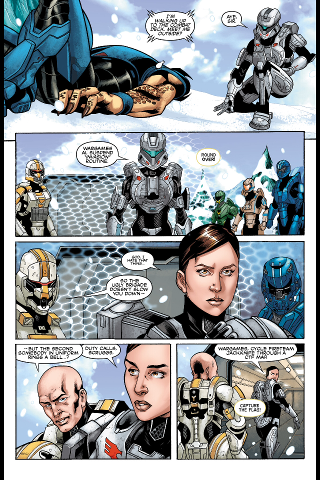
The UNSC is using space magic at this point.

2908623-halo_4_unsc_infinity_by_kingficus-d54tcrd.png


Palmer_leaving_the_War_Games_room.png
 

woodland

Member
Seeing these medals makes me less excited for Halo 5

Agreed ;\ I miss the days when there were fewer medals, and they were more easily distinguishable at a quick glance.

Now even on a screenshot that I can look at multiple times I can't figure out what they are. I also really wish they had the colorful ones from 2&3 back.
 

Booties

Banned
This literally makes zero sense.

The medals in halo 4 were stupid as shit. They were pointless, too common, and difficult to distinguish from one another. Why add them in to an old game? Why add the good ol 343 dick stamp to an already perfect game?

And they received a lot of backlash for having them in halo 4. Going back and putting them in halo ce makes me nervous for Halo 5 because it means they haven't learned anything or listened to any constructive criticisms.
 

lybertyboy

Thinks the Evil Empire is just misunderstood.
I believe there are some differences in the physics and HUD. I haven't played it in an extremely long time, but I'm quite certain it feels different in how it plays.

I assume you mean it felt different beyond playing with a mouse and keyboard?
 

RowdyReverb

Member
Idk about you guys, but I tend to just tune out the medals when I'm actually playing, unless I know I just earned a tough one. Except I do like to know when I got a headshot, so I guess I pay attention to that one.
 

RoKKeR

Member
The medals in halo 4 were stupid as shit. They were pointless, too common, and difficult to distinguish from one another. Why add them in to an old game? Why add the good ol 343 dick stamp to an already perfect game?

And they received a lot of backlash for having them in halo 4. Going back and putting them in halo ce makes me nervous for Halo 5 because it means they haven't learned anything or listened to any constructive criticisms.

Making inferences about Halo 5 based on medals in two games that are not Halo 5 seems pretty ridiculous to me.

But I'll give you points for the phrase "dick stamp", made me laugh.
 

CliQ

Member
Pretty sure they said there was an option to turn off the medals if you wanted to. Not sure where I read that though.
 
Top Bottom