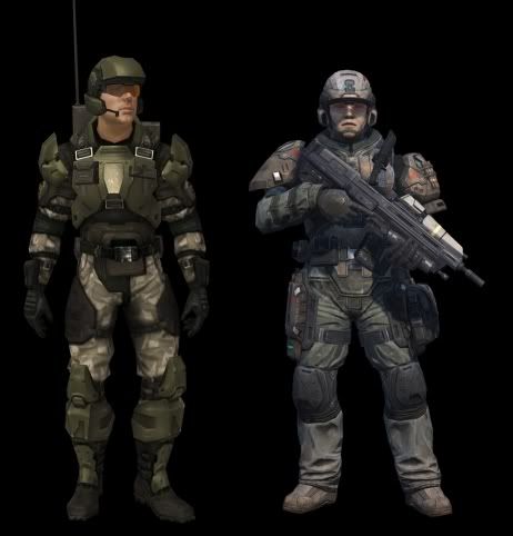
Something I noticed while playing campaign earlier.
How in the world did we ever go from this
to this
I'm okay with the unicorn helmets and armour that looks completely ridiculous and impractical, but the Marines in this game are just terrible. I can't even imagine what was going through the designer's mind when he thought changing them like they are was an improvement. Okay, not terrible as such... I just really don't like it. Maybe it's the colours which make it look a lot worse than it is... I don't know.
Regardless, it needs to be taken back to the drawing board for Halo 5 - Maybe take it as an opportunity to draw inspiration from Reach/CEA. Not expecting a copy paste, but the complete redesign in 4 was really unneeded. I can understand pretty much every other visual change in the game, but I just don't get this one. It's a massive step back - no matter which way you look at it.


