• Hey Guest. Check out your NeoGAF Wrapped 2025 results here!

NeoGAF Drawing-a-Day Thread

...I feel like I've really been out of my element. And I'm frustrated that I'm really apathetic to all of it.
sounds like you could use a break dude.

8bh29Hp.jpg
nothing feels quite right with this drawing but i like it anyway.
 
It's been a while since I last posted some of my hand-drawn sketches. Here's what I did today at the office:

12135443_1483230521983333_1926751172_n.jpg


PS: These are the first vehicles I did since the last time I posted some of my side-view ships.
 
Hery Servbot, that character reminds me of DeusEx! Looking good, if a bit too thick perhaps?


Anyway, here are 3 variations I made for some sort of giant structures set in some tundra.

miguel-alonso-snow02.jpg


miguel-alonso-snow03.jpg


Don't wanna clutter this so the third I'll just leave it for the link.

https://www.artstation.com/artwork/6veEn

Each one took me around an hour, and I did them on Thursday and Friday during my lunch breaks (two of them) and Thursday after work (another one).
 
sounds like you could use a break dude.

Yeah, I'm trying to spend more time studying, rather than just drawing to escape my problems. Detrimental.

I did work on this though, which is a piece for the pages I've been working on. If it's too nsfw I'll remove it. The unedited version is on my tumblr.

laurelsfw40bxq.jpg


trying to play around with tonal values.
 
I forgot how crazy good artists you are. I have been drawing on tablet now that I'm in a digital art class and I'm enjoying it. I like being able to draw the shape of a head and now having to erase a ton. I'm still drawing on paper, but I'm really enjoying drawing on tablet. I will try to upload some tomorrow, there nothing even close to as good as yall. But hey I have to start some where.
 
It's not quite New Year's (that's like 2 months away), but I've always wanted to learn to draw. It was going to be my New Year's resolution (to do a drawing a day for a year), but I decided that's just not going to cut it. I can't wait that long.

I have no experience and no idea where to start. BUT! I've read that one of the best things you can do as an aspiring artist is to draw every day. So that's what I'm doing. I'll draw and sketch a lot of random crap, but I'll make sure to spend time every day doing an actual "drawing" to post. I know they aren't good, but consider this my way of jumping into the deep end to motivate myself to finally do this.

This was yesterday's - a random candle on my desk at home. It's clear that I need to develop a my perspective and spatial recognition skills, haha.

 
^ Your pic doesn't seem to work

Also, you should check the Art self study thread.

Anywho, guys, it's the final week for the current Great Gaf Art Challenge and y'all should give it a shot.

Thanks - I actually used that thread to find the Mastering Manga series. I'm also going to pick up a book on figure drawing. Until then, I'm just spending time sketching as much as I can to encourage my brain to "work" like that, ha.
 
Joke arts~
Well kind of! Some old childhood characters and then my friends and characters as sonas in the species. xD

tumblr_nwy3394yh51tb3rvdo1_1280.png

tumblr_nwy3394yh51tb3rvdo2_400.png
tumblr_nwy3394yh51tb3rvdo3_400.png
tumblr_nwy3394yh51tb3rvdo4_400.png

tumblr_nwy3394yh51tb3rvdo5_1280.png


~3 hours!
 
^ Your pic doesn't seem to work

Also, you should check the Art self study thread.

Anywho, guys, it's the final week for the current Great Gaf Art Challenge and y'all should give it a shot.

Every singly time I see the art challange thread pop up I want to participate. Every single time I make some dumb ass excuse to myself as to why I cant. If I dont manage to squeeze something in for this one then certainly the next one. If not, someone should request me to be banned.
Not permanently though gosh
.

Here is my apathy crystallised into the form of a sketch:

robotosfwss6.jpg


I am still drawing my nsfw comic stuff so. yeap.
 
imageitskj.jpg

My quick kinda bad drawing of hands.
So when drawing with a tablet in photoshop what type of brushes should I use.
If you have any videos about shading on a computer or in real life it would be much appreciated.
 
It's been a while since I last posted some of my hand-drawn sketches. Here's what I did today at the office:

12135443_1483230521983333_1926751172_n.jpg


PS: These are the first vehicles I did since the last time I posted some of my side-view ships.

I really dig your style.

How did you develop it?

also really like your travel book stuff from a few pages back
 
AHHHH I SHOULD BE ASLEEP!!!
I will be drawing all most of the coming week too so maybe I will flood you guys. lol

Secret Santa Banner:
fire_emblem_club_secret_santa_2015_by_meibatsu-d9f0q8b.png

2.5 hours?

Halloween comic:
Uhhhhh.. 4 hours?
 
foulrobotocover24al23.jpg


still mixed feelings about everything. It's weird. Maybe I'll touch it up more another day. Can't be bothered at the moment.
 
I really dig your style.

How did you develop it?

also really like your travel book stuff from a few pages back
Thank you! For the style, don't know... for things like vehicles and other stuff in perspective, I tried to check a lot of the Scott Robertson videos and also when I started learning, a lot of the Feng Zhu videos he has on Youtube.

Otherwise, I think using pens give it a unique touch compared to pencils or other tools, as the linework always has the same width.

Glad you liked the travel journal! I make one every time I travel, too bad I haven't traveled for quite a while now :(
 
Not sure if this is the right place but this thread seemed like a good fit...

I am hoping to hire one of you talented artists to create some illustrations for a children-esque book. It only needs to cover 2 pages but it needs to tell a story via the images of a couple first meeting, the relationship, and end right at the point where the woman becomes pregnant.

They can be very simple drawings but I'd love for them to be whimsical, child like, and hopefully convey some real emotion. Think, the beginning montage of UP, only much more simple and without the death of course.

I don't know what this would cost so you guys will have to help me there and I'm currently trying to find some examples to convey what I'm looking for a bit better. Please PM me if you're interested.
 
So I decided to take part in the Gaf Art Challenge this month. The theme was "Autumn".

autumnfsi1sxo.jpg


I really suggest some of you guys give it a go; I think some of you guys would come up with some really awesome shit.
 
^ Wouldn't mind helping, is there anything you feel you're needing to work on specifically?

sophgfsfuzj1.jpg


did this quickly while cooking roast. Painting it up...
 
^ Wouldn't mind helping, is there anything you feel you're needing to work on specifically?

Alot lol.

1. I have problems with shading, particularly primary and secondary/tertiary forms. I understand how shading works already and I can shade simple forms (spheres, boxes, cylinders). The thing that isn't clicking for me are when secondary forms are involved (forms within forms, like muscles over the cylindrical arm). If I render the secondary forms (the muscles and/or folds), it tends to look all over the place and the primary forms (the whole cylindrical arm) get lost.

(This is where I realized knowing anatomy doesn't automatically translate with my artwork. At this point I think I can point out most, if not all, the superficial muscles + fat pads, its general shape, and its origin and insertion, but it doesn't help me shade the whole figure overall).

2. Same struggles with drapery, but with added problem of not being able to represent them via lines. Like, I'm gonna make/detail a fold and the whole thing gets too messy. I learned recently that I have to quiet those kinds of details, but when I do, I lose the whole fold. I cannot strike that balance.

3. Doing sketching digitally with a tablet. I don't get satisfied with my digital sketches compared to my pencil sketches. If I get too loose, I get a better sketch but it's scratchy and ends up causing a bad lineart. But if I'm too careful I end up taking too much time and the results aren't good either.

I guess I'm still trying to figure out a proper workflow digitally overall.
 
You think maybe you're worrying too much about having everything in the right place and not enough about technique? Might be worth doing a bunch of master studies to see how they render things.
 
You think maybe you're worrying too much about having everything in the right place and not enough about technique? Might be worth doing a bunch of master studies to see how they render things.

What do you mean by it? Like shading techniques and stuff? But yeah I might be worried too much about everything being in the right place, but then I can't help be frustrated when I can't get my art where I wanna be, maybe its my skill still lacking...

Thanks for master studies suggestion. Will do this week.
 
Yeah shading but also just basic contour stuff. Like if you want to draw a clavicle or whatever feature you can save yourself a lot of pain by drawing it really simply, but you need to have good technique to be able to pull it off convincingly.

Do you have any Loomis books? I could give you a couple examples of what I'm talking about.

I do have Loomis books. Just show me where.
 
Try pages 104-112 in figure drawing and do the contours as best as you can, and maybe don't worry too much if they're accurate. If you want to shade just keep it real basic. You sorta need that kind of flow he has on those or some other visual hook to make contour look halfway decent.
 
DEATH™;184732049 said:
Alot lol.

1. I have problems with shading, particularly primary and secondary/tertiary forms. I understand how shading works already and I can shade simple forms (spheres, boxes, cylinders). The thing that isn't clicking for me are when secondary forms are involved (forms within forms, like muscles over the cylindrical arm). If I render the secondary forms (the muscles and/or folds), it tends to look all over the place and the primary forms (the whole cylindrical arm) get lost.

(This is where I realized knowing anatomy doesn't automatically translate with my artwork. At this point I think I can point out most, if not all, the superficial muscles + fat pads, its general shape, and its origin and insertion, but it doesn't help me shade the whole figure overall).

2. Same struggles with drapery, but with added problem of not being able to represent them via lines. Like, I'm gonna make/detail a fold and the whole thing gets too messy. I learned recently that I have to quiet those kinds of details, but when I do, I lose the whole fold. I cannot strike that balance.

3. Doing sketching digitally with a tablet. I don't get satisfied with my digital sketches compared to my pencil sketches. If I get too loose, I get a better sketch but it's scratchy and ends up causing a bad lineart. But if I'm too careful I end up taking too much time and the results aren't good either.

I guess I'm still trying to figure out a proper workflow digitally overall.

I'll address these points fairly briefly as what's causing these problems is actually a deeper problem of your technical skill and understandings; these things you notice here are just symptoms of the root cause.

1. You have to understand that when you put down basic shapes of the body these are loose representations of what you're trying to further build on. Sure using a cylinder to represent an arm works as its the nearest like basic geometric shape to what an arm is; but an arm is far from a cylinder. The body is made up of a network of muscles that are all different shapes and sizes and they push and pull and contort to create movements within the body. The arm should not just be a cylinder by the time you get onto further rendering. If anything its much more ovular and narrow on one of the axis. Use your base shapes to lay down proportions, do not use them to determine your form. There will be all sorts of crevices (or lack there of) depending on the build of the person you are drawing; be sure to take notice of these. Once you are done laying down your body plan of basic shapes, forget them and start thinking about the actual human anatomy. As always I reccomend people watch work out videos to better understand how the human body works. They usually go in great depth of what each muscle is doing during any particular exercise, and better yet you get to see the muscle in action on a body that likely has lower body fat% so you can see what it is doing exactly.

The second part of this problem probably has more to do with your values. If you're adding shading to your body from a particular light source you need to be able to understand where your form shadows will come from and where your cast shadows will fall. On top of that you need to determine if the tint or shade is the right value depended on the strength of your light source. From these pictures alone I couldn't tell you what your problem is specifically as there's no value work there. I couln't explain in a single paragraph a lone how this all works as light is a bit more complicated than that (depending on its setting), as well as that you have things as secondary light, and some diffusion going on in some cases.

2. This sounds like you're struggling with line weight here. (This is something that I can see more apparently with your sketches provided). You need to learn to lighten the pressure. Draw incredibly light when mapping and like a marksman go in heavy when you are absolutely sure this is the line you want. I go by the "there's only one line for everything" rule. Any object or detail you are trying to represent within your image (when it comes specifically to representing the shape and contour lines only) should have a singular line to determine it. The fewer lines you use the better. It's also important to keep an eye on the values of your lines; thicker/darker/heavier lines will give the impression of solidity while lighter/thinner/softer lines will ease up the weight of the object. Do not use consistent weights throughout an entire image if you're wanting to show changes in texture, weight or importance.

3. Are you sketching with the pen pressure off? It sounds like more line weight issues. Either work with lower opacity or thinner lines. Build up to the heavier line work when you have settled on the placement of objects and ready to solidify everything. Unfortunately this is going to have to be a matter of trail and error to see what works best for you as well, as digital tools have lots of different ways of making them do pretty much the same thing.

As I said, these are all my brief analysis of what you're saying compared to the work I've seen. It sounds to me like you need to study more on values and how light works in reality for you to be able to flesh out your sketches. It takes time and more studying! I'm always happy to talk about art stuff on my streaming channel if you ever want to stop by. I typically announce when I'm streaming on my twitter. Good luck man.

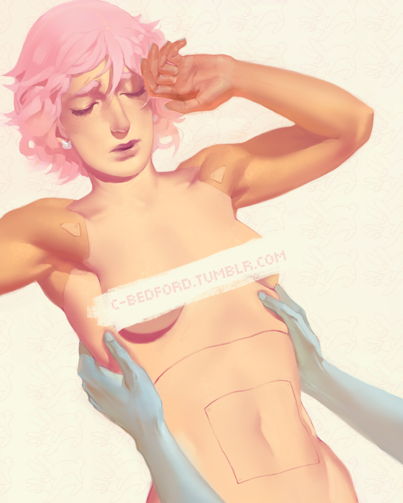
So I started quickly painting this last night half asleep:

sophgcol2x4qpv.jpg


I want to practice more with having high key backgrounds and low key subjects, and able to keep my value range distinctive between the two. such a weird ass angle. I'll probably stream while working on this later...

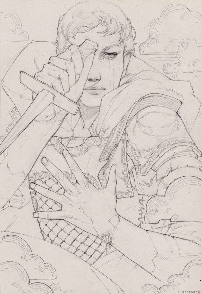
Managed to get a commission done today as well. I'm satisfied with this one, I feel like I haven't produced anything pleasant for a while graphite wise.

blairfsido4k.jpg


Just hoping the commissioner digs it.
 
Top Bottom