• Hey, guest user. Hope you're enjoying NeoGAF! Have you considered registering for an account? Come join us and add your take to the daily discourse.

Pillars of Eternity by Obsidian Entertainment (Kickstarter) [Up: Teaser]

injurai

Banned
Witcher 2


Dark Souls

conceptart08mqugg.jpg


........Project Eternity

conceptart07hnu7e.jpg

Ya... this post really puts things into perspective.

TW2 is the uncontested champion at striking art, I really hope PE gets its shit together.

Tyrone must be on the project...
 

Midou

Member
Gets millions in funding for dream project

Makes most generic looking game possible

???

Early concept art looks bland and uninspired*

No need to jump to conclusions this early in the process.

This is also the point of them releasing content early. It's early enough that they can change directions too.
 

thefil

Member
I actually really like the Edair character art. I think he looks appropriately muted for a martial character. I prefer it to someone hyper-stylized in service of the extraordinary.
 
Early concept art looks bland and uninspired*

No need to jump to conclusions this early in the process.

This is also the point of them releasing content early. It's early enough that they can change directions too.

Well, based on that argument it is best to lose our shit now so they get a loud and clear message.

I actually really like the Edair character art. I think he looks appropriately muted for a martial character. I prefer it to someone hyper-stylized in service of the extraordinary.

I thought the art during the kickstarter was a mixed, mostly okay bag. The new pieces just aren't very good.

edit: The building looks nice!
 
Well, even though I was a bit skeptical of kickstarters in general and did not put money into this project, I think you guys are overreacting a bit.

Isn't the whole reason you guys are high on this game is because you anticipate great game design and writing? Now you are knocking it solely based on the look? Obsidian will never win a graphic arms race with its competitors, resources poured into art and graphics are resources they won't be able to put into other aspects of the game. They should focus on what they are good at, and if that isn't good enough for you, then this game isn't for you/
 

Nirolak

Mrgrgr
So, I decided to take one of the safest fantasy games out there and pick out some evocative concept art with characters in fairly standard medieval armor.

The title shipped over 10 million copies, so I'll say that the art direction definitely isn't audience limiting.

I feel these give a nice sense of adventure and distinction despite being deeply rooted in traditional fantasy tropes.

 
Not even in the artist's wild dreams his stuff looks anything like a good animated cartoon or something made by disney.
Its as generic as it gets, and its really bad. It doesnt have any personality, and thats the worst thing of all.
They know the backlash, they have the money, so I hope they have MUCH better artist cooking the real thing, becuase simply, this guy sucks, and im very sorry saying that, but sadly is the truth.

If only!

Meanwhile at Obsidian:

What I meant is that the style of the actual rendering- the flat colors (or shades of grey in this case) and explicitly drawn lines- reminded me of an animated cartoon.

Of course the actual design isn't up to par with the likes of Disney. I don't even really like the designs they've shown either but I'm willing to give them a bit of break especially since the stuff we've seen that people seem to be reacting to strongly against is all from one person, with one style that's rather sparse with just the monochromatic colors against a blank background.

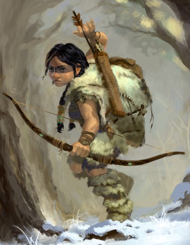
Take the dwarven ranger lady- we've seen her in 3 styles so far:

1.) One style like the ones people are raging about:
CrwMd.jpg


2.) The more colorful and active scene that people seemed to like:

3.) And as part of the fairly detailed wallpaper:

I don't think the style of the designs is anything great but even with bland designs, I think the quality of the rendering can go a long way to making them more palatable. Certainly with black and white or monochromatic drawings in a more cartoon like aesthetic that's not going to match up with what people see from the likes of The Witcher 2, Dark Souls or other concept art. Hopefully they hear this feedback and try to liven up the art a little.
 

DTKT

Member
Well, even though I was a bit skeptical of kickstarters in general and did not put money into this project, I think you guys are overreacting a bit.

Isn't the whole reason you guys are high on this game is because you anticipate great game design and writing? Now you are knocking it solely based on the look? Obsidian will never win a graphic arms race with its competitors, resources poured into art and graphics are resources they won't be able to put into other aspects of the game. They should focus on what they are good at, and if that isn't good enough for you, then this game isn't for you/

At the same time, PE is not a text-adventure game. It has to fit in an interesting art style. This is an issue I have with the Avadon and Arcanum series. While it may have great writing, it looks terrible and detracts from the immersion.

I'm shallow like that.
 

thefil

Member
The D&D3.5 Player's handbook style character portraits are definitely a little hokey, but I have to love that they went for that style.
 

Midou

Member
Well, based on that argument it is best to lose our shit now so they get a loud and clear message.

Yes. Best to do it on the kickstarter comments though, probably.

It's one thing to point out that it's bland but another to act like the game is doomed and this is what the final game looks like.
 

Zeliard

Member
I don't think the only complain here is that it looks generic, but that the quality of art and the overall ambition in the visual look is seriously lacking. I mean if we're talking about "generic" medieval fantasy settings, let's look at some concept art from Tactics Ogre: http://www.parkablogs.com/content/book-review-タクティクスオウガ-運命の輪-art-works-tactics-ogre-art-works


Would anyone be complaining if the concept art so far looked like this? Certainly not. The look is traditional, the sort of armor and equipment characters use here are standard stuff we're all familiar with, but yet the design itself stands out. It looks unique, there is life and detail in every element which seems to say something more. There is thought put into how the characters reflect the world they inhabit. There is nothing so far in the Project Eternity character artwork which feels that way at all.

I totally agree that you can create compelling art with a relatively generic setting and characters, but I do think it is more of a hill to climb in order to do so. Making memorable art with something like Planescape - just as one example - is comparatively easier because a lot of the stuff from that setting isn't what people are generally used to, so it automatically stands out right away.

Ultimately, all I'm saying is that Project Eternity's more generic attributes are not going to mash well with workmanlike - at best - concept art. Workmanlike could have potentially been more effective with a stranger, more naturally evocative setting, but when it's already based on such common and overused tropes and styles, then a basic effort doesn't cut the mustard. You just end up with something boring.
 

duckroll

Member
Well, even though I was a bit skeptical of kickstarters in general and did not put money into this project, I think you guys are overreacting a bit.

Isn't the whole reason you guys are high on this game is because you anticipate great game design and writing? Now you are knocking it solely based on the look? Obsidian will never win a graphic arms race with its competitors, resources poured into art and graphics are resources they won't be able to put into other aspects of the game. They should focus on what they are good at, and if that isn't good enough for you, then this game isn't for you/

I don't think the style of the designs is anything great but even with bland designs, I think the quality of the rendering can go a long way to making them more palatable. Certainly with black and white or monochromatic drawings in a more cartoon like aesthetic that's not going to match up with what people see from the likes of The Witcher 2, Dark Souls or other concept art. Hopefully they hear this feedback and try to liven up the art a little.
I don't think any reasonable person expects the game's graphics to look like Witcher 2 or Dark Souls. But I think it's fair to say that for a game which got over 4 million dollars in funding, and is from the people who created Fallout and Planescape Torment, there is an expectation that it wouldn't look like dogshit.

This is what Tactics Ogre PSP looks like, in-game:
dJJCw.jpg


There is no excuse that just because a game, especially a RPG, is low-fidelity in terms of graphics, that the art direction should be expected to be bad. That is nonsense. Good art direction creates a great conceptual view of the world, and helps everything else in the game. With good art direction and good character concepts, the writing will be better, the tone will be better, and the levels will be better.
 

Nirolak

Mrgrgr
I don't think the style of the designs is anything great but even with bland designs, I think the quality of the rendering can go a long way to making them more palatable. Certainly with black and white or monochromatic drawings in a more cartoon like aesthetic that's not going to match up with what people see from the likes of The Witcher 2, Dark Souls or other concept art. Hopefully they hear this feedback and try to liven up the art a little.

I get where you're coming from, that you can't one to one compare full color fantasy art to lower detail black and white sketches, but I feel even within that constraint you could make some pretty cool designs.

 
wow, the concept art really is starting to look like hot garbage. at least we've got good environment artists. Damn I haven't checked on WL2 in a while, now THAT looks amazing.
 

Midou

Member
hA7hG.jpg

I think this looks fine for example. They just need to work on portraits/artstyle in general. Though if the environments look like the earlier shots, the models look like an improved version of the above shot, and the writing is good, I don't really care.
 

DTKT

Member
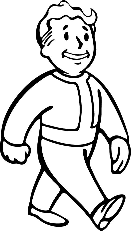
The Vault Boy is a theme on itself. It's not supposed to represent the entire Fallout art-style. It's something that they have kept since Fallout 1 while accompanying that with more traditional concept art.

It's hardly the same.
 

DiscoJer

Member
I think it's a matter of style. It's meant to be an old school CRPG, using old school (aka D&D) style artwork.

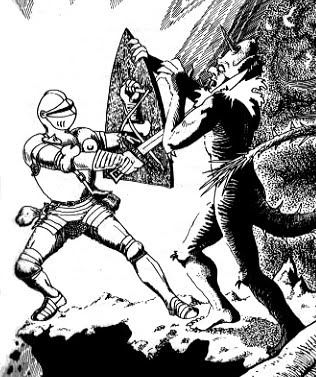
One of the most iconic images of early AD&D was the A Paladin in Hell piece in the PHB. It's not hard to see the similarity between it and the picture of the lady in the plate armor.

davesutherland-paladin-in-hell.jpg
 
I get where you're coming from, that you can't one to one compare full color fantasy art to lower detail black and white sketches, but I feel even within that constraint you could make some pretty cool designs.

For sure. I do wonder if possibly they're keeping some of these character designs on the simple side for the sake of more easily translating them into the in game models, perhaps? I mean, when you're actually playing the game all pulled back, you're not going to be noticing little intricate details in armor or clothing like in those sketches you just posted. I don't know, I'm just wondering if maybe that's a possibility.

And while the Wasteland 2 art has looked phenomenal its not like the actual in game characters are going to live up to that. Will there be disappointment when people see what the actual characters look like compared to how the concept art depicts them? The concept art and portraits are important for these types of games in their own right though.

I guess I just want to see more concept art from different artists at Obsidian before I start losing my shit. The stuff they've shown from this one artist isn't great and if thats all they've got then yes, that is a major cause for concern. But I'm willing to give them some time since they're probably barely in pre-production on a lot of this.
 
The Vault Boy is a theme on itself. It's not supposed to represent the entire Fallout art-style. It's something that they have kept since Fallout 1 while accompanying that with more traditional concept art.

It's hardly the same.

The point is how do you know that this PnP DnD manual illustration look isn't a theme onto itself?
 

duckroll

Member
So it's inconceivable that they choose the art design on purpose to resemble traditional DnD manual illustrations because that was the feeling they intended to evoke with the design.

Vault Boy is not fucking ugly. This is fucking ugly. That's all the matters really.
 

injurai

Banned
People complaining about people complaining. Realize that this is crowd funded, and above all other games Obsidian should be working towards player satisfaction. Whatever a players gut feeling is about their art direction is something that they should know. Early in the production this is the exact stuff they need to hear about. They know we love them, they know we overreact, its not like we are hurting their feelings. It's all about getting that feed back at this point.
 

Zeliard

Member
Vault Boy's a pretty distinctive and memorable chap - iconic, really - and evokes the feel of blind 50s American idealism pretty well. I think he's a very effective example of character art.
 
The vault boy BECAME iconic after you play through the game.

If you've never played or heard of fallout, and some group kickstarted an RPG today and showed you that vault boy picture as concept art, the number of people in a GAF thread complaining about bland and lazy and mailing it in would be 10 times this thread.
 

Nirolak

Mrgrgr
For sure. I do wonder if possibly they're keeping some of these character designs on the simple side for the sake of more easily translating them into the in game models, perhaps? I mean, when you're actually playing the game all pulled back, you're not going to be noticing little intricate details in armor or clothing like in those sketches you just posted. I don't know, I'm just wondering if maybe that's a possibility.

And while the Wasteland 2 art has looked phenomenal its not like the actual in game characters are going to live up to that. Will there be disappointment when people see what the actual characters look like compared to how the concept art depicts them? The concept art and portraits are important for these types of games in their own right though.

I guess I just want to see more concept art from different artists at Obsidian before I start losing my shit. The stuff they've shown from this one artist isn't great and if thats all they've got then yes, that is a major cause for concern. But I'm willing to give them some time since they're probably barely in pre-production on a lot of this.
We actually saw Wasteland 2 pretty early:


duckroll

Member
The vault boy BECAME iconic after you play through the game.

If you've never played or heard of fallout, and some group kickstarted an RPG today and showed you that vault boy picture as concept art, the number of people in a GAF thread complaining about bland and lazy and mailing it in would be 10 times this thread.

Erm. No. But feel free to make up more strawmen.
 
Wasn't Fallouts art pretty generic vault boy
Vault_Boy.png


I mean, can you get more generic than that?

Yet it turned out okay.

Fallout's art direction is pretty damn unique. When Fallout 1 was released, there wasn't thing in pop culture that I could think of that was doing the retro future theme mixed with Mad Max. The Vault Boy logo was really just a logo.
 

Raging Spaniard

If they are Dutch, upright and breathing they are more racist than your favorite player
Hey Id be happy to make art for them, as would other people, lol, but you gotta trust them on this. Concept art goes through a million iterations and rarely ends up in the game at 100 percent accuracy.

Hell, most of the time the design you came up with will change so much by the time the 3D model is done that youll just redraw the character so it looks like the 3D one, thats how backwards a process it is.
 
D

Deleted member 20920

Unconfirmed Member
Hold on guys, I have an exclusive scoop on the work-in-progress cover art for the game:

X7kdd.jpg

Lol...This looks really familar. Where is it from? I vaguely remember the girl in the tiara and the wizard guy next to her.
 

God damn I forgot how good this movie looked. The character designs, composition and amazing background art and colour schemes. The textures in that tree are sublime. Why can't modern Disney make something that looks this good?

As for the obsidian artwork, I really liked the early stuff like this:

dwarf_ranger5cjq1.jpg


What happened? did they change concept artist? New stuff doesn't look as good. But then again, it's only concept art.


Yikes, even worse than feared.


Here is a random example of good fantasy art:


That's good too, but you could post anything by Frank Frazetta as an example of good fantasy art :p


Des0lar

will learn eventually
The vault boy BECAME iconic after you play through the game.

If you've never played or heard of fallout, and some group kickstarted an RPG today and showed you that vault boy picture as concept art, the number of people in a GAF thread complaining about bland and lazy and mailing it in would be 10 times this thread.

I never played a Fallout game, but I remebered Vault Boy when I didn't even know what game he was from. That's good design right there.
I wouldn't remember any of the characters shown by PE.
 

Ledsen

Member
It's a bit unfair to compare it to stuff like Dark Souls, that game has some of the best art in any game ever. PE doesn't even reach the "average" mark so far, which should be a bigger concern. At least that actual in-game environment looked amazing.
 

MrHicks

Banned
WTF @ the difference between the environment screenshot in the OP and the character art
can't the background dude do the chars too or doesn't it work that way?
 

Riposte

Member
I think the art in plenty of DnD sourcebooks (3.0 and on anyway) are great.

Gets millions in funding for dream project

Makes most generic looking game possible

???

lol, 4 million is very little in the scope of things. This is why I don't like kickstarter much, though maybe they just need better art direction. If you are going to be cheap, then maybe hiring a Japanese dude (from the doujin scene perhaps) to do your art isn't a bad idea.

I just hope it doesn't end up looking something like Fallen Enchantress (a good game, granted), because that is what that zoomed out character model is reminding me of:


You guys are probably going to hate me for this, but I would have preferred a game structured like Alpha Protocol over the infinity engine style and I bet that would have been easier to develop on a smaller budget.
 

zkylon

zkylewd
Pretty terrible on all fronts. I'd be interesting if maybe the visual inspiration in this game won't come from the concept art but from the writing and world design, that seems to be the strong point of the game. I hope not only that's the case, but that they actually get someone that actually inspires the backers as well, because this images are pretty underwhelming as far as originality and overall quality goes.

Still, they say it's work in progress and I'm happy I'm getting the unfiltered version and we get to look at things looking like crap before they look better. I think they should do a better job and maybe hide the embarrassing a bit, but I can't honestly complain about bullshots if I'm gonna go crazy every time they show me an ugly picture.

We didn't even get to talk about the house in the start of the post, that looks pretty great.

Anyone asked something about visual design in the Q&A thread?

Obsidian: Don't freak out!
GAF: *Freaks out*
Yeah well that kinda falls on Obsidian for not realizing who they were dealing with :D
 

Taruranto

Member
Why?


AumauaWizard.jpg


Why?

I just can't believe no one at Obsidian thought "Hey guys, this looks ugly as fuck, maybe we shouldn't release it". Ugh. What the hell were they thinking? Were they thinking at all?

The vault boy BECAME iconic after you play through the game.

Completely untrue. I know that because i played Fallout pretty late, and yet the Vault Boy stood out for me as soon i saw it. It's one of the most iconic thing you can find.
 

Corto

Member
Obsidian themselves seem to point that these are almost placeholders. I'm not worried considering that environment screenshot (my PC wallpaper ever since) and also that this is just Obsidian showing us how the sausage is made. I expect the final hotdog to be great.
 

jb1234

Member
The concept art isn't a big deal to me. But I'm not a very visual person, either. As long as the writing is good and the game is fun, that's all I need.
 
Top Bottom