• Hey, guest user. Hope you're enjoying NeoGAF! Have you considered registering for an account? Come join us and add your take to the daily discourse.

Pillars of Eternity by Obsidian Entertainment (Kickstarter) [Up: Teaser]

Minsc

Gold Member
Saw this on their official forums:

Scaling_example.jpg

Things look so much better at this scale, where you can't really see them any more! I just hope the uninspiring artwork / character models don't negatively effect any other aspects of the final game, beyond just being bad looking at sizes you'd never see them at normally.
 

Lime

Member
I've enjoyed the last 3 pages discussion immensively but I fear the consensus is that Fantasy-Medieval art looks good if it is "bad-ass" as the 80's Power Metal lizard pictured above.

Did you see the Wasteland art? The Dark Souls art? The Witcher 2 art? Even the Dragon Age 2 art? People are clamouring for better art direction akin to those, not 80's power metal lizard stuff or the current Deviantart shit we have now.
 

Corto

Member
This is a joke, right? Why'd you post some weirdo with a spike fetish riding a red bearded dragon?

Why not? You don't like awesome? ;)

That wizard with the book reminds me a traditional Japanese samurai image that I saw once, google image is failing me at the moment. But the pose and the eyes are really tickling my memory bank.
 

dude

dude
Oh, more bitching? I mean, come on, they even wrote mock-trolling comments on the posts to let us know this doesn't currently look good (nor should it, it's still incredibly early.)
 

Enduin

No bald cap? Lies!
Oh, more bitching? I mean, come on, they even wrote mock-trolling comments on the posts to let us know this doesn't currently look good (nor should it, it's still incredibly early.)

I don't see the problem as long as people aren't completely gloom and doom. Just because it's early doesn't mean it can't look good. A good artist can make something simple and quick but still be effective and evocative. Plus this is what this whole project is about.

We doled out a few million dollars to find their dream project and we get to see status updates on it and voice our opinions and concerns. It's perfectly reasonable and within our rights to say that art looks like shit. So if they already didn't realize this they do now and will hopefully take it to heart. We'll see this in future art and all will be happy, until the next issue arises.

This is what crowd funding and community involved development is all about. They don't have to change shit just because we don't like it, artistic integrity and all that, but it doesn't mean they shouldn't in some cases.
 
Wait............ what were you guys expecting anyway? If you compared the art of New Vegas to that of Fallout 3, or heck even that of KOTOR2 to KOTOR, it's pretty obvious Obsidian is outclassed by other studios when it comes to art that's original and exciting. People actually played Obsidian games for their art, not for their so called incredibly deep roleplaying? When was the last time any Obsidian game had incredible art design?
 

water_wendi

Water is not wet!
Wait............ what were you guys expecting anyway? If you compared the art of New Vegas to that of Fallout 3, or heck even that of KOTOR2 to KOTOR, it's pretty obvious Obsidian is outclassed by other studios when it comes to art that's original and exciting.
i dont remember New Vegas or KotOR2s art lacking. Those two games i thought had better art than their predecessors. The Obsidian game that had generic looking art design was NWN 2 but it was faithful to the source material for whatever that is worth (3E D&D art.. esp monster design.. generally sucks imo).
 
Wait............ what were you guys expecting anyway? If you compared the art of New Vegas to that of Fallout 3, or heck even that of KOTOR2 to KOTOR, it's pretty obvious Obsidian is outclassed by other studios when it comes to art that's original and exciting. People actually played Obsidian games for their art, not for their so called incredibly deep roleplaying? When was the last time any Obsidian game had incredible art design?

One could arguably say that it is good art direction what makes the South Park game look exactly like the show.
 

zkylon

zkylewd
Maybe it's just so bad and generic that it's good? XD Totally had the generic DnD vibe to me..
I'll trust that they'll make something serviceable and possibly impressive in the end though.

I think good fanart or an active fan community for the game might help. I found this piece on Deviantart (it might be the only one):


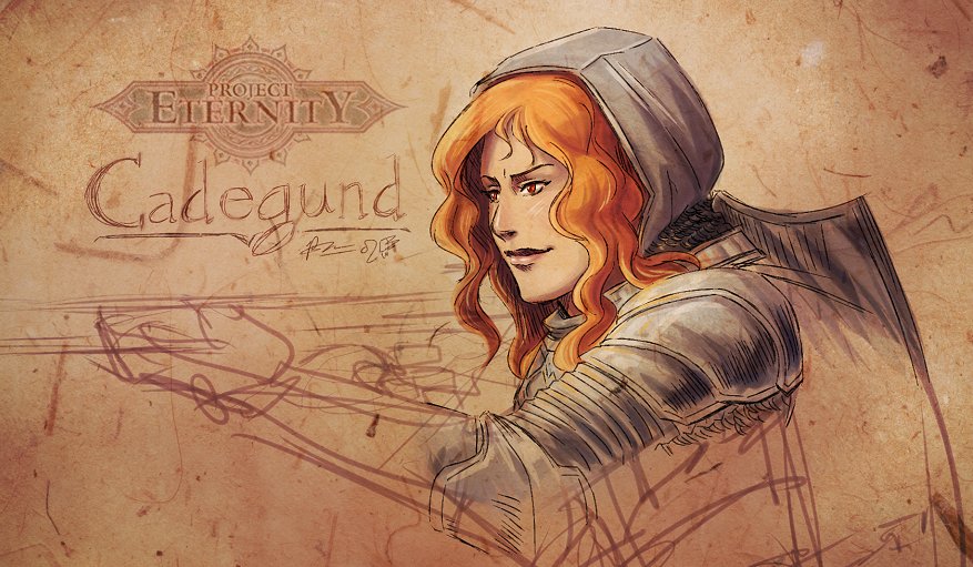
And apparently, the artist making the first concepts we saw of the companions has a DeviantArt account too: http://ravenlight.deviantart.com/
(she can certainly colour better than what the concepts might lead you to believe.. Go check her out!)


In the spirit of Project Eternity being a work-in-progress, here's my spin on Cadegund:
cadegund_by_meibatsu-d5n7ci7.jpg

I WANT to like her because she has red hair. But I just don't know..
I'm personally hoping she's debonair and sassy with a good sense of justice.
Nice, really like your take on her.
 

Lime

Member
Many people criticized the art during the actual Kickstarter funding process, yet Obsidian didn't seem to change much about the quality based on this new update. Maybe they simply don't know how to accomplish a change in visual character direction?
 

Ithil

Member
This is bad it's good


Why would they even present us atrocious art like that if they were to completely scrap it later on anyway? "Guys, here's our poor art but please spare us any criticism. Praise is appreciated though".

Because if they didn't show people their test models, they'd get complaining that they clearly aren't doing anything and are evil.
 

Ledsen

Member
to be fair the art direction of PST (I mean character portraits) is hideous, so I guess nothing new here.

The portraits are 3D models (why I'll never understand), all the 3D stuff in that game looks like shit. The overall art direction is amazing, especially the environments.
 
Why did you mislead me with the dwarf ranger in snow concept art Obsidian? If it wasn't for that I would have simply expected the other concept art to be bad.
 

zkylon

zkylewd
Why would they even present us atrocious art like that if they were to completely scrap it later on anyway? "Guys, here's our poor art but please spare us any criticism. Praise is appreciated though".
Because they're naive to think the gaming community isn't gonna whine about everything? It's work in progress, as was the background mockup. Some things look great, some things don't, but fortunately they have 2 YEARS of work ahead to fix them.

I can't understand how people can be so volatile as to want to remove their backings because work in progress pictures look like crap.

Edit: I do get it looks very bad, but the outpour of negativity seems to be completely disproportionate to the intent of the post that's actually saying "Don't get all GAF on us".
 

Lancehead

Member
Why would they even present us atrocious art like that if they were to completely scrap it later on anyway? "Guys, here's our poor art but please spare us any criticism. Praise is appreciated though".

Because this is a Kickstarter project, and they want to share the iterative process that they go through, which they couldn't if it was publisher backed?
 
This is so bad it's good
Why would they even present us atrocious art like that if they were to completely scrap it later on anyway? "Guys, here's our poor art but please spare us any criticism. Praise is appreciated though".

I don't see anywhere where they're saying not to criticize it but at the same time, its concept art. And not even polished concept art but just sort of prototyping different designs that likely will be heavily iterated on. Thats kind of the point. And besides, when you read the whole update it seems that this one artist basically is the only full time concept art person on their team right now. So they're still really, really, really early on.

I'm sure the Wasteland team has rough concept art like this too, but they're only showing off the polished portraits and so forth.
 

Pociask

Member
The quality of the execution leaves some to be desired, but I'm not seeing the backlash here. It looks like they're going for a realistic-fantasy vibe. Fantasy art of a dude in crazy armor with tons of spikes riding spike covered beasts, or a fantasy dude with a gigantic weapon, seem to be missing the point.

I hope they stick with the "Armor that real people actually have to put on and use because it is effective armor, not because it maximizes cleavage" and "Scholars that actually have to carry all those scrolls" vibe. Again, it's the execution that I think is lacking.
 

Lime

Member
The quality of the execution leaves some to be desired, but I'm not seeing the backlash here. It looks like they're going for a realistic-fantasy vibe. Fantasy art of a dude in crazy armor with tons of spikes riding spike covered beasts, or a fantasy dude with a gigantic weapon, seem to be missing the point.

I hope they stick with the "Armor that real people actually have to put on and use because it is effective armor, not because it maximizes cleavage" and "Scholars that actually have to carry all those scrolls" vibe. Again, it's the execution that I think is lacking.

Would you call this "realistic fantasy":

No matter how you spin it, the above is simply terrible character design, regardless of the visual genre that the artist is aiming for (except 'satire').
 

Pociask

Member
Would you call this "realistic fantasy":


No matter how you spin it, the above is simply terrible character design, regardless of the visual genre that the artist is aiming for (except 'satire').

Looks like a magician. He's got a lot of scrolls in his leg - they've got to be somewhere, right? He's got a pouch down there, probably some kind of magical ingredients. His clothing looks like it's for practicality (except for those weird cross straps around his pants), and he's got a cape and hood. So... yes? I think they were going for someone not attractive, that's fine. He's a frumpy looking dude that obviously doesn't hit the beach that often, that's fine too.

In terms of how the art looks, I don't feel like it's a good drawing - as I said, something is lacking in the execution. I can't tell if his head is too big or too small, but something about the proportions look off. His shoulders and upper arms look too big considering the straps that are inexplicably there (as well as on the legs, mentioned earlier). I think capes are overdone in fantasy, and it'd be better without it. And for that matter, gloves too - it's hard to do any kind of precision work today using gloves. I imagine if he's doing MAGIC! that involves putting together tiny ingredients, he wouldn't want to use gloves. Then again, maybe some of the ingredients you don't want to touch with your bare skin, so there you go.
 

saxman717

Banned
This looks more than fine.
Looks like most IE games, only in higher resolution.
I wish they could get some Planescape: Torment's "character" though.

That's an unofficial user mockup ---- yes, the environment example looks great and is a great example of why I pledge $280 for this. The character model is user-mockup colored and the official released character model and character artwork from the latest Project Update is generic, sloppy, uninspired drivel that needs to be completely redone to justify praise like "more than fine"....
 

EVOL 100%

Member
That's an unofficial user mockup ---- yes, the environment example looks great and is a great example of why I pledge $280 for this. The character model is user-mockup colored and the official released character model and character artwork from the latest Project Update is generic, sloppy, uninspired drivel that needs to be completely redone to justify praise like "more than fine"....

It's wip which means that it's going to look much better in the final product.

I think the character art isn't going to get much better going off the few finished pieces of art we have, but the models can and are going to be much more better.
 

Zaptruder

Banned
That's an unofficial user mockup ---- yes, the environment example looks great and is a great example of why I pledge $280 for this. The character model is user-mockup colored and the official released character model and character artwork from the latest Project Update is generic, sloppy, uninspired drivel that needs to be completely redone to justify praise like "more than fine"....

Going off the mockup - if they can animate it well and make lighting/environment changes work well, and provide a wide range of gear changes that update the model appearance...

then I think the game will look significantly better than what the lower than average character concept art has alluded to... as in, I think it'll be the best looking isometric style RPG to date.
 

Lime

Member
It's wip which means that it's going to look much better in the final product.

I think the character art isn't going to get much better going off the few finished pieces of art we have, but the models can and are going to be much more better.

I know it's WIP, but if the point of departure is the concept art, then the probability of it becoming not-good-looking is pretty high. I mean, this is what we have seen in terms of prototype 3D modelling:

EdairInGameModel.jpg
 

GlassBox

Banned
IMO, the concept art is sadly generic and bland. I don't see anything interesting, let alone unique about it. It's disappointing to hear that this is the direction that they've gone in, since I had hoped that Kickstarter would be an incentive to move away from cookie-cutter settings and art.

Though, it sadly seems that this is Sawyer's idea of cool. His reticence on trying to create something unique and alien is misguided IMO. There are examples of games with non-traditional characters selling, like Soul Reaver, so I don't necessarily agree with the idea that the only way a game can sell is by making generic appealing characters.

But I was worried about this project from the moment that it seemed it was going in the typical human/elf/dwarf direction of fantasy that has been so played out now.
 

zkylon

zkylewd
I know it's WIP, but if the point of departure is the concept art, then the probability of it becoming not-good-looking is pretty high. I mean, this is what we have seen in terms of prototype 3D modelling:

EdairInGameModel.jpg
It's a test model, they're testing shit up, maybe they didn't convey it well enough in the update but it sounded to me like all the 3D stuff was disposable and was just testing in-engine armor and weapon swapping, rigging, animation, etc.

The concept artists should step up their game, though, I've seen concept artist friends draw stuff that's better than that in 10 minutes.
 

saxman717

Banned
Exactly ---- that test environment image partially inspired me to bump my pledge up from $30 to $280.

I may not have even pledged $30 if they had released the latest character artwork and models, regardless of the WIP caveat.

People who are saying "just be calm, it will all be better, they are just WIP concepts that may be thrown out" are kidding themselves.

If they don't completely scrap their current character artwork and modeling direction and get some creative, inspired artists in there, then they will just be trying to polish their own turds moving forward from here......
 

GlassBox

Banned
It's work in progress, people should chill.
For me it's not the WIP model that concerns me. It's the concept art and general style direction of the game. If the concept art isn't anything to write home or be inspired about, there's no way the Character Modelers will be able to make anything good out of it.
 

zkylon

zkylewd
Exactly ---- that test environment image partially inspired me to bump my pledge up from $30 to $280.

I may not have even pledged $30 if they had released the latest character artwork and models, regardless of the WIP caveat.

People who are saying "just be calm, it will all be better, they are just WIP concepts that may be thrown out" are kidding themselves.

If they don't completely scrap their current character artwork and modeling direction and get some creative, inspired artists in there, then they will just be trying to polish their own turds moving forward from here......
Kidding ourselves with what? It says right there, WIP, which means it's not finished. Raging about something that they clearly realize is not up to quality and are asking people not to take it too seriously is nuts.

If Obsidian was perfectly pleased and set with what they're showing they wouldn't put a giant sign that says "don't get all urrr!", don't you think?

Also, the screen Dennis posted clearly shows they have good taste and are capable of making shit pretty and interesting.
 

Lime

Member
Kidding ourselves with what? It says right there, WIP, which means it's not finished. Raging about something that they clearly realize is not up to quality and are asking people not to take it too seriously is nuts.

If Obsidian was perfectly pleased and set with what they're showing they wouldn't put a giant sign that says "don't get all urrr!", don't you think?

They should have put up the giant signs on the original character artworks they released then, because it looks to me like Obsidian is using them as points of departure for their 3D modelling.
 
Top Bottom