• Hey, guest user. Hope you're enjoying NeoGAF! Have you considered registering for an account? Come join us and add your take to the daily discourse.

Pillars of Eternity by Obsidian Entertainment (Kickstarter) [Up: Teaser]

Fjordson

Member
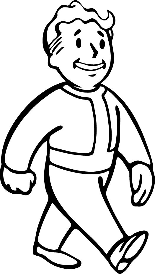
Vault Boy works because of Fallout's satirical nature I think. Him looking all happy and clean cut is what makes the other art funnier. Like when he's holding a giant plasma rifle or is glowing from too much radiation. Basically what Zeliard said.

I'm mostly apathetic towards this Eternity art so far, certainly isn't the most exciting looking stuff ever.
 

Lancehead

Member
Yeesh, I thought the previous character arts they released could've been much better had they released them in colour. But even colour can't improve these.

But since Vault Boy was brought up, and Obsidian say those are work-in-progress, I'll draw a silver line here.

Here's the earliest version of Vault Boy, called Skill Guy:

ibhRXfSxfiOGlF.jpg


Then we got this:

Vault_Boy.png
 

Dice

Pokémon Parentage Conspiracy Theorist
That character concept art looks like some random iOS or DS game. I'm pretty sure I could draw better myself. So gross.
 
Yeesh, I thought the previous character arts they released could've been much better had they released them in colour. But even colour can't improve these.

But since Vault Boy was brought up, and Obsidian say those are work-in-progress, I'll draw a silver line here.

Here's the earliest version of Vault Boy, called Skill Guy:

ibhRXfSxfiOGlF.jpg


Then we got this:

Vault_Boy.png

....

Okay.

Lance, put down the coke.

I know it's addictive.

But I can get you into a nice place called Sunset.

It's amid the beauty of the desert plains.
 

Rootbeer

Banned
Can't believe they posted this art... they clearly knew it wasn't very good and would get ripped to shreds based on the watermarking. As a backer, I'm not pleased with it at all.

Vault Boy is not to be compared to this, it's not the same. He does no represent the in-game PCs or NPCs, he's a separate thing.
 

Corto

Member
Can't believe they posted this art... they clearly knew it wasn't very good and would get ripped to shreds based on the watermarking. As a backer, I'm not pleased with it at all.

Vault Boy is not to be compared to this, it's not the same. He does no represent the in-game PCs or NPCs, he's a separate thing.

This was always the main appeal of this Kickstarter and Double Fine's to me. I get to see the creative process from start until the final product released. They want to show it, they want our feedback, and they believe we'll get a better game from it, though of course they won't please everyone in the process.
 

Lancehead

Member
Wasn't he arguing that the concept for Vault Boy was better? That's what I got.

Vault Boy looks awesome. But even if you don't agree with that, the point is, things can and often do change, for better or worse.

Can't believe they posted this art... they clearly knew it wasn't very good and would get ripped to shreds based on the watermarking. As a backer, I'm not pleased with it at all.

Vault Boy is not to be compared to this, it's not the same. He does no represent the in-game PCs or NPCs, he's a separate thing.

That's an irrelevant reason not to compare. I'm pointing out how concept art can evolve, and they're absolutely comparable in that regard.
 

subversus

I've done nothing with my life except eat and fap
What I really don't like is how huge ball looks on this chain. It's either made of plastic or the character posses some magical strenght capability because he doesn't look like a guy who could even lift such ball using both hands.
 

EVOL 100%

Member
Ugh, I always knew that the art wouldn't be good, but this is just terrible.

It's not a deal breaker or anything, I was always in for the writing and gameplay but still.. :/
 

Perkel

Banned
What is going on in this thre... oh fuck, people.

Seriously. Characters what you see are wearing default armors and weapons they will look nothing like that in game after few hours of playing.

Also they are going for more realistic approach meaning most of your posted concept art will not work in this game meaning most of common things you can get are bland armors normal looking swords etc just like in BG or IW. Special weapons armors that are uncommon will look way different.

Also Obsidian creates PE expecting what Obsidian does the best meaning story world choices and here we are we are complaining about first batch of concept art.

thisisneogaf244p45.gif


Arcanum didn't either have good art moreover it was even worse than that what we already saw and yet it was awesome game. And yet Arcanum was living and it was awesome in short hours that art lived meaning it grew on you.

What if this dude who look like aragorn is actually very very very evil dude who behaves more like thief than paladin ? What if this steel plate woman is actually very delicate and well behaved ? If we look at torment art we couldn't know how characters would behave. Swearing skull ? or Letho from witcher ? He looks like butcher but in reality he is highly intelligent and very logical.

Art should not look only good but also fit a role even if this role is to miss direct player. And from what i saw art is good. It is we saw it in form of dwarf girl and mage woman with black/white hair.
 

EVOL 100%

Member
What is going on in this thre... oh fuck, people.

Seriously. Characters what you see are wearing default armors and weapons they will look nothing like that in game after few hours of playing.

Also they are going for more realistic approach meaning most of your posted concept art will not work in this game meaning most of common things you can get are bland armors normal looking swords etc just like in BG or IW. Special weapons armors that are uncommon will look way different.

Also Obsidian creates PE expecting what Obsidian does the best meaning story world choices and here we are we are complaining about first batch of concept art.

thisisneogaf244p45.g'if


Arcanum didn't either have good art moreover it was even worse than that what we already saw and yet it was awesome game. And yet Arcanum was living and it was awesome in short hours that art lived meaning it grew on you.

What if this dude who look like aragorn is actually very very very evil dude who behaves more like thief than paladin ? What if this steel plate woman is actually very delicate and well behaved ? If we look at torment art we couldn't know how characters would behave. Swearing skull ? or Letho from witcher ? He looks like butcher but in reality he is highly intelligent and very logical.

Art should not look only good but also fit a role even if this role is to miss direct player. And from what i saw art is good. It is we saw it in form of dwarf girl and mage woman with black/white hair.

It's not just that the designs are bland though, the drawing is just poor. And Arcanum actually had some great looking portraits iirc, and while the designs of characters can be used to subvert the player's expectations, it doesn't change the fact that most of the art just looks bad to most people here.

The art seriously looks like stuff that you'd find on DeviantArt.
 

Perkel

Banned
It's not just that the designs are bland though, the drawing is just poor. And Arcanum actually had some great looking portraits iirc, and while the designs of characters can be used to subvert the player's expectations, it doesn't change the fact that most of the art just looks bad to most people here.

The art seriously looks like stuff that you'd find on DeviantArt.

There is big difference between generic and bad art. Something that looks generic doesn't mean it is bad art. For example our steel plated woman looks generic yes but it is not a bad art. Face sure isn't exiting but has some charm. As of armor design it is realistic looking one and cope with their realistic approach to world. Giving her spikes on armor or crazy design with knowledge that world is more realistic it wouldn't work well in game.

I would be scared if they would go for other art style like dragon age one or warhammer. Just thought of spiked half naked elven armor with to long cape makes me puke.

More arcanum less craziness.

Art for art is bad art in games in my opinion.
 

Prax

Member
Maybe it's just so bad and generic that it's good? XD Totally had the generic DnD vibe to me..
I'll trust that they'll make something serviceable and possibly impressive in the end though.

I think good fanart or an active fan community for the game might help. I found this piece on Deviantart (it might be the only one):

And apparently, the artist making the first concepts we saw of the companions has a DeviantArt account too: http://ravenlight.deviantart.com/
(she can certainly colour better than what the concepts might lead you to believe.. Go check her out!)


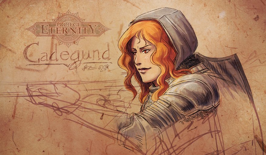
In the spirit of Project Eternity being a work-in-progress, here's my spin on Cadegund:
cadegund_by_meibatsu-d5n7ci7.jpg

I WANT to like her because she has red hair. But I just don't know..
I'm personally hoping she's debonair and sassy with a good sense of justice.
 

Phandy

Member
I tried to convince myself that it would be OK when they released the first stuff. Really not being impressed though.
I said it before; they have unlimited creative control, something every studio artist (especially concept artists) want, and they are shitting on it.

What can save this is though their environmental art. Realistically, what is going to get a lot of attention (zoomed-out-iso game) is the locations and spaces. Hopefully they really do some interesting stuff with settings, to match what they will be doing with their stories (no doubts here).

I might email them and say I'll work for free for them in my evenings. #pleasedontruinthisobsidian
 

Ledsen

Member
Maybe it's just so bad and generic that it's good? XD Totally had the generic DnD vibe to me..
I'll trust that they'll make something serviceable and possibly impressive in the end though.

I think good fanart or an active fan community for the game might help. I found this piece on Deviantart (it might be the only one):


And apparently, the artist making the first concepts we saw of the companions has a DeviantArt account too: http://ravenlight.deviantart.com/
(she can certainly colour better than what the concepts might lead you to believe.. Go check her out!)

So she really is a good artist, it just doesn't show much in these concepts.
 

HK-47

Oh, bitch bitch bitch.
Gets millions in funding for dream project

Makes most generic looking game possible

???

Yeah it kind of funny that there big pub games, even the ones from the king of all generic fantasy in Forgotten realms, are worlds more interesting from a design standpoint.
 

Perkel

Banned
Maybe it's just so bad and generic that it's good? XD Totally had the generic DnD vibe to me..
I'll trust that they'll make something serviceable and possibly impressive in the end though.

I think good fanart or an active fan community for the game might help. I found this piece on Deviantart (it might be the only one):


And apparently, the artist making the first concepts we saw of the companions has a DeviantArt account too: http://ravenlight.deviantart.com/
(she can certainly colour better than what the concepts might lead you to believe.. Go check her out!)


In the spirit of Project Eternity being a work-in-progress, here's my spin on Cadegund:
cadegund_by_meibatsu-d5n7ci7.jpg

I WANT to like her because she has red hair. But I just don't know..
I'm personally hoping she's debonair and sassy with a good sense of justice.

Your take on this is superb.

Yeah it kind of funny that there big pub games, even the ones from the king of all generic fantasy in Forgotten realms, are worlds more interesting from a design standpoint.

Let's not make a decision upon early concept art. This may be just general approach to their art-style and how they will create characters or what fantasy they target (low-high) They may change a lot in 2 years.

From looks of it they target low fantasy and i'm happy about it.

Gets millions in funding for dream project

Makes most generic looking game possible

???

Pledge because he want Obsidian to do anything they want
Complain
 

Prax

Member
I tried to convince myself that it would be OK when they released the first stuff. Really not being impressed though.
I said it before; they have unlimited creative control, something every studio artist (especially concept artists) want, and they are shitting on it.

What can save this is though their environmental art. Realistically, what is going to get a lot of attention (zoomed-out-iso game) is the locations and spaces. Hopefully they really do some interesting stuff with settings, to match what they will be doing with their stories (no doubts here).

I might email them and say I'll work for free for them in my evenings. #pleasedontruinthisobsidian

WHAT IF YOU DO GET IN AND THEN WHATEVER SECRET PROCESS THEY HAVE MAKES ALL YOUR STUFF A SOURCE OF COMPLAINTS TOO?! XD

So she really is a good artist, it just doesn't show much in these concepts.
I think so... Maybe these pieces are rush jobs just to get the general characters and equipment down? Tweaking when things are finally put together, and then actual nice and impressive pieces can be made so fans don't lament about how the game looks nothing like the amazing concept art? One can hope!
 

Perkel

Banned
WHAT IF YOU DO GET IN AND THEN WHATEVER SECRET PROCESS THEY HAVE MAKES ALL YOUR STUFF A SOURCE OF COMPLAINTS TOO?! XD


I think so... Maybe these pieces are rush jobs just to get the general characters and equipment down? Tweaking when things are finally put together, and then actual nice and impressive pieces can be made so fans don't lament about how the game looks nothing like the amazing concept art? One can hope!

That is what early concept art is. And we know that is early concept art.
 

Phandy

Member
WHAT IF YOU DO GET IN AND THEN WHATEVER SECRET PROCESS THEY HAVE MAKES ALL YOUR STUFF A SOURCE OF COMPLAINTS TOO?! XD

Honestly, its completely feasible that she is just getting really bad art direction and poor story/descriptions etc from the writers and so on.
Thats more of why I see it as a collective problem. Writers coming up with poor descriptions and ideas, limits the artist. She clearly isn't that great of a designer or artist, but that doesn't matter if you have some really cool/good initial direction. The overall direction seems limiting.

So far that original painting of a dwarf ranger is the only thing that shows any creativity. And the nice wallpaper was done freelance by a pro illustrator.
 

Zaptruder

Banned
My hope is that they'll take on board the fan feedback and continue to keep us in the loop as part of an iterative development process.

I mean, if you have creative freedom and the ability to break outside the existing mold of development, you might as well use that opportunity to create a higher quality product than just you alone could manage.


Edair's base concept isn't a terrible idea. Aragorn style character. But the execution leaves much to be desired.

The nicely rendered fan art of the female priest in plate is giving the character and interesting edge. I would hope that the final art is of an equal or better quality to what we see there.
 

Ledsen

Member
What I really don't like is how huge ball looks on this chain. It's either made of plastic or the character posses some magical strenght capability because he doesn't look like a guy who could even lift such ball using both hands.

If you read the update (or even look at the pic: "Medicine Ball +4" it's pretty obviously a joke.
 

Phandy

Member
That is what early concept art is. And we know that is early concept art.

Generally early concept art works the other way.
You have the most interesting and varied stuff at the beginning. And slowly tune/tone/refine everything so that it comes closer together to form a coherent direction. Early stuff might not be very refined or good, but it should still have all your interesting and strong characteristics in there, albeit roughly.
 

Forkball

Member
People bashing Vault Boy? the hell GAF

I always assumed it was supposed to look like the old Balder's Gate games. I mean, it's not like Obsidian are pioneers of character design or aesthetics, people like them for their detailed gameplay and unique stories.
 

saxman717

Banned
Can't believe how gushing and kiss #@! they are on the official forums ---- people are just eating up this concept art. How can anyone be excited and inspired over this? They are either the definition of blind fans or are forum plants (conspiracy!!! LOL)
 

Phandy

Member
Can't believe how gushing and kiss #@! they are on the official forums ---- people are just eating up this concept art. How can anyone be excited and inspired over this? They are either the definition of blind fans or are forum plants (conspiracy!!! LOL)

They spent some of the money that was designated for concept artists on forum plants, and then pocketed the change! Thieves!!!
 
Also, isn't this you know an ADVANTAGE of KS that the developers must share their WIP early to the fans so that the fans can signalize ASAP that it looks like shit?

This exactly happened here.
 

EVOL 100%

Member
I've enjoyed the last 3 pages discussion immensively but I fear the consensus is that Fantasy-Medieval art looks good if it is "bad-ass" as the 80's Power Metal lizard pictured above.

In a technical point of view there's nothing wrong with that picture. Can't say the same for Eternity. It's just bad all around.

Again, I was never asking for good art in Eternity, the appeal was always on the writing and gameplay. I'm still superhyped for this game but the art could be a lot better.
 

Lime

Member
Can't believe how gushing and kiss #@! they are on the official forums ---- people are just eating up this concept art. How can anyone be excited and inspired over this? They are either the definition of blind fans or are forum plants (conspiracy!!! LOL)

Official forums are always fettered with mindless uncritical sycophants.
 

thefil

Member
I've enjoyed the last 3 pages discussion immensively but I fear the consensus is that Fantasy-Medieval art looks good if it is "bad-ass" as the 80's Power Metal lizard pictured above.

Definitely seems like the consensus.

Also, isn't this you know an ADVANTAGE of KS that the developers must share their WIP early to the fans so that the fans can signalize ASAP that it looks like shit?

This exactly happened here.

No. In reality, the advantage of KS is that the developers have no obligation to publishers OR fans, and can produce a game following their vision instead of the whims of external influence.
 

Alexios

Cores, shaders and BIOS oh my!
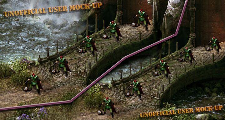
Looks okay to me, I won't even be able to see them well from the IE style camera angle anyway (I think that fan mock up still has the character scale too large, there will probably be room for a couple characters side by side on those bridges, not just one). The BG and most other IE games didn't exactly have supreme character art in-game regardless of any concept art (and cool portraits). Fallout too. Vault Boy wasnt an in game character, just a mascot. Maybe this one will have cute mascots too. That wouldn't suddenly fix your issues with the actual characters. But yeah, not really what the games are about. And I'm personally glad they don't spend all their budget on intricate paintings taking the artist days if not weeks each that we'll never see in game anyway. The in game art will be the same whether the concept art is simple like this or with insanely detailed atmospheric full scenes. Wasteland 2 in game material has fallen short of the crazy good concept art so far for example. But I certainly wouldn't say no to some more unique looking armor designs. But that's about it as far as complaints go for me. Characters will be great for their writing, not because the world they live in has or doesn't have an awesome sense of style for military gear.
 
Top Bottom