• Hey, guest user. Hope you're enjoying NeoGAF! Have you considered registering for an account? Come join us and add your take to the daily discourse.

Pillars of Eternity by Obsidian Entertainment (Kickstarter) [Up: Teaser]

Enduin

No bald cap? Lies!
It's work in progress, people should chill.

I think Evilore said it as well as anyone could.

Concept art sets the tone. It directs the imagination of the team, sits in the back of your mind when you're writing for these characters and also completes your visualization when you're eventually playing as them in low poly 3d form. It's very important. It's not there for PE in any capacity.

It's not simply people freaking out because it looks bad and they want good art just to have it, but because this type of early, normally high concept, art can have a rather broad impact on the game. People want to see high quality and most importantly inspiring concept art to not just get themselves excited about the game and what possibilities it holds, but also that it inspires the creators as well and fuels that enthusiasm and creativity down the line.

Showing this to us just does not inpsire confidence, the game probably won't suck as a result, and the end product will probably look good, but right now this is all we have and a lot of us really wish it were something better so we could believe that whatever else they've got cooking up in there is also great, but we don't, so we can't. First(ish) impressions and all that.
 

Dennis

Banned
If this concept art was from a small European RPG developer GAF would be laughing its collective ass off.

Instead we have people going "oooh aaah in Obsidian we trust"
 

Sinatar

Official GAF Bottom Feeder
This episode gives me a new perspective on why publishers are so protective of what they show and don't show.

Yea no kidding, this thread has gotten ridiculous.

If this concept art was from a small European RPG developer GAF would be laughing its collective ass off.

Instead we have people going "oooh aaah in Obsidian we trust"

Yes because this theoretical small european studio would be releasing concept art 3 weeks into development.

They are giving you guys a window into the development process and you're shitting all over them. Don't expect much in the future.
 

subversus

I've done nothing with my life except eat and fap
This episode gives me a new perspective on why publishers are so protective of what they show and don't show.

yep. Most people can't get their heads around development. It's not their problem, they were raised in cosumer's society where everything is presented in the final form available for purchase.


BUT

In this case I won't agree with you. We Wasteland II for comparison and concept art there has been superb so far. They have a badass concept artist though and real talent is rare. So Wasteland II can be an exception from the rule.
 

.la1n

Member
If this concept art was from a small European RPG developer GAF would be laughing its collective ass off.

Instead we have people going "oooh aaah in Obsidian we trust"

Who is GAF? Have I met him / her?

Personally I don't trust Obsidian, unless you mean trusting them to release a bug ridden game.
 

zkylon

zkylewd
They should have put up the giant signs on the original character artworks they released then, because it looks to me like Obsidian is using them as points of departure for their 3D modelling.
We’ve been making test characters--we call them gray characters.
Test characters based on WIP concept art during the pre-production phase of a project that's two years from completion.

Bioshock's plot was written 6 months prior to release, this stuff changes, game development is an iterative process... you can't seriously think that the character designs are gonna stay the same they were on a promotional pic made in the Kickstarter rush?

edit: Obsidian should really take notice and only release stuff that's at least acceptable. This is way too rough and amateurish, no doubt.
 

Dennis

Banned
Yea no kidding, this thread has gotten ridiculous.


Yes because this theoretical small european studio would be releasing concept art 3 weeks into development.

They are giving you guys a window into the development process and you're shitting all over them. Don't expect much in the future.

Concept art shown to the public is not some new and novel thing. The issue here is that the concept art in question is bad and very generic.
 

Lime

Member
They are giving you guys a window into the development process and you're shitting all over them. Don't expect much in the future.

How is feedback and criticism undesirable? Especially for something that is funded through Kickstarter? Obsidian do have artistic integrity and all, but I don't see why we have to censor ourselves because we have to be oh-so-grateful for any information or indication of where the game is going.
 

subversus

I've done nothing with my life except eat and fap
Bioshock's plot was written 6 months prior to release, this stuff changes, game development is an iterative process... you can't seriously think that the character designs are gonna stay the same they were on a promotional pic made in the Kickstarter rush?

the problem is that while concept art changes the level of its execution may not. Every piece of concept art from The Witcher 2 could make into the game but was deemed as not really appropriate for some reason but not because of its execution. What we have here isn't suitable for such project. The artist should really up her game or take more time with her sketches.

Or they can stop showing what is meant to be some point of reference and nothing more.
 

Raging Spaniard

If they are Dutch, upright and breathing they are more racist than your favorite player
I know you guys are going nuts because you have little else to go on, but all this knee jerk feedback is the last thing a concept artist wants to hear.

Pretty art very often is NOT good concept art. I agree that so far these designs are not exciting but a lot of you are mistaking marketing art with concept art.
 
Going off the mockup - if they can animate it well and make lighting/environment changes work well, and provide a wide range of gear changes that update the model appearance...

then I think the game will look significantly better than what the lower than average character concept art has alluded to... as in, I think it'll be the best looking isometric style RPG to date.

Yeah, that fan-mockup looks really good, and I don't think it's too big of a stretch to expect the actual game to look even better with the dynamic lightning/shadows they've been talking about and stuff.

Probably going to be the best looking isometric RPG, I agree.
 

subversus

I've done nothing with my life except eat and fap
I know you guys are going nuts because you have little else to go on, but all this knee jerk feedback is the last thing a concept artist wants to hear.

Pretty art very often is NOT good concept art. I agree that so far these designs are not exciting but a lot of you are mistaking marketing art with concept art.

have you seen The Witcher 2 concept art book? It has tons of sketches. Like scenes where perspective lines are drawn. And it still looks interesting and pretty even though it's very basic.

Well, we'll see what they can do.
 

Dennis

Banned
Don't do Kickstarters if you can't deal with customer feedback.

I have praised the released concept background art to the skies.

Warning them that the art direction they have chosen for the characters so far comes off as very generic serves the same purpose as the above praise - to help them get a feel for what this fan want and don't want.
 

zkylon

zkylewd
the problem is that while concept art changes the level of its execution may not. Every piece of concept art from The Witcher 2 could make into the game but was deemed as not really appropriate for some reason but not because of its execution. What we have here isn't suitable for such project. The artist should really up her game or take more time with her sketches.

Or they can stop showing what is meant to be some point of reference and nothing more.
Clearly Obsidian's been very naive with their showing of concept art, specially when you compare it to the godly stuff we've seen from Wasteland 2 and the bits we got from the DFA videos. This is the gross part of how the sausage is made, some people may not like it, I've worked on games a bit to have seen that sometimes people draw really hideous stuff and then you see it get better and better until it's great, so I'm not all that frightened by it. Sometimes, though, it's gold from the start, like with Wasteland 2, but that's the exception rather than the rule, and they have that guy dedicated to doing promotional stuff, which is maybe what Obsidian should do.

The style of this game has never really been too inspiring for me, though, the high fantasy setting, taking Baldur's Gate as reference instead of Torment or Arcanum or Fallout, the concept art, it all screams generic, but it's only been two, three months of development, there's tons of time for that to get fixed.

Don't do Kickstarters if you can't deal with customer feedback.

I have praised the released concept background art to the skies.

Warning them that the art direction they have chosen for the characters so far comes off as very generic serves the same purpose as the above praise - to help them get a feel for what this fan want and don't want.
This is the right attitude, I'll be the first to say these new pics look like trash, I just take offense with people wanting to withdraw their pledges because they don't like the latest picture.
 

Lancehead

Member
Don't do Kickstarters if you can't deal with customer feedback.

I have praised the released concept background art to the skies.

Warning them that the art direction they have chosen for the characters so far comes off as very generic serves the same purpose as the above praise - to help them get a feel for what this fan want and don't want.

I think the feedback they're going to get from this is not to show early versions of any work.
 

saxman717

Banned
Don't do Kickstarters if you can't deal with customer feedback.

I have praised the released concept background art to the skies.

Warning them that the art direction they have chosen for the characters so far comes off as very generic serves the same purpose as the above praise - to help them get a feel for what this fan want and don't want.

Agree 100% ---- I will stick to my warning that if they take any of their currently-released character artwork and carry it forward in actual game development, they will merely be trying to polish their own turds from this point forward. For this to have any hope at greatness, they need to fire their current concept artist (intern from China? read the update and that's what it sounds like......) and hire someone competent and creative.
 
What exactly is the point of feedback if all you are allowed to say is "great, its all great!" ?

Feedback.

That word.

I don't think it means what you think it means.

they need to fire their current concept artist (intern from China? read the update and that's what it sounds like......)

... what?

Not only does that sound incredibly racist ("we don't need no stinkin' Chinaman working on our Western RPGs! He probably doesn't even speak the same language as the rest of the team, being an intern and all!"), but that's also not at all what the passage describing James sounds like. And Dmitri is James' boss. Should we fire the Russian as well?

He might be a spy.
 

zkylon

zkylewd
Agree 100% ---- I will stick to my warning that if they take any of their currently-released character artwork and carry it forward in actual game development, they will merely be trying to polish their own turds from this point forward. For this to have any hope at greatness, they need to fire their current concept artist (intern from China? read the update and that's what it sounds like......) and hire someone competent and creative.
Their concept artist is a professional artist that's worked at least on Uncharted 2 and Clone Wars (game? series? idk) and looking through her site, she seems to be much much better at backgrounds than characters, which might explain why we see such difference between the two.

Probably the right move would be to move her to do background art while have a dedicated character artist that's just better at it.

Her site: http://www.polinadesign.com/
 

Enduin

No bald cap? Lies!
What exactly is the point of feedback if all you are allowed to say is "great, its all great!" ?
Feedback.

That word.

I don't think it means what you think it means.

But they are getting feedback, most people are not acting all apocalyptic. The majority are simply saying shit art is shit, which might not seem that constructive, but while crude it still does the job of letting them know people expect better. Still then a good few others are expounding on that sentiment and offering why they want to see better art and some pieces they think are good examples, including Obsidian's own work for the same project. Only a small portion are actually acting like the games gone to shit and was never worth funding and is doomed for all time.
 

embalm

Member
All the hate here is very surprising.

Concept art changes constantly, details are added, the units are broken down into bits and built back up. Everything is considered and then they drop some stuff and keep other stuff. This is so ridiculiously early in the development process that anything more than stick figures is pretty impressive.

In my game the first pieces of art for our Praetorian looked like this.
Then the final concept ended up like this.
Which has resulted in a half finished sprite that looks like this.

Give your feedback to them, it's all helpful, but be aware that sometimes when you make so much noise about something that is going to change 10 times anyways you just look silly.
 

Dennis

Banned
All the hate here is very surprising.

Concept art changes constantly, details are added, the units are broken down into bits and built back up. Everything is considered and then they drop some stuff and keep other stuff. This is so ridiculiously early in the development process that anything more than stick figures is pretty impressive.

In my game the first pieces of art for our Praetorian looked like this.
Then the final concept ended up like this.
Which has resulted in a half finished sprite that looks like this.

Give your feedback to them, it's all helpful, but be aware that sometimes when you make so much noise about something that is going to change 10 times anyways you just look silly.

I judge what they put in front of my eyeballs. I have no reason to be critical just for the sake of being critical.

If they release new concept art og in-game characters that look great I will be the first to say so.
 

saxman717

Banned
Feedback.

That word.

I don't think it means what you think it means.


... what?

Not only does that sound incredibly racist ("we don't need no stinkin' Chinaman working on our Western RPGs! He probably doesn't even speak the same language as the rest of the team, being an intern and all!"), but that's also not at all what the passage describing James sounds like. And Dmitri is James' boss. Should we fire the Russian as well?

He might be a spy.

Race card --- seriously? I won't waste time defending myself from being as far from a racist as possible. I'll just go directly to t he Project Update:


"Our other Character Artist; James is from China, but says he's from Fresno. He is essentially Dimitri's slave and willingly does whatever he’s told to do, because he doesn’t have to write documents. I sometimes give James direction, but I’m pretty certain that Dimitri tells him to ignore me immediately after I’ve left their office. Remember Dimitri is Russian, so he’s a little controlling, very direct and has high expectations. This isn’t a problem, however, because a) it’s his job and b) it just so happens that James is pretty good and making characters. He made our first character Edair, who can be seen running around with a morning star flail the size of a medicine ball--not his fault. He seems to know Maya better than Dimitri, but let’s his boss learn the hard way--keeping his ear buds in, pumping up the volume, and modeling and texturing his cares away. He’s making gray weapons now. For some reason Dimitri speaks Russian expletives perfectly."


EdairInGameModel.jpg


This guy, apparently an underling, was responsible for a turd of a character (whom they are praising as awesome), the ridiculously generic bearded hero with short sword. I can't believe this guy got paid to produce that character and that he is actually getting praised by the devs. We know who is responsible for at least one of the terribly lazy, uninspired and cliche characters. He should not be allowed to make any more and his previous work should be scrapped. Sorry to be blunt, but it is painfully obvious and I would really like to see this project become a masterpiece.
 
Maybe it's just so bad and generic that it's good? XD Totally had the generic DnD vibe to me..
I'll trust that they'll make something serviceable and possibly impressive in the end though.

I think good fanart or an active fan community for the game might help. I found this piece on Deviantart (it might be the only one):


And apparently, the artist making the first concepts we saw of the companions has a DeviantArt account too: http://ravenlight.deviantart.com/
(she can certainly colour better than what the concepts might lead you to believe.. Go check her out!)


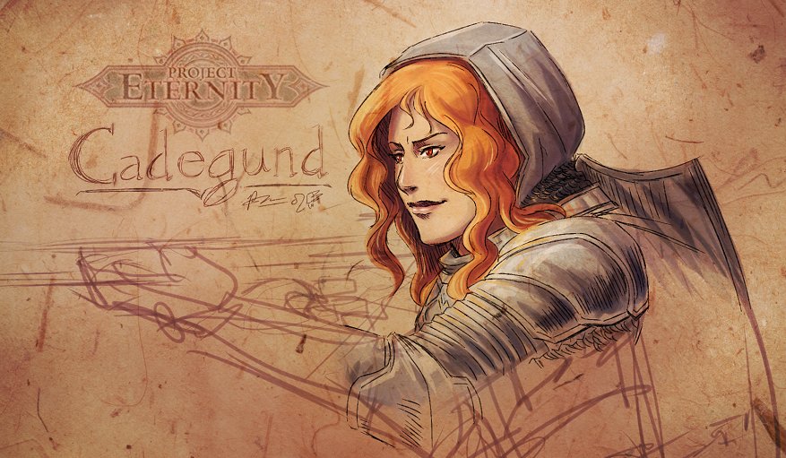
In the spirit of Project Eternity being a work-in-progress, here's my spin on Cadegund:
cadegund_by_meibatsu-d5n7ci7.jpg

I WANT to like her because she has red hair. But I just don't know..
I'm personally hoping she's debonair and sassy with a good sense of justice.

It looks like she is just rushing out her concept designs based on that. But I do think some people are going a little overboard on this. Most of these sketches are marked as WIP's and won't most of the game models end up being rendered using computer 3D anyway?

But cool fan art you did. Finish the gun, dammit.
 

inm8num2

Member
Best thing for people to do would be to post in the update threads on Obsidian's forums and present the criticisms there, since the comments posted here most likely will not reach the team.
 

GlassBox

Banned
Again, the reason I'm concerned is that the concept art is kind of validating what JE Sawyer has stated about creating things that are "weird" or "alien" and to me, it seems that so far, going by what's been revealed and the WIP art, that they're trying to go for a style that is as "inoffensive" and "generic" as possible when it comes to the characters especially.

Sawyer pretty much stated that a non-human main character or protagonist group wouldn't be done because it wouldn't sell.
 

Lancehead

Member
Again, the reason I'm concerned is that the concept art is kind of validating what JE Sawyer has stated about creating things that are "weird" or "alien" and to me, it seems that so far, going by what's been revealed and the WIP art, that they're trying to go for a style that is as "inoffensive" and "generic" as possible when it comes to the characters especially.

Sawyer pretty much stated that a non-human main character or protagonist group wouldn't be done because it wouldn't sell.

I maybe forgetting things here, but can you find that quote, especially your second assertion? I remember him saying that not everyone likes non-conservative designs because they may find it hard view it as a fantasy setting.

Edit: Found the quote I'm talking about:

Why is the art style/direction so conservative. This is your chance to make your own IP, something unique and beautiful, yet its the same Medieval Europe with Elves and Dwarves that everyone is sick of.

I don't think everyone is sick of conservative weapon and armor design. While Planescape: Torment had wild 'n wacky designs for everything, the other IE games all illustrated characters, weapons, and armor with fairly normal proportions and understated stylization (exception: Sarevok and/or Jon Irenicus).

Also, the pendulum swings both ways on this topic. I worked on a fantasy setting that had a pretty unusual art style (well, the whole setting was unusual). The people who liked it really loved it, but a lot of people really didn't like it (even if they appreciated the aesthetics of it). Part of the reason was because the unusual choices of characters, equipment, and landscape made it difficult for a person to look at a scene and think, "This is a fantasy setting."

Personally, I like that ambiguity, but not everyone does.

http://www.formspring.me/JESawyer/q/374937522343528900
 

Nirolak

Mrgrgr
Contrast the insanely gorgeous background art with this new terribad character art


Crazy
If this concept art was from a small European RPG developer GAF would be laughing its collective ass off.

Instead we have people going "oooh aaah in Obsidian we trust"
I judge what they put in front of my eyeballs. I have no reason to be critical just for the sake of being critical.

If they release new concept art og in-game characters that look great I will be the first to say so.
Yeah, I was incredibly positive about the environmental art, but have frequently felt that characters are a notable weak spot for the company.

That they actually seem to be getting worse in that department is disappointing, since environmental art wise they seem to be taking a large step up here.

What exactly is the point of feedback if all you are allowed to say is "great, its all great!" ?
And exactly this. I react positively to whatever I feel is positive, and negatively to whatever I feel is negative.

If you don't, how would anyone ever be able to receive honest feedback? The goal here should be to make something as good as possible, not to ignore any faults and just praise everything carte blanche.
 

Perkel

Banned
Again, the reason I'm concerned is that the concept art is kind of validating what JE Sawyer has stated about creating things that are "weird" or "alien" and to me, it seems that so far, going by what's been revealed and the WIP art, that they're trying to go for a style that is as "inoffensive" and "generic" as possible when it comes to the characters especially.

Sawyer pretty much stated that a non-human main character or protagonist group wouldn't be done because it wouldn't sell.

There is a lot of high fantasy in gaming market from FFs to darksiders crazy to big armor design going realistic low fantasy is imo way better to tell serious story that will correspond with people playing it.

I don't understand also how people can review their artstyle choice without not playing game. They clearly said that they are trying to do here BG/IW with PT story dialogs with feel of IE games.

PT wasn't fucking amazing because it had weird world but because MCA story. Sure world in that game is interesting like sensates but overall it's dialogs and story did wow factor rather than world itself.

Anarchox was another one. Sure world was crazy but actual characters were the one that pushed game to awesome level.

With PE they are trying to do similar world to Witcher and Games of Thrones and i don't see what is wrong with that especially if we didn't saw yet this world.

This world look more like Arcanum and i'm all good with that.
 

rope kid

Member
Edair is an ordinary guy, but Edair is not indicative of all characters. He isn't designed the way he is because I think "that's cool", but because it fits his character. He is an unassuming man who tries to keep a low profile. Other wilder/more exotic/unusual characters will be available (and you can make them on your own).

We started modeling Edair first in part because he is a very straightforward character. The problems we are trying to solve in modeling are not related to how cool the character can look, but to how we have to build and export characters in Maya, then into Unity. For such purposes, often the more straightforward characters are better because they're "neutral". Chain mail and leather not make you hop out of bed and scream OWOOOOOGA! but they're things we're pretty likely to have to create and they pose actual challenges for us when it comes to building and rendering it.

Someone compared the painted portrait of Sagani to the line art of Sagani. You can certainly compare them, but they're made for different purposes. Line art drawings like the ones Polina has done will probably never appear in the game. They're made as reference. Any coloring done after the fact is mostly just to give a sense of volume to the character and his/her gear. The painting of Sagani is a great portrait and we'd like all of our portraits to be that good and in a similar style -- but no one is going to build Sagani from the painting of her. She's in a cool pose with a determined expression, but you're mostly looking at her back and side.

I understand that people want to see more art, better art, and more unusual art. We will make it. It has always been our intention to do so, but a lot of the problems we're trying to solve right now are logistical, not quality-related, and while paintings like the one of Sagani or even the wallpaper of the whole party are exciting and beautiful, they don't necessarily help us build the game right now.

Thanks for all of your feedback.
 
There is a lot of high fantasy in gaming market from FFs to darksiders crazy to big armor design going realistic low fantasy is imo way better to tell serious story that will correspond with people playing it.

Agree, in this particular case I rather have an unimpressive but grounded low fantasy style than the next Yoshitaka Amano (as amazing as that sounds). But I don't think most of the criticism here claims otherwise, it wouldn't be Compared to Dark Souls or The Witcher 2 if this wasn't the case.
 

zkylon

zkylewd
I maybe forgetting things here, but can you find that quote, especially your second assertion? I remember him saying that not everyone likes non-conservative designs because they may find it hard view it as a fantasy setting.

Edit: Found the quote I'm talking about:


http://www.formspring.me/JESawyer/q/374937522343528900
It might be a mistake commercially to do something weird but I sure would've loved it. Even if they ramped up the quality of the character designs I'm still not thrilled with such a traditional look. Dark Souls and The Witcher are both noticeably rooted in fantasy tropes but still manage to look very much like their own thing. I hope they can steer the art style a bit towards something more distinctive.
 

Lime

Member
Sawyer pretty much stated that a non-human main character or protagonist group wouldn't be done because it wouldn't sell.

...

Then why the fuck do a Kickstarter? Isn't the purpose of the project to create something unrestricted by financial concerns?
 

Perkel

Banned
Yeah, I was incredibly positive about the environmental art, but have frequently felt that characters are a notable weak spot for the company.

That they actually seem to be getting worse in that department is disappointing, since environmental art wise they seem to be taking a large step up here.


And exactly this. I react positively to whatever I feel is positive, and negatively to whatever I feel is negative.

If you don't, how would anyone ever be able to receive honest feedback? The goal here should be to make something as good as possible, not to ignore any faults and just praise everything carte blanche.

This is valid as you said but you should also take note it is:

1) early work far from being done (especially this recent black and white comix style mage)
2) it's 2D isometric game which will point that most of those concept art will end up as small 3D models. Meaning creating super detailed models won't matter to overall look. Because most of what you see will be just larger details.

I'm pretty sure that Sawyer wanted to include those 2D events from Darklands. That would probably the only place where concept art would matter.
 

Lancehead

Member
I understand that people want to see more art, better art, and more unusual art. We will make it. It has always been our intention to do so, but a lot of the problems we're trying to solve right now are logistical, not quality-related, and while paintings like the one of Sagani or even the wallpaper of the whole party are exciting and beautiful, they don't necessarily help us build the game right now.

This certainly explains a few things.
 

Perkel

Banned
Edair is an ordinary guy, but Edair is not indicative of all characters. He isn't designed the way he is because I think "that's cool", but because it fits his character. He is an unassuming man who tries to keep a low profile. Other wilder/more exotic/unusual characters will be available (and you can make them on your own).

We started modeling Edair first in part because he is a very straightforward character. The problems we are trying to solve in modeling are not related to how cool the character can look, but to how we have to build and export characters in Maya, then into Unity. For such purposes, often the more straightforward characters are better because they're "neutral". Chain mail and leather not make you hop out of bed and scream OWOOOOOGA! but they're things we're pretty likely to have to create and they pose actual challenges for us when it comes to building and rendering it.

Someone compared the painted portrait of Sagani to the line art of Sagani. You can certainly compare them, but they're made for different purposes. Line art drawings like the ones Polina has done will probably never appear in the game. They're made as reference. Any coloring done after the fact is mostly just to give a sense of volume to the character and his/her gear. The painting of Sagani is a great portrait and we'd like all of our portraits to be that good and in a similar style -- but no one is going to build Sagani from the painting of her. She's in a cool pose with a determined expression, but you're mostly looking at her back and side.

I understand that people want to see more art, better art, and more unusual art. We will make it. It has always been our intention to do so, but a lot of the problems we're trying to solve right now are logistical, not quality-related, and while paintings like the one of Sagani or even the wallpaper of the whole party are exciting and beautiful, they don't necessarily help us build the game right now.

Thanks for all of your feedback.

Now GAF apologize. Sawyer you are the man :)
 

zkylon

zkylewd
Edair is an ordinary guy, but Edair is not indicative of all characters. He isn't designed the way he is because I think "that's cool", but because it fits his character. He is an unassuming man who tries to keep a low profile. Other wilder/more exotic/unusual characters will be available (and you can make them on your own).

We started modeling Edair first in part because he is a very straightforward character. The problems we are trying to solve in modeling are not related to how cool the character can look, but to how we have to build and export characters in Maya, then into Unity. For such purposes, often the more straightforward characters are better because they're "neutral". Chain mail and leather not make you hop out of bed and scream OWOOOOOGA! but they're things we're pretty likely to have to create and they pose actual challenges for us when it comes to building and rendering it.

Someone compared the painted portrait of Sagani to the line art of Sagani. You can certainly compare them, but they're made for different purposes. Line art drawings like the ones Polina has done will probably never appear in the game. They're made as reference. Any coloring done after the fact is mostly just to give a sense of volume to the character and his/her gear. The painting of Sagani is a great portrait and we'd like all of our portraits to be that good and in a similar style -- but no one is going to build Sagani from the painting of her. She's in a cool pose with a determined expression, but you're mostly looking at her back and side.

I understand that people want to see more art, better art, and more unusual art. We will make it. It has always been our intention to do so, but a lot of the problems we're trying to solve right now are logistical, not quality-related, and while paintings like the one of Sagani or even the wallpaper of the whole party are exciting and beautiful, they don't necessarily help us build the game right now.

Thanks for all of your feedback.
Cool, good to hear that as expected this isn't indicative of final quality.

Welcome to GAF by the way lol
 

Lancehead

Member
It might be a mistake commercially to do something weird but I sure would've loved it. Even if they ramped up the quality of the character designs I'm still not thrilled with such a traditional look. Dark Souls and The Witcher are both noticeably rooted in fantasy tropes but still manage to look very much like their own thing. I hope they can steer the art style a bit towards something more distinctive.

It's not so much about commercial factors as it's about the fact that even among the backers (80000 or so so-called hardcore RPG fans) people have varying tastes, and some of them are more comfortable with conservative style.

...

Then why the fuck do a Kickstarter? Isn't the purpose of the project to create something unrestricted by financial concerns?

I'm pretty sure Sawyer didn't say that.
 
Top Bottom