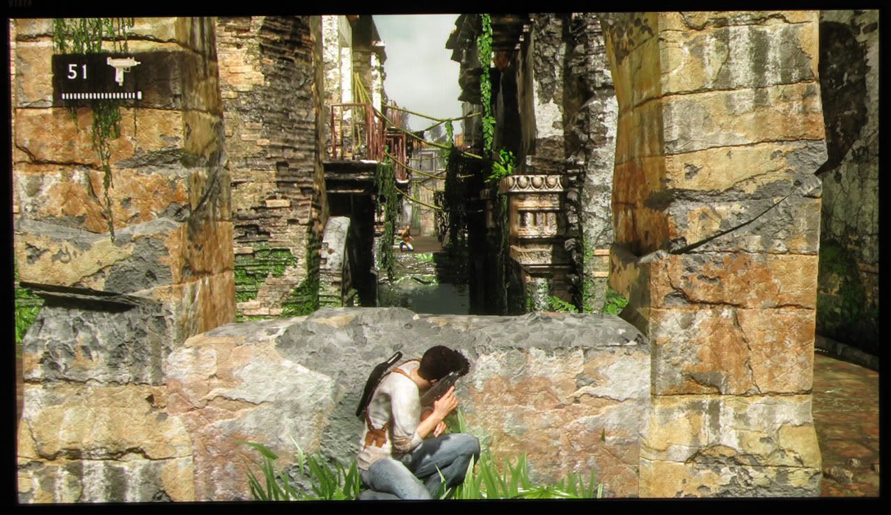
I agree that Killzone is a graphical beast. I love the little details in the game, such as a flag blowing in the wind. The little touches really help distinguish a game's visuals.
Insomniac has the gist of the graphics right, but where they need to improve is by adding variation through texturing, filters, and shaders. They are too geometry heavy when it comes to creating an interesting image. Resistance is a perfect example... You'll have areas that look awesome because you can see geometry everywhere (later in the game), but the small rooms looked awful because there wasn't a ton of geometry to throw around in there. The rooms ended up being relatively empty. What they could've done in those rooms was use texturework to add all kinds of variations within.
I believe Insomniac has the core graphics right. R1 was kind of stuck inbetween the cartoony type games Insomniac was accustomed to making and a more serious tone, but R2 seems to be upping the grit a good bit, which is excellent. Where they DO need to improve in in is the small details part, for example, varying up the textures, adding various details to the ground, filters such as maybe motion blur, use different shaders to give metal things a sheen. Hopefully they can get in contact with the Killzone guys and steal the metal code off of them. The metal on the rocket launcher for that game is amazing. Add some sort of bloom lighting in that window. Those rays coming through look awfully weak. Looking at the movie they released, it looks amazing, but small details will make it really pop. For example, there should be sparks flying everywhere after the Chimera plasma blasts hit the truck, and the truck should rock back and forth from the impact of the bullets. I'd also like to see a few more puffs of dust about as bullets hit the ground. They are doing an amazing job overall, but it's just the small details and texture storytelling that need more work. Let me see some rust, dust, dings and dents on that truck.
http://i35.tinypic.com/2e4m2zb.gif
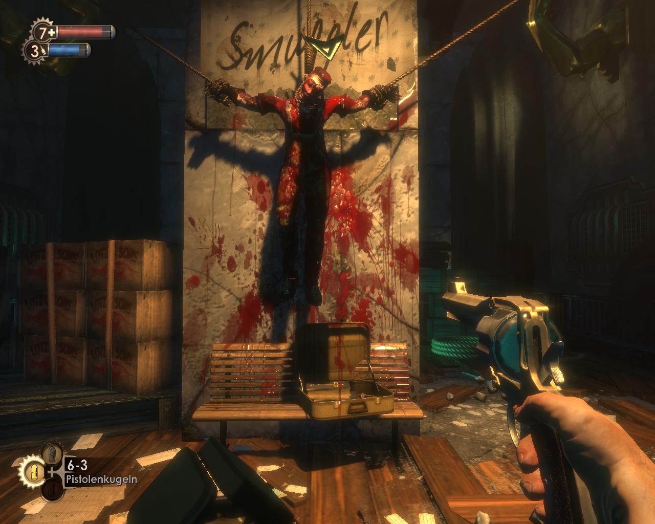
Bioshock is a perfect example of what I'm talking about. Look at all the variation there. It just looks interesting. There is so much going on and so much detail there. Papers littering the ground, blood on the walls, spraypaint, the briefcase with blood dripping down it.
http://whatspikelikes.files.wordpress.com/2008/03/bioshock200708261254317yr0.jpg
Here go a few images to demonstrate what I was talking about with the original Resistance. A lot of the drab moments were usually the indoor environments. There just needs to be more variation to make each place look unique. I hate that feeling of, "Oh, here I go down another generic corridor again."
For example, this looks amazing because there is a ton of geometry everywhere:
http://ps3media.ign.com/ps3/image/article/745/745206/resistance-fall-of-man-20061110064419046.jpg
But this is a bit boring:
http://ps3media.ign.com/ps3/image/a...stance-fall-of-man-20071115030603664_640w.jpg
In summation, what I'm really trying to say is that environments should tell just as much of a story as the characters. In that Bioshock picture, I can tell that you are in the domain of a psychopath. That Bioshock picture is an example of varying up the textures, shaders, etc., to create an interesting image in smaller, more intimate settings. This is where I believe Insomniac can make the greatest improvement. I want to see more environmental story telling from resistance 2. For example, as you start the game, you see much of the normal human architecture... Everything where it's supposed to be. As you progress, you start to see how the Chimera have really interacted with the environment... Scratches and blood dripping off the wall, graffitti in the Chimeran language, a human skull being used as a cup by the Chimera, broken vases, bottles, ripped up magazines, etc. I want the environments to tell more of a story. I want to be able to tell how the humans lived when I visit the environment, and I definitely want to be able to tell how the Chimerans lived when I travel through some new area.
The one thing I always admired about Insomniac is their willingness to listen to their fans. I'm sure they will improve the visuals by a good bit by the time the game is released. Where I give them a lot of credit for taking the consideration of the fans in account is through the addition of a significant level of gore. It makes the game look so much more interesting and gritty.


