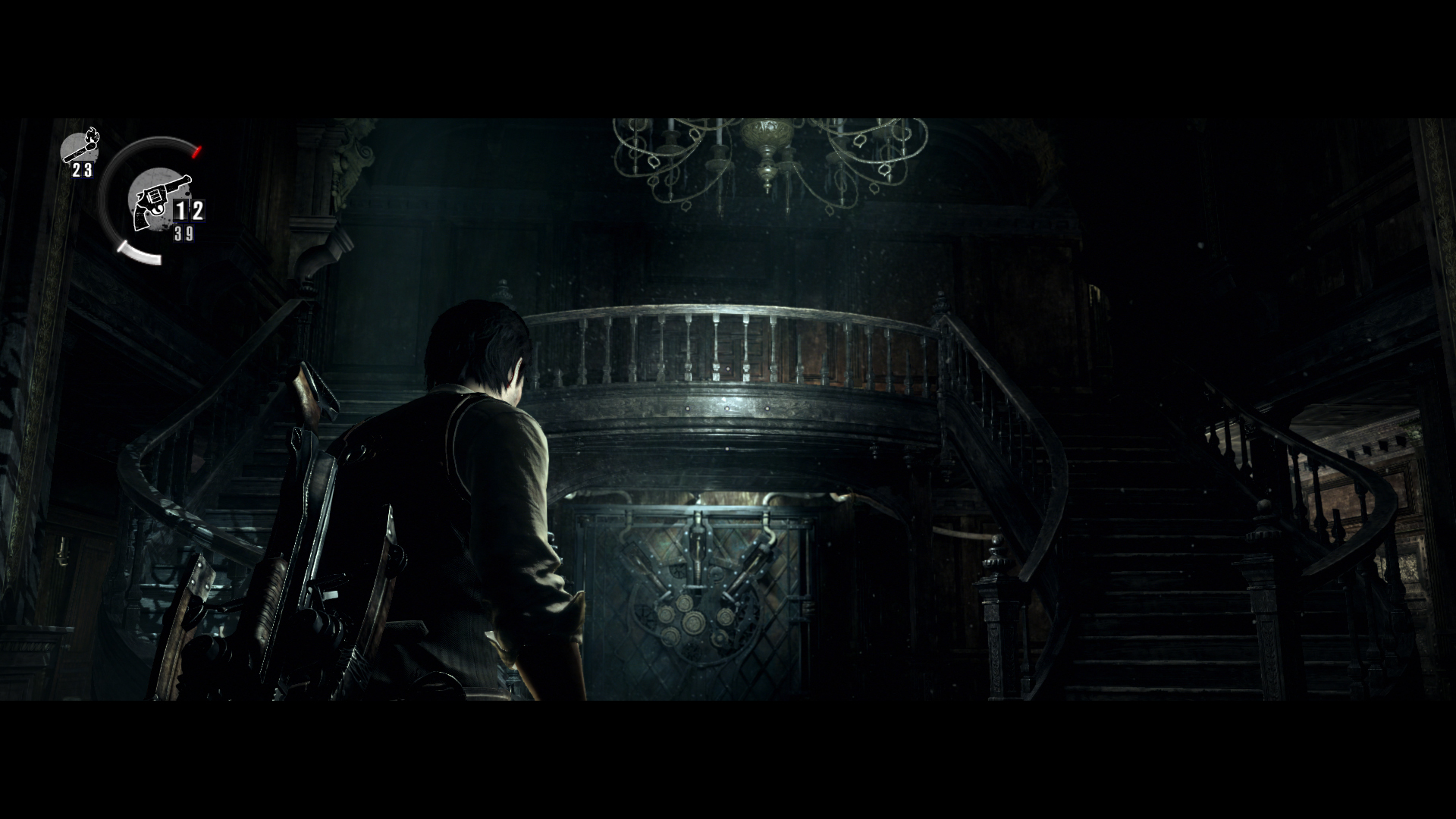
I just picked this up, as the word of mouth was seeming pretty good. I'm only part of the way through chapter 2, and while the setup and presentation are all pretty good, there are already some fairly baffling design choices.
The biggest issue I have with the game is the horrendous filters that are just destroying black levels. I've cranked up the in-game brightness, but it's a band-aid on an issue that shouldn't exist. There's a difference between being in the dark, and crushing out half the image. It's really taking me out of the game, as I'm fighting the brightness levels to try and see the game I'm supposed to be playing. It's either crushed, or overexposed. I really don't like it.
The controls and also far from ideal. We have a third person camera mixed with the wide aspect ratio, yet we're given an FOV that feels are too narrow even when it's pulled back, make for an aggravating experience. Not sure what they were going for here, but it makes the game feel unpolished, rather than introducing tension via limited manoeuvrability. And the aiming aggravates this enormously. Resident Evil 4 walked the line perfectly, not sure how this got all fucked up. I'll get used to it, but it doesn't feel right, and it'll mean I probably won't want to return to this as often as I returned to RE4.
I hope it starts to come together for me tomorrow after a long session, reading through this thread got me seriously excited about playing through it.