• Hey, guest user. Hope you're enjoying NeoGAF! Have you considered registering for an account? Come join us and add your take to the daily discourse.

Slim PS3 ...good fake or...

Status
Not open for further replies.

mollipen

Member
tass0 said:
PS2 is a sexy beast. I hate the "curve" shape of the PS3, you can't stack other consoles or whatever on it, but it's still a nice looking thing.

You mean the same PS2 with its oh so wonderful paneling on the front? It got tolerable over time, but really, that was a terrible design. The original PlayStation had a fabulous look for the time, but so far as I'm concerned, the PS2 and PS3 were both disasters when it comes to design; both look like they were randomly pieces together with not one bit of sense for style.

As god-awful ugly as the original Xbox was, Microsoft actually got the 360 pretty right. Funny how both the Xbox 360 and Wii went for simple, elegant designs, while the PS3 is just this big hunk of awkwardness.
 
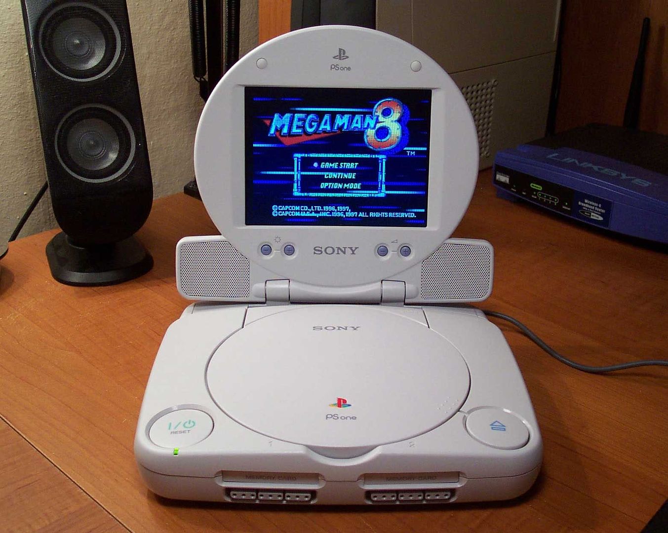
Let's not forget the PSOne, even today it still looks great!

psonelcd.jpg
 
Philanthropist said:
Only if you don't take the 360's power brick into account.

True, I fucking hate powerbricks sitting around clogging up the back of my TV which is already infested with wires (Wii/PS3/360/PS2/Sound System).

I really hope a Slim 360 is released, or even just one with an internal PSU, I'd upgrade mine instantly.

I never bought a PS2 Slim due to the external power supply (I know it's internal now).
 

Rolf NB

Member
tass0 said:
PS2 is a sexy beast. I hate the "curve" shape of the PS3, you can't stack other consoles or whatever on it, but it's still a nice looking thing.
It's designed to not be stacked deliberately I reckon.
 
PS1 was ok for the time. The design didn't really age well though. My favorite is the ps2 slim and older versions of the ps3, especially the 20gb. It boggles my mind that Sony decided to replace the chrome lined ps3's with that stupid plastic crap instead of just going back to the all black finish of the 20gb.

sony_ps3_comparison.jpg


So hot.
 

Phreak47

Member
I think I am cautiously becoming a believer in the PS3 slim being real.

That youtube video where the guy analyzes that recent video at least proves that somebody took quite a bit of time making a fake.
 

DrXym

Member
H_Prestige said:
PS1 was ok for the time. The design didn't really age well though. My favorite is the ps2 slim and older versions of the ps3, especially the 20gb. It boggles my mind that Sony decided to replace the chrome lined ps3's with that stupid plastic crap instead of just going back to the all black finish of the 20gb.

sony_ps3_comparison.jpg


So hot.

Without reference to scale the PS3 looks nice, but god its a bloater when you see it in the flesh. If a slim can preserve its general proportions but slash its volume down then that is no bad thing at all. I would not be surprised if a lot of people were scared off the console just by its size alone. A bit of chrome trim would be nice but I expect all it will get is some spray on silver finish.
 

cakefoo

Member
Audioboxer said:
If only, the matte black is going to look cheap as chips... As long as Sony make it jet black though, not the charcoal black the 360 is (not a dark enough shade).
I'll try a matte version:

28jlity.jpg


Hopefully it looks that good :D
 
JoJo13 said:
*sigh*

if only that one indian guy didn't purchase the ps3 slim and then disappear

we'd have this all solved by now

Think of the internet fame he's missing out on, a youtube video and GAF topic post and he's rolling in the pussy.

What a noob.
 

Combichristoffersen

Combovers don't work when there is no hair
shidoshi said:
You mean the same PS2 with its oh so wonderful paneling on the front? It got tolerable over time, but really, that was a terrible design. The original PlayStation had a fabulous look for the time, but so far as I'm concerned, the PS2 and PS3 were both disasters when it comes to design; both look like they were randomly pieces together with not one bit of sense for style.

As god-awful ugly as the original Xbox was, Microsoft actually got the 360 pretty right. Funny how both the Xbox 360 and Wii went for simple, elegant designs, while the PS3 is just this big hunk of awkwardness.

Personally I love the design of the PS3 (even if it's XBOX HUEG), while I think the 360 looks completely godawful (just makes me think of some cheap and poorly made Taiwanese plastic toy or something). The Wii is meh when white, but damn sexy when black.
 

noah111

Still Alive
cakefoo said:

Really nice mockup, looks pretty accurate as far as size goes, it seems like the size estimates back when this got leaked (by gofreak IIRC) were nearly spot on. Seems about 1/3 less in thickness, but it's really hard to tell at this point.
 

Ardorx

Banned
Sorry if this is old but I was on Zombie Studios homepage and at the bottom they use what appears to be the same logo as featured on the slim. Mistake on their part perhaps or more fuel for the rumor?

Again, sorry if old.
 

VegaShinra

Junior Member
Ardorx said:
Sorry if this is old but I was on Zombie Studios homepage and at the bottom they use what appears to be the same logo as featured on the slim. Mistake on their part perhaps or more fuel for the rumor?

Again, sorry if old.
Hmmmm

Second said:
This is becoming the worst kept secret or the biggest fake ever in gaming.
I think we are at the point we know it's real.
 

Majmun

Member
Ardorx said:
Sorry if this is old but I was on Zombie Studios homepage and at the bottom they use what appears to be the same logo as featured on the slim. Mistake on their part perhaps or more fuel for the rumor?

Again, sorry if old.

Looks like the Ps2 logo.

There are so many Ps3 logo's. Sony should stick with one imo.
 

Sage00

Once And Future Member
Ardorx said:
Sorry if this is old but I was on Zombie Studios homepage and at the bottom they use what appears to be the same logo as featured on the slim. Mistake on their part perhaps or more fuel for the rumor?

Again, sorry if old.
That just looks like something they've made themselves from the PS2/PSP font.
 

noah111

Still Alive
Ardorx said:
Sorry if this is old but I was on Zombie Studios homepage and at the bottom they use what appears to be the same logo as featured on the slim. Mistake on their part perhaps or more fuel for the rumor?

That's basically like the PS2/PSP logos, the logo on this slim appears to be the exact same as those, except curved instead of edged, which IMO looks sleek as hell.
 

Ardorx

Banned
I figured it was something they whipped up but it's hella close to font used so it makes me wonder a little bit. It wouldn't be too bold to suggest that Sony is using a font closer to that seen on the PSP/PS2 since they've been going for "you only need these three"angle.
 

noah111

Still Alive
Machado said:
nothing so far???

What's the rush man? You really expect Sony is going to come out and say "oh shux you got us!" and release full specs and glamour shots? For all we know the store we saw in that video of the slim could have been informed by Sony themselves! Wait till at least late august for real news, until then it's just rumors (pretty credible ones IMO).
 

Tobor

Member
OuterWorldVoice said:
All of 'em have. I for one welcome our new Junior Underlords.
I can't instantly look at their avatars and know if they're insane yet. All insane until proven innocent, I guess.
 
cakefoo said:
Source, and to get a rough sense of scale:

23vmah1.jpg
If that's anywhere near accurate, I actually prefer the look of the slim... by quite a lot.

Though I must say, I have the PS3 horizontal in my house and I think it looks fugly (I'm not the only one to see it and think so either)... so maybe I'm not the right person to judge.
 
Status
Not open for further replies.
Top Bottom