• Hey, guest user. Hope you're enjoying NeoGAF! Have you considered registering for an account? Come join us and add your take to the daily discourse.

[SPOILERS] Star Wars: The Force Awakens (Thread #3) - That's Not How the Force Works

Oidisco

Member
The soundtrack really grew on me with repeat viewings. I think it's the most subtle of the Star Wars scores, but definitely up there with the OT in quality. I was kind of down on it initially.

Yea I didn't really like it at first, nothing stood out to me. 2nd and 3rd time watching and I really noticed how they'd allude to Rey and Kylo's theme throughout, or sometimes weave them into some of the more classic themes from the series.

Rey's theme in particular is fantastic.
 
I'd love a hybrid puppet/CGI Yoda. Use the puppet to get some of those awkward puppet movements that Yoda is sort of known for, and just CGI the minor details, like lip movements.

Man, I wonder how weird that would look...
You could probably get a bit of an idea from Unkar Plutt, because I'm pretty sure that's exactly what they did with him.
 
I'd love a hybrid puppet/CGI Yoda. Use the puppet to get some of those awkward puppet movements that Yoda is sort of known for, and just CGI the minor details, like lip movements.

Man, I wonder how weird that would look...

So, like the Blu-Ray Ewoks (CGI eyelids).
 
Same, classic SW right there. It really bothers me when people say the SW is forgettable or disappointing. If you give it a chance you'd be surprised to see there's a lot to offer.

It's poorly mixed in the movie imo. It's the one thing the movie failed at for me sound and music mixing.

Listening to the combined commercial and For Your Consideration soundtrack makes TFA frankly one if my favs of the series. It's just so quiet a lot in the movie except in IMAX
 
I will say, when I first saw this movie, I wasn't a big fan. I thought the story, the score and the villains were dumb...but after reading weeks of discussion here and watching the conversation topics flow from one thing to another, I realize there is a lot going on in this film and it has opened up so much speculation to the future (and even the past) of Star Wars, which is only a good thing.

I am looking forward to a second viewing when I get it on blu ray, but until then, right now the only thing I still think is really dumb about TFA are the three(?) CGI characters. It's really a shame the producers didn't make them physical like they said they would.

Snoke was a conscious decision, but they've said that Maz was CGI because they didn't have time to make a puppet. She was one of the last characters designed for the film.
 
I think the biggest thing about TFA is that it is the most subtle of all the series. That's not to say it's super subtle but in comparison it's much more visually driven than dialogue driven which is a departure from the PT especially but even the OT as well.

A lot of the key character work is in facial expressions and reactions and body language. That it worked for so many is frankly proof that this is the Star Wars with the best acting of the series
 

Surfinn

Member
It's poorly mixed in the movie imo. It's the one thing the movie failed at for me sound and music mixing.

Listening to the combined commercial and For Your Consideration soundtrack makes TFA frankly one if my favs of the series. It's just so quiet a lot in the movie except in IMAX

IMAX is the way to go. Much better sound overall and makes for a great SW experience.
 

Hawkian

The Cryptarch's Bane
I will say, when I first saw this movie, I wasn't a big fan. I thought the story, the score and the villains were dumb...but after reading weeks of discussion here and watching the conversation topics flow from one thing to another, I realize there is a lot going on in this film and it has opened up so much speculation to the future (and even the past) of Star Wars, which is only a good thing.

I am looking forward to a second viewing when I get it on blu ray, but until then, right now the only thing I still think is really dumb about TFA are the three(?) CGI characters. It's really a shame the producers didn't make them physical like they said they would.
wait maz, snoke, and who is #3?
 

-griffy-

Banned
wait maz, snoke, and who is #3?

Must be referring to Unkar Plutt? Though that character is mostly a practical guy in suit (Simon Pegg to be precise), with CG used to augment facial animation:
A3r8AQyCzKSx.jpg
 

Fliesen

Member
What if it's Luke speaking to Ben before he starts studying with him? That it's a line from a flashback from Ep.8 ?

Bingo.

It wasn't a line from Episode VII, not even a cut one.

It was either solely for the trailer or it might come back in Ep VIII and then it might very well be Luke explaining his gift / legacy / responsibility to little Ben.
 

Surfinn

Member
100% Wish it was 2D but 3D was decent.

Can't believe I'm saying it but.. me and my GF vastly preferred 3D. Wasn't too much and added a lot of depth to lots of scenes. Plus.. there's just nothing better than having the opening crawl fly in your face. We were both pleasantly surprised with its effective implementation.
 

Snake

Member
Just want to chime in at this moment of discussing CG characters to say how happy I am that they cut Constable Zuvio from the film. So incredibly happy.

I remember when someone first posted a screenshot of the character in the film and I thought to myself: "that's a screenshot from the Rebels cartoon, right? Please?"
 

Surfinn

Member
Just want to chime in at this moment of discussing CG characters to say how happy I am that they cut Constable Zuvio from the film. So incredibly happy.

I remember when someone first posted a screenshot of the character in the film and I thought to myself: "that's a screenshot from the Rebels cartoon, right? Please?"

I thought it looked shaky too, but I'd have loved to see what it looked like in motion.
 
Can't believe I'm saying it but.. me and my GF vastly preferred 3D. Wasn't too much and added a lot of depth to lots of scenes. Plus.. there's just nothing better than having the opening crawl fly in your face. We were both pleasantly surprised with its effective implementation.

Cool. It was goid but to many over the shoulder scenes where the thing popping out at me was a blurry back of head.

Focus like that works 2D but in 3D all ofva sudden the wrong thing is popping out. Distracting.
 

lawnchair

Banned
the first time i saw it was in 3D. maybe its a personal problem but 3D always leads to fuzzy images for me. like in the beginning when there's the star destroyer and the planet, i saw a ghost shadow outline of the planet around the planet. that's not good.

second time i saw it was in a junky little theater and it looked better than it looked in IMAX 3D.
 

Surfinn

Member
Sorry if it's been touched on in this thread but.. I'd like to focus on a criticism of the TFA: too much blue and green in shots. In lots of scenes, it almost feels like there's a light blue color filter over everything, during much of the movie. For example, when the Falcon goes into hyperspace, or when X-Wing pilots are in hyperspace, when Han is talking to Rey and Finn in the Falcon, during Rey's interrogation scene, and in other various shots. Is this something that's common in JJ's movies? I know he's pretty close with Spielberg, and I also noticed the same type of colors and lighting in Bridge of Spies.. so much so, it took me out of the immersion of that time period. Looks like everything is just far too bright and washed out with a blue rag. I believe this is a stylistic choice (har har, cue GL reference), but it's one that I really don't like. In the next two movies, I really hope there's much darker scenes, visually, and that more colors are used throughout the movie to keep cinematography more varied and interesting. I'm thinking of the Skywalker duel on Cloud City.. remember how many colors were used in conjunction with darkness throughout the scene? It's visually pleasing and memorable. I really hope more work goes into generating visual variation and general cinematography in 8 and 9.

Anyone else feel this way?
 
Yea, I skipped out on the IMAX cause 3D is 95% of the time not worth it.

Fuck you Cameron for making it a long term fad :(

It's worth it here for the superior sound and picture quality. The 3D is neither great or terrible it's inoffensive. I just can't romanticize the IMAX sound quality enough. It's worth it
 
Darth Maul is an easy act to follow. Maul wasn't even a character really. It's amazing watching the Plinkett review of TPM in that 90 min or so he barely mentions Darth Maul because frankly he was completely unimportant to anything

I meant in terms of Maul's intimidating and well received look.

Darth Vader is iconic, and Darth Maul was a hit on a superficial level.
It would have been hard to recreate that kind of success by simply making another "badass" villain that only plays a badass villain role.

Kylo being different from both of them allows him to be his own type of villain and not a cheap copy.
 

LakeEarth

Member
There was this one part where the movie side-wipes to the Star Destroyer facing the viewer, and the 3D really made the damn thing come out. This part, and where Kylo Ren put the lightsaber against Rey's side, were the only parts of the movie where the 3D really stood out.
 
I meant in terms of Maul's intimidating and well received look.

Darth Vader is iconic, and Darth Maul was a hit on a superficial level.
It would have been hard to recreate that kind of success by simply making another "badass" villain that only plays a badass villain role.

Kylo being different from both of them allows him to be his own type of villain and not a cheap copy.

Fair point.
 
Sorry if it's been touched on in this thread but.. I'd like to focus on a criticism of the TFA: too much blue and green in shots. In lots of scenes, it almost feels like there's a light blue color filter over everything, during much of the movie. For example, when the Falcon goes into hyperspace, or when X-Wing pilots are in hyperspace, when Han is talking to Rey and Finn in the Falcon, during Rey's interrogation scene, and in other various shots. Is this something that's common in JJ's movies? I know he's pretty close with Spielberg, and I also noticed the same type of colors and lighting in Bridge of Spies.. so much so, it took me out of the immersion of that time period.

What time period are you referring to.

Also hyperspace had them in a blue form hole type thing. Its going to cast blue light. Also in the falcon they had the blue map open.

There was this one part where the movie side-wipes to the Star Destroyer facing the viewer, and the 3D really made the damn thing come out. This part, and where Kylo Ren put the lightsaber against Rey's side, were the only parts of the movie where the 3D really stood out.


Star Destroyer in 3d scene was amazing. I wish they would just push more scenes like that. I mean, I understand being subtle, but sometimes you need to push it.
I paid a lot of money to see this shit with these broke ass glasses.
 

Cth

Member
Some interesting analysis/reading from other forums I thought was worth reposting here:

- Self-acceptance is a major theme of the film. All of the three main characters are introduced wearing masks. (Rey, Finn, Kylo)

- Luke saber in the snow recalls the Sword in the Stone allegory.

- There's tons of Arthurian imagery in the film. Poe serving as Lancelot, Maz as the Lady in the Lake holding onto Excalibur (Luke's saber). Luke having vanished.

-- JJ: "go backwards to go forwards" In some cases, elements of the OT are literally presented in "backward" fashion in TFA. Inverted. For example, Rey's motivation is to do what she can to STAY on Jakku and wait for her parents. She's looking to the past. Luke is doing everything he can to LEAVE Tatooine in the hopes of an exciting future

http://icsfilm.org/reviews/star-wars-the-force-awakens-j-j-abrams/

[..]

A youth on a desert world making a hard living who discovers they have extraordinary powers, who feels compelled to do good and use those powers to become a Jedi. Who am I talking about?

A brave and compassionate young man standing outside the war who takes up the lightsaber to defend his friends and pays dearly for it. Who am I talking about?

A daring pilot in the fight against an Evil Empire who destroys a superweapon through impossible feats of flying. Who am I talking about?

A young Force user torn between light and dark, struggling with the legacy of Darth Vader and the shadow of his father. Who am I talking about?

Together, Rey, Finn, Poe, and Kylo all form a deconstruction of Luke Skywalker.

[...]

Much has been made during the film’s advertising process of how Luke Skywalker was missing. But even if he’s not physically present in the film, he is implicitly there in every single frame. His presence or absence is far more crucial than any mere superweapon. He is a folk hero, someone who has ascended in this universe to the level that King Arthur or Robin Hood holds in our world. The film is a celebration of that type of hero as the galaxy cries out for him to return. But, as the film shows, each one of its lead characters has the capacity to be him. They have that power too.

As pointed out above, however, Starkiller Base actually plays a different role in execution than the two Death Stars. It is the backdrop against which the main characters make their choices and their fates are decided. They are what’s important, not Starkiller Base. And, symbolically, it plays a very different role from either one as well.

The first Death Star is the symbol of the technological bureaucratic monstrosity of the Empire. It’s a gray, featureless world brought down by the colorful alliance. The second Death Star is a spider’s web, representative of the labyrinthine plotting of the Emperor as he attempts to pull all his enemies into his trap.

Starkiller Base is nothing short of the Dark Side of the Force itself. It’s a decaying corpse of a world, with the remaining trees a fake organic shell around the cold mechanical might within. And more, it literally sucks the light out of the galaxy as it’s powered. Starkiller Base is the logical extension of what the villains have wished to do to the galaxy all along.

Yet look at its final fate. It, too, cannot contain the light within. Starkiller Base does not explode. It becomes a star. Light prevails. Life prevails. This is the story of the entire series, writ as large and as operatic as possible. There were no fairy tale endings for the lead characters of the Original Trilogy, and there will be much loss and grief along the way for the lead characters of the sequels too. But The Force Awakens ends by affirming the ultimately hopeful nature of the series. As long as there is a single spark of light within the all-consuming dark, good will triumph.
 

Snake

Member
Sorry if it's been touched on in this thread but.. I'd like to focus on a criticism of the TFA: too much blue and green in shots. In lots of scenes, it almost feels like there's a light blue color filter over everything, during much of the movie. For example, when the Falcon goes into hyperspace, or when X-Wing pilots are in hyperspace, when Han is talking to Rey and Finn in the Falcon, during Rey's interrogation scene, and in other various shots. Is this something that's common in JJ's movies? I know he's pretty close with Spielberg, and I also noticed the same type of colors and lighting in Bridge of Spies.. so much so, it took me out of the immersion of that time period. Looks like everything is just far too bright and washed out with a blue rag. I believe this is a stylistic choice (har har, cue GL reference), but it's one that I really don't like. In the next two movies, I really hope there's much darker scenes, visually, and that more colors are used throughout the movie to keep cinematography more varied and interesting. I'm thinking of the Skywalker duel on Cloud City.. remember how many colors were used in conjunction with darkness throughout the scene? It's visually pleasing and memorable. I really hope more work goes into generating visual variation and general cinematography in 8 and 9.

Anyone else feel this way?

This was something I was worried about going into the film, since the trailers showed a few shots with that strong aqua blue look that JJ's cinematographer is definitely into. Thankfully I didn't think it was nearly as overbearing as it is in JJ's Star Trek movies, but it was noticeable here too. Mainly in First Order facility interior scenes. I don't think the other movies will feature that look.

Your post made me look up who's doing the cinematography in Episode VIII, and unsurprisingly it's the guy who has worked with Rian Johnson in all of his films. If Looper is the best we can judge things from, I think we'll be in okay hands (I'm going to rewatch it sometime before Episode VIII to get a better idea).
 

-griffy-

Banned
Sorry if it's been touched on in this thread but.. I'd like to focus on a criticism of the TFA: too much blue and green in shots. In lots of scenes, it almost feels like there's a light blue color filter over everything, during much of the movie. For example, when the Falcon goes into hyperspace, or when X-Wing pilots are in hyperspace, when Han is talking to Rey and Finn in the Falcon, during Rey's interrogation scene, and in other various shots. Is this something that's common in JJ's movies? I know he's pretty close with Spielberg, and I also noticed the same type of colors and lighting in Bridge of Spies.. so much so, it took me out of the immersion of that time period. Looks like everything is just far too bright and washed out with a blue rag. I believe this is a stylistic choice (har har, cue GL reference), but it's one that I really don't like. In the next two movies, I really hope there's much darker scenes, visually, and that more colors are used throughout the movie to keep cinematography more varied and interesting. I'm thinking of the Skywalker duel on Cloud City.. remember how many colors were used in conjunction with darkness throughout the scene? It's visually pleasing and memorable. I really hope more work goes into generating visual variation and general cinematography in 8 and 9.

Anyone else feel this way?
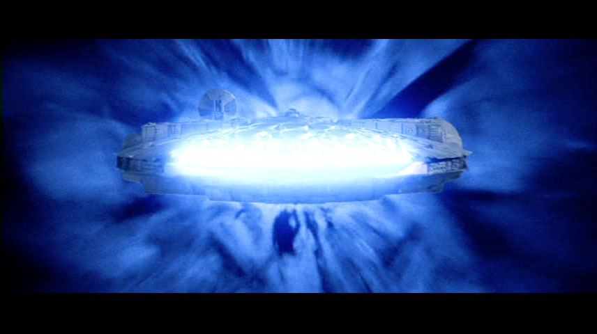
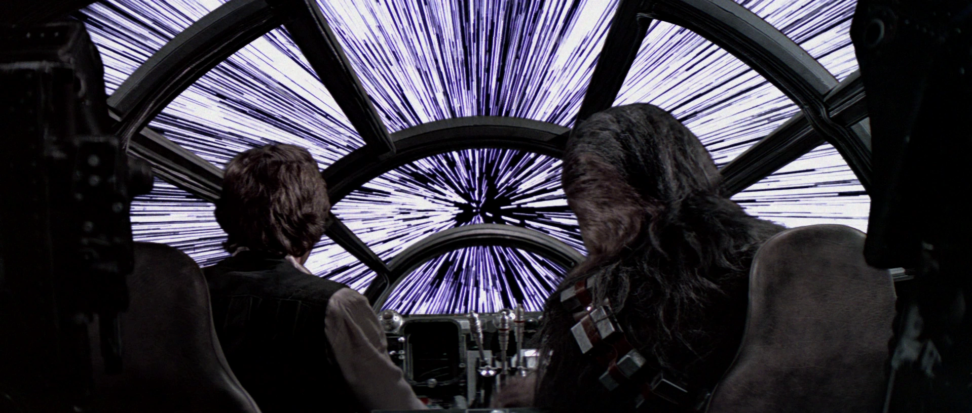
I definitely noticed a strong use of color and light/shadow in the movie overall, but I wouldn't say it was leaning heavily towards any specific color. The hyperspace stuff is blue because that's what hyperspace in Star Wars looks like. The stars streak out into a blue blur and the wormhole is a noisy blue thing:
Now with modern technology they are also able to "project" light from the outside environment into the cockpit and onto the characters, so that blue from hyperspace kind of washes over things during those scenes.

There's more colors too though. Jakku obviously has a lot of orange (not only because of desert/sand, but even pushed with the fire in the first scene), Takadona (where Maz's castle is located) has a lot of green obviously because of the trees, but the water is also pushed towards that color as well (which ends up contrasting nicely with the explosions and fire of the battle), Starkiller base has a greenish/red color scheme in interiors, and they use red light a lot around Kylo Ren, often in really subtle ways.

There's the scene early on when a guy is giving him a report about Jakku, and Kylo is facing away from him and only lit partially by a white light. As the convo goes on, Kylo turns towards him slightly and a red highlight starts to catch the metal on his mask, then as he turns more it becomes more prominent before he finally ignites his saber and destroys the console behind him. The gradual increase in red light matches his temper before he explodes.

Then of course there's the whole bridge scene which has been talked about, with the white/blue light on one side of his face that gradually fades away to darkness leaving him bathed in red right before he kills Han.

I thought the cinematography and use of color was really striking (along with some really nice extended takes with motivated camera movement in the vein of Spielberg). Easily the best in the series since ESB.
 

Cth

Member
Sorry if it's been touched on in this thread but.. I'd like to focus on a criticism of the TFA: too much blue and green in shots. In lots of scenes, it almost feels like there's a light blue color filter over everything, during much of the movie. For example, when the Falcon goes into hyperspace, or when X-Wing pilots are in hyperspace, when Han is talking to Rey and Finn in the Falcon, during Rey's interrogation scene, and in other various shots. Is this something that's common in JJ's movies? I know he's pretty close with Spielberg, and I also noticed the same type of colors and lighting in Bridge of Spies.. so much so, it took me out of the immersion of that time period. Looks like everything is just far too bright and washed out with a blue rag. I believe this is a stylistic choice (har har, cue GL reference), but it's one that I really don't like. In the next two movies, I really hope there's much darker scenes, visually, and that more colors are used throughout the movie to keep cinematography more varied and interesting. I'm thinking of the Skywalker duel on Cloud City.. remember how many colors were used in conjunction with darkness throughout the scene? It's visually pleasing and memorable. I really hope more work goes into generating visual variation and general cinematography in 8 and 9.

Anyone else feel this way?

There's definitely a lot of color symbolism in the film. Specifically, the whole scene with Kylo killing Han.

Others have noted Kylo's introduction was descending in a red, hellish type place.. With Rey ending the film by ascending to a blue/green, heavenly place.

Also:
"When introduced, we see Rey inside the belly of a downed Empire destroyer starship. Everything is completely black, except a single light shining on her. From the get go we see the symbolism Abrams is trying to set up in that she is the sole hope of the Rebel Alliance, our new hero to root for as a Ray of Light inside the Empire’s literal darkness."
 

prag16

Banned
Hot damn I'd forgotten just how unbelievably stupid that whole sequence was.

I don't see how that's some kind of smoking gun for how overall terrible the prequels are. Yeah, the "Nooooooooo" wasn't very well done. But what's so awful about the rest of that sequence...
 
Star Wars in IMAX 3D was amazing but a Cineworld nearby has just done some upgrades and got a new 4DX screen, so me, the gf and a few friends decided to go check it out and it was an absolute blast to watch Star Wars in 4DX.

If you haven't seen 4DX yet, here's vid showing what it is:

https://youtu.be/lu4M5SL6Em4
 

Surfinn

Member
What time period are you referring to.

Also hyperspace had them in a blue form hole type thing. Its going to cast blue light. Also in the falcon they had the blue map open.

1950s (Bridge of Spies). Right, it had a blue map open.. but it would have been interesting to use a different light for that scene since so many interior shots have a light tinted blue filter. The blue didn't bother me too much up until that point, even in the trailer. Not a huge deal, but still something that stood out to me.

This was something I was worried about going into the film, since the trailers showed a few shots with that strong aqua blue look that JJ's cinematographer is definitely into. Thankfully I didn't think it was nearly as overbearing as it is in JJ's Star Trek movies, but it was noticeable here too. Mainly in First Order facility interior scenes. I don't think the other movies will feature that look.

Your post made me look up who's doing the cinematography in Episode VIII, and unsurprisingly it's the guy who has worked with Rian Johnson in all of his films. If Looper is the best we can judge things from, I think we'll be in okay hands (I'm going to rewatch it sometime before Episode VIII to get a better idea).

Ah, thanks for this information; that's good news. Looper had great world building too.

I definitely noticed a strong use of color and light/shadow in the movie overall, but I wouldn't say it was leaning heavily towards any specific color. The hyperspace stuff is blue because that's what hyperspace in Star Wars looks like. The stars streak out into a blue blur and the wormhole is a noisy blue thing:

Now with modern technology they are also able to "project" light from the outside environment into the cockpit and onto the characters, so that blue from hyperspace kind of washes over things during those scenes.

There's more colors too though. Jakku obviously has a lot of orange (not only because of desert/sand, but even pushed with the fire in the first scene), Starkiller base has a greenish/red color scheme in interiors, and they use red light a lot around Kylo Ren, often in really subtle ways.

There's the scene early on when a guy is giving him a report about Jakku, and Kylo is facing away from him and only lit partially by a white light. As the convo goes on, Kylo turns towards him slightly and a red highlight starts to catch the metal on his mask, then as he turns more it becomes more prominent before he finally ignites his saber and destroys the console behind him. The gradual increase in red light matches his temper before he explodes.

Then of course there's the whole bridge scene which has been talked about, with the white/blue light on one side of his face that gradually fades away to darkness leaving him bathed in red right before he kills Han.

I thought the cinematography and use of color was really striking (along with some really nice extended takes with motivated camera movement in the vein of Spielberg). Easily the best in the series since ESB.

Nice post. Right, and I totally agree with you - there's some fantastic cinematography throughout the movie, and the scenes you're referring to are among the best of the movie. One of my absolute favorite scenes (not quite as popular I don't think) is when Starkiller fires and there's a series of shots in space. There's a deeply satisfying contrast of red and black, especially as the beam shoots past Kylo's ship. As the beams branch off, the score kicks in and the viewer is visually/auditorily engaged in the importance of the moment.

Other shots I enjoyed:

BB-8's reaction as Poe's X-Wing explodes into a deep contrast of red/orange and black in front of a darkened sky.

Zoomed out shot of Han on the bridge with Kylo, contrast of light/dark, symbolizing their moral affiliation.

Rey/Kylo's saber battle in the snow, red and blue against a dark background.

However, as others have mentioned, there's a blue tint often when indoors that bothers me. Also, when we get to Maz's castle (outside of the initial arrival/planet shot), we lose some of that great cinematography from the beginning and end of the film. There's only one scene I can think of that is a particularly ugly shot (and I'm surprised it remained in the movie) and it's when Rey runs out of the castle. There's a top down shot where we see Rey running on wet cement and grass; normally one shot wouldn't bother me, but it's during a crucial scene. Also, lots of the locations (forest outside of Maz castle, Resistance base, island at the end of the film) that have a repetitive green look that's always bothered me (I get that we're talking about trees, plants and vegetation). In some instances, it feels far too familiar to locations on earth. Now, I'm not saying I didn't enjoy these scenes and locations in the film, just that they could have been improved with more of the visual creativity we saw in the first and third act.

There's definitely a lot of color symbolism in the film. Specifically, the whole scene with Kylo killing Han.

Others have noted Kylo's introduction was descending in a red, hellish type place.. With Rey ending the film by ascending to a blue/green, heavenly place.

Also:
"When introduced, we see Rey inside the belly of a downed Empire destroyer starship. Everything is completely black, except a single light shining on her. From the get go we see the symbolism Abrams is trying to set up in that she is the sole hope of the Rebel Alliance, our new hero to root for as a Ray of Light inside the Empire’s literal darkness."

I agree. There are lots of satisfying scenes with great use of colors/contrast. My criticism was for particular sections of the film.
 

Hawkian

The Cryptarch's Bane
I thought Unkar Plutt looked great, no qualms with whatever CGI they used there.

Maz has also grown on me after repeat viewings. In particular I like her interaction with Finn when she grabs his hand with the lightsaber in it and pushes it back toward him ("I need a weapon"/"You have one!").

Snoke just looks downright awful. Shockingly so, to be tragically honest. I hope they rely on the "hologram factor" and seriously redo him when we finally see him in physical presence.

I do like the way he roars "GENERAL!"
Some interesting analysis/reading from other forums I thought was worth reposting here:

A youth on a desert world making a hard living who discovers they have extraordinary powers, who feels compelled to do good and use those powers to become a Jedi. Who am I talking about?

A brave and compassionate young man standing outside the war who takes up the lightsaber to defend his friends and pays dearly for it. Who am I talking about?

A daring pilot in the fight against an Evil Empire who destroys a superweapon through impossible feats of flying. Who am I talking about?

A young Force user torn between light and dark, struggling with the legacy of Darth Vader and the shadow of his father. Who am I talking about?

Together, Rey, Finn, Poe, and Kylo all form a deconstruction of Luke Skywalker.
that's goddamn fantastic
 

Loris146

Member
Some interesting analysis/reading from other forums I thought was worth reposting here:

"A youth on a desert world making a hard living who discovers they have extraordinary powers, who feels compelled to do good and use those powers to become a Jedi. Who am I talking about?

A brave and compassionate young man standing outside the war who takes up the lightsaber to defend his friends and pays dearly for it. Who am I talking about?

A daring pilot in the fight against an Evil Empire who destroys a superweapon through impossible feats of flying. Who am I talking about?

A young Force user torn between light and dark, struggling with the legacy of Darth Vader and the shadow of his father. Who am I talking about?

Together, Rey, Finn, Poe, and Kylo all form a deconstruction of Luke Skywalker. "

Just wow.
 
that's goddamn fantastic

Just wow.

Also liked this follow up paragraph.

Much has been made during the film’s advertising process of how Luke Skywalker was missing. But even if he’s not physically present in the film, he is implicitly there in every single frame. His presence or absence is far more crucial than any mere superweapon. He is a folk hero, someone who has ascended in this universe to the level that King Arthur or Robin Hood holds in our world. The film is a celebration of that type of hero as the galaxy cries out for him to return. But, as the film shows, each one of its lead characters has the capacity to be him. They have that power too.
 
Top Bottom