Zuo
Member
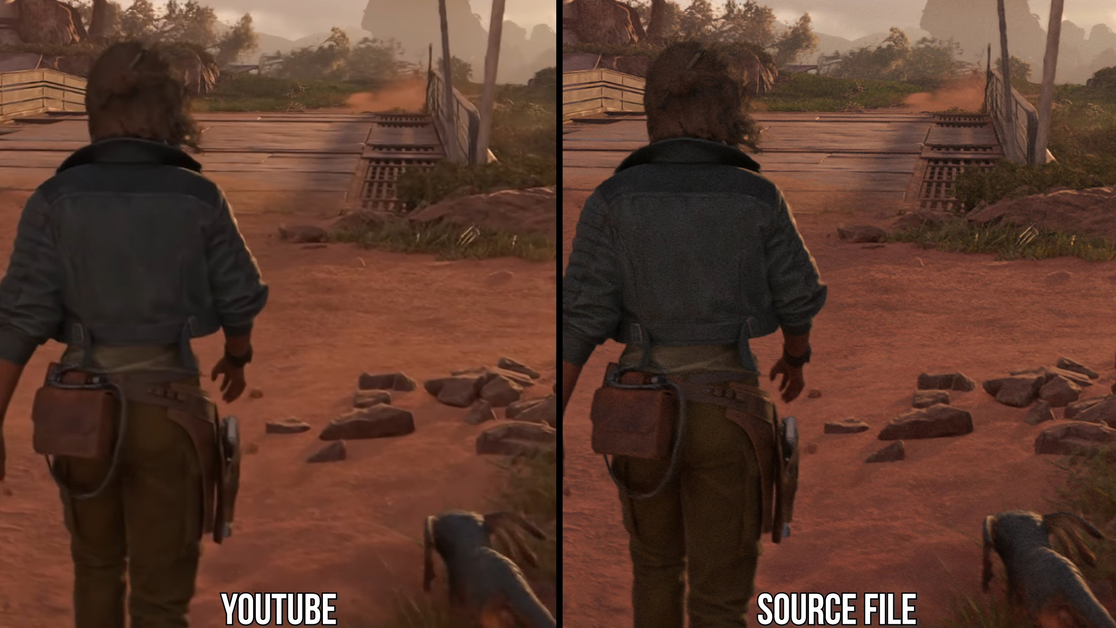
Switch (2) textures seem to be missing the subtle checkerboard aesthetic present in the original games. It's a neat effect that not only gives textures some grit but often helps them match a certain aesthetic (fabric, candy, gardeny stuff, etc.)
Losing unique visual nuance for sharper textures doesn't seem worth it, especially in older or stylized games where sharper textures actually just clash with the geometry.

Edit:
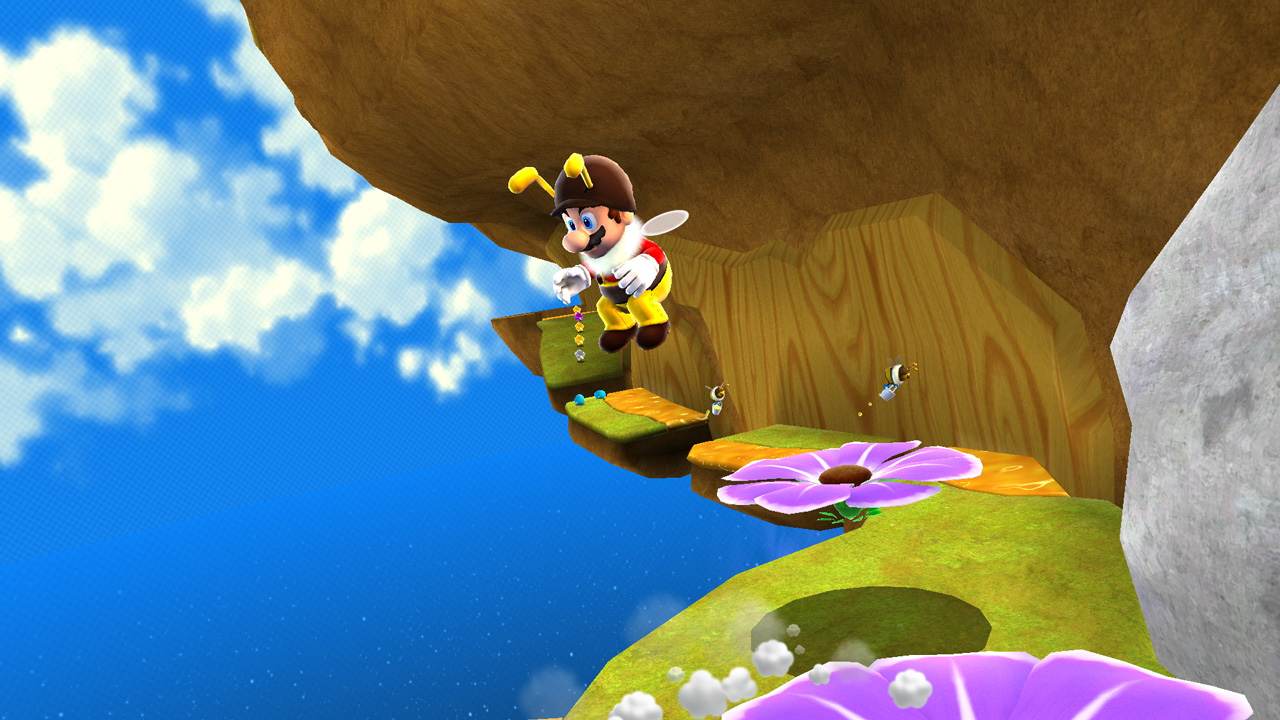
Looks like even some huge and obvious patterns are missing, like the walls here that gave all the bee levels their honeycomb aesthetic. Yikes
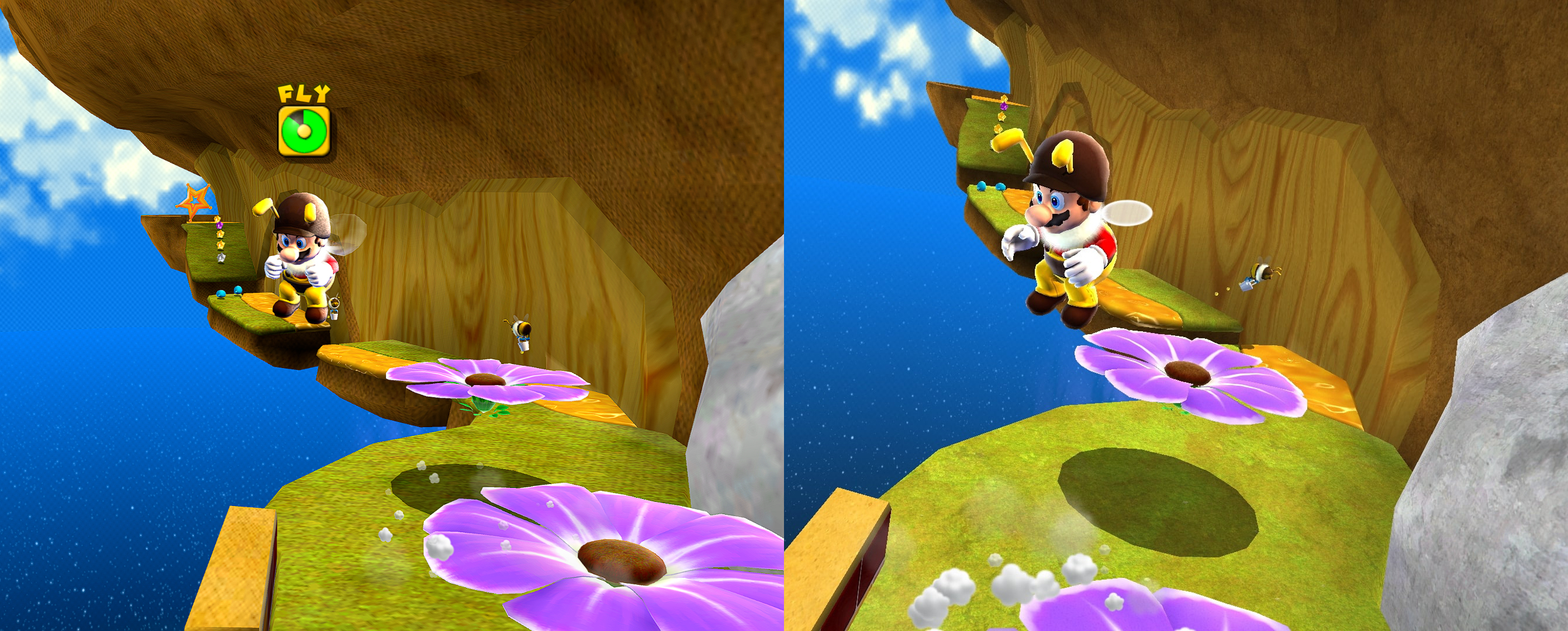
It really looks like the original went for a full-on yarn look sometimes (maybe inspired by older Yoshi games and what then inspired Kirby's Epic yarn shortly after)
Losing unique visual nuance for sharper textures doesn't seem worth it, especially in older or stylized games where sharper textures actually just clash with the geometry.
Edit:
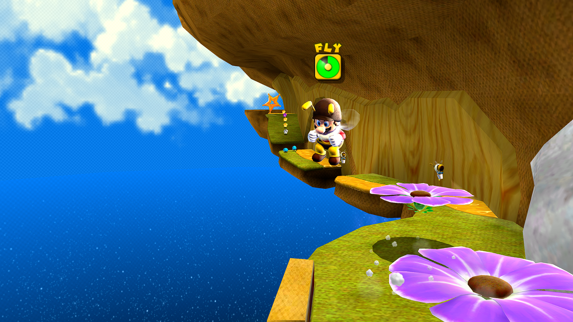
Looks like even some huge and obvious patterns are missing, like the walls here that gave all the bee levels their honeycomb aesthetic. Yikes
It really looks like the original went for a full-on yarn look sometimes (maybe inspired by older Yoshi games and what then inspired Kirby's Epic yarn shortly after)
Last edited:


 . I'd rather they focus their efforts on the inevitable Galaxy 2 or what the follow up to Odyssey is (please don't say Bananza, I'm taking about the next Mario).