RetroGamingUK
Member
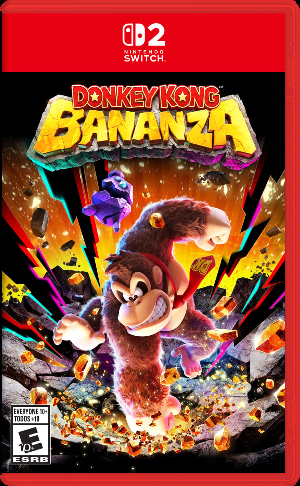
Ignoring the messy game key carts with their blurb and QR codes I really like the Switch 2 game cases.
For me Nintendo has always been the red brand and the more red the better I think.
Whenever I saw Switch games on the shelves with their little red Nintendo logo and the clear plastic cases, I always thought a banner with a red case would sit well alongside PS4's blue and Cbone's green.
Well, I've got my wish with Switch 2. While the banner is maybe a bit thick (I'm guessing the cases match the size of the console's tablet as per Switch 1) and the logo is a little isolated In really liking them.
All that's missing is the iconic Nintendo logo

What's more, they evoke nostalgia by bringing back the red banner of the US N64 cases

What say you, GAF?
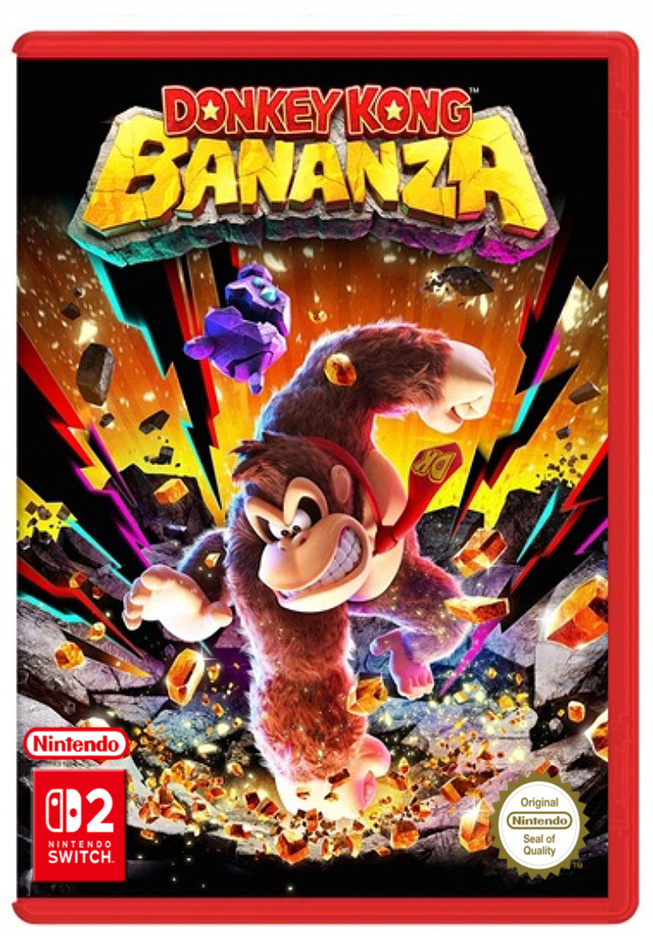
For me Nintendo has always been the red brand and the more red the better I think.
Whenever I saw Switch games on the shelves with their little red Nintendo logo and the clear plastic cases, I always thought a banner with a red case would sit well alongside PS4's blue and Cbone's green.
Well, I've got my wish with Switch 2. While the banner is maybe a bit thick (I'm guessing the cases match the size of the console's tablet as per Switch 1) and the logo is a little isolated In really liking them.
All that's missing is the iconic Nintendo logo
What's more, they evoke nostalgia by bringing back the red banner of the US N64 cases
What say you, GAF?
Last edited: