• Hey, guest user. Hope you're enjoying NeoGAF! Have you considered registering for an account? Come join us and add your take to the daily discourse.

The Formula 1 Off-Season |OT| Haas to get better, right?

I always had a hard time seeing the Marlboro logo since the ban, until this livery. I understand the criticism of the Barcode in the Jalopnik.com article, but some even said that the Scuderia Ferrari logo was straight up Marlboro marketing and I can't agree with that.

That said, the red painted find on the new livery is very obvious.
 

kharma45

Member
Ducati has/had the same barcode on their bikes reading on Reddit. Don't follow Moto GP so never knew

55530.jpg


I always had a hard time seeing the Marlboro logo since the ban, until this livery. I understand the criticism of the Barcode in the Jalopnik.com article, but some even said that the Scuderia Ferrari logo was straight up Marlboro marketing and I can't agree with that.

That said, the red painted find on the new livery is very obvious.

The Scuderia Ferrari logo is essentially half the Marlboro logo. Mirror it and tell me you don't see this

marlboro-logo-C1ACA76845-seeklogo.com.gif
 

DrM

Redmond's Baby
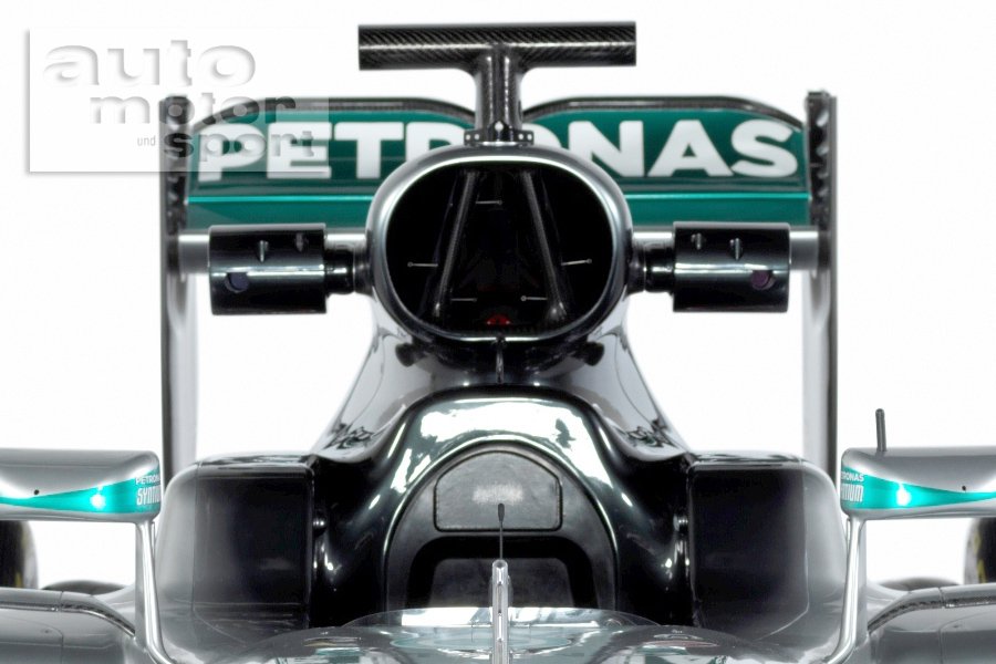
A couple of the spy pictures did suggest a new airbox but I wasn't expecting one you can kick a football down. I suspect they are up to something.
Airbox is roughly 30% bigger than last year

Haas changed their mind and they will unveil their car tomorrow at 14:00 CET, Mclaren is also tomorrow at 11:00 CET
 
The Scuderia Ferrari logo is essentially half the Marlboro logo. Mirror it and tell me you don't see this

marlboro-logo-C1ACA76845-seeklogo.com.gif

That's the argument I've been hearing, but saying that you can easily recognize the Marlboro logo out of it is a bit much, imo. You can't cut the Nike logo in half, change the angle and say it's still just as recognizable. It works on the new livery, because the color proportions are actually kinda similar to the Marlboro logo again.

But maybe I'm just blind to it, because I smoke Lucky.
 
Only confirmed followers have access to @MercedesAMGF1's Tweets and complete profile. Click the "Follow" button to send a follow request.

Yeah, fuck you too.
 

kharma45

Member
That's the argument I've been hearing, but saying that you can easily recognize the Marlboro logo out of it is a bit much, imo. You can't cut the Nike logo in half, change the angle and say it's still just as recognizable. It works on the new livery, because the color proportions are actually kinda similar to the Marlboro logo again.

But maybe I'm just blind to it, because I smoke Lucky.

No not with Nike, but it's not symmetrical. A better one would be half a McDonald's.
 
No not with Nike, but it's not symmetrical. A better one would be half a McDonald's.

I get the point and why people see it, but to me it's really not that similar. Different proportions of red and white, different shape. I guess you can see it, if you want to. But I can also see why Ferrari never got shit for it.

The "logo" even only works on one side of the car, because the SF logo is flipped on the other side.
 

kharma45

Member
I get the point and why people see it, but to me it's really not that similar. Different proportions of red and white, different shape. I guess you can see it, if you want to. But I can also see why Ferrari never got shit for it.

The "logo" even only works on one side of the car, because the SF logo is flipped on the other side.

They never got shit because the FIA don't care.
 

kharma45

Member
Reading more into it, I was surprised to find out that Philip Morris owns all the Ferrari advertising space and sells it on to others.
 

Aiii

So not worth it
Well at least they won something, ugliest car on the grid.

Unless Sauber comes up with something worse than last year, of course.
 

Ryne

Member
That McLaren is hideous. Did Mercedes take their art team or something, yuck.

Please someone bring some decent colour to the grid. All dark cars so far (I know Renault is changing theirs).
 

Staab

Member
The Mercedes is alright, kinda looks neat with those darker black undertones.

The McLaren on the other end... looks downright fucking hideous, did they get bought by HRT or something ?! good lord !

Not looking too bright for Haas either with all that grey on their outfit.

Manor, pls save us !
 

ElTorro

I wanted to dominate the living room. Then I took an ESRAM in the knee.
What's the deal with that terrible font for the car's number?

VSwYPXh.png


jqlSC4N.png
 

Jibbed

Member
I think we're set for a great season this year.

Can Ferrari and Williams take the fight to Mercedes? How quick will Manor and Haas be with 2016 factory engines? Will Red Bull genuinely have to fight Toro Rosso for points? Will Renault be any good? Have McLaren got their shit together?

I love it.
 

DrM

Redmond's Baby
that's ginormous ....

Looks like new Mercedes PU106C needs quite a lot of air. And Mercedes is the first car that has S-duct already installed on promotional pics

Also we have only two preseason tests this year - this mean each day lost due to technical issues will be costly and due to that we see a lot of teams doing 'filming' days
 
Top Bottom