Metroid Hunter
Banned
Who?...what?....where?.....Two threads running the same content!?!?!?!?
No one comes to the community subforum.

Who?...what?....where?.....Two threads running the same content!?!?!?!?
Box art by YoshiStar. I just removed the old Wii U logo.
You know you guys want this hehe

So what's the consensus around here about the Wii U boxart? Like or dislike?
So what's the consensus around here about the Wii U boxart? Like or dislike?
So what's the consensus around here about the Wii U boxart? Like or dislike?
Not sure if it's time for a rerelease yet, though - perhaps they could launch it as a downloadable title on the shop...
So what's the consensus around here about the Wii U boxart? Like or dislike?
You....I still haven't gotten around to playing this game. I really need to do that sometime soon!
Not sure if it's time for a rerelease yet, though - perhaps they could launch it as a downloadable title on the shop...
So what's the consensus around here about the Wii U boxart? Like or dislike?
So what's the consensus around here about the Wii U boxart? Like or dislike?
Why you gotta be so late Nibel!
Box art by YoshiStar. I just removed the old Wii U logo.
Box art by YoshiStar. I just removed the old Wii U logo.
I still haven't gotten around to playing this game. I really need to do that sometime soon!
Not sure if it's time for a rerelease yet, though - perhaps they could launch it as a downloadable title on the shop...
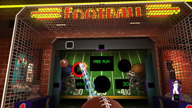
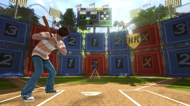
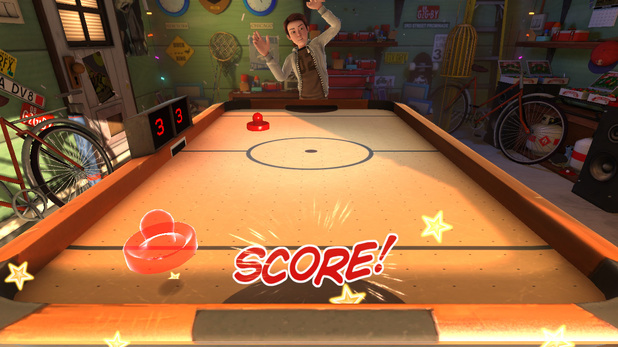
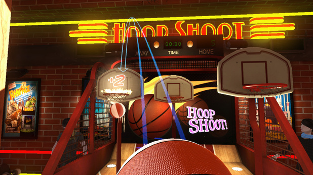
Game Party Champions offers arcade, sports, and party games. Players can use the Wii U GamePad to compete in activities such as ping pong, skill ball, table hockey, and hoop shoot.
I'm all in thank you")
 I might do a better one later when I get home. More hi-res. tht was a quick mockup for me.
Depends if the game in question is worth playing again.
in Wind Waker's case, that's a hell yes.
The yellow line looks weird at first, but now i really like it. Its very distinguished from Wii games, wich is the most important aspect imo.
Game Party Champions announced for wii u by Warner Bros. Interactive
http://nintendoeverything.com/95809/warner-bros-interactive-announces-game-party-champions-for-wii-u/

Slap me if old.
New Wii U game alert! Warner Bros announces "Game Party Champions"
http://www.eurogamer.net/articles/2012-08-08-warner-bros-announces-wii-u-title-game-party-champions
Literally seven posts too slow.
Damn. I really don't like the turquoise blue in that cover though.
Slap me if old.
New Wii U game alert! Warner Bros announces "Game Party Champions"
http://www.eurogamer.net/articles/2012-08-08-warner-bros-announces-wii-u-title-game-party-champions
Damn. I really don't like the turquoise blue in that cover though.
It may be lack of colour correction. The file on the website of the agency Warner Bros uses (Premier) is a CMYK PSD. I only have GIMP to use at that moment, and that doesn't support CMYK so I cannot open the file to check settings.Damn. I really don't like the turquoise blue in that cover though.
Rösti;40757623 said:It may be lack of colour correction. The file on the website of the agency Warner Bros uses (Premier) is a CMYK PSD. I only have GIMP to use at that moment, and that doesn't support CMYK so I cannot open the file to check settings.
A login may or may not be needed (I have an account there): http://games.premiercomms.com/default.asp?p=1&i=1129

Someone tweeted a shot of the console's box, but it's gone now.
Can Detective-GAF get it back?
Someone tweeted a shot of the console's box, but it's gone now.
Can Detective-GAF get it back?
Rösti;40757623 said:It may be lack of colour correction. The file on the website of the agency Warner Bros uses (Premier) is a CMYK PSD. I only have GIMP to use at that moment, and that doesn't support CMYK so I cannot open the file to check settings.
A login may or may not be needed (I have an account there): http://games.premiercomms.com/default.asp?p=1&i=1129
Someone tweeted a shot of the console's box, but it's gone now.
Can Detective-GAF get it back?
Someone tweeted a shot of the console's box, but it's gone now.
Can Detective-GAF get it back?
.Found this on twitter. Nintendo Land bundle confirmed?

Edit: Fan concept