-
Hey Guest. Check out your NeoGAF Wrapped 2025 results here!
You are using an out of date browser. It may not display this or other websites correctly.
You should upgrade or use an alternative browser.
You should upgrade or use an alternative browser.
Windows 8 Release Preview
- Thread starter celebi23
- Start date
- Status
- Not open for further replies.
StudioTan
Hold on, friend! I'd love to share with you some swell news about the Windows 8 Metro UI! Wait, where are you going?
I seriously wouldn't have come to that solution by myself at all, and I've been using computers since I was 10, when I got my first MS-DOS based 386, and pretty much trouble-shooting myself. I mean, in Android or iOS there's at least some "item" to swipe down (the status bar) but in Metro there's nothing at all. It feels weird doing gestures without any kind of "hint" about what you are able to do. Even some translucent arrows or "handles" in the edges of the screen hinting there's an active area at a global level you can "pull" to reveal more information would be better than nothing. I bet that expecting people to instinctively know they can swipe from the edges to have additional options without any kind of hint is like a big red "FUCK NO" in any software usability manual. Seriously, I've tried every kind of OS both desktop and mobile, every single flavour of Linux and dozens of different desktop paradigms and Metro is the first time in my life I've felt completely lost on how to do even the most basic stuff.
iOS gestures were not instantly apparent either. They showed you how to use the OS right in the first commercials so that when someone picked up the an iPhone for the first time they already knew how to use it because they saw how the gestures worked in the commercial. MS will do the same thing. MS also did this when the Start button was introduced for the first time.
Ha, they've made it so you can't log straight into desktop and skip metro. Oh Microsoft.
Why would you need to? Are you booting a computer to look at your desktop or to run a program?
Steelyuhas
Member
Why would you need to? Are you booting a computer to look at your desktop or to run a program?
True, also who doesn't sleep their computer 99% of the time?
iOS gestures were not instantly apparent either. They showed you how to use the OS right in the first commercials so that when someone picked up the an iPhone for the first time they already knew how to use it because they saw how the gestures worked in the commercial. MS will do the same thing. MS also did this when the Start button was introduced for the first time.
Why would you need to? Are you booting a computer to look at your desktop or to run a program?
Metro gives you a very narrow view of your computer and limits what you can access. You can't place a file on the tile set. You can't easily see file paths and many other things.
Sure, it might be slightly faster for 1 or two things. Then, it fails to be as efficient as the start button in every other aspect. The basic idea behind Metro is not bad. I'm all for a more efficient interactions with computers. It's just that Metro feels like step backward and badly designed UI. It feels 100% unnecessary.
I'll say what I said to markot before he popped an aneurysm.
W8 is about the shift in computer usage. Very few people give a shit about file paths. They just want access to their abstract data "pictures/music/videos/websites/tweets/facebook/etc".
Microsoft is obviously chasing that and if they focused on placing files on the desktop instead, they will fail in the next few years.
For the three people that need to navigate into file hierarchy, they still can. Total abstraction of files and content is the next step in computing. That's why they are moving the user away from "c:\my documents\pics" to "User's Pictures".
The desktop blemish on W8 is needed for the transition, but it will be dropped in it's entirely, and be relegated to business specific frameworks.
StudioTan
Hold on, friend! I'd love to share with you some swell news about the Windows 8 Metro UI! Wait, where are you going?
Metro gives you a very narrow view of your computer and limits what you can access. You can't place a file on the tile set. You can't easily see file paths and many other things.
Sure, it might be slightly faster for 1 or two things. Then, it fails to be as efficient as the start button in every other aspect. The basic idea behind Metro is not bad. I'm all for a more efficient interactions with computers. It's just that Metro feels like step backward and badly designed UI. It feels 100% unnecessary.
In terms of file management I agree but that's what the desktop is for. As a program launcher I disagree, Metro provides quick access to to far more programs than you get with the Start menu. I have room for 84 tiles without having to scroll, that's more than 4x the amount of items you can see at once in the Start menu.
To answer your earlier question about search being divided, this is done because search is now universal. It's not just programs, settings and files but you use the same interface to search within apps.
I agree the file search needs work and needs to have more options and more information. Until that's done searching using the file browser on the desktop works fine.
Metro gives you a very narrow view of your computer and limits what you can access. You can't place a file on the tile set. You can't easily see file paths and many other things.
Sure, it might be slightly faster for 1 or two things. Then, it fails to be as efficient as the start button in every other aspect. The basic idea behind Metro is not bad. I'm all for a more efficient interactions with computers. It's just that Metro feels like step backward and badly designed UI. It feels 100% unnecessary.
It is unnecessary for us 'core' users. That's why I still believe that a non-metro solution to W8 should be created for those who favor the 'legacy' design.
Damon Bennet
Member
I'll say what I said to markot before he popped an aneurysm.
W8 is about the shift in computer usage. Very few people give a shit about file paths. They just want access to their abstract data "pictures/music/videos/websites/tweets/facebook/etc".
Microsoft is obviously chasing that and if they focused on placing files on the desktop instead, they will fail in the next few years.
For the three people that need to navigate into file hierarchy, they still can. Total abstraction of files and content is the next step in computing. That's why they are moving the user away from "c:\my documents\pics" to "User's Pictures".
The desktop blemish on W8 is needed for the transition, but it will be dropped in it's entirely, and be relegated to business specific frameworks.
this made me laugh somehow
lunarworks
Member
Well, that was one extreme case of people that worked in text-only and then changed to a mouse-operated GUI, it's a huge paradigm switch that needs time to adjust to. However now we're talking about switching between different kind of GUIs, something that, as I said, never should take more than a minute to find where all the programs and where the settings are which is the bare essential to start working (and mind me, all it took in Windows 95 was clicking that fancy "Start" button to instantly see both). If that's hidden behind invisible buttons to the point of making experienced people feel like they're in front of "Fisher Price's My First PC"... well, let me say your engineers fail at basic UX design.
You're just unwilling to embrace change. You're the problem. Why don't you embrace the future?

Anyway, I showed and explained Windows 8 to my girlfriend today, and she had a hostile reaction to it.
Why can't some of you just accept that
unless you are searching for things every 5 seconds it is very easy to ignore the new UI.It is unnecessary for us 'core' users. That's why I still believe that a non-metro solution to W8 should be created for those who favor the 'legacy' design.
It is unnecessary for us 'core' users. That's why I still believe that a non-metro solution to W8 should be created for those who favor the 'legacy' design.
I'm all for transitions into more efficient computing models. What I really want is the option. Yes, keep developing that UI for my Mom, my sister and tablets. Integrate a closed marketplace and make thousands of "apps". Make them as small and useless as you can. Limit their scope and access and price them at 99cents. But, for the love of god, give me the option of having an efficient Windows experience.
Don't distribute two different OS. Just let me tick a checkbox somewhere so that I don't have to feel like I'm gimping myself with Metro. Let it be active by default. Bury the option into the 7th layer of a hidden folder. My sister, my mom and everyone that isn't a core user won't be any wiser to it. They might even like Metro, the poor souls. In fact, my mother will be ecstatic when she will see the tileset. It's perfect for her. Like the Ipad, it fits her need. 5-6 programs that she frequently uses and that's pretty much it. Her computer needs aren't the same as mine and that something that Microsoft needs to accept.
Anyway, I understand that this is a transitional period. One where the complexity of computers will start to be hidden behind pretty tilesets and colors. Where new control scheme will change the way we interact with content. Touch controls, voice and all that will mix into a new era of computers. But we are not there yet. The iOS generation is growing but the more traditional user base is still there. All I wish is that Microsoft would make it a smooth transition.
iOS gestures were not instantly apparent either. They showed you how to use the OS right in the first commercials so that when someone picked up the an iPhone for the first time they already knew how to use it because they saw how the gestures worked in the commercial. MS will do the same thing. MS also did this when the Start button was introduced for the first time.
iOS gestures are common sense, anyone automatically tries doing them without knowing about them, it simply feels natural since it is a touch screen.
Win8 gestures? Completely stupid to do with mouse. They are there not because it is natural, not because it is faster, but because its gestures are cool and they put that in presentation.
W8 is about the shift in computer usage. Very few people give a shit about file paths. They just want access to their abstract data "pictures/music/videos/websites/tweets/facebook/etc".
Microsoft is obviously chasing that and if they focused on placing files on the desktop instead, they will fail in the next few years.
For the three people that need to navigate into file hierarchy, they still can. Total abstraction of files and content is the next step in computing. That's why they are moving the user away from "c:\my documents\pics" to "User's Pictures".
The desktop blemish on W8 is needed for the transition, but it will be dropped in it's entirely, and be relegated to business specific frameworks.
really? If thats what people want on their Desktop, wouldnt they be buying OS X and not Windows? And yet, despite huge popularity of Apple, they are having tough luck in PC market, with MS having >90% share worldwide.
Abstractions are cool when you have 10 files... and very inefficient when you have thousands.
There was a reason people got Windows for Laptop and then got iOS for their phone/tablet.
Now I wonder how many devs will start porting their stuff to OS X now due to worry that Windows ecosystem will rapidly collapse.
Damon Bennet
Member
iOS gestures are common sense, anyone automatically tries doing them without knowing about them, it simply feels natural since it is a touch screen.
Win8 gestures? Completely stupid to do with mouse. They are there not because it is natural, not because it is faster, but because its gestures are cool and they put that in presentation.
what is natural about 4 finger swipes?
Today, I discovered that older people (anecdotal I guess) who didn't grow up with computers that were introduced to windows 8 actually like the new start screen layout more than the start menu. I'm guessing the charms bar is going to take a little time to get used to though.
On the flip side, I also now understand why the store and metro in general are a bad thing for people who have already developed stores on windows, but I'm not sure if the same demographics are going to be affected. The people who use and know what steam is are probably still going to use steam and the desktop regardless of whether or not it has a metro app. In a few years though, who knows.
On the flip side, I also now understand why the store and metro in general are a bad thing for people who have already developed stores on windows, but I'm not sure if the same demographics are going to be affected. The people who use and know what steam is are probably still going to use steam and the desktop regardless of whether or not it has a metro app. In a few years though, who knows.
Steelyuhas
Member
Today, I discovered that older people (anecdotal I guess) who didn't grow up with computers that were introduced to windows 8 actually like the new start screen layout more than the start menu.
On the flip side, I also now understand why the store and metro in general are a bad thing for people who have already developed stores on windows, but I'm not sure if the same demographics are going to be affected. The people who use and know what steam is are probably still going to use steam and the desktop regardless of whether or not it has a metro app. In a few years though, who knows.
Yeah if you are starting from scratch, the new UI makes a lot of sense and the unified areas for stuff like settings and search through the charms is great. It's the people that have trained themselves on using Windows the same way for the past 15+ years that get thrown for a ride of WTF is going on.
StudioTan
Hold on, friend! I'd love to share with you some swell news about the Windows 8 Metro UI! Wait, where are you going?
iOS gestures are common sense, anyone automatically tries doing them without knowing about them, it simply feels natural since it is a touch screen.
Win8 gestures? Completely stupid to do with mouse. They are there not because it is natural, not because it is faster, but because its gestures are cool and they put that in presentation.
They make sense after you know them sure, but they in no way relate to how you use a computer with a mouse. He's saying since they don't give a hint that you can do things with the sides of the screen or relate to mouse movements then it is bad design and no one will know what to do. The same thing must be true for iOS since you're also given no visual indication that swiping, pinching and two finger movements do anything at all. People know how to do them because they've been shown how and after you see it done it makes sense. The same is true of Window 8 on a tablet. The side gestures make perfect sense in use and feel very natural.
Also, you don't do the same gestures with a mouse. They're completely separate actions and make sense for each input method.
I think most of them regularly use windows, my dad got windows 95 at midnight (it was just him and some friends who were over for dinner that night that I showed win8 to) so they're all familiar with the regular start menu, though none of them really use it to it's full extent I'd imagine. Large buttons and plenty of space to pin tabs appealed to them.Yeah if you are starting from scratch, the new UI makes a lot of sense and the unified areas for stuff like settings and search through the charms is great. It's the people that have trained themselves on using Windows the same way for the past 15+ years that get thrown for a ride of WTF is going on.
Hell, I still forget that search now exists via the charms bar...there are going to be plenty that are confused with the charms bar. I don't think the little introduction in the RTM build is going to be sufficient.
Steelyuhas
Member
I think most of them regularly use windows, my dad got windows 95 at midnight (it was just him and some friends who were over for dinner that night that I showed win8 to) so they're all familiar with the regular start menu, though none of them really use it to it's full extent I'd imagine. Large buttons and plenty of space to pin tabs appealed to them.
Hell, I still forget that search now exists via the charms bar...there are going to be plenty that are confused with the charms bar. I don't think the little introduction in the RTM build is going to be sufficient.
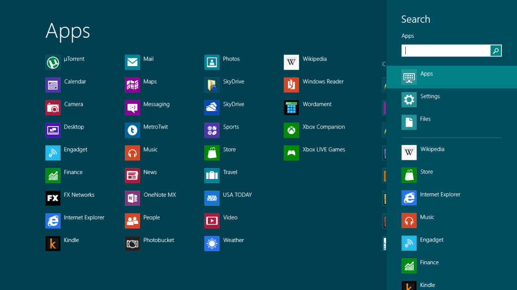
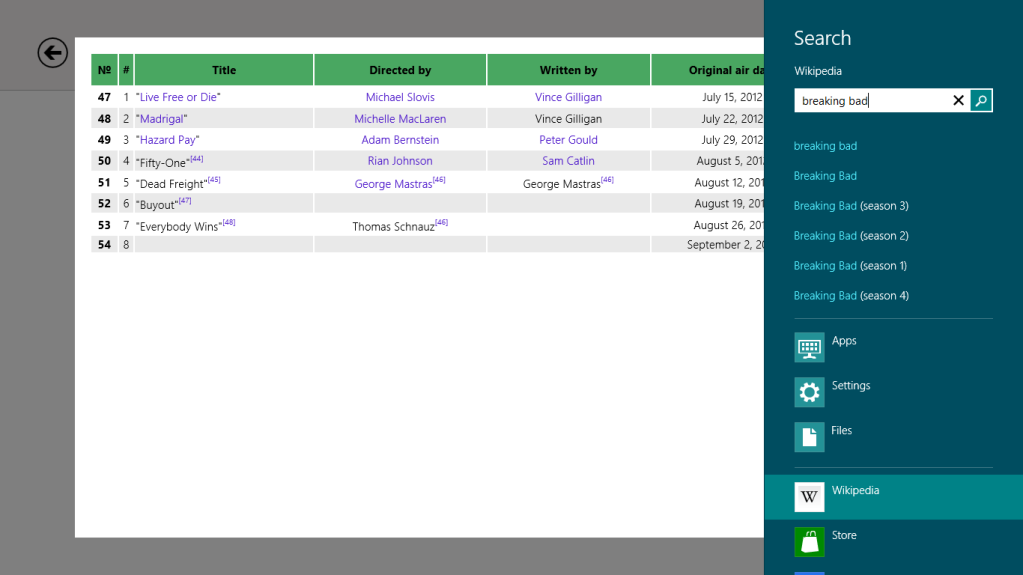
The search charm is actually something I use all the time. Of course, I use the keyboard shortcut (Win Key + Q). I search the wikipedia app all the time for stuff, which of course just brings up my search in the app by clicking on wikipedia on the search charm without going to the app prior to my search. It's very slick.
The search charm is actually something I use all the time. Of course, I use the keyboard shortcut (Win Key + Q). I search the wikipedia app all the time for stuff, which of course just brings up my search in the app by clicking on wikipedia on the search charm without going to the app prior to my search. It's very slick.
Please post a screenshot.
Steelyuhas
Member
Please post a screenshot.
Hitting Win + Q. If you are in a Metro app, it won't kick to this screen, but it will if you are in the desktop.
Enter my search and click on the Wikipedia app on the right.
soul creator
Member
why are you pressing win+q? just hit win and start typing.
for searching within apps, win+q would still be needed (unless the app itself supports just typing at any time)
Of course, for the general metro launcher, you can just type.
ehhh i don't think so. Win+q and Win+typing or just typing from the start screen go to the same place, App search which is default. You then can select another category whether it be Settings, Files or a specific Application. So pressing q is kind of pointless.for searching within apps, win+q would still be needed (unless the app itself supports just typing at any time)
Of course, for the general metro launcher, you can just type.
Hitting Win + Q. If you are in a Metro app, it won't kick to this screen, but it will if you are in the desktop.
Enter my search and click on the Wikipedia app on the right.
Nice.
soul creator
Member
ehhh i don't think so. Win+q and Win+typing or just typing from the start screen go to the same place, App search which is default. You then can select another category whether it be Settings, Files or a specific Application. So pressing q is kind of pointless.
I think I read his wikipedia example slightly wrong. I forgot you can select other search categories/apps from the start menu

That said, if you're already inside the wikipedia app, just typing doesn't seem to do anything.
I assume win+q will auto select the current app?
Correct. Same as selecting search from the charms bar.
not using win+Q is an extra click, or an extra scroll+click if wikipedia's app is not on up on the list if he wanted to search inside the app.ehhh i don't think so. Win+q and Win+typing or just typing from the start screen go to the same place, App search which is default. You then can select another category whether it be Settings, Files or a specific Application. So pressing q is kind of pointless.
I'm not sold on metro apps, and probably won't be until we get some properly made ones.
really? If thats what people want on their Desktop, wouldnt they be buying OS X and not Windows? And yet, despite huge popularity of Apple, they are having tough luck in PC market, with MS having >90% share worldwide.
Abstractions are cool when you have 10 files... and very inefficient when you have thousands.
There was a reason people got Windows for Laptop and then got iOS for their phone/tablet.
Now I wonder how many devs will start porting their stuff to OS X now due to worry that Windows ecosystem will rapidly collapse.
I'm not too familiar with OSX, but I never thought of it as something that was primarily content driven.
With metatagging, and db organization, huge collections can be easily managed...look at Google search.
That's where the future of managing content is, deep scanning of data. Its plenty obvious already I'm w8 with searching through apps.
I always pit OSX right next to Windows, into terms of interaction. The interaction tats drastically changing.
Steelyuhas
Member
not using win+Q is an extra click, or an extra scroll+click if wikipedia's app is not on up on the list if he wanted to search inside the app.
I'm not sold on metro apps, and probably won't be until we get some properly made ones.
The list is always ordered by what you've recently used I believe.
what is natural about 4 finger swipes?
Nothing. Double tap of home button is also not intuitive.
Wiktor
Member
Now I wonder how many devs will start porting their stuff to OS X now due to worry that Windows ecosystem will rapidly collapse.
OSX will never be anything besides niche. Even if Windows would collapse OSX has zero chances of being safe heaven for devs. Linux stands much better chance, but even that is unlikely.
OSX will never be anything besides niche. Even if Windows would collapse OSX has zero chances of being safe heaven for devs. Linux stands much better chance, but even that is unlikely.
Eh, Linux will never move beyond niche either. If Windows 8 is a massive failure then consumers and devs will just stick to Windows 7 and OEMs will offer "downgrades" to it.
Now I wonder how many devs will start porting their stuff to OS X now due to worry that Windows ecosystem will rapidly collapse.
Windows ecosystem "will rapidly collapse"? Devs will start porting their stuff to OS X (i.e. a system that also starts to adapt the whole tablet ecosystem, along with app store)? What?
If anything, people will just stay on Windows 7, devs will continue producing their stuff on Windows (Windows XP - Windows 8) and Microsoft will have to rethink their plans for Windows' future.
You're just unwilling to embrace change. You're the problem. Why don't you embrace the future?
If the future is a retarded abstraction of a computer where I'm devoid of all control of my machine and most likely limited to a walled garden where I'm told what can I install and how can I access media, with every kind of technical aspect hidden from me like I'm too stupid to understand it... yep, I'd rather stay in the past.
By the way, about the wikipedia search, Ctrl+T -> W -> <TAB> -> write what I need to search -> Intro is always quicker than relying in the Metro search and mouse clics.
HollovVpo1nt
Banned
I just don't understand what is wrong with the current Windows 7 layout. It's great. Windows 8 PC should have been that UI, but more in line with their Metro push. Honestly, what is wrong with this amazing concept:
Serious question, are there any developers/designers that can tell me what's wrong with that?
They should have kept the current W8 tablet exclusive, without the legacy desktop. Without having ever used Windows 8, I dislike the concept of it.

Serious question, are there any developers/designers that can tell me what's wrong with that?
They should have kept the current W8 tablet exclusive, without the legacy desktop. Without having ever used Windows 8, I dislike the concept of it.
By the way, about the wikipedia search, Ctrl+T -> W -> <TAB> -> write what I need to search -> Intro is always quicker than relying in the Metro search and mouse clics.
Is that while the browser is the active window?
Serious question, are there any developers/designers that can tell me what's wrong with that?
They should have kept the current W8 tablet exclusive, without the legacy desktop. Without having ever used Windows 8, I dislike the concept of it.
It looks nice, but it still has the same issue of not being good for touch. Several of those things are too small to be used effectively with touch and reliably.
Serious question, are there any developers/designers that can tell me what's wrong with that?
They should have kept the current W8 tablet exclusive, without the legacy desktop. Without having ever used Windows 8, I dislike the concept of it.
It does look sweet, but implementing this would affect the look of every single program running on Windows. I remember playing with WindowsBlinds few years ago and some themes managed to break some programs I was using back then: icons had wrong colors, menus and fonts were black etc.
Damon Bennet
Member
meh, looks like it was made by a linux user. the colors scream "ubuntuuuuu"
PetriP-TNT
Member
My biggest gripe with W7 is the file management. Hell, it would be thousand times better if you could use tab in Windows Explorer.
As someone who needs to manage multiple files to multiple different folders and rename them accordingly, I still yet to find a proper tool. I can do that with, say, Ubuntus default filebrowser but not with WE. It doesn't seem that W8 would be any help with this.
As someone who needs to manage multiple files to multiple different folders and rename them accordingly, I still yet to find a proper tool. I can do that with, say, Ubuntus default filebrowser but not with WE. It doesn't seem that W8 would be any help with this.
It does look sweet, but implementing this would affect the look of every single program running on Windows. I remember playing with WindowsBlinds few years ago and some themes managed to break some programs I was using back then: icons had wrong colors, menus and fonts were black etc.
This is the key.... if they made any drastic changes to the desktop EVERY program would have to be remade (effectively starting over from scratch anyways). If they were going to do that they chose to make their model something that would work for touch as well as on traditional pc's but touch was given priority.
Is that while the browser is the active window?
Which for me is like... 99% of the time I want to check anything in the Wikipedia. Or any other searchable source. Just start writing the url (usually one or two characters are enough if they're common) then press Tab and ta-da! instant search.
Fine Ham Abounds
Member
I'll say what I said to markot before he popped an aneurysm.
W8 is about the shift in computer usage. Very few people give a shit about file paths. They just want access to their abstract data "pictures/music/videos/websites/tweets/facebook/etc".
Microsoft is obviously chasing that and if they focused on placing files on the desktop instead, they will fail in the next few years.
For the three people that need to navigate into file hierarchy, they still can. Total abstraction of files and content is the next step in computing. That's why they are moving the user away from "c:\my documents\pics" to "User's Pictures".
The desktop blemish on W8 is needed for the transition, but it will be dropped in it's entirely, and be relegated to business specific frameworks.
This is how I see it as well, and this is everything I dislike about said shift.
My personal view is that all tech should be readily accessible to the masses, but the masses should become more literate with the media they use, not have the mode of content delivery become dumbed down to accommodate a hypothetical lowest common denominator to the point where an advanced user no longer has any control of their media. Familiarity with the content is going to naturally lead some people to wanting to learn to control it better, and I don't think that option should go away entirely. Maybe I'm oversimplifying the issue, and it's simply not possible to offer advanced control in an accessible manner.
It's just got me imagining this campy future with banners reading, "when there are no more advanced users of computers, only computers will be advanced users."
LukasTaves
Member
Part of the "getting out" of Metro applications that is an issue is that users have this inherent attempt to try to "close" an app, while the Metro applications are not designed to be closed. Just something that people will have to adjust to.
This. Once they have the mentality that they don't need to close an app to start another they will just use the start button/charm/corner.
Which for me is like... 99% of the time I want to check anything in the Wikipedia. Or any other searchable source. Just start writing the url (usually one or two characters are enough if they're common) then press Tab and ta-da! instant search.
Which is great(and is still available in W8), if all of your searchable sources are browser based. There are plenty of cases where having a universal search interface across all of your applications is a darn good idea. Search is better in W8 in my opinion for this very reason.
This is how I see it as well, and this is everything I dislike about said shift.
My personal view is that all tech should be readily accessible to the masses, but the masses should become more literate with the media they use, not have the mode of content delivery become dumbed down to accommodate a hypothetical lowest common denominator to the point where an advanced user no longer has any control of their media. Familiarity with the content is going to naturally lead some people to wanting to learn to control it better, and I don't think that option should go away entirely. Maybe I'm oversimplifying the issue, and it's simply not possible to offer advanced control in an accessible manner.
It's just got me imagining this campy future with banners reading, "when there are no more advanced users of computers, only computers will be advanced users."
Couldn't have said it better myself, thanks!
lunarworks
Member
If the future is a retarded abstraction of a computer where I'm devoid of all control of my machine and most likely limited to a walled garden where I'm told what can I install and how can I access media, with every kind of technical aspect hidden from me like I'm too stupid to understand it... yep, I'd rather stay in the past.
I was being sarcastic. Simply repeating what's been told to me over and over. That I'm the problem.
Tablets aren't PCs (aside from the broad, vague definition of the term "personal computer"), and PCs aren't tablets. What's great for one doesn't effectively translate to the other.
Edit: Analogy time.
Handlebars are great for my bicycle. But, I wouldn't want the steering wheel and brake pedal in my car replaced with bicycle handlebars.
This is how I see it as well, and this is everything I dislike about said shift.
My personal view is that all tech should be readily accessible to the masses, but the masses should become more literate with the media they use, not have the mode of content delivery become dumbed down to accommodate a hypothetical lowest common denominator to the point where an advanced user no longer has any control of their media. Familiarity with the content is going to naturally lead some people to wanting to learn to control it better, and I don't think that option should go away entirely. Maybe I'm oversimplifying the issue, and it's simply not possible to offer advanced control in an accessible manner.
It's just got me imagining this campy future with banners reading, "when there are no more advanced users of computers, only computers will be advanced users."
Yup, that's the other side of the equation. I think both can co-exist, but MS and Co are obviously moving in a direction where they want to limit hardware access for their platform benefits.
- Status
- Not open for further replies.