• Hey, guest user. Hope you're enjoying NeoGAF! Have you considered registering for an account? Come join us and add your take to the daily discourse.

Windows Phone 8.1 |OT| Update 1

I don't know if it was posted here, but Denim is out for the 1520.3. Just disable your preview for developer, I'm updating mine right now.
 

hankster

Member
No camera button.
God.
Dammit.

Maybe this will push the 830 price down. Yeah that's the ticket.

Its just a bridge phone
Its just a bridge phone.
 

Milchjon

Member
Just saw the W10 Icons.

Hold me, Brot.

WP is aging like it's human. WP7 was 60s Claudia Cardinale. W10 is 2010s Claudia Cardinale.

Edit: Spartan with Cortana looks amazing though.
 

kazinova

Member
If you need a bridge phone the 1520 is the best. As a bridge phone it can connect the largest gaps.

Cause it's big.

Like a big phone/bridge.

Get it?
 

JaggedSac

Member
I guess so, but why even waste the time making them when they look (even) worse than the old ones and will be replaced anyway.

They are probably there so they know what still needs final art.

Because it's more likely that someone shit out fake, incomplete icons for a very public unveiling?

Embrace the bad isometric future.

See, I can't tell if people are serious or not, lol.
 

maeh2k

Member
If you think that change was made for shits and giggles, you're wrong. You'd be surprised at how difficult it is for some people to learn how to get to All Apps. This was one of the obvious things that was easily fixed.

It may be hard to learn for some people and that was clearly the easiest way to 'fix' the usability, but it surely isn't the most elegant fix.
They could have kept the arrow and used some animation to emphasize it when scrolled all the way down, or added the text next to the arrow when someone tries to scroll down further than possible. Or they could have used an animation after starting the phone that briefly shows/hints at the app list while bringing up the start screen. I'm sure there are countless ways to improve the usability while keeping the look intact.
Ideally, you'd want a signifier that communicates the affordance without having to scroll all the way down, since the real issue isn't that the users don't know what to make of the button, but that they don't know that there's something to the right and how to get there. The label on the button still won't tell them that they could have swiped to the right at any point.
 

Totakeke

Member
It may be hard to learn for some people and that was clearly the easiest way to 'fix' the usability, but it surely isn't the most elegant fix.
They could have kept the arrow and used some animation to emphasize it when scrolled all the way down, or added the text next to the arrow when someone tries to scroll down further than possible. Or they could have used an animation after starting the phone that briefly shows/hints at the app list while bringing up the start screen. I'm sure there are countless ways to improve the usability while keeping the look intact.
Ideally, you'd want a signifier that communicates the affordance without having to scroll all the way down, since the real issue isn't that the users don't know what to make of the button, but that they don't know that there's something to the right and how to get there. The label on the button still won't tell them that they could have swiped to the right at any point.

#bringbackthegutter
 
I never thought I'd see a reaction to the words "All apps" like this. Yeesh.

That's what happens when you build a beautiful OS from scratch and then slowly butcher it with each update. A gutter here, another hub there... oh look, some pivot controls! no one needs that, right? What does that arrow do again? So confusing!

People are sensitive when you mess with the stuff they know and love.
 

NeOak

Member
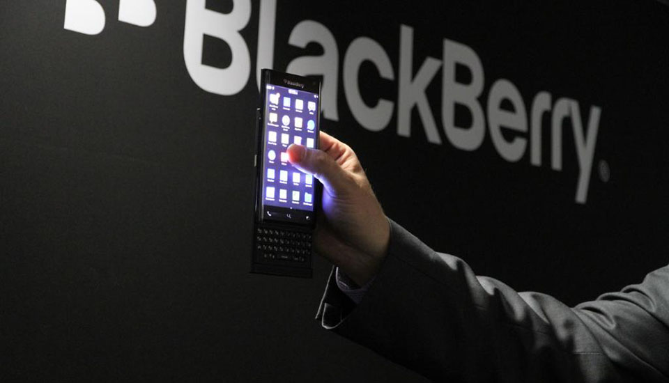
blackberry-2015-03-03-01.jpg

Need this with W10.

Dell, please bring back the Venue Pro phones kthxbye.
 
That's what happens when you build a beautiful OS from scratch and then slowly butcher it with each update. A gutter here, another hub there... oh look, some pivot controls! no one needs that, right? What does that arrow do again? So confusing!

People are sensitive when you mess with the stuff they know and love.

Plus, the (admittedly super super early) W10 preview has me really worried about where the design is headed, so I'm all extra sensitive and shit.
 

dLMN8R

Member
I haven't and won't comment on other design guideline changes because:
  1. I'm not a designer
  2. I don't know what else the design team has planned
  3. I've probably seen some stuff that's not public but I'm not sure and don't want to accidentally reveal anything

I'm just talking specifically about the "all apps" thing. It's such an arbitrary complaint. It changing doesn't violate any sort of design guidelines as far as I'm aware, it doesn't make it look bad, it doesn't get in the way, it's not front and center of anything since it only shows up if you scroll all the way down, it was a simple fix, and it helps customers.

People seem like they're mad simply because it changed at all, are are coming up with excuses to justify the complaint after already deciding that change is inherently bad.
 

Magni

Member
  1. I'm not a designer

It's such an arbitrary complaint. It changing doesn't violate any sort of design guidelines as far as I'm aware, it doesn't make it look bad

You set yourself up for that one ;)

We're complaining because it's a lazy fix for what I'm sure was a real problem for some users. It looks ugly, and it's only helpful once, at most. Lazy fix.
 

VanMardigan

has calmed down a bit.
They could have kept the arrow and used some animation to emphasize it when scrolled all the way down.

Am I crazy or was this already a feature that they removed? I remember the arrow bouncing when you hit the bottom of the page, but I tried it just now and nothing happens.
 
I've worked on features that tried intro designs like this.

They fail utterly spectacularly with real people because it's total information overload.
The product I work on daily has nearly every button labeled with an icon AND text. Our designer insisted on it. I don't think people in this thread really appreciate how useful it is to a huge number of users.

And I agree with the quoted. We had considered the tutorial style on first viewing but decided against it. Far too often in one on one training people just couldn't take everything in at once.
 

PG2G

Member
I don't think a tutorial works when someone plays with your phone at a store to get a feel for the OS.

Everytime someone hands me a Android phone I press some buttons, get lost, and decide it's not worth my time
 

joshschw

Member
Like I stated earlier, the All Apps doesn't truly bother me, I just feel like it's not respecting the design as a whole, which seems to be the theme of late with new features in WP.

In Windows 8.1, when you install a new app, or it even updates itself as far as I know, the arrow on the start screen has a text header "3 New Apps Installed"

What was wrong with this route for WP? A temporary text tag that would accomplish the same thing, but yet go away once the point was made? And the point gets made often in Win8.1, and no one minds.

I've worked on features that tried intro designs like this.

They fail utterly spectacularly with real people because it's total information overload.

Agreed. Completely useless tutorials. Not to mention most users won't ever see them as the phone / computer comes halfway set up for them. I mean, I configure a Win8 computer for people/companies and there's the tutorial, but it's GONE once I set it up, I have to endure it every time though!
 

Magni

Member
Any of this would have been better:
maeh2k said:
It may be hard to learn for some people and that was clearly the easiest way to 'fix' the usability, but it surely isn't the most elegant fix.
They could have kept the arrow and used some animation to emphasize it when scrolled all the way down, or added the text next to the arrow when someone tries to scroll down further than possible. Or they could have used an animation after starting the phone that briefly shows/hints at the app list while bringing up the start screen. I'm sure there are countless ways to improve the usability while keeping the look intact.
Ideally, you'd want a signifier that communicates the affordance without having to scroll all the way down, since the real issue isn't that the users don't know what to make of the button, but that they don't know that there's something to the right and how to get there. The label on the button still won't tell them that they could have swiped to the right at any point.

Or this:
In Windows 8.1, when you install a new app, or it even updates itself as far as I know, the arrow on the start screen has a text header "3 New Apps Installed"

What was wrong with this route for WP? A temporary text tag that would accomplish the same thing, but yet go away once the point was made? And the point gets made often in Win8.1, and no one minds.
 
I never thought I'd see a reaction to the words "All apps" like this. Yeesh.

Honestly man, part of the problem is that at this point the distinctive visual design is almost the only thing WP has left going for it. Apps are way behind, all of Microsoft's services are available on other platforms, no new hardware, but at least we have phones that look cool. Mess that up and there's really not much tying me to the platform.
 
Honestly man, part of the problem is that at this point the distinctive visual design is almost the only thing WP has left going for it. Apps are way behind, all of Microsoft's services are available on other platforms, no new hardware, but at least we have phones that look cool. Mess that up and there's really not much tying me to the platform.

Yes, this was one of the reason I stick with Windows Phone for so long. The "metro" language is beautiful and a joy to use even now with the 8.1 that butcher much of the Windows Phone 7.1. I am still enjoy when I pick up my Lumia 1020 couple with beautiful Lumia phone. But I don't think Microsoft get that. They are slowly turning Window Phone into Android, and not the good part.
 
I think I'm probably not going to miss the old Windows Phone if it means a possibly better feature. I'll gladly take chances when it comes to things like this - even though the older-style UI is a very nice thing to have, to be honest, I don't really see the point of clinging onto it if it means being able to move on to other things.

Then again, I've never really cared about OSes in general, and I tend to get what I want at a given time point, so yeah.
 

kharma45

Member
I've worked on features that tried intro designs like this.

They fail utterly spectacularly with real people because it's total information overload.

José Mourinho;154488577 said:
The product I work on daily has nearly every button labeled with an icon AND text. Our designer insisted on it. I don't think people in this thread really appreciate how useful it is to a huge number of users.

And I agree with the quoted. We had considered the tutorial style on first viewing but decided against it. Far too often in one on one training people just couldn't take everything in at once.

I stand corrected.
 

CaptainABAB

Member
Nothing about "All App ->" is anti-Metro. I think people have taken a certain implementation of Metro as set-in-stone gospel that cannot be ever modified.

Here is a link that shows every page of the original Metro book (in the WP7 days.) Tell me where it addresses putting text next to an arrow?

PDF download link:
http://www.codefest.at/file.axd?file=2010/9/Windows+Phone+Design+System+-+Codename+Metro+(1).PDF

Screenshots:
http://www.istartedsomething.com/20100316/a-look-at-metro-the-book/

Here is another PDF that describes the WP7 specific implementation in great detail:
http://www.joshholmes.com/resources/wpuxtour/metropublic_v0.1.pdf

But even that does not say anything about "icons, but no text."

The discussion is not whether or not Metro can be modified. It's not that it can not be modified or shouldn't be modified. Design can be modified over time and different people are going to have a different interpretation of a design language. Metro got a huge overhaul with Windows 8 (for the better or worse) and that's okay. But that doesn't mean that this specific implementation is good. It's not a good solution to that problem.


Look at this and tell me honestly "yeah, this is good. this is how it should be done".
 

hadareud

The Translator
I can look at that and honestly say that I don't think it's a bad idea, or ugly, or anything else bad.

Whether there's an arrow or an arrow plus text doesn't make the slightest of differences to me. Personally I'd get rid of the arrow altogether, I've never used it once and I don't see it during 99% of my use of my phone. But it's there, it always has been. At least they had the decency to move it to the bottom. The text changes nothing as far as I can see.

And since they do the same on W10 desktop, why not do it on the phone too.
 
Top Bottom