That's not Darkseid
that's the joke
That's not Darkseid
Only good Lex Luthor
Fucking Superman's cousin burned hotter than Kryptonite
Want to buy some nuke kid? It'll get you hiiiighhhhh!
Are these suppose to be """""homages""""" to Liefeld's Cable & Deadpool #1/New Mutants #98 covers or has he just gotten that lazy.
Hey now. Isn't that the alien goo monster Supergirl?
Hey now. Isn't that the alien goo monster Supergirl?
That's exactly what I thought when I first saw the pic
He looks like an unused character from one of Frank Miller's Robocop scripts
All of the Trinity's main villains use purple and green. Joker, Luthor, Circe (green armor + purple hair) when they were pushing her as WW arch nemesis.Green and Purple are Luthor's colors. Purple and Green are Joker's.
What retro 90's extreme bullshit is from this comic panel from?
Are you going to address the fact that it's literally the All-Star Superman design with dumb gloves and less ostentatious colors or just keep talking about the 90s?
Only good Lex Luthor


Fucking Superman's cousin burned hotter than Kryptonite
All of the Trinity's main villains use purple and green. Joker, Luthor, Circe (green armor + purple hair) when they were pushing her as WW arch nemesis.
Is that Paul Shaffer?
What retro 90's extreme bullshit is from this comic panel from?
I like one shots from every house, and enjoy paperback collections very much, but to believe you can read comics in a straight order and get some kind of well thought, laid out storytelling is autodelusion.But you said in the BO thread that you liked Marvel comics

I like one shots from every house, and enjoy paperback collections very much, but to believe you can read comics in a straight order and get some kind of well thought, laid out storytelling is autodelusion.
have you guys seen the new street level Green Lantern yet:

I miss Parallax
I like one shots from every house, and enjoy paperback collections very much, but to believe you can read comics in a straight order and get some kind of well thought, laid out storytelling is autodelusion.
I don't enjoy his over abundance in shock and gimmicks for sure, and I'vre read a good chunk of them. The skinned joker screamed "tryhard" so hard for me. Court of Owls was pure quality, I'll give him that.happens all the time. Snyder has written 40 plus comics of thought out and well told Batman stories.
have you guys seen the new street level Green Lantern yet:
http://media.comicbook.com/uploads1/2015/03/gl-cv41-127275.jpg[img]
I miss Parallax[/QUOTE]
Don't hate, he's off to a rap battle against Sinestro with Lobo as the MC.
have you guys seen the new street level Green Lantern yet:
I don't enjoy his over abundance in shock and gimmicks for sure, and I'vre read a good chunk of them. The skinned joker screamed "tryhard" so hard for me. Court of Owls was pure quality, I'll give him that.
have you guys seen the new street level Green Lantern yet:

I miss Parallax
Second thought, is this on an alien world? IF so that could be cool.
But all of that ends up leading to a great pay-off.
EDIT: God damn I love Wondy's new look.
You're more patient that I am. I'm not saying I'm right, I might be playing a fool here so feel free to ignore me, the point I'm trying to make is, people shouldn't get too played up when some zany redesign like this one happens, it's.. comics, it's ok, it's easier to enjoy itfor what it is, and if you don't then stay away because crazier things will happen at every turn.But all of that ends up leading to a great pay-off.
have you guys seen the new street level Green Lantern yet:

I miss Parallax
You people really got hung up on this quote eh? If you're happy with the sitcom cheese that was AoU then good for you manUh Edgy is straight from the CEO of WB/DC's mouth
http://screenrant.com/dc-comics-movies-edgier-marvel-differences/
I think these are the redesigns so far. I really like cyborg and wondy so far.
Let's change the subject to how much that Wonder Woman design knocks it out of the park.I think these are the redesigns so far. I really like cyborg and wondy so far.
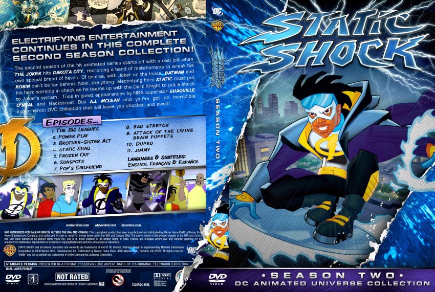
He looks like a Static Shock character now...

every hero/bad guy in this show had goggles/square thick sunglasses of various colors.
Let's change the subject to how much that Wonder Woman design knocks it out of the park.
I like one shots from every house, and enjoy paperback collections very much, but to believe you can read comics in a straight order and get some kind of well thought, laid out storytelling is autodelusion.
I think these are the redesigns so far. I really like cyborg and wondy so far.
I think these are the redesigns so far. I really like cyborg and wondy so far.
You people really got hung up on this quote eh? If you're happy with the sitcom cheese that was AoU then good for you man
I think these are the redesigns so far. I really like cyborg and wondy so far.
