bigboss370
Member
Cavill looking like a boss.
Which classic one?
I guess a big spoiler.
Not really surprising.
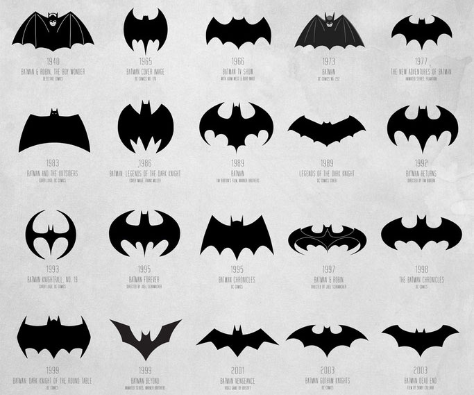
Burton era symbol is still the best. some of the other ones are overengineered or they look stretched or squashed or like car company emblems (Nolan era)

Huh but it doesn't exist in this universe wonder if that is truly correct
Huh but it doesn't exist in this universe wonder if that is truly correct
ww angling her head down is somehow disappointing
put your chin up
This thing?
Naw man, that's super over designed.
Is that what that is? I thought it was a beach ball that represented summer.
Haha look at his hair
What? Really?Is that what that is? I thought it was a beach ball that represented summer.
That was never the Burton bat symbol
That was never the Burton bat symbol

Why do you think they added the word love to it then...?Is that what that is? I thought it was a beach ball that represented summer.
yeah it is. It's exactly the symbol on the chest of the 89 costume.
Summer love, is a common phrase.Why do you think they added the word love to it then...?
i dont think its the faces. if you were to single out each character on a cover. (batman on a cover, ww on a cover, supes on a cover) it looks less cheesy.The look of their faces makes me think that this is a comedy or something. They could have shot a better picture of the Trinity.
Then my brain has been wrong for 25 years...
Even though nearly every company imaginable have been adopting rainbow colored logos to celebrate gay marriage you thought neogaf would use it to celebrate summer love? Lol what.Summer love, is a common phrase.
Burton era symbol is still the best. some of the other ones are overengineered or they look stretched or squashed or like car company emblems (Nolan era)
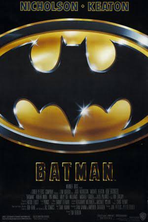
That chart is actually showing the badge on his chest, and that was what it looked like in Burton's first Batman:
That was never the Burton bat symbol
Is that what that is? I thought it was a beach ball that represented summer.
at the age of 16, lex luthor learned gained his machinations of global conquest from hit video game Call of Duty.
Yeah, the chest symbol didn't match the one used in the marketing, but the one in the marketing for that movie was created in 1966. Basically became the "merchandising logo" at that point, same with that one Superman S (that isn't even very good) that's on every mug & T-Shirt everywhere.
Although Burton switched to something closer to that 66 logo in Batman Returns.

Well beach balls are round, and most are rainbow colored. Plus I'm mostly using mobile GAF, so I rarely see the other version of GAF.Even though nearly every company imaginable have been adopting rainbow colored logos to celebrate gay marriage you thought neogaf would use it to celebrate summer love? Lol what.
I love how Gal Gadot looks in this.


