You are using an out of date browser. It may not display this or other websites correctly.
You should upgrade or use an alternative browser.
You should upgrade or use an alternative browser.
Android |OT3| This thread is incompatible with all of your devices.
- Thread starter ThatObviousUser
- Start date
- Status
- Not open for further replies.

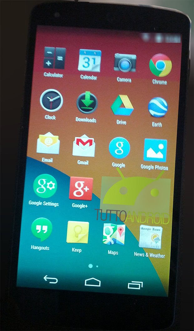
Okay this screenshot convinces me it's all fake. Unless HTC is now in charge of AOSP. Standalone bottom menu button? Come on.
You never know man. Did you see the new Quickoffice app?
I hope this is real, looks good.If that's real, I really like it.
The new launcher design is great, love the transparent background and new phone icon design.
Randy Lanzarote
Member

Okay this screenshot convinces me it's all fake. Unless HTC is now in charge of AOSP. Standalone bottom menu button? Come on.
Stock 4.3 still has standalone bottom menu button under bluetooth settings.
Edit: it would follow current design guidelines as there is an on/off toggle on the top of page, so menu button gets relegated to bottom corner of page, ie. Wifi and bluetooth settings.
brotkasten
Member
Google, you had one job. Redesign your damn settings in Holo Light.
Their redesign looks fine to me.Google, you had one job. Redesign your damn settings in Holo Light.
Vanillalite
Ask me about the GAF Notebook
Google, you had one job. Redesign your damn settings in Holo Light.
No Holo Light is disappointing for sure.
Baroquemantic
Member
Those leaked pics look nice, but I'd much prefer the widgets to still be in the drawer. They could just allow a long press on the home screen as well, instead of removing them from the drawer. I don't like the iOS style page indicator either. The line that slid across at the bottom looked better. Settings look fine to me based on those pictures. I've never had a problem with current Holo dark. I'll admit, though, I'd prefer something like a gray background for Holo Dark instead of that gradient. But eh, not a big deal.
-Pyromaniac-
Member
I'm hoping that's still happening in the future though. I was hoping for it now though.No Holo Light is disappointing for sure.
Nicktendo86
Member
Calling those screens fake, the downloads icon is the same old one when we have already seen the new one on android police. Also, why only 4x5 app draw grid?
brotkasten
Member
Their redesign looks fine to me.
They made the icons flatter, the background of the app drawer transparent and the icons in the notification bar white. The ugly dark side of Holo is still present throughout the OS, including the blue switches, which don't really match with the rest of the OS and core apps anymore.
But it's Google, they're not under pressure from anymore and can take all the time they need to fix up that design mess.
Nicktendo86
Member
OK so looks like that leak is genuine. There is a LOT there I really do not like. Removal of widgets from app draw? Horrible phone icon?
brotkasten
Member
HOLO LIGHT ON EEEEEEEEEEEVERYTHIIIIIIIIIIIING
I'm not saying it's the best thing in tech and mobile design, but it's definitely the best design Google has right now and if they can execute it well enough, I wouldn't mind using a Nexus phone again.
e: Question for the people in ROM City. Is there any ROM that skins the settings menu to Holo Light?
They got rid of the high contrast blue/black action bar but you still complain about a tiny button. You must really dislike blue.They made the icons flatter, the background of the app drawer transparent and the icons in the notification bar white. The ugly dark side of Holo is still present throughout the OS, including the blue switches, which don't really match with the rest of the OS and core apps anymore.
But it's Google, they're not under pressure from anymore and can take all the time they need to fix up that design mess.
Edit: Just also want to add that the app drawer and lock screen appear to have their own wallpaper separate from the homescreen's.
Love the Note 3. Heard rumours around it not selling well.
Disappointed and pretty shocked actually. Note II sold great.
I think most of those people are in contract and are still holding on to their note IIs, just like what I planned to do because the note II is still pretty friggin awesome.
can't justify (side-grading) for 700$ + tax
vs a clear upgrade from my galaxy nexus and current note II with unlimited 4g vzw and even then I'd only paid 299$ using someone elses 2gb data plan upgrade.
Nicktendo86
Member
I think it is meant to be final. Really disappointing.Man I'm really hoping we're getting more than just that in terms of graphical overhaul. From when did they say this build was?
I think it is meant to be final. Really disappointing.
Man, I'd be sorely disappointed if that's it. Some of these settings and upgrades are great, don't get me wrong. But I don't want to look at dark menus anymore.
Don't know how I feel about that new phone icon.
Also this. It looks real funky. In a bad way.
Nicktendo86
Member
Taking the widgets out of the app draw and back to long pressing the home screen is a massive backstep as well, I mean why? What's the point? Also those huge app icons on a 4 x 5 grid look horrible compared to the 5 x 5 nexus 4 app draw.Man, I'd be sorely disappointed if that's it. Some of these settings and upgrades are great, don't get me wrong. But I don't want to look at dark menus anymore.
Also this. It looks real funky. In a bad way.
Vanillalite
Ask me about the GAF Notebook
They got rid of the high contrast blue/black action bar but you still complain about a tiny button. You must really dislike blue.
Edit: Just also want to add that the app drawer and lock screen appear to have their own wallpaper separate from the homescreen's.
I love blue, but this is just inconsistent. It stands out because of this, and you figure Google would have noticed.
Let's take a step back on the word "horrible," friendo.Taking the widgets out of the app draw and back to long pressing the home screen is a massive backstep as well, I mean why? What's the point? Also those huge app icons on a 4 x 5 grid look horrible compared to the 5 x 5 nexus 4 app draw.
It looks a little goofy on this grainy screenshot, but we'll have to wait until we see it on devices.
If you want to complain about inconsistencies, look at the icon set. This is still Google.I love blue, but this is just inconsistent. It stands out because of this, and you figure Google would have noticed.
I wasn't expecting the overall visual overhaul until 5.0 anyway, so I'm fine with incremental improvements.
Are you telling me I had way too high hopes for this? Because if you are, then I say NAY to thee, sir, NAY!
Nicktendo86
Member
I know I know, there are supposed to be loads of new animations as well. Need to see HQ video I suppose but still, meh.Let's take a step back on the word "horrible," friendo.
It looks a little goofy on this grainy screenshot, but we'll have to wait until we see it on devices.
If you want to complain about inconsistencies, look at the icon set. This is still Google.
ThatObviousUser
ὠαἴÏÏιÏÏÎ¿Ï Ïαá¿Ï εἶ

Looks like circles are going to be the new icon guideline (cribbing from Firefox OS?) Look at Google and Google Settings and compare to Google+ (which it looks like in today's version.)
ThatObviousUser
ὠαἴÏÏιÏÏÎ¿Ï Ïαá¿Ï εἶ
Also, I wonder if Motorola was given a heads up about the transparent navbar or if the Android team got inspiration from them.


brotkasten
Member
Made me chuckle for a second.


Made me chuckle for a second.

Is it sad that I can't tell if that's image compression or fake plastic linen texture
brotkasten
Member
Is it sad that I can't tell if that's image compression or fake plastic linen texture
Here's the original picture:

But don't worry, fake linen texture will replace the fake leather texture in 2015.
ThatObviousUser
ὠαἴÏÏιÏÏÎ¿Ï Ïαá¿Ï εἶ
Nicktendo86
Member
Does it bug anyone else that the Google settings and Google search app circles are completely different sizes, and the Google+ icon is a square? My ocd will go of the chart.
Looks like circles are going to be the new icon guideline (cribbing from Firefox OS?) Look at Google and Google Settings and compare to Google+ (which it looks like in today's version.)
Not the Verizon home button again!?!?!?!
DON'T CALL IT A COMEBACK BABY
Does it bug anyone else that the Google settings and Google search app circles are completely different sizes, and the Google+ icon is a square? My ocd will go of the chart.
No you're not alone. There's some really strange iconography going on in these screens
The Google Photo icon too.Does it bug anyone else that the Google settings and Google search app circles are completely different sizes, and the Google+ icon is a square? My ocd will go of the chart.
Oh, well. This is why we use Android: because we can swap all the icons.
Does it bug anyone else that the Google settings and Google search app circles are completely different sizes, and the Google+ icon is a square? My ocd will go of the chart.
I'm so used to the Stark icon pack that in the end it won't matter.
I may use the phone for a bit with the standard icons so I can see what's new, but I will eventually use Novalauncher and the Stark icons by default.
I prefer Holo Dark though :X
anyone using Icon packs?
I do. I would recommend Stark, Nox and a new one called Banx.
I do. I would recommend Stark, Nox and a new one called Banx.
Or, if you are a cheap bastard like me, Holo Icons is pretty nice.
Google to make big changes to tablet apps on Play Store:
Android PoliceThe first of two changes affects the top lists in the Play Store app. That means the Top Paid, Top Free, Top Grossing, Top New Paid, Top New Free, and Trending. These lists will now default to showing apps that meet Google's tablet design guidelines. The "Designed for tablets" view is only a suggestion, though. Users can still switch over to see all apps.
The other change will make it easier to tell if the app you're looking at has been developed with tablets in mind. Any app or game that isn't up to snuff will get a "Designed for phones" label slapped on it. You'll still be able to view and install anything, but you'll have an idea if the app has met some basic requirements.
ThatObviousUser
ὠαἴÏÏιÏÏÎ¿Ï Ïαá¿Ï εἶ
I got my new Nexus 7. 1080p City.

It's doing like 20 download/installing things at once and isn't slowing down a damn bit. GOTDAAMN

It's doing like 20 download/installing things at once and isn't slowing down a damn bit. GOTDAAMN
- Status
- Not open for further replies.
