Box Art Used to be So Much Better

Walshicus

Member
So a set of random gaming links reminded me of an old Amiga game with awesome box art:
Space1889.jpg


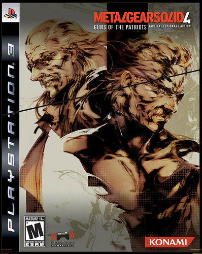
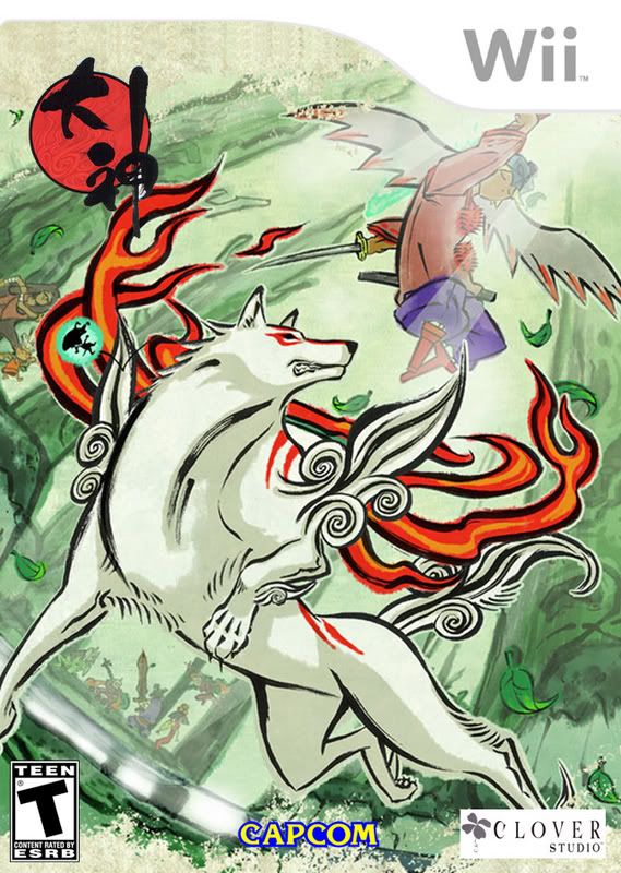
And it got me thinking about how the stylisation of box art prior to the late 90s just plain rocked. It had character and range. [I hope Moby Games don't mind me rehosting their images...]

Film Style
Moonwalker.jpg

Indiana.jpg


Noir Style
GabrielKnight.jpg

KillingMoon.jpg


Sci-Fi Epic Style
Atlantis.jpg

Albion.jpg

BAT.jpg

BAT2.jpg


Fantasy Novel Style
Simon.jpg

TwoTowers.jpg


British Comic Style
WizLiz.jpg

Dizzy.jpg


Art Deco Style
TransTycoon.jpg


What The Fuck Style
MCKids.jpg

FiendishFreddy.jpg


Real Photography aka Seriously, Where the Fuck is Carmen Sandiego Style
Carmen.jpg

CarmenTime.jpg

CarmenAmerica.jpg


Shit Style
TekWar.jpg

Typhoon.jpg


So why did box art get mostly crap? Am I just looking back on gaming's presentational past with rose tinted, whiskey stained nostalgia glasses?
 
Sir Fragula said:
So why did box art get mostly crap? Am I just looking back on gaming's presentational past with rose tinted, whiskey stained nostalgia glasses?

Yes. And a lot of that is not good.

I mean, really? The guy in the wolfman mask is good box art? :lol
BAT.jpg
 
wait a second, the German and Hungarian Albion boxart doesn't feature that stupid hole in the front cover of the box?

Urgh..
 
Tabris said:
I think you are confusing "better" with the "80's"
Well no, of course most of them were heavily 80s. But the point was that within the style of the time they had character and personality beyond the manufactured art we see today.

I'm looking through the 25 or so 360 games I own and the only box art I'd say had any real merit belongs to GTA 4.
 
MattKeil said:
Yes. And a lot of that is not good.

I mean, really? The guy in the wolfman mask is good box art? :lol
BAT.jpg
You pull out that to demonstrate bad art? I want to play this shit right know!
 
Tabris said:
I think you are confusing "better" with the "80's"

The 80's WAS better, watch Miami Vice if you don't believe me, and Knight Rider. Also see American Ninja, No Retreat No Surrender and Fists of Steel.

To the OP, to a certain degree I agree with you, problem is for the most part we've got standards now, and unfortunately with that comes homogenization.
 
One thing that does suck about boxes now is the amount of standardized design elements that take up space that used to be artistic. Ratings symbols, more and bigger publisher/developer logos, greatest hits bars, platform bars, warranty info on the back. Yuck!
 
Sir Fragula said:
I'm looking through the 25 or so 360 games I own and the only box art I'd say had any real merit belongs to GTA 4.

Look harder, and beyond the 360.

Box-l-jp.jpg


resident_evil_4_box_pal.jpg


colossus_box.jpg


Okami_Final.jpg


12458.jpg


510I20WXffL._AA280_.jpg


But hey, hooray for "character."
588567_40333_front.jpg
 
Dibbz said:
2401924749_f0013e7893.jpg


Open your eyes!
Well yeah, that's pretty good from a generational perspective. Within that general area character drawing I prefer the approach... um... whas-is-name used with the FFVI cast:
terra2.jpg
- messy but in a good way.
 
Sir Fragula said:
Well yeah, that's pretty good from a generational perspective. Within that general area character drawing I prefer the approach... um... whas-is-name used with the FFVI cast:

Wow. :lol
 
MattKeil said:
Look harder, and beyond the 360.
But hey, hooray for "character."

I'll give you Ico, Okami and to an extent Bioshock. But RE4, Shadow of the Colossus and Sins of a Solar Empire? Great games, but the cover designs are pretty boring and unimaginative.


Get over your nostalgia
Nevar!


backfire total
Hah, just a little! How can I twist this to make *them* look like *they're* the ones with bad taste?
 
I personally can't stand the majority of those box arts but then I didn't grow up with them so perhaps I don't have the rose-tinted glasses required to enjoy them.
 
Sir Fragula said:
I'll give you Ico, Okami and to an extent Bioshock. But RE4, Shadow of the Colossus and Sins of a Solar Empire? Great games, but the cover designs are pretty boring and unimaginative.

Compared to what you posted, they're fucking Rembrandts.

That RE4 cover is absolutely perfect.
 
Pojo said:
The only good box art can be found in Japan.

I challenge you to compare Konami art on Nintendo / Super Nintendo years:

b-cont3j.jpg

Super Famicom

compared to this:

b-cont3.jpg

Super Nintendo


And let's not talk about Castlevania 3 / Akumajou Densetsu.

box-cv3j.jpg

Famicom

compared to:

castlevania3box_front.jpg


All American Konami art of 8/16 bit era is poster worthy
 
MattKeil said:
Yes. And a lot of that is not good.

I mean, really? The guy in the wolfman mask is good box art? :lol
BAT.jpg

This is excellent art. Ever red some Liberatore graphic novel ? Also, CYBERPUNK ffs! How can you hate ?
 
Box arts alright still, what does suck ass is the booklets from PS2/X Box > PS3/360 the gaming booklet has pretty much been killed, they are like 6-10 pages where as they used to be 30-40 pages, sucks ass.
 
In all seriousness.

The artwork on these boxes is based on the styles of the time. Bad boxart is bad boxart, regardless of period, but some of these (Indiana Jones, The Two Towers, Atlantis, Simon the Sorcerer) are lovely to me. A lot of that has to do with the fact that I remember when such art was cool. Much like clothing, what looks good at the time looks bad 20 years later.

I fully suspect that some of the boxart we consider cool right now will seem cliched and dated if we were to look back on them from 20 years in the future. Well, WE might still think they look cool, but a 15 year old at the time will probably see a lot of them as out of style. So I think it's important to remember that in some cases, box art today is not just "better because it's better" but actually "better because it's not out of style right now".
 
MattKeil said:
Compared to what you posted, they're fucking Rembrandts.

That RE4 cover is absolutely perfect.
Really? I mean, I don't really think the use of colour works in the RE4 box art. If you use black on red you kind of need to have more going on - it's pretty suffocating, and not in an appropriate fashion. At least in my opinion. Sins of a Solar Empire's art looks like it came off of any of a billion random space scene generators. Shadow of the Colossus' box art is a total disappointment though, given how beautiful the game' stylisation is when running. It's completely mundane.

I always thought Bioshock should have used a more... obviously art deco design over the rusted metal approach. But it's still better than most of what's been put out recently. Okami though; that's pretty much a testament to how box art SHOULD be this/last generation.


why are they shooting a ship of ninja turtles
Because they're awesome. Those Ninja Turtles are also Pirates.
 
Top Bottom