You are using an out of date browser. It may not display this or other websites correctly.
You should upgrade or use an alternative browser.
You should upgrade or use an alternative browser.
Box Art Used to be So Much Better
- Thread starter Walshicus
- Start date

snoopers said:This is excellent art.
Joke?
Ever red some Liberatore graphic novel ?
No, but I have read cyberpunk, and none of the images in my head during said activity looked that retarded.
Also, CYBERPUNK ffs! How can you hate ?
Because it's total shit work? They took photos of a guy in a Halloween mask, touched up a publicity photo from Knight Rider and called it a fucking day.
Xisiqomelir
Member
Tabris said:I think you are confusing "better" with the "80's"
Those are synonyms.
dacuk
Member


oldschoolpinball
Member
MattKeil said:No, but I have read
Smart boy. Let's speak french so I can correct your typos.
cyberpunk, and none of the images in my head during said activity looked that retarded.
Well good for you. Again, I invite you to read some good graphic novel. You may not be sensitive to this style of drawing but calling it bad, especially for a boxart, that's what I find retarded. It has the look and feel of a cyberpunk comic book cover art, and if that's not awesome, I don't know what is.
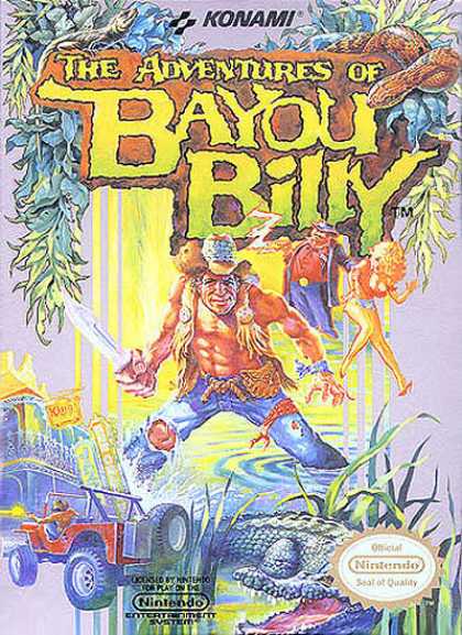
Classic. It took me many years to learn what a bayou was though...oldschoolpinball said:
oldschoolpinball
Member
Sir Fragula said:Classic. It took me many years to learn what a bayou was though...
i still to this day cannot pass the driving levels
Were they the ones that used the light gun? I'm remembering that right... right?oldschoolpinball said:i still to this day cannot pass the driving levels

oldschoolpinball
Member
Sir Fragula said:Were they the ones that used the light gun? I'm remembering that right... right?
http://youtube.com/watch?v=IjRfDym50vg *sigh* my childhood was almost ruined
AlphaSnake
...and that, kids, was the first time I sucked a dick for crack
Joke Threads Used to be So Much Better
It's my favourite RPG to this day. I long for a XBLA/PSN/WiiWare style remake or sequel.CTLance said:I wholeheartedly endorse the honrorary mention of Albion.
Seriously. Good stuff. One of Bluebytes' best.
GeneralIroh
Member
meh.Sir Fragula said:Well yeah, that's pretty good from a generational perspective. Within that general area character drawing I prefer the approach... um... whas-is-name used with the FFVI cast:
- messy but in a good way.
Yoshitake amano's work always looked emo to me. His chicks always looked like they're anorexic. I'll take Yoji shinkwa's work over amano's work anyday.


See, that box art makes me regret not having played it.camineet said:
snoopers said:Smart boy. Let's speak french so I can correct your typos.
Sorry, I should have used my prodigious psychic powers to know what language you speak best. All I know is that if I were posting on a French message board, I wouldn't get pissy when they corrected me.
Well good for you. Again, I invite you to read some good graphic novel. You may not be sensitive to this style of drawing but calling it bad, especially for a boxart, that's what I find retarded.
I've been reading comics for thirty years, and I have read exceptional graphic novels. That box art is absolute shit. I don't know if you're referring to the backgrounds (which are decent, if very derivative of Blade Runner), but you cannot be talking about the characters, because they're all traced-over photographs, some of them from other published material.
It has the look and feel of a cyberpunk comic book cover art, and if that's not awesome, I don't know what is.
I'm sure there are numerous awesome cyberpunk comic book covers. That box art is not among them, although it seems likely it stole from a few of them.
I can't tell if you're just not communicating adequately or if you actually hold the idiotic opinion that everything cyberpunk is automatically good. I'm going to to give you the benefit of the doubt and go with the former, but I reserve the right to be completely unsurprised should it turn out to be the latter.
GenericPseudonym
Banned
Esperado said:They look like a bunch of bad novels.
Drug store quality


Yes! The design just... epitomised the feeling, the emotion of the game.Label said:The best ones that stand out for me are:
GalacticAE
Member
MattKeil said:Sorry, I should have used my prodigious psychic powers to know what language you speak best. All I know is that if I were posting on a French message board, I wouldn't get pissy when they corrected me.
Shouldn't it be "...when they correct me" or "if they corrected me"?
Like the hat?
Banned
The Phalanx SNES box art is and always will be my single favorite piece of game box art
GalacticAE
Member
JodyAnthony said:The Phalanx SNES box art is and always will be my single favorite piece of game box art
Yea, but is that old guy in the game at all? I mean, how many games these days feature something on the cover art that isn't in the actual game? I can't think of any.
Souldriver
Member
A lot of the boxarts in the OP are nice because they look dated and bad. I wouldn't say kitsch or camp is the right word for it, but you get what I mean.
This one I personally find very nice, even though it probably didn't help selling the game.

This one I personally find very nice, even though it probably didn't help selling the game.


Liabe Brave
Member
I think you can probably find just as wide a gamut of art styles if you looked across all releases in all regions. It's just that most big AAA games tended to have very stereotyped artwork through the PS2 years. That trend has been loosening a lot recently though, what with Bioshock and MGS4 and EA's newfound insistence on covers with strong "graphic designer" style (e.g. Army of Two, Need for Speed, skate., Burnout Paradise).
KyanMehwulfe
Member
Long live the SSI Gold Box.
(Results may vary based on nostalgia.)

But really, the 80s sci-fi novel art 'look' isn't for everyone.
And on modern games, it doesn't always work out. Case in point: Suikoden. Damn was it a 70s fantasy throwback (almost nothing to do with the game didn't help) gone wrong.
(Results may vary based on nostalgia.)
But really, the 80s sci-fi novel art 'look' isn't for everyone.
And on modern games, it doesn't always work out. Case in point: Suikoden. Damn was it a 70s fantasy throwback (almost nothing to do with the game didn't help) gone wrong.
Sorry, but with the exception of the indiana jones, and the art deco boxart - everything is utter shite.
IMO, best covers are probably European ones. Japanese try to put a lot of characters and make it a cluster fuck. American ones generally have one or two characters - in macho action poses or something. European ones are actually in which the put some good art.
Overall, newer boxarts are much better than the older ones. OP is blind.
Great Rumbler
Member
GalacticAE said:Yea, but is that old guy in the game at all? I mean, how many games these days feature something on the cover art that isn't in the actual game? I can't think of any.
Well, I can tell you right now that I was very disappointed when I found out that Haley Joel Osment WASN'T in ICO.
Azure Dream
Member
bathhouseterror said:http://stevewalsh2.pwp.blueyonder.co.uk/BoxArt/Space1889.jpg
why are they shooting a ship of ninja turtles
Most of them just look like green spacesuits, but that one leaping...
Who cares, anyway? What happened to the far-out, camp concepts like this? So many games play it too seriously anymore. The closest thing I can think of like this is Bioshock (and Fallout 3 I'm guessing, I'm not that familiar with the series). Anything remotely fantasy anymore tries to be Lord of the Rings, anything remotely Sci-Fi can't help but focus on heavily-armed space marines.
battleMAUS
Member
Olaeh said:
W T F a game with Baphomet, star troopers, and apes. thats really fucking creepy
metalmania4evr
Member
battleMAUS said:W T F a game with Baphomet, star troopers, and apes. thats really fucking creepy
i was literally thinking the same thing, only bigfoot in stead of an ape :lol
they should have flipped the star upside down on baphomet's head though
Kitschkraft
Member
I like these boxarts the OP posted in the campy sort of way...I can't for the life of me see how people can take art so seriously, is it that objective? I just like stuff that brings out good emotions/thoughts.
Anyways, I've always liked the Out of this World/Another World box art. Reminds me of some 70's sci-fi movie poster or something.


I've never wanted to see a game remade moreso than this one.....those guys making Mirrors Edge could probably pull something like this off wonderfully....
Anyways, I've always liked the Out of this World/Another World box art. Reminds me of some 70's sci-fi movie poster or something.
I've never wanted to see a game remade moreso than this one.....those guys making Mirrors Edge could probably pull something like this off wonderfully....
Azure Dream
Member
Liara T'Soni said:I've never wanted to see a game remade moreso than this one.....those guys making Mirrors Edge could probably pull something like this off wonderfully....
There was a PC port made not too long ago. I think the topic here had a larger version of the artwork, too.
Edit: Found some links. It doesn't help that the forum search ignores "Another".
http://www.neogaf.com/forum/showthread.php?t=94219
http://www.neogaf.com/forum/showthread.php?t=143605


The-Switcher
Banned


proposition
Banned

I like this one. Captures the mystery of the game.
stephendedalus
Member
NaughtyCalibur said:Why is the main character in "Bat" doing the same exact thing in both box arts?
Rhyming images.


