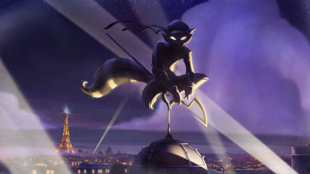
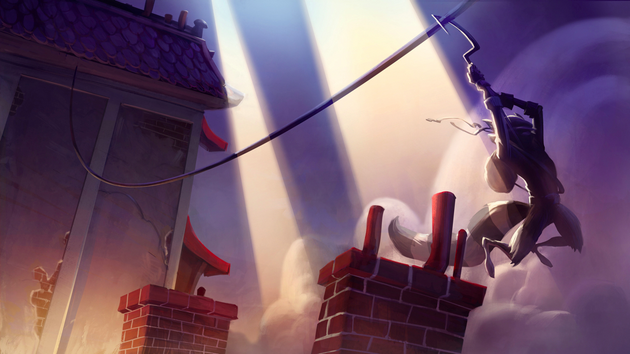
Castlevania Lords of Shadow of course. Few games are even close.It's just artwork in motion
Well it was a slideshow.
Castlevania Lords of Shadow of course. Few games are even close.It's just artwork in motion
I actually wrote a fairly in-depth look at the art style for Outland, it was so immediately striking and the visual cues were familiar to me right away.OUTLAND


PS: Outland in general is criminally overlooked by way to many people. In terms of art style the game is ridiculously good.
PPS: REZ Art Style wise looks crazy good in HD. Makes everything look like real vector graphics. I'd go so far as to say it looks better than it's spiritual successor Eden.
I actually wrote a fairly in-depth look at the art style for Outland, it was so immediately striking and the visual cues were familiar to me right away.

Killzone 2-3
nope
Mirror's Edge, where realism meets color.


One of my personal favourites, FFXII.


I wish this looked good on an HDTV, but it doesnt. Maybe FFX HD sales well, maybe Square will consider doing an HD port.


Anyone who mentions Zelda Skyward Sword should be shot. Absolute terrible graphics.
Final Fantasy VIII's art direction is my overall favorite for the whole series


although a remake of FFVI using an Amano designed steampunk/NeoVictorian style would likely top it.


Well it was a slideshow.
")
Gorgeous grabs!
That's mostly only true for the first world.Super Mario Bros 3 on the NES. While already being a great looking NES game, the whole subtle stage/theater design of the world is still pretty cool.


One of my personal favourites, FFXII.


Art direction is not just art style. It also involves how the game uses architecture to set an emotional tone, how lighting is used to convey information, camera angles for cutscenes and how space is used to set scope (how small spaces can make you paranoid or claustrophobic, while vistas and skyboxes feel epic and grand in stature), how character clothing conveys a certain style or national background, etc.
There are a lot of people in this thread who are basically posting games strictly because they are pretty. Some games are both pretty and have great art direction, others are ugly but have good art direction, others are pretty but have poor art direction.
Deadly Premonition is an example of a game that doesn't really look that great but that has great art direction. The way things are laid out in the town, the sense of scale, the way all the normal level designs "invert" when you are in the combat scenarios, the biome conveys that sort of mysterious cold foggy great ancient redwood Washington/BC feel, things like the coffee, the flies and beard that follow York around if he's dirty, the day/night cycle. But yeah, it looks like a PS2 game, kind of. But that's okay.
Bully and Mafia II both have great art direction in the way they deal with the passage of time. Zelda and Metroid both have very striking use of biomes and architecture and strongly themed areas to convey certain moods. Assassin's Creed 1 was hideous to me at least in part due to the scorching, bleaching lighting setup, but that did a good job of conveying what I expect the Middle East looks like. Mirror's Edge used really stark, clean environments to set up the theme that the world was safe, secure, and prosperous--by ruled by a panopticon surveillance and censorship regime.
Psychonauts, I thought had strong art design. The Milkman Conspiracy level's dimension bending, the Meat Circus level's clash of realities, the overall design and environment of the summer camp in general, the Fever Dream Neon Mexican Luchadore level. Great choices.


