First thing's first; feedback!
Canyon:
- Very interesting layout, I could see it being a blast to play on.
- There's a ramp near the green spawn point that leads up to the sword that I tried several times to leap off of, to no avail. I'm guessing you made it that way on purpose so green players can't race right at the sword, but if not you might consider a small platform at the top.
- There's a spot on the map where your guardrails are slouched down towards a block. It looks alright, but it kind of suggests that you'd be able to jump across the gap there. If you;re a Spartan, you have to really nail a perfect crouch jump to make it, though as an elite it was much easier... I know I made a few passages on Cistern too short for elites to squeeze through, so... make sure you test it with both.
Chateau:
- Very nice design and it 'feels' like a big mansion. Even the plot you plopped it down on has great views.
- The yellow team starts kind of close to the sword. Granted, the yellow team starts out very much exposed, so that kind of balances it. That's a great spot for the sword though, so if it plays kind of weird, maybe look at your team spawning points. There were similar issues with the Hammer, so... I'm thinking you're aware of it.
---------------------------
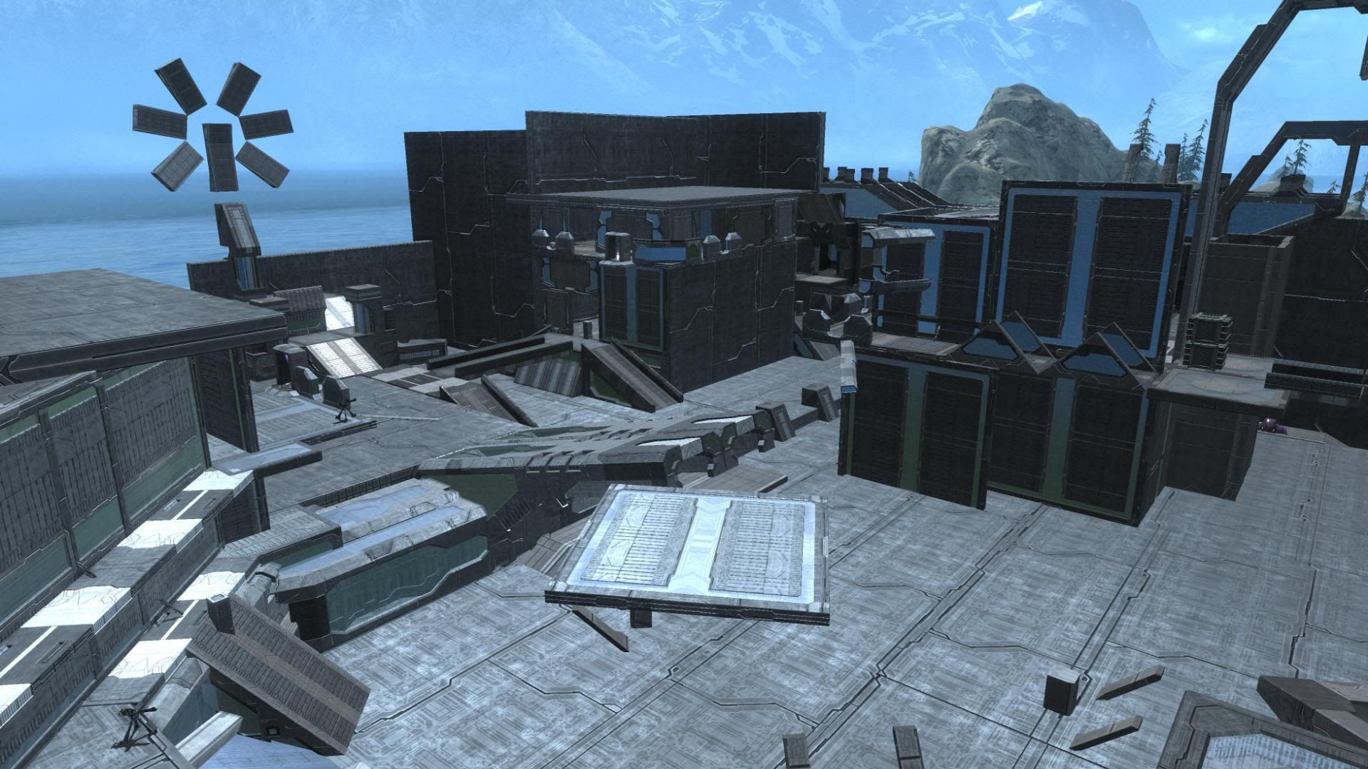
As for my own Forgings... I've decided to remake Moonpool ... from scratch to cut some of the geometry out of the blue base, streamline the overall layout, and give the Red base something interesting other than ramps and a moat. I'm experimenting with a few rough ideas, but nothing yet.
I even cloned Yeti's giant glass dome/saucer to see how a big domed area would look... neat, but it's too big for my needs so I'm either going to try a smaller version (20° or 30° angles instead of 15° and rough out the difference), accept that Red will have a huge base, or just go somewhere else with it.
The Moonpool room is larger, no longer has a lot of railings, and the blue base ''fits" in better. There's more cover, more water, less changes in elevation (found a really interesting way to handle it using Rounded Walls, of all things), better weapon positioning... and it looks cleaner without the rocks. I've been insanely stingy with building materials this time around, and it shows.
The armory is also larger, the room above it is easier to get into, and the entire thing feels like a solid fortress now (it's very imposing when view from the red base, which is one of the reasons I'm trying to leave that section open so you can experience it.)
Anyways, I'm really happy with "Moonpool 2.0" and I think it's gone from a really neat map to something really fucking impressive. I'd like to get a lot of playtesting in before I even consider releasing it widely, so if we're leaning towards Sunday, consider me there.
One other quick question; how are people converting their Halo movies over to Youtube? I'd much rather have a video than a bunch of screenshots, but I'm completely clueless on anything to do with video. If anyone has any tips, let me know.