• Hey, guest user. Hope you're enjoying NeoGAF! Have you considered registering for an account? Come join us and add your take to the daily discourse.

Halo Reach Forge |OT| - Create, Share & Kill

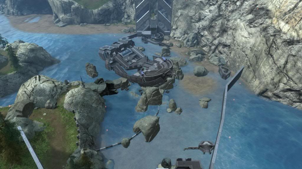
Hey guys, I actually started messing around in Forge again recently, and wanted to post a quick screenshot of what I'm calling "Surf" for now.

surf_tease.jpg


It's a map in pretty much the same place as Seashell, but an entirely new map. I'm trying to make it pretty obvious where in the water is safe to be, and where isn't. Hopefully you guys will help me test it :)
 

op_ivy

Fallen Xbot (cannot continue gaining levels in this class)
timetokill, looks nice, what game type are you creating it primarily for?


also, the newly reworked Truss.3 is "complete" (barring more revisions and adjustments - almost a certainty with more testing). i really tried to take any criticism, or feedback, to heart (thanks Zayne) and tried to address each issue discussed. since the last revision post i've redone the spawns to take into account the new base layout, revised the weapon placement, and added grav lifts to assist with map flow moving from the lower portion of the bridge to the upper.

i'm hoping it will make this weekends forgegaf and customs playlists again, for team slayer - ideally with 12-16 players (and personally, i think it should be run with default weapon starts, no DMR starts please).

download link
http://www.bungie.net/Stats/Reach/FileDetails.aspx?fid=13165103&player=LoopOfHenle
 

Retro

Member
I tooled around in Forge yesterday looking for a place to make my "Safe Havens" map (multiple safe rooms connected by bridges that are made to give the outside battlefield warning). Every time players would step out of the safe rooms, they'd have to race to another.

I can't get the water to change color enough to appreciably be Lava, and kill balls are too rounded to look dangerous unless viewed in very narrow pits. The best I could come up with to give the sense of an environmental hazard was to use Green FX and call it Poison Gas, which makes no sense since Spartans can breathe in space...

On top of that, the layout of the map has to be somewhat small because there needs to be enough time to move between safe rooms and possibly have scuffles between. 10 seconds isn't enough time for this unless the passages are fairly small. The map ends up looking like a series of rooms connected by short bridges. I tried adding different sized safe rooms, some more interesting routes (I had a really cool destroyed bridge you had to jump over), but it still ended up feeling like a really really generic map.

And that's pretty much when I decided to shitcan an entire morning's work.

I would imagine fights would devolve into people hanging out in one shield door-protected room and waiting for someone to come get them. Windows help, but there are still ways to hide. Overall a neat concept, but it just doesn't work.

Also tired a few other ideas, but I'd run out of pieces before I got anywhere close to spending my budget. Sooooo many good ideas fucked by having so few pieces.
 
op_ivy said:
also, the newly reworked Truss.3 is "complete"

Looking forward to putting it through the paces in customs. Will vote for default weapon starts but the customs guys are a tough bunch and they like them some DMR.
 

op_ivy

Fallen Xbot (cannot continue gaining levels in this class)
Bregmann Roche said:
Looking forward to putting it through the paces in customs. Will vote for default weapon starts but the customs guys are a tough bunch and they like them some DMR.

i figured that was why they did DMR starts last week, but i feel that, on truss especially, if everyone has a dmr from the get go, every fight will be at a longer range and less interesting. the entire lower half of this map is set up for close to medium range and got ignored with dmr starts. heres hopping they'll respect my wishes on this...

i'll double post in the community thread.
 

zumphry

Banned
op_ivy said:
i figured that was why they did DMR starts last week, but i feel that, on truss especially, if everyone has a dmr from the get go, every fight will be at a longer range and less interesting. the entire lower half of this map is set up for close to medium range and got ignored with dmr starts. heres hopping they'll respect my wishes on this...

i'll double post in the community thread.

e:I Suppose AR/Pistol starts on one match won't kill.

Retro said:
I can't get the water to change color enough to appreciably be Lava, and kill balls are too rounded to look dangerous unless viewed in very narrow pits. The best I could come up with to give the sense of an environmental hazard was to use Green FX and call it Poison Gas, which makes no sense since Spartans can breathe in space...

One reason I haven't started my Giant Flaming Pit of Lava remake/reimagining. Giant Squishy Pit of Aqua doesn't have the same ring to it.
 

Retro

Member
ZayneH said:
One reason I haven't started my Giant Flaming Pit of Lava remake/reimagining. Giant Squishy Pit of Aqua doesn't have the same ring to it.

Yeah, I've kinda given up on thematic ideas that don't involve water or trees at this point. I'd kill for a 'blank world' DLC, where there are 'Skybox' FX items so you can have Deep Space, In Orbit, and a variety of different cloud themes, etc.

I've got Moonpool setup for testing this weekend if we're all going to get on again. I killed the green light in the center and fixed the spawns. Maybe before we get started, Zayne, I can get you to hop in and take a look at them?

Anyways, if Moonpool works out, I'd like to have something vehicle based but with lots of on-foot sections to balance it.

I had an idea for a "Donut" map for Air vs. Infantry; it was essentially an enclosed ring with a central area for on-foot combat. Players could hop into Hornets and dogfight in a fairly narrow area, or hang out in the center and try to take down the ships with anti-air weaponry.

The problem is, there aren't enough Colosseum Walls to make a respectably large space to fly around in, even when 'cheating' and using the natural walls and floor of Forgeworld.

So I guess it's back to the drawing board.
 

GhaleonEB

Member
Finally making some headway redoing the second map I did, Sandybridge. It's more like Sandyisland now, which doesn't quite ring as well. That ship map looks interesting, look forward to playing it.
 
op_ivy said:
timetokill, looks nice, what game type are you creating it primarily for?

Right now I'm thinking slayer + asymmetric gametypes, with the ship being the stronghold point that must be infiltrated.
 

zumphry

Banned
GhaleonEB said:
I work for Intel, and specifically the group that developed Sandybridge. Been working on it for over a year. It seemed to fit. :p

OT but: Can you tell marketing to just end that william.264 (or whatever that guy's name is) thing now? :p

As for checking out maps, I think I'll be on later tonight so if you're on Retro or op I'll look around your maps and do my best Ebert-ish impression.
 

J-Roderton

Member
Man, it's been a while since I played with ForgeGaf. I'm working on a BTB map. Hopefully I can catch up next time you guys play.
 

GhaleonEB

Member
This is way late, but here's some feedback from Dani and I on the maps from last weekends customs. I spent some time organizing a way for us to collaborate, then got busy during the week and didn't get it out in a timely manner. Going forward we'll try to post this the day after customs.

I know a lot of these maps have been revised since then, and I haven't had a chance to play them, but we'll pull them into customs this weekend.

I've bucked comments into a few categories: Design (flow, sight lines, navigation, clarity, size), Forging (flicker, attractiveness, slowdown), Funtion (spawns, objectives) and Balance (weapons, vehicles, timers). Not every map will have feedback in every category.

Reactor

Design | Strong design with a clear layout. Some of the sight lines feel a bit cramped around the outsides of the map; I suggest shortening the thick wall that sticks out on one side to make the corner less cramped (if this doesn't make sense I'll post a pic).

Forging | Slowdown, one rock used as a ramp is broken - half of it is unwalk-upable. Could probably remove the lights to get rid of the slowdown.

Spawns and such worked well. Good map.​

Château

Design | Top floor feels redundant, too much climbing, dominates lower center. Suggest truncating to two levels with the same function.

Balance | Too many close-range power weapons: sword, hammer and shotty. Suggest paring down to just one to fight over, or give both sides their own one.

Personally, I thought this map had a lot of potential.​

Seashell

Design | Initially confusing layout with some difficult navigation.

Forging | There's not an over-arching visual theme; feels somewhat cobbled together.

Function | One team is spawned in front of their base, the other behind.

Balance | Sniper dominated the map. Suggest working in some specific sight lines while building in more protection for both teams from it.​

Kingdom

Our feedback file just says, "SHIP IT" on the Kingdom line. That and the health pack placement issues which I know have been addressed in the latest version. If we can play a few different game types on the updated map - another Slayer, some CTF, etc. - for customs, we'll be sending this to the Community Cartographers group at Bungie for the next round of testing.

Very solid design, smart Forging choices, great sight lines and a good dose of restraint and thought when it came to the power weapons. No spawn issues that I saw. Personally, the Slayer game on it was one of the best I've had in GAF customs.​

Atrium V1

Design | Sight lines favour height advantage. Ground level has good flow.

Function | Bomb almost impossible to disarm when armed.

Balance | Can be dominated by jet-packers. (Personal note: this is often a problem with multi-level maps. I'd suggest additional blocking and/or ways to access top levels.)​

Trestle (I haven't checked out the new version but will shortly)

Design | Navigation; too much clutter, lots of cover objects placed in the middle of walkways. Simplify. Needs a better balance between dance floor and hallways.

Forging | Hard to get a feel for the flow visually - clutter blocks sight lines. Suggest being more selective about viewpoints; longer sight lines are okay.

For me, this was another map I thought had a lot of potential and I look forward to the new version.​

Yeti Dome

Design | Visually unique with a clear layout. Size may only accommodate FFA or Doubles.

Function | Spawns need a bit more tweaking, occasionally spawning near/in front of enemy. Team games allow some spawn trapping.

I'll echo the praise for Yeti Dome, fantastic map perhaps only limited in its possible uses by its size.​

Truss

Design | Wide walkways leading to narrow ones - players get caught up, mancannon can lead players to jump off map, softkill barriers need tweaking.​

Again, I'll make this more timely next time around. And this largely echoes the other feedback posted, which people have been responding to.

Great set of maps - lots of potential, and I think two clear standouts (Yeti Dome and Kingdom).
 

Retro

Member
ZayneH said:
Would anyone be opposed to more ForgeGAF customs tomorrow at the same time?

I'd welcome them. I've been bitten by the Forge Bug again and I really really really want to wrap up Moonpool 2 so I can tinker around on new stuff without feeling like I left it half finished. I also love seeing what other people are putting together and drawing inspiration or ideas from that.

Plus I really want to see what people think of it. So far the response has been surprisingly positive and I want feedback on how to make it a better map.

And I wasn't on at all last night, unfortunately. I'm about to sneak on in an hour or so, maybe pop MP2's hood and have a look today?
 

op_ivy

Fallen Xbot (cannot continue gaining levels in this class)
GhaleonEB said:
This is way late, but here's some feedback from Dani and I on the maps from last weekends customs. I spent some time organizing a way for us to collaborate, then got busy during the week and didn't get it out in a timely manner. Going forward we'll try to post this the day after customs.

I know a lot of these maps have been revised since then, and I haven't had a chance to play them, but we'll pull them into customs this weekend.

I've bucked comments into a few categories: Design (flow, sight lines, navigation, clarity, size), Forging (flicker, attractiveness, slowdown), Funtion (spawns, objectives) and Balance (weapons, vehicles, timers). Not every map will have feedback in every category.

thanks for the feedback... i was getting a little down at how little actual discussion of the maps there has been.

Trestle (I haven't checked out the new version but will shortly)

Design | Navigation; too much clutter, lots of cover objects placed in the middle of walkways. Simplify. Needs a better balance between dance floor and hallways.

Forging | Hard to get a feel for the flow visually - clutter blocks sight lines. Suggest being more selective about viewpoints; longer sight lines are okay.

For me, this was another map I thought had a lot of potential and I look forward to the new version.​

FYI, there is currently no new version of Trestle (you must be thinking of Truss - maybe having similar names wasn't a good idea :p)

Hmmm, not sure i agree (or maybe i'm missing) your points about clutter and longer sight lines. i feel that the map does have fairly long lines of sight from bridge to bridge, but within bridge its all close and medium, by design... maybe your opinion is based on customgafs love of DMR starts? maybe the map could stand to be a bit bigger (something i'm beginning to come around to) which would allow for a bit longer range combat?

i believe you guys played assault on this and i forget the number of players. i'd like to try 4v4 players and team slayer, which is the primary gametype my maps are designed around first and foremost.

Truss

Design | Wide walkways leading to narrow ones - players get caught up, mancannon can lead players to jump off map, softkill barriers need tweaking.​

Truss is the map that has seen MAJOR revisions since last weekend. i think i hit on all the issues people have brought up. this was played i think in 5v5 TS and seemed a bit large, so heres hoping we can get at least 6v6 to properly test it as a BTB map.


I plan to be around this time to test, both with forgegaf and customgaf. can someone please post the NA times though? i *think* GMT is +8hrs to PST, but things get a little wacky with daylight savings time.
 
Thanks so much for the feedback, Ghaleon. I really wish I had an Xbox so I can fix some things.

If anyone is up for it, it would be really cool if someone could look at the map and perhaps tweak it a little bit.
 
ZayneH said:
Would anyone be opposed to more ForgeGAF customs tomorrow at the same time?

3 PM Eastern? Works for me if so.

Liking the feedback from Ghal and Dani. I wouldn't consider it too late since it gives those of us who are going to play the maps things to keep in mind while playing. Which can only lead to more feedback from more sources post customs.

As for Moonpool: I really wish I could come up with suggestions for it. I looked at it a couple times this week in monitor mode and it seems like the biggest challenge is reducing the object density. How to do that while maintaining the aesthetic is not going to be easy.

From a gameplay perspective I think you need more pathways on the top level. I almost want to suggest adding a "wing" on each side. You could have additional pathways into the upper levels from the wings. They would also allow you some flexibility in setting up new spawns. Keep in mind all my forge creations that aren't just recreations of genitalia are either completely unimaginative or totally unplayable messes.

A quicker fix might be to set up a receiver node up top with sender nodes elsewhere. In any case I wanna play at least one more game on it. I suspect others would like to see a decrease in weapons that cause explosions.
 
Ghaleon, thanks for the feedback!

I've pretty much scrapped Seashell as I work on Surf, which should address a lot of the issues with Seashell while still having some of the concepts I wanted from it. Seashell was pretty clearly a map I did before Château and Great Bear Lodge, though.

As for Château, I could definitely do some weapon rebalancing. The third floor changes seem interesting, but I'm not sold on them yet. I might take a look and see about making the third floor more of a "half floor" or something though, or seeing what happens when that jump gets merged over. Main issue is that moving the jump pad to the 2nd floor will make for some VERY short objective matches unless things get moved around more.
 

Retro

Member
Bregmann Roche said:
3 PM Eastern? Works for me if so.
That seemed like a decent time for me too; after all of my morning stuff is out of the way but well before dinner. 3 PM sounds fantastic and regardless of whether we all get on or not, I suspect I will probably be on anyways.

Bregmann Roche said:
As for Moonpool: I really wish I could come up with suggestions for it. I looked at it a couple times this week in monitor mode and it seems like the biggest challenge is reducing the object density. How to do that while maintaining the aesthetic is not going to be easy.

First, thanks for taking a look at it and the feedback.

It's a small map, so there's a lot crammed into a small space. There are a few things I could take out (little aesthetic things), but I'm not sure that will make a difference. I'm not sure anything needs to be taken out either; the center is the only place people have noticed slowdown. I'm hoping this weekend's test will run better since I ripped the green light effect out of the center. That sounds like it might help the slowdown issues. Beyond that, there's very little I can do that won't destroy large parts of the map. Things are set up the way they are for a reason and there was very little used 'just because'.

Bregmann Roche said:
From a gameplay perspective I think you need more pathways on the top level. I almost want to suggest adding a "wing" on each side. You could have additional pathways into the upper levels from the wings. They would also allow you some flexibility in setting up new spawns.

A quicker fix might be to set up a receiver node up top with sender nodes elsewhere. In any case I wanna play at least one more game on it.

The upper level is comprised of two 'round base' objects flipped upside down. To sneak another entry point in there, I'd have to tear them apart slightly. Normally that'd be ok, but that also destroys their connection to the middle level and screws up the tunnel access.

I've considered using Teleporters and having some kind of 'outside the map' type location, where players are literally spawning outside the map in some completely different area and then teleporting in. I don't particularly care for it.

Hopefully, this weekend's testing and maybe a quick once-over from another Forger will make the spawn issues disappear. I've spent a while today poking at different maps to see how their spawns are set up and I'm pretty confident I can at least handle FFA and Team Slayer.

Bregmann Roche said:
I suspect others would like to see a decrease in weapons that cause explosions.

Yeah, on this size of a map, I think the rockets are probably just too much of a nusance. The smaller Plasma Launchers aren't quite so bad (for one, very few people notice them... heh.).

I'm thinking I'll tear out the launcher, move the shotgun down, and put something like Active Camo or Overshields in the upper level. I haven't seen a lot of maps use those and it kind of fits the 'stealthy' nature of that upper level. At the very least it's one less power weapon.
 

GhaleonEB

Member
op_ivy said:
FYI, there is currently no new version of Trestle (you must be thinking of Truss - maybe having similar names wasn't a good idea :p)

Hmmm, not sure i agree (or maybe i'm missing) your points about clutter and longer sight lines. i feel that the map does have fairly long lines of sight from bridge to bridge, but within bridge its all close and medium, by design... maybe your opinion is based on customgafs love of DMR starts? maybe the map could stand to be a bit bigger (something i'm beginning to come around to) which would allow for a bit longer range combat?
Yea, the Truss/Trestle thing confused me :p

I just went through and took some screens of the specific areas I was referring to, but b.net is taking some time to update with them. I'll update here when the screens show up.

timetokill said:
Ghaleon, thanks for the feedback!

As for Château, I could definitely do some weapon rebalancing. The third floor changes seem interesting, but I'm not sold on them yet. I might take a look and see about making the third floor more of a "half floor" or something though, or seeing what happens when that jump gets merged over. Main issue is that moving the jump pad to the 2nd floor will make for some VERY short objective matches unless things get moved around more.
Yeah those were just my suggestions. I think the current layout could work well if there was some way to mitigate how dominant the top level was.
 
GhaleonEB said:
Yeah those were just my suggestions. I think the current layout could work well if there was some way to mitigate how dominant the top level was.

What was happening on the top level? Just people using DMRs/NRs from the perch?
 
I'm pretty stoked you guys liked Kingdom so much. Joeski and co also playtested, and they've suggested a few improvements, which I'm working on at the moment. I'll post it when I'm done.
 

MrBig

Member
Sikamikanico said:
I'm pretty stoked you guys liked Kingdom so much. Joeski and co also playtested, and they've suggested a few improvements, which I'm working on at the moment. I'll post it when I'm done.
It was my favorite map
 

op_ivy

Fallen Xbot (cannot continue gaining levels in this class)
GhaleonEB said:
Yea, the Truss/Trestle thing confused me :p

I just went through and took some screens of the specific areas I was referring to, but b.net is taking some time to update with them. I'll update here when the screens show up.

awesome, looking forward to it. i'm really glad to see there being more discussion on criticisms, suggestions, and fixes for maps, rather then just being just a place to post maps. and screen shots to make points i something we all should start doing.

i'll be there for forgegaf at 12pm PST and hopefully customs as well (when?), and plan to provide helpful feedback for all maps tested.
 

GhaleonEB

Member
op_ivy said:
awesome, looking forward to it. i'm really glad to see there being more discussion on criticisms, suggestions, and fixes for maps, rather then just being just a place to post maps. and screen shots to make points i something we all should start doing.

i'll be there for forgegaf at 12pm PST and hopefully customs as well (when?), and plan to provide helpful feedback for all maps tested.
Agree, that was one of the hard things about refining my map, most of the feedback I gathered from the saved films studying behaviors. In that spirit....:p

Bear in mind this is just like, my opinion.

I'll highlight three areas of what I was describing as clutter (which sounds harsher than I meant it, but that's what came to mind).

The first was this area here:

reach_13231139_Full.jpg


I think that cover wall in the middle of the pathway is not needed, as there's a good combat space with it removed. It makes the sight line too short. This is what it looks like without it:

reach_13231151_Full.jpg


The reason I like this is, the upper area is pretty exposed. The high ground here is naturally balancing since that place can be fired on from a few locations, and the players down low (from this viewpoint) can duck from side to side for cover. It's a nice medium distance that accommodates a lot of different weapons.


The second area was here:

reach_13231194_Full.jpg


I bumped into these prongs a few times when moving through. And I think for players on the platform, the built in cover corners are adequate, and the prongs just get in the way of the strafe/dance floor space.

reach_13231189_Full.jpg


The third one was here:

reach_13231183_Full.jpg


Similar to the first one, this hallway is long enough for some pistol/DMR fights, but not so long that it needs to be broken up. The cover in the center felt like it was in the way, since there's protrusions from the walls already that players can step behind to break things up.

reach_13231193_Full.jpg


Throughout the map, the elevation changes provide a lot of natural sight line breaks, and the cover elements placed in the center of the paths shortened them down to the point that most of the combat was close quarters. The base areas and the back corners have a lot of tight twists and turns, and I think the longer hallways and paths would juxtapose those nicely and make the map flow a touch better.

:)
 

Slightly Live

Dirty tag dodger
Sikamikanico said:
I'm pretty stoked you guys liked Kingdom so much. Joeski and co also playtested, and they've suggested a few improvements, which I'm working on at the moment. I'll post it when I'm done.


See if you can have a new version ready for us tomorrow for Customs. After that I'm pretty sure we'll be directly taking this map straight to the Cartographers. =)
 

op_ivy

Fallen Xbot (cannot continue gaining levels in this class)
GhaleonEB said:
Agree, that was one of the hard things about refining my map, most of the feedback I gathered from the saved films studying behaviors. In that spirit....:p

Bear in mind this is just like, my opinion.

I'll highlight three areas of what I was describing as clutter (which sounds harsher than I meant it, but that's what came to mind).

The first was this area here:

http://i128.photobucket.com/albums/p172/ghaleoneb/Reach Screens/reach_13231139_Full.jpg

I think that cover wall in the middle of the pathway is not needed, as there's a good combat space with it removed. It makes the sight line too short. This is what it looks like without it:

http://i128.photobucket.com/albums/p172/ghaleoneb/Reach Screens/reach_13231151_Full.jpg

The reason I like this is, the upper area is pretty exposed. The high ground here is naturally balancing since that place can be fired on from a few locations, and the players down low (from this viewpoint) can duck from side to side for cover. It's a nice medium distance that accommodates a lot of different weapons.

that barrier was actually a direct reference to similar barriers on Assualt on the Control Room's bridges. its also led to some really interesting battles in the matches i've played, and i dont think it marks a drastic difference in sight lines (being that its just outside the door). of all your issues, this is one i feel pretty strongly about keeping, but it may be good to test the map without too.


The second area was here:

http://i128.photobucket.com/albums/p172/ghaleoneb/Reach Screens/reach_13231194_Full.jpg

I bumped into these prongs a few times when moving through. And I think for players on the platform, the built in cover corners are adequate, and the prongs just get in the way of the strafe/dance floor space.

http://i128.photobucket.com/albums/p172/ghaleoneb/Reach Screens/reach_13231189_Full.jpg

i really like the look of those prongs. while i feel they could provide nice cat and mouse gameplay moments over the "hill", i could also see how they could be in the way. maybe it wouldnt be an issue with more time on the map? either way, they probably dont add enough benefits to outweigh the costs associated with them. in addition, by removing them, i'd open up some sight lines between the upper and lower decks of opposing bridges. i think i'm convinced, i'll try a version without.


The third one was here:

http://i128.photobucket.com/albums/p172/ghaleoneb/Reach%20Screens/reach_13231183_Full.jpg[/IMG]

Similar to the first one, this hallway is long enough for some pistol/DMR fights, but not so long that it needs to be broken up. The cover in the center felt like it was in the way, since there's protrusions from the walls already that players can step behind to break things up.

http://i128.photobucket.com/albums/p172/ghaleoneb/Reach Screens/reach_13231193_Full.jpg

this was the one i was expecting, and you'll get no argument from me. they look cool though!


Throughout the map, the elevation changes provide a lot of natural sight line breaks, and the cover elements placed in the center of the paths shortened them down to the point that most of the combat was close quarters. The base areas and the back corners have a lot of tight twists and turns, and I think the longer hallways and paths would juxtapose those nicely and make the map flow a touch better.

:)

thanks again, ghal. was it just assault that was played on this map, or was that the forgegaf guys?
 

GhaleonEB

Member
I think that was the ForgeGAF guys. The game I played on it was Slayer.

The prongs make a lot more sense given that is a hill location (they do look nice visually). I wonder if they could be tagged to be gametype specific and only show up in KotH and so clear up the platform for DMR fights in Slayer.

For the AotCR reference, I see it. I think one of the things that made that bridge so perfect was the spacing between cover elements, and with the incline at the center breaking up the sight line, that makes three breaks in what's a relatively short space. And because it's so close to the doorway, it felt a bit cramped.

But again, that's me. I tend to gravitate toward cleaner layouts, partly because I suck at making complex spaces. :lol
 

op_ivy

Fallen Xbot (cannot continue gaining levels in this class)
GhaleonEB said:
I think that was the ForgeGAF guys. The game I played on it was Slayer.

The prongs make a lot more sense given that is a hill location (they do look nice visually). I wonder if they could be tagged to be gametype specific and only show up in KotH and so clear up the platform for DMR fights in Slayer.

For the AotCR reference, I see it. I think one of the things that made that bridge so perfect was the spacing between cover elements, and with the incline at the center breaking up the sight line, that makes three breaks in what's a relatively short space. And because it's so close to the doorway, it felt a bit cramped.

But again, that's me. I tend to gravitate toward cleaner layouts, partly because I suck at making complex spaces. :lol

i'll create a version with ALL your suggestions for tomorrow and see what people think. those "AotCR barriers" might remian off, despite my love of them, because trestle is a comparatively small map, even for 4v4.

i'll take solace in the fact that truss, the much larger of the two, also has them and due to its size, sight lines should not be an issue ;)
 

GhaleonEB

Member
Oh, and my daughter recognized the map when I was going through and taking pictures. She asked me to fly up high and look down so she could see it. Exact wording: "Oh, that map. It's a good design but there's too much cover."

She'll like the new version. :p
 

zumphry

Banned
Bregmann Roche said:
3 PM Eastern? Works for me if so.

Yep.

As for maps, should I keep Juicy on to let the object's color lights be more visible, or not? I really hate how blue objects show up more clearly on default than red ones do.

OH MY FUCKING GOD. The game deleted Downpour when I finally got a version I actually liked in progress.
 

op_ivy

Fallen Xbot (cannot continue gaining levels in this class)
GhaleonEB said:
Oh, and my daughter recognized the map when I was going through and taking pictures. She asked me to fly up high and look down so she could see it. Exact wording: "Oh, that map. It's a good design but there's too much cover."

She'll like the new version. :p

probably doubtful, but do you still have that replay from the ts match on trestle available?
 

zumphry

Banned

GhaleonEB

Member
ZayneH said:
Jeeze I'm done forging tonight. I have no idea how deleting "Downpour", which was from October, could replace "Downpour Maybe?", which was made last Sunday morning with "Roost v2". How does that even happen?! Now I have to remake the freaking map from scratch, and try to guess where everything was.
That's happened to me four times, where the game replaced one map with another, but kept the name the same. So "Crossroads" kept the name, but turned into a different map when opened. The four instances cost me a good 20 hours of Forge work overall. This is the first thing I think of when people wonder if Reach needs patching. That, and the Revenant.
 
ZayneH said:
Jeeze I'm done forging tonight. I have no idea how deleting "Downpour", which was from October, could replace "Downpour Maybe?", which was made last Sunday morning with "Roost v2". How does that even happen?! Now I have to remake the freaking map from scratch, and try to guess where everything was.


The newest version is here

A shame they didn't use an actual creek. Even a sort of less true to form version based where Jackal Creek is would be more welcome. It's so sterile that it's kind of depressing.
 

op_ivy

Fallen Xbot (cannot continue gaining levels in this class)
ok, my maps are set for tomorrows games (forgeGaf and customsGAF):

Trestle.b - Ghaleon edition. Less cover. recommended for 4v4 TS.
Truss.4 - Zayne edition. revised bases, mancannons, added grav lifts. recommended for 6v6+ BTB TS.

EDIT: pre-emptively edited out some of the same cover bits in Truss.3 Ghal complained about in Trestle (the glass sails).
 

Retro

Member
First, when are regular GAFCustoms? I know Forge Customs are at 3PM EST, but when do we roll out the regular customs? I'd like to get Moonpool 2 into both if I could. On that note...

New version of Moonpool II is up; Download Here

Removed the green light object, added some neutral spawn and respawn points so FFA should work now as well. Removed the rockets, dropped the shotgun down to the middle level and added an Active Camo object on the third level.

I'll make some tweaks tomorrow if anybody hops into my game while I'm forging or makes any suggestions tonight. I'm thinking I may have fucked up the Active Camo object; I set it to have a long respawn time but I'm not sure if I can get in and change the duration. I want it to be kind of short so it's not overwhelming.

Changes will bring MP up to version 3.0 for testing. Yay.

ZayneH said:
OH MY FUCKING GOD. The game deleted Downpour when I finally got a version I actually liked in progress.

.... I really hope this wasn't a result of me dipping into your game to say hello, when I spawned there wasn't anything by two spawn points on the island and I didn't see you flying around anywhere, so I figured you were AFK in a corner somewhere.

I really really really hope I didn't fuck you over there, man.
 

zumphry

Banned
Retro said:
First, when are regular GAFCustoms? I know Forge Customs are at 3PM EST, but when do we roll out the regular customs? I'd like to get Moonpool 2 into both if I could. On that note...

New version of Moonpool II is up; Download Here

Removed the green light object, added some neutral spawn and respawn points so FFA should work now as well. Removed the rockets, dropped the shotgun down to the middle level and added an Active Camo object on the third level.

I'll make some tweaks tomorrow if anybody hops into my game while I'm forging or makes any suggestions tonight. I'm thinking I may have fucked up the Active Camo object; I set it to have a long respawn time but I'm not sure if I can get in and change the duration. I want it to be kind of short so it's not overwhelming.

Changes will bring MP up to version 3.0 for testing. Yay.


.... I really hope this wasn't a result of me dipping into your game to say hello, when I spawned there wasn't anything by two spawn points on the island and I didn't see you flying around anywhere, so I figured you were AFK in a corner somewhere.

I really really really hope I didn't fuck you over there, man.

8 pm EST are when HaloGAF customs are.

And nah, that was the Giant Pit of Lava map I'm in WIP mode at. Not Downpour.
 

Retro

Member
ZayneH said:
8 pm EST are when HaloGAF customs are.

And nah, that was the Giant Pit of Lava map I'm in WIP mode at. Not Downpour.

Excellent, I'll try to make it to both.

And I'm glad I didn't screw things up for you. I didn't even see you on the map or anywhere you were building. That'll learn me to jump into other peoples' Forges.
 

zumphry

Banned
Retro said:
Excellent, I'll try to make it to both.

And I'm glad I didn't screw things up for you. I didn't even see you on the map or anywhere you were building. That'll learn me to jump into other peoples' Forges.

I think I had a respawn point and starting point on the island facing the submerged coliseum wall (with hill marker highlighting where it is so I don't lose it). And it's fine, I forgot to close the party. I'm kinda paranoid when forging. Probably got it when I had idiots on my friendslist and they'd come into Foundry and pull "merged" pieces out of where I had them.

As for maps being "finished" I put up Roost (v2) to my fileshare, though it has Juicy on because I still haven't decided to keep it on or off. Not the final release, but the ForgeGAF version. Please give me scathing criticism on whatever doesn't work, and a thumbs up on whatever does.

Recommended player size: 8-12| Recommended gametypes: Slayer, CTF, Assault. | Supports: KotH, Oddball, Stockpile, Headhunter

Should probably get to bed so I can actually wake up before 3. :s
 

GhaleonEB

Member
Old Sandybridge, looking toward center.

reach_13251058_Full.jpg


New Sandy...island? looking toward center.

reach_13251010_Full.jpg


I'm about 75% through the rebuild, with two major areas needing love (the beach and the platforms on the left, which are placeholder) and then lots of touch up. But I'm happy with the new layout. If the first one hurled players onto a narrow platform/bridge in the center, the new one folds players around the map in a figure eight, hopefully making better use of island and beach.

Probably won't be ready for customs unless I do something incredibly fast tomorrow morning, but next week for sure.
 

zumphry

Banned
Tomorrow's list so far:

Might roll around* in Yeti-Dome when waiting for people to show up, so that'll be technically game one...

In order:
Lookout | FFA
Bereavement | Assoc. Gametype
Bulldogs | Assoc. Gametype
Bikini Atoll | Gaffball
Moonpool | Slayer
Truss or Trestle (depends on party size) | Slayer or CTF (ARs)
- Ditto -
Crown of Flies | Slayer
Kingdom | CTF
Roost | CTF

I was going to have Roost before Kingdom so that if it sucked, we could wash it down with Kingdom, but I'd rather my map not be played due to people taking a break, just so more gametime can be played on other maps.

If I missed your map/recommended options, it'll be added in the mix before we start.

*
scarves: armor lock evolved. sorry in advance, yeti
 

vhfive

Member
sigh will most likely miss both customs this and (and probably next week also).

gotta help a friend move then I got work at night.

have fun
 
Top Bottom