• Hey, guest user. Hope you're enjoying NeoGAF! Have you considered registering for an account? Come join us and add your take to the daily discourse.

Is Horizon Forbidden West: Burning Shores the Best Looking Game Ever?

Is Horizon Forbidden West: Burning Shores the Best Looking Game Ever?

  • Yes

    Votes: 125 33.0%
  • No

    Votes: 108 28.5%
  • Maybe

    Votes: 47 12.4%
  • Red Dead Redemption 2 is Still King

    Votes: 36 9.5%
  • Cyberpunk 2077 Overdrive Mode FTW

    Votes: 60 15.8%
  • Other (Specify in the Comments)

    Votes: 3 0.8%

  • Total voters
    379
lighting is still shit

Why has this rediculous narrative popped up here? Seems to me since Cyberpunk's path tracing update I'm seeing this take a lot more.

The lighting is far from "shit" it's just not on the same level as a freaking path traced game. Obviously. If the lighting was truly bad why is FW even in the conversation for best looking games?

Low effort drive by shit post
 
To me TLOU2 is my favorite looking game. They made a normal American city like Seattle look like some war torn remote jungle. The art direction is just insane.

I'm so pissed off LoU2 hasn't received a ps5 update. Imagine how much better the game would look and feel with 1800p/60 fps, improved shadows, and dual sense support!
 
It's the most realistic garage I've ever seen. I'm guessing you and I interpreted the OP title differently. I took it as "realistic", but I could see how something else could be "better looking".
It really does depend on what you value. HFW character models generally look great, but imo are ruined by the hero lighting. Every time a cutscene starts I wish they gave you an option to use more realistic lighting instead of the off-screen sun that is constantly shining on the characters 😆
 
Yeah whether or not one is better looking than the other is kind of debatable, but what's not is that Ratchet is ridiculously underrated. It's absolutely beautiful and to think it's doing all that with the burden of RT at 60fps for me still puts it in a class apart, technically.
I think possibly cus when it’s in motion is when it looks best. Like before release I much preferred the look of forbidden wests graphics and thought nothing of ratchet- but playing it through I was like blown away several times more than any other game this generation
 

ClosBSAS

Member
lol come on op, those acreenshots...jesus. it has terirble LOD just like the first game. Its very good looking, but far from the best. better than base game for sure, but yeah....it has its issues with its magic sauce.

the pop in is ridiculous...and yes, after cp2077 overdrive...this shit has nothing on it.
 
Last edited:

SlimySnake

Flashless at the Golden Globes
I think this video by one dude shows just how far behind even GG is when it comes to environment rendering and they are by far the best at rendering foliage and foresty areas with CG Project nailing urban areas.


I was hoping that Burning Shores being PS5 only would bring several new enhancements but of course, they went the opposite way and made things worse. Pop-in is awful. I have islands pop in right infront of me when im on a boat. Flying adds a million new artifacts in the water. At first i was like maybe there is something glowing in the water the game wants me to check out. Nope, just visual glitches they didnt bother ironing out.

A lot of the smaller palm trees look really really bad. Either they arent casting shadows in the distance or their shading isnt being rendered, but they look really out of place in a game that does amazing foliage and trees. I expect much better from not just sony studios but from a game that I consider to be the best looking game of all time. I knock Ratchet for not being consistent enough and well, HFW has done the opposite. It was never a looker in indoor areas but now the outdoor areas look wildly inconsistent.

It sucks because they shouldve just reduced the resolution to 1440p 30 fps to fix the LOD pop-in and increased fidelity while flying.

P.S The game has way too much detail in some areas. It is very hard on the eyes. There is foliage, man made objects, rivers and streams, rocks, and tents and its too much. That said, I went back to TLOU Part 1 on PC and it lacks detail in a lot of areas and I thought that was lame too. I honestly think RDR2 might be soemthing they ought to look at to find the right balance.
 
Last edited:

Hunnybun

Member
I think this video by one dude shows just how far behind even GG is when it comes to environment rendering and they are by far the best at rendering foliage and foresty areas with CG Project nailing urban areas.


I was hoping that Burning Shores being PS5 only would bring several new enhancements but of course, they went the opposite way and made things worse. Pop-in is awful. I have islands pop in right infront of me when im on a boat. Flying adds a million new artifacts in the water. At first i was like maybe there is something glowing in the water the game wants me to check out. Nope, just visual glitches they didnt bother ironing out.

A lot of the smaller palm trees look really really bad. Either they arent casting shadows in the distance or their shading isnt being rendered, but they look really out of place in a game that does amazing foliage and trees. I expect much better from not just sony studios but from a game that I consider to be the best looking game of all time. I knock Ratchet for not being consistent enough and well, HFW has done the opposite. It was never a looker in indoor areas but now the outdoor areas look wildly inconsistent.

It sucks because they shouldve just reduced the resolution to 1440p 30 fps to fix the LOD pop-in and increased fidelity while flying.

P.S The game has way too much detail in some areas. It is very hard on the eyes. There is foliage, man made objects, rivers and streams, rocks, and tents and its too much. That said, I went back to TLOU Part 1 on PC and it lacks detail in a lot of areas and I thought that was lame too. I honestly think RDR2 might be soemthing they ought to look at to find the right balance.

Personally I've always found the emphasis people place on detail when it comes to good graphics a bit strange. Like, I don't think the technology is at a point yet where detail can be a valid priority. You need a huge display and 4k rendering to be able to really see the kind of detail Horizon offers, but then you're so close to the screen that the general shortcomings of the graphics become apparent. It's catch 22: if you want the game to look nice, you have to be far enough away not to be able to see all the detail.

The focus should be on other things for now.
 

Ansphn

Member
I hardly think the insane amount of texture and shadow pop in the DLC introduced is "nitpicking". It's bad. Egregiously so and on all three graphics settings. It wasn't an issue in the base game (nor did the base game have issues loading the stash or gear inventory), so it's entirely new to this DLC/upgrade patch. If it had been like this in the base game, it would have been (rightfully) called out for it.


I suppose where we diverge is in the point of form over function. Yeah, the clouds and the seas are beautiful. But what good is that beauty when it's functionally useless space? The map is too small to ever fly at max ceiling for any reason and there's only one sky based side mission. As I mentioned in the OT, there's no need or use for the Waterwing other than the single main story mission to get to Jurassic Pangea Park. It doesn't open up underwater areas you couldn't explore without it -- it just becomes a slightly faster pelican Sunwing with a water gimmick that has no meaningful use.

It would be like getting a brand new Ferrari without an engine or transmission and having it sit in your garage. Sure, it's still a beautiful car but it's just a useless frame. If they had given us stuff to do in the skies and the seas, I'd be more inclined to praise them for the graphical beauty of them. As it stands, it's just marketing that has little to no bearing on the total game.
This is a $20 dollar DLC. Did you beat the whole DLC? Its obvious this DLC is focused on the main boss and spectacle of something that couldnt be done in the main game because of the PS4 version. The cloud technology and Waterwing is also something they couldn't do that they tacked on to give us a ability to treverse from sea to water with a single mount. They're pretty much giving us a dose of what to expect for the next game when its fully designed for the PS5. I don't know why people expect so much from a $20 dollar DLC. I agree though that they could have added a couple more missions but then again its a $20 dollar DLC with the main focus being the last boss and the fact that the PS4 is no longer holding them back.
 
Last edited:

EverydayBeast

ChatGPT 0.1
The graphics world is fantastic let’s just talk about the last 5 years, Spider-Man, ghost, battlefield too. Graphics today are really close to real life and get better.
 
This is a $20 dollar DLC. Did you beat the whole DLC? Its obvious its obvious this DLC is focused on the main boss and spectacle of something that couldnt be done in the main game because of the PS4 version. The cloud technology and Waterwing is also something they couldn't do that they tacked on to give us a ability to treverse from sea to water with a single mount. They're pretty much giving us a dose of what to expect for the next game when its fully designed for the PS5. I don't know why people expect so much from a $20 dollar DLC. I agree though that they could have added a couple more missions but then again its a $20 dollar DLC with the main focus being the last boss and the fact that the PS4 is no longer holding them back.
The pop-in is god awful and distracting. The base game doesn't run like that at all.
 

Sygma

Member
Why has this rediculous narrative popped up here? Seems to me since Cyberpunk's path tracing update I'm seeing this take a lot more.

The lighting is far from "shit" it's just not on the same level as a freaking path traced game. Obviously. If the lighting was truly bad why is FW even in the conversation for best looking games?

Low effort drive by shit post

Its in the conversation because the closest contender in an open world game is RDR 2. Yes the lighting is just plain bad in interiors and in a couple of scenarios, you can just look at my posting history to notice that I was saying this well before Cp2077's RT was enhanced which btw, isn't even a part of my argument, just pure paranoia on your end

The low effort drive by shit post here is your narrative, fuck off
 

HighPoly

Banned
Forget the mods in Cyberpunk and take a look at the both games originally made.
I think Horizon is better, because of the Charecters poligon count.
Cyberpunk is better in Ray Tracing or Path Tracing.
 

Represent.

Represent(ative) of bad opinions
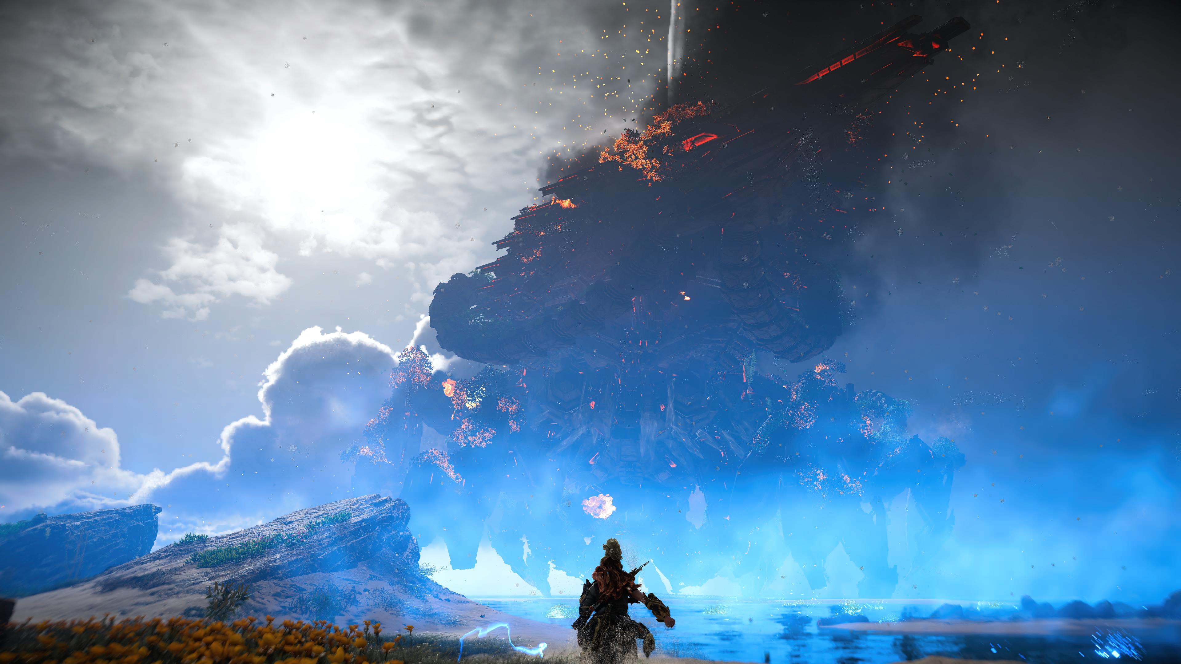
Upon beating the final boss. Only strengthened my stance. Not only does it have the best fidelity this gen, it also has the most impressive boss set piece.


FvkWwboWYAEHxmR
 
Upon beating the final boss. Only strengthened my stance. Not only does it have the best fidelity this gen, it also has the most impressive boss set piece.


FvkWwboWYAEHxmR


The Horus boss fight was cool....but honestly I was far more impressed with Kratos vs. Kronos fight on God of War 3... funny isn't it, the game came out in 2010 on the PS3 and nothing comes close to it in terms of cinematic set piece boss fights

With the advancements in next-gen tech like the SSD and more graphics horsepower I hope we get more of these super large, ultra cinematic set pieces....within the relevant context of the game of course.
 

nemiroff

Gold Member


Horizon aside, I was watching the beginning of the video and I got a little confused as to why the author decided to highlight the game's lesser good aspects when using path tracing. It seems he kinda "modded away" the lighting with some sandstorm looking volumetric stuff, the assets look kinda flat as a result.

I'd suggest checking out the timestamp in the video below. IMO, it provides a slightly better showcase of what can happen when all the elements like lighting, shadows, reflections, and global illumination align. It also makes me daydream about what a developer like Rockstar could potentially create with a full set of tools in their hands.


Oh, and have you guys seen the news? There are even higher quality path tracing and framerate improvements coming for both 30xx (perhaps also 20xx, IDK) and 40xx cards.
 
Last edited:
Hell no. Forza Horizon 5 is, hands down.

This game would be in a Top Five/Six with RDR2, Cyberpunk, Forza Horizon 5, Witcher 3, and Zelda TotK* but isn’t the best ever.

*Running on a PC via emulation
 
Last edited:
I would say there's been a few ps5 games that I genuinely thought looked truly next gen.

Demon Souls springs to mind, as that is a stunning looking exclusive.

GoW Ragnarok, GT7, Ratchet and Clank, Returnal, Spiderman Miles Morales, all look phenomenal too, as does the remake of The Last of Us.

I have to give a mention to Guardians of the Galaxy and Metro Exodus which I played on pc - both very nice looking games as well.
 
Top Bottom