I just bought a 2-in-1 Win 8.1 tablet PC off Amazon WHD. I like the device (it has some shortcomings, especially as a tablet but it's OK) and Win 10 is this big unknown factor in this. Maybe I should send it back, wait until Win 10 hits and buy it again for a lower price. Maybe I should just upgrade to Win 10 when it releases, not knowing how well it'll run and all. The OS itself looks OK though. I don't care about what the icons look like.
-
Hey Guest. Check out your NeoGAF Wrapped 2025 results here!
You are using an out of date browser. It may not display this or other websites correctly.
You should upgrade or use an alternative browser.
You should upgrade or use an alternative browser.
Microsoft Announces Windows 10
- Thread starter PGamer
- Start date
PuppetSlave
Member
Maybe it's the cynic in me but what are the odds that MS will sell "premium" sets of icons to people?
The first freemium OS!
The first freemium OS!
I don't know why everyone cares so much about icons. Looking at my desktop right now I have zero of these icons on it.
I'm so happy to hear about your terrible use case.
LukasTaves
Member
Another good news:
Cortana available for devs to use within their apps: http://www.neowin.net/news/microsof...development-platform-give-devs-a-helping-hand
Edit:
Even more:
Win10 will have native support for wired and wireless docking: http://microsoft-news.com/windows-10-will-native-support-for-wired-docking-and-wireless-docking/
(Docking for phones all but confirmed)
Win10 has native support for more sensors: http://microsoft-news.com/windows-1...rometer-long-range-proximity-sensor-and-more/
I actually don't have icons on my desktop..and I have two monitors.

Just noticed recycle bin LOL
Dead Prince
Banned
launching this summer in some odd countries
upgrade includes all versions of W7 and W8 genuine or otherwise.
http://www.engadget.com/2015/03/17/...ium=feed&utm_campaign=Engadget&?ncid=rss_full
upgrade includes all versions of W7 and W8 genuine or otherwise.
http://www.engadget.com/2015/03/17/...ium=feed&utm_campaign=Engadget&?ncid=rss_full
SEGAvangelist
Member
launching this summer in some odd countries
upgrade includes all versions of W7 and W8 genuine or otherwise.
http://www.engadget.com/2015/03/17/...ium=feed&utm_campaign=Engadget&?ncid=rss_full
Yeah, this is thread worthy. Crazy how pirated copies will get the upgrade too.
Dead Prince
Banned
Yeah, this is thread worthy. Crazy how pirated copies will get the upgrade too.
in before influx of pirated copies increase 1000% before summer
diggmcbadass
Member
in before influx of pirated copies increase 1000% before summer
Why would it? People who pirate have already pirated, people with legal copies aren't going to reinstall a pirated version, and people who don't have Windows aren't going to switch.
And also, I can't fathom the obsession with icons apart from the need for them to be easily distinguishable. It's nice if they look nice, but there are a million other things that are more important to me in a user interface.
It's nice if they look nice, but there are a million other things that are more important to me in a user interface.
I'll sit here patiently while you list them.
AdventureMike
Member
I don't see the issue with the icons. They look fine and perfectly serviceable.
I don't see the issue with the icons. They look fine and perfectly serviceable.
I can't see how someone got paid to design those. The colouring alone is eye straining.
killer rin
Member
So if it wasn't apparent already, RT has officially been WP7'd
Junior Mint
Member
I don't think it looks THAT bad. The desktop/taskbar portion of Windows 10 looks great to me but I absolutely hate the alignment and look of the minimize/maximize/close buttons.
Metro/Modern is still the part that looks like trash. Straight up, the worst take on flat design of the big 3 tech companies. It annoys me that they converted the network/wifi connections pop-up to Metro style. Looks terrible.
Metro/Modern is still the part that looks like trash. Straight up, the worst take on flat design of the big 3 tech companies. It annoys me that they converted the network/wifi connections pop-up to Metro style. Looks terrible.
diggmcbadass
Member
I'll sit here patiently while you list them.
Thing like consistent interface, competent use screen real estate, logical placement of related tasks, support for power users and advanced users, adapting the user interface to the device it's intended for, the ability to customize. You know. All the things that have gone wrong in the past. I might have to break down into sub categories if I am to reach a million though. These are more general things from earlier versions, as I haven't spent enough time with Win10 to know how it does overall on the things that are more valuable to me than icons.
So if it wasn't apparent already, RT has officially been WP7'd
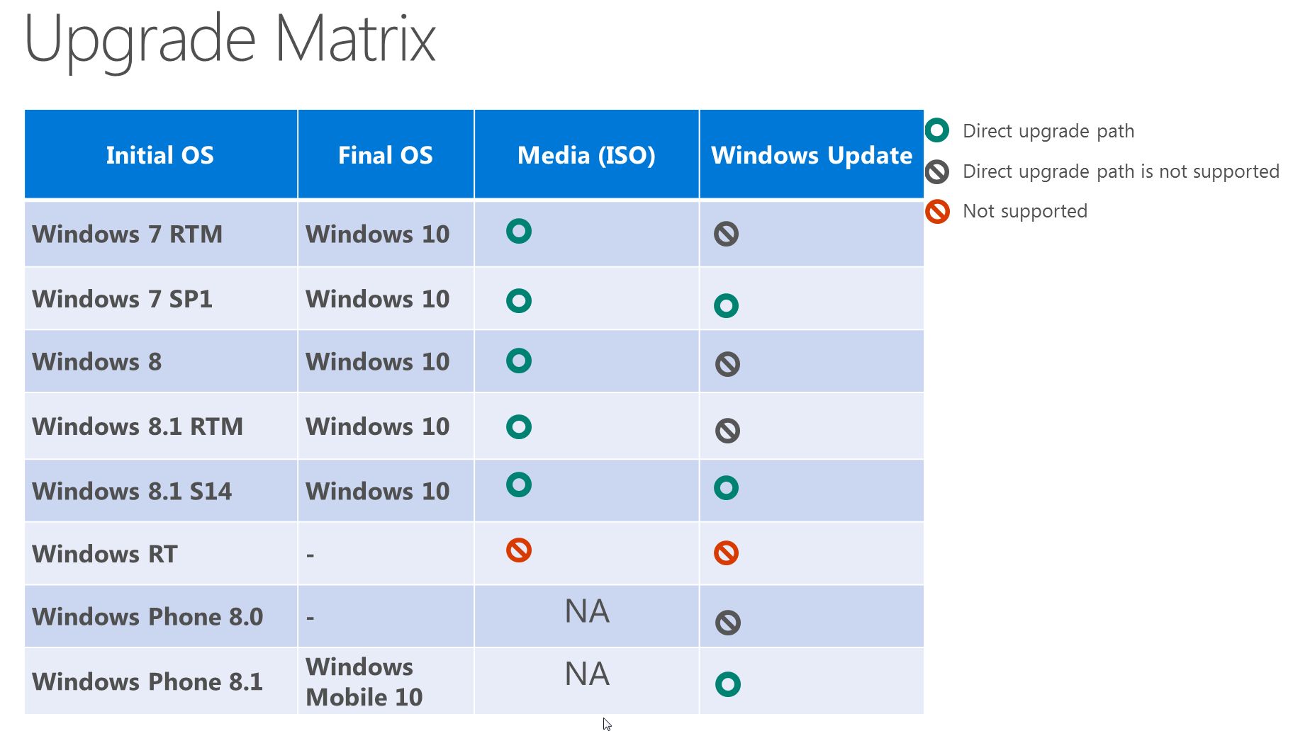
I don't understand this.
RTM = OS ship with computer - right?
smokeandmirrors
Banned
I actually don't have icons on my desktop..and I have two monitors.
Just noticed recycle bin LOL
I have 3 monitors and no icons. Although I hide the icons rather than delete them.
I don't understand this.
RTM = OS ship with computer - right?
RTM is the initial version as released, before any service packs.
The chart is saying that if you want to update by using Windows Update, you need to install the latest available service pack first.
But if you don't want to do that, you can just use media / ISO and do a direct upgrade.
AdventureMike
Member
I can't see how someone got paid to design those. The colouring alone is eye straining.
Compensation for work provided aside, are your eyes truly being strained by those colors?
The icons have a somewhat retro feel. They feel basic and somewhat like something from Windows 3.1 or an older Macintosh. I can kinda dig it. That's why I said serviceable. They get the job done and their point across without being particularly flashy or overdone.
My eyes don't strain while looking upon them. Are we looking at the same icons?
Does this include windows 10 for phones? I am one of those crazy people that is actually interested in getting a phone with windows 10.
lastflowers
Banned
Does this include windows 10 for phones? I am one of those crazy people that is actually interested in getting a phone with windows 10.
you aint crazy brother. Besides, the WP OT is like a family. If you ever leave, we'll still love you
")
HarryDemeanor
Member
WP8 phones should be updated to Windows 10. Which ones yet to be determined.Does this include windows 10 for phones? I am one of those crazy people that is actually interested in getting a phone with windows 10.
So if it wasn't apparent already, RT has officially been WP7'd
I saw that coming from the moment it was announced.
WP8 phones should be updated to Windows 10. Which ones yet to be determined.
Yeah, but at this point I figure I should wait until new windows phones are released, as everything out now is a bit behind technologically and the best nokia phone that I'd want (the 930) is not offered on AT&T and is supposed to be problematic with their 4G. I'd assume new phones would be released with the launch of the OS.
.
I honestly don't see anything wrong with the icons. Loving almost everything about W10 so far.
From an aesthetics point of view they are pretty ass.
cyberheater
PS4 PS4 PS4 PS4 PS4 PS4 PS4 PS4 PS4 PS4 PS4 PS4 PS4 PS4 PS4 PS4 PS4 Xbone PS4 PS4
launching this summer in some odd countries
upgrade includes all versions of W7 and W8 genuine or otherwise.
http://www.engadget.com/2015/03/17/...ium=feed&utm_campaign=Engadget&?ncid=rss_full
Amazing. Just amazing.
LukasTaves
Member
The new icons are here, and we still can give feedback for changes:
http://www.neowin.net/news/microsof...n-windows-10-icons-shows-off-entirely-new-set
http://www.neowin.net/news/microsof...n-windows-10-icons-shows-off-entirely-new-set
AdventureMike
Member
The new icons are here, and we still can give feedback for changes:
http://www.neowin.net/news/microsof...n-windows-10-icons-shows-off-entirely-new-set
These look good too! I'd love to see a full layout of all of them like what was in that twitter post.
Compensation for work provided aside, are your eyes truly being strained by those colors?
The icons have a somewhat retro feel. They feel basic and somewhat like something from Windows 3.1 or an older Macintosh. I can kinda dig it. That's why I said serviceable. They get the job done and their point across without being particularly flashy or overdone.
My eyes don't strain while looking upon them. Are we looking at the same icons?
We are. 'Eye-straining' is an exaggeration on my part but they are overly bright and just not very pleasant to look at.
Something like this looks a lot better to me, even if it isn't really consistent with the rest of the OS.

Still, it's not that big of a deal since I will be changing the icons anyways, it's just weird that this is what MS comes out with after almost a decade of the same icon set. I've seen better designs from people who do this on their spare time.
EDIT: Just saw that post above, those definitely are an improvement from the placeholders.The general 'cube' shape of them doesn't really jive well with the metro interface though.
LukasTaves
Member
These look good too! I'd love to see a full layout of all of them like what was in that twitter post.
These do look better on their own, but they still feel dettached from the modern/flat look.
To be honest, I would love to see the file explorer gone, in favor of a universal version of that metro file explorer app they showed for Wp10.
AdventureMike
Member
Still, it's not that big of a deal since I will be changing the icons anyways, it's just weird that this is what MS comes out with after almost a decade of the same icon set. I've seen better designs from people who do this on their spare time.
EDIT: Just saw that post above, those definitely are an improvement from the placeholders.
I don't know. Maybe the icons just don't bother me. The ones you posted look perfectly acceptable to me as well. So far I haven't seen anything that I would call (as someone else earlier in this thread did) "offensive".
Maybe that's something that is more telling of the quality of independent/outside designers of today. This is similar in regards to video games and things related to that as well. We have whole swaths of individuals who make mock ups, mods and artwork that many will find superior to the products being put out by the actual companies that develop them. It doesn't catch me as odd that Microsoft's icon designer is somehow subpar to some guy/gal on the internet doing their own mock up. After all, that designer for Microsoft is just some guy/gal.
brotkasten
Member
Anyone paused to think that the icon sets may have a theme engine of which you may actually be able to load themes (with icons) directly from the Microsoft Store? Seems like this is the direction they are heading.
What makes you think that that is the direction they're heading?
littlegrasshopper
Member
I have a Surface Pro 3 (i5 model) and im contemplating installing Windows 10. It's not my main machine (my home PC is) but its my work/school machine. Has anyone else installed Windows 10 preview on their Surface Pro 3? Would you recommend it?
I have Office 2016 Preview installed and my only complaint is that I cant default OneNote 2016 to be the default app to go when I tap or double tap on the pen. Never had this issue with 2013 but now it defaults to the Metro OneNote always. Sucks.
I have Office 2016 Preview installed and my only complaint is that I cant default OneNote 2016 to be the default app to go when I tap or double tap on the pen. Never had this issue with 2013 but now it defaults to the Metro OneNote always. Sucks.
I have a Surface Pro 3 (i5 model) and im contemplating installing Windows 10. It's not my main machine (my home PC is) but its my work/school machine. Has anyone else installed Windows 10 preview on their Surface Pro 3? Would you recommend it?
I would recommend definitely not installing it on your SP3 yet.
I've rolled back after a few hours. There's no IE modern, continuum didn't work very well for me, there was heat issues and all of the touch gestures I got used to and like don't work.
There's a lot of work to be done for touch still.
The new icons are here, and we still can give feedback for changes:
http://www.neowin.net/news/microsof...n-windows-10-icons-shows-off-entirely-new-set
Much, much better. Modern, nice understated palette, and very clean. A+
I hope they also choose a more pleasing palette for the Modern parts of the OS. The Windows 8 palette is pretty garish.
LukasTaves
Member
I have a Surface Pro 3 (i5 model) and im contemplating installing Windows 10. It's not my main machine (my home PC is) but its my work/school machine. Has anyone else installed Windows 10 preview on their Surface Pro 3? Would you recommend it?
I have Office 2016 Preview installed and my only complaint is that I cant default OneNote 2016 to be the default app to go when I tap or double tap on the pen. Never had this issue with 2013 but now it defaults to the Metro OneNote always. Sucks.
I'm using it on mine, but it still not good enough. Tons of minor issues that together hamper the experience:
- Connected standby is borked (i think they are making it more like phones), it never sleeps properly, the touch screen and rotation sensors can wake your device even when the cover is closed. And I also had some issues coming back from sleep.
- Random processes eating the cpu up.
- It's nowhere near as fast or fluid as W8.1. Search and start screen management are specially a lot worse performance wise.
- Touch/Pen is weird. Dunno the cause, but sometimes continuous input from touch and pen get interrupted... Like you are scrolling a webpage and a mouse pointer keeps appearing under your finger, and when it does the scroll becomes kinda jerky. With pen the issue is similar, but then you have your hand getting the input and messing up what you are doing.
- Metro apps crashing, constanly
- Some issues with the store, like apps not installing, iaps not working etc.
- Not optimized for touch. Continuum just make everything maximized (but not full screen), and simply moving the surface will make it spam the notification center with about 20 notifications, non touch version for IE, the current action center has less actions for controls, legacy metro apps that relied on the app command bar, or charms are a chore to use.
- The play to charm is gone
- The start screen currently is behind the 8.1
- The wifi options in the settings app is kinda broken, I end up opening the app and then invoke the previous connection side bar to be able to properly connect to a network.
It's still usable, but definitely not recomended, unless you like really needs to test the new stuff as they come

littlegrasshopper
Member
I would recommend definitely not installing it on your SP3 yet.
I've rolled back after a few hours. There's no IE modern, continuum didn't work very well for me, there was heat issues and all of the touch gestures I got used to and like don't work.
There's a lot of work to be done for touch still.
I'm using it on mine, but it still not good enough. Tons of minor issues that together hamper the experience:
- Connected standby is borked (i think they are making it more like phones), it never sleeps properly, the touch screen and rotation sensors can wake your device even when the cover is closed. And I also had some issues coming back from sleep.
- Random processes eating the cpu up.
- It's nowhere near as fast or fluid as W8.1. Search and start screen management are specially a lot worse performance wise.
- Touch/Pen is weird. Dunno the cause, but sometimes continuous input from touch and pen get interrupted... Like you are scrolling a webpage and a mouse pointer keeps appearing under your finger, and when it does the scroll becomes kinda jerky. With pen the issue is similar, but then you have your hand getting the input and messing up what you are doing.
- Metro apps crashing, constanly
- Some issues with the store, like apps not installing, iaps not working etc.
- Not optimized for touch. Continuum just make everything maximized (but not full screen), and simply moving the surface will make it spam the notification center with about 20 notifications, non touch version for IE, the current action center has less actions for controls, legacy metro apps that relied on the app command bar, or charms are a chore to use.
- The play to charm is gone
- The start screen currently is behind the 8.1
- The wifi options in the settings app is kinda broken, I end up opening the app and then invoke the previous connection side bar to be able to properly connect to a network.
It's still usable, but definitely not recomended, unless you like really needs to test the new stuff as they come
Nope, thats okay. I will definitely wait. Thanks for the comments. Much appreciated.
HarryDemeanor
Member
Even better!The new icons are here, and we still can give feedback for changes:
http://www.neowin.net/news/microsof...n-windows-10-icons-shows-off-entirely-new-set
Build 10041 is coming today.
https://www.thurrott.com/windows/wi...-10041-is-here-from-paralyzed-to-parallelized
Edit: It's out.
https://www.thurrott.com/windows/wi...-10041-is-here-from-paralyzed-to-parallelized
Edit: It's out.
http://blogs.windows.com/bloggingwi...-technical-preview-build-10041-now-available/@GabeAul: @GabeAul And yes, we just pressed it to publish 10041 for PC to the Fast Ring. Have fun #WindowsInsiders!
@brandonleblanc: Heads up - #Windows10 Build 10041 is going out to #WindowsInsiders.
HarryDemeanor
Member
Time to update.
@IEDevChat: Windows 10 build 10041 is now available to Windows Insiders - here's what's updated in our new rendering engine: http://blogs.msdn.com/b/ie/archive/...rch-for-the-windows-10-technical-preview.aspx
@IEDevChat: Due to the change in build cadence, today's build doesn't include the Project Spartan preview, which will be available in the next release.
.