You are using an out of date browser. It may not display this or other websites correctly.
You should upgrade or use an alternative browser.
You should upgrade or use an alternative browser.
Monster Hunter Tri G |OT| Dozens of Monsters, Zero Compelling Textures
- Thread starter Brazil
- Start date
I'm bummed that subquests are gone.
Damn, that sucks. Hopefully 4 brings them back.
How's the difficulty Main-esque or Portable-esque? Also how's Plessy's new hitboxes?
I'm still too early to say - Tri's got lots of tutorial stuff to wade through. I'm just now free of it and working my way through the 1 star village quests before heading out and trying some port quests.Damn, that sucks. Hopefully 4 brings them back.
How's the difficulty Main-esque or Portable-esque? Also how's Plessy's new hitboxes?
Nuclear Muffin
Banned
Never mind, quoted the wrong post. Damn that sucks. I really liked the sub quests 
Damn, that sucks. Hopefully 4 brings them back.
How's the difficulty Main-esque or Portable-esque? Also how's Plessy's new hitboxes?
I found a picture of the old tail hitbox.

I'm still too early to say - Tri's got lots of tutorial stuff to wade through. I'm just now free of it and working my way through the 1 star village quests before heading out and trying some port quests.
Fair enough. You at least fought Plesioth in the demo, though. You surely can comment on that, can't you?
I found a picture of the old tail hitbox.

Looks about right.
is 3G a reinterpretation of Tri's storyline?
that is, earthquake destroyed village. Lagiacrus gets blamed and hunted. then it turns out it was Caedeus' doing.
Even as a guess, are purple sharpness back?
Yes and Purple sharpness never left in first place (though you needed Sharpness + 1 to get in Tri).
Purple left in MHP3
Oh, fair enough. Well point is, it was already in Tri so it's guaranteed to be in Tri G.
On the topic of purple sharpness, I hope in 4 they swap it with white sharpness. Sure it'll confuse a few people at first but from a colour theory perspective red->orange->yellow->green->blue->purple->white just makes so much more sense.
walking fiend
Member
I'm still too early to say - Tri's got lots of tutorial stuff to wade through. I'm just now free of it and working my way through the 1 star village quests before heading out and trying some port quests.
any update, is it good?!
So far, so good; I mean, it's basically Tri so far.  I just got to the first "new" monster (Aoashira), and like Urukususu, he also looks a little better in Tri G.
EDIT: Also, only used it twice so far, but the new target camera option when fighting large monsters seems nice. Pressing L makes you look at the monster, which makes playing w/o a right stick very convenient. Dunno how it'll go with two monsters at once, but for one at least, it seems pretty handy.
EDIT: Also, only used it twice so far, but the new target camera option when fighting large monsters seems nice. Pressing L makes you look at the monster, which makes playing w/o a right stick very convenient. Dunno how it'll go with two monsters at once, but for one at least, it seems pretty handy.
Alexios
Cores, shaders and BIOS oh my!
With two monsters I think it was shown that you'll also have two "look at" icons in that space, toggling it for each. I think.
I played MHFU by mostly relying on the re-center, this will make it so I don't have to momentarily change my direction toward the monster for re-center to turn toward it.
Though I don't think I'll have issues with the touch d-pad once I adjust the size except perhaps for the water segments until I get a hang of the new behaviour.
So far, so good; I mean, it's basically Tri so far.I just got to the first "new" monster (Aoashira), and like Urukususu, he also looks a little better in Tri G.
EDIT: Also, only used it twice so far, but the new target camera option when fighting large monsters seems nice. Pressing L makes you look at the monster, which makes playing w/o a right stick very convenient. Dunno how it'll go with two monsters at once, but for one at least, it seems pretty handy.
When you have two monsters in one area you can switch which one is targeted with the the L button by using the touchscreen. I find myself using it more than the right stick at the moment. It's definitely a welcome addition to the existing controls.
Gianni Merryman
Member
Any second day reports, or must we wait until next Monday?
Looking forward to some reviews/hands-on in English language.
Looking forward to some reviews/hands-on in English language.
Gianni Merryman
Member
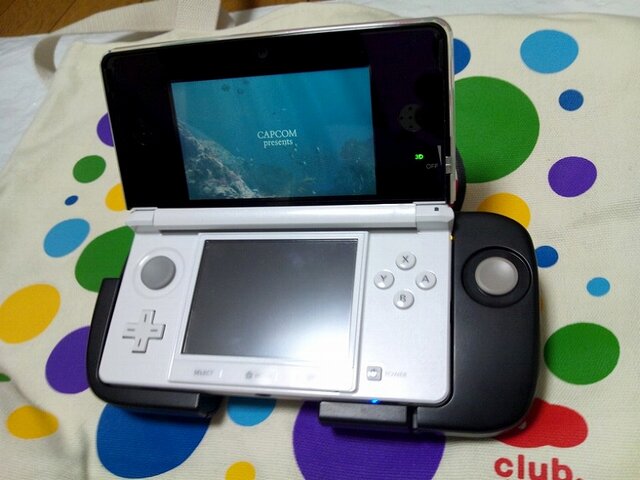
As a matter of fact I gather Frankenstick is apparently doing fine, despite it is coming only in black.
RoboFu
One of the green rats
As a matter of fact I gather Frankenstick is apparently doing fine, despite it comes only in black.
Good it is an awesome attachment that I thought would never happen in a million years. I will have one day 1.
Gianni Merryman
Member
Good it is an awesome attachment that I thought would never happen in a million years. I will have one day 1.
Yes, I reckon it may be a nice useful add-on, only thing I could do with some alternative colours to match the consoles; if you have a red, blue or white 3DS I think the Frankenstick may be actually looking much uglier on them, although comfortable.
Alexios
Cores, shaders and BIOS oh my!
Should look alright, don't almost all colors have prominent black areas too, like around the screen? Looks ok on the white there.Yes, I reckon it may be a nice add-on, only thing I could do with some alternative colours to match the consoles, if you have a red, blue or white 3DS I think the Frankenstick may be looking even much uglier on them, although comfortable.
Alexios
Cores, shaders and BIOS oh my!
3DS is smaller than I thought though, thumb shouldn't have to travel as much distance as it seems to in pics to move between the slider and buttons.Looks really awkward to use :\
Pretty weird that it's on the same level as the face buttons. Frankenstick indeed.
3DS is smaller than I thought though, thumb shouldn't have to travel as much distance as it seems to in pics to move between the slider and buttons.
Makes sense. Not a very good picture, makes everything look larger than it really is.
Gianni Merryman
Member
Should look alright, don't almost all colors have prominent black areas too, like around the screen? Looks ok on the white there.
Glad you proved me wrong, since I couldn't lay my hands on it yet mine was clearly only a guess based on what I have seen from the web.
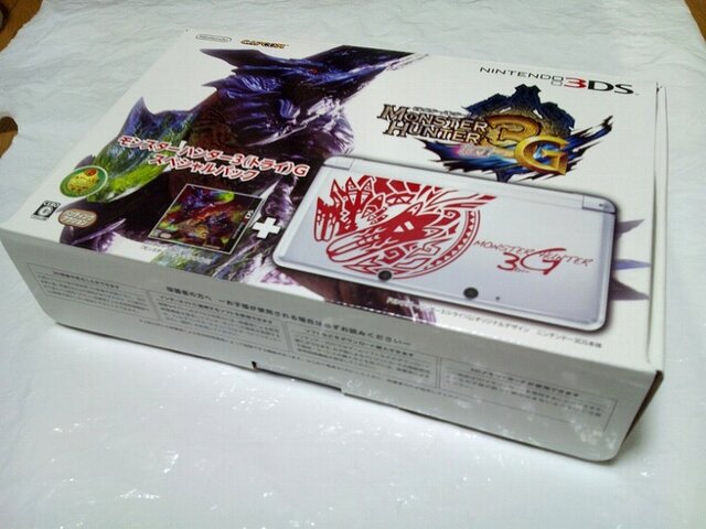
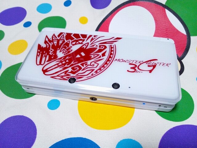
Finally the real deal! Erm... but it doesn't look very appealing :/
StickSoldier
Member
Finally the real deal! Erm... but it doesn't look very appealing :/
I think it looks okay, but would rather have the regular ice white 3ds.
Gianni Merryman
Member
I reckon MH 3DS is quite nice looking; any road, in my opinion, it looks much better than Zelda limited edition, that is really tacky indeed.
Finally the real deal! Erm... but it doesn't look very appealing :/
It looks exactly like what we've seen before...
I wonder if they'll ever make a MH specific 3DS just like that PSP that was bundled with MHP3. That one looked mighty fine.
Gianni Merryman
Member
Someone in the MC thread is reporting that MH3G is already sold out, so as for now may we assume it is faring pretty good overall in its first week?
Cosmo Clock 21
Banned
If you're that much of a junkie, there's a stream of early-game content going on right now:
http://www.ustream.tv/channel/happy-go-lucky3
EDIT: Video of
Some Japanese people going all WHOAAAAAAAAAA at Jinouga Subspecies
Pink Rathian
http://www.ustream.tv/channel/happy-go-lucky3
EDIT: Video of
Some Japanese people going all WHOAAAAAAAAAA at Jinouga Subspecies
Pink Rathian
If you're that much of a junkie, there's a stream of early-game content going on right now:
http://www.ustream.tv/channel/happy-go-lucky3
Thanks for the link. In motion, it looks far more impressive than it did in screenshots. I think I may have even spotted a few compelling textures.
Gianni Merryman
Member
One thing I'm much interested in, and that has been maybe widely overlooked so far - since everybody's main concern is about the graphics: how does MH3G sound compared to MHTri, that had a truly epic soundtrack?
The musics are the same as Tri?
How good is sound quality, are 3DS's speakers up to it?
And playing with a headset on, is it any better?
Does the game support any standards, say Dolby 5.1?
I have just happened to think, should Capcom need to save some space, in order to put extra content in the card without exceeding 4GB limit, I fear they may have compressed audio files, rather than tone down textures, if they had to choose.
I hope that's not the case, a great game such as MH deserves the best sound quality, especially as music in MH emphasizes the most dramatically epic moments of the fights, and more in general is one of the main elements that make this game so great, so involving.
Incidentally, I'm looking forward to knowing whether they used a 4 GB card or did they go for something bigger instead.
Nuclear Muffin
Banned
It's a 2GB card; RE: Rev is going to be the first game to ship on a 4GB card.
No it isn't, it's a 4GB card. Snake Eater 3D was scheduled to be the first, with Revelations being 2nd (that was before we knew about MH3G though and before Snake Eater 3D was delayed)
MH3G is the first 4GB 3DS game (BTW the original Wii version was only 2.9GB, so I doubt that space would really be much of an issue)
Gianni Merryman
Member
It's a 2GB card; RE: Rev is going to be the first game to ship on a 4GB card.
Are you sure, do you know it as a fact, or you're just taking a guess based on what you gather?
I mean, have someone checked for confirmation?
Frankly 2GB seems to me quite a little amount of memory, since this is supposed to be an expanded version of Tri, with much extra content, monsters and scenarios, but admittedly, since it runs on a tiny screen, models and textures should take less space perhaps than the ones on Wii's version, so you may be right as far as I'm concerned, although I am not truly convinced yet.
Mr_Appleby
Member
Sorry people, but what do you mean by... compelling textures ?
Google Translation can't help me.
it's a joke:
Someone in a previous Tri G thread picked out a screenshot of underwater mining and was going on about the graphics and how the "textures weren't compelling."
my search skills have failed me though and i can't find the post in question, although i remember it clearly. the poster was complaining about how awful the "enemy" looked. it was actually the mining point.
If you're that much of a junkie, there's a stream of early-game content going on right now:
http://www.ustream.tv/channel/happy-go-lucky3
EDIT: Video of
Some Japanese people going all WHOAAAAAAAAAA at Jinouga Subspecies
Pink Rathian
LOL the jin ogre subspecies vid was terrible. Guy died almost immediately.
That said, holy shit soo fucking cool.
ShinNL
Member
http://www.neogaf.com/forum/showpost.php?p=31617085&postcount=51it's a joke:
my search skills have failed me though and i can't find the post in question, although i remember it clearly. the poster was complaining about how awful the "enemy" looked. it was actually the mining point.
ok then. Tell me what is compelling about this:

The UI that takes up a third of a screen and is composed of ten different aspects? The complete lack of compelling textures? The one crappy enemy on screen? The terrible texture work? Seriously, from that screenshot what makes this anything more than a third rate effort for a second rate publisher? What makes THIS compel you to want to spend $40?
By the way, don't look at the thread if you're not a Sony fanboy. The amount of port begging is vomit worthy.
LOL the jin ogre subspecies vid was terrible. Guy died almost immediately.
That said, holy shit soo fucking cool.
Jinogre subspecies is crazy hard
He has the projectile attack like regular Jin, but they're stationary for about 5 seconds and then they HOME IN ON YOU. :/
He also mixes up his attacks a lot more than regular Jin. He sometimes does the two ground pound attacks and then immediately backs up and dives at you. He does this especially when he's enraged....
Mr_Appleby
Member
thank you
No it isn't, it's a 4GB card. Snake Eater 3D was scheduled to be the first, with Revelations being 2nd (that was before we knew about MH3G though and before Snake Eater 3D was delayed)
MH3G is the first 4GB 3DS game (BTW the original Wii version was only 2.9GB, so I doubt that space would really be much of an issue)
MH3G definitely uses a 2GB cart because RER was confirmed by Capcom themselves that it would be the first to use a 4GB cart. It's a bit messy to follow due to MGS3's delay but if we take into consideration the order of events we can clearly see that MH3G can not have a 4GB cart.
1. MGS3 confirmed to be the first game to use a 4GB cart with a November launch.
2. MGS3 was delayed to March.
3. MH3G announced, December release date.
4. RER 4GB cart confirmed.
5. RER January/February release date announced, Capcom claims this will make it first game to use a 4GB cart.
Given that MH and RE are both Capcom games, there isn't a chance in hell that Capcom was mistaken or undercut here.
Give me some time and I'll find Capcoms statement for you (unfortunately Google search is being a bitch and searching "Resident Evil Revlations First 4GB" just floods the first few pages with "First to be $50 because of 4GB" articles).
Edit: And found.
Revelations, the first 3DS game to be on a 4GB cart.
http://www.inside-games.jp/article/2011/10/13/52080.html
The lighting/self-shadowing looks really nice. Much nicer looking than Tri already.
http://www.neogaf.com/forum/showpost.php?p=31617085&postcount=51
By the way, don't look at the thread if you're not a Sony fanboy. The amount of port begging is vomit worthy.
I guess I lied in that thread:
I'm never going to enter another Monster Hunter thread in Gaming again.
It's not like anyone outside the Community thread has ever played the game anyway.


