1 point perspectiveI don't see what's bad about this image
-
Hey Guest. Check out your NeoGAF Wrapped 2025 results here!
You are using an out of date browser. It may not display this or other websites correctly.
You should upgrade or use an alternative browser.
You should upgrade or use an alternative browser.
Spring Anime 2012 II | Welcome Home Eureka
- Thread starter duckroll
- Start date
- Status
- Not open for further replies.
Chet Rippo
Member
While facing away from each other? Probably only when walking.
Nobody in Minnesota looks at each other while they're talking.
That doesn't make it bad.1 point perspective
Crash Station
Member
While facing away from each other? Probably only when walking.
Well in the context of that scene, it makes sense. Grandpa was groping Wanko, so she's still in the position she was in when that finished and he's just crazy, so he's looking away. Furuya is at least looking at the guy he's talking to.
Nothing about the framing of the scene tells you anything about mood, the characters' relationships to each other, or even attempt to play a visual gag on them. There's no logical or artistic reason for them to be talking to each other while being side by side, not to mention the rest of the background is there solely as a place for the characters to be situated with no regard to the actual storytelling. It's depressingly banal when compared to the Kids on the Slope shot described by Jexhius.
Uh ok, don't see how most of these stuff make sense but sure.
PdotMichael
Banned
It makes so much sense to compare a scene with important impact for the story with a normal scene of another anime.
Nothing about the framing of the scene tells you anything about mood, the characters' relationships to each other, or even attempt to play a visual gag on them. There's no logical or artistic reason for them to be talking to each other while being side by side, not to mention the rest of the background is there solely as a place for the characters to be situated with no regard to the actual storytelling. It's depressingly banal when compared to the Kids on the Slope shot described by Jexhius.
You're right, that is a great shot and I think it nicely demonstrates the important role that background art and mise-en-scene play in establishing mood.
For those of you who might not know exactly what I am talking about when I go on about stuff like the important of background art is to take a look at something really extreme. For the most part, it's easy not to pick up on things like this because they're usually handled in a subtle fashion, but that's not always the case.
For example, lets take a very famous and influential German Expressionist film, The Cabinet of Dr. Caligari from 1920. To explain very briefly, the German Expressionist movement attempted to use the visual language of film to capture the emotions and feelings of characters, rather than displaying the traditional realistic world.
To provide an example of how this different from a 'traditional' film, imagine a sequence where a character explains how he is going insane through dialogue and physical acting. An expressionist film would use imagery to tell that a character was going insane, perhaps by having the scenery become distorted or deranged. It's also important to remember that number of these works came from a time before sound, so long bouts of exposition were hardly common anyway. You might say that they were forced to resort to more complicated techniques to convey emotions and ideas. (This may remind many of the ancient debate about showing vs. telling).
GE would convey those kind of themes and emotions through lighting, scenery, shadows, strange angles, composition, contrast unusual costumes, unnatural acting and so forth. Here's an example from The Cabinet of Dr. Caligari:
http://i835.photobucket.com/albums/zz278/Jexhius/600full-the-cabinet-of-dr-caligari-screenshot.jpg[IMG]
It's pretty noticeable, right? The gentleman on the bed is right at the back of the frame far away from the audience. The scenery is nightmarish and otherworldly, with no straight lines in sight. See how even the walls appear to be falling in on him, making it look like the whole world is out of balance and unstable. It looks like the whole world is going to crush him.
Now, this is not the kind of imagery you see often today because it is so extreme and unrealistic. That isn't to say that background art can't play the same role today, it's just a lot subtler these days. Let's return to [B]Kids on the Slope[/B] and this image:
[IMG]http://i835.photobucket.com/albums/zz278/Jexhius/Apollon6Corridor.jpg[MG]
Does anything stand out to you about this image? Can you put it into words? To me it looks like someone who is isolated, withdrawn and possibly unhappy. What, exactly, about the image helps to convey any of these feelings? I think it's helpful to look at where Karou is positioned in the frame and what we're actually seeing. Here's how the scene looks if I highlight all the straight lines:
[IMG]http://i835.photobucket.com/albums/zz278/Jexhius/Apollon6Lines.jpg[IMG]
Now you'll notice how much [I]depth[/I] this frame contains. By depth, I mean that the image feels like it represents an actual three-dimensional space, like there's space that extends into the back of the shot as opposed to everything existing on a flat plane at the front of the image. They achieve this by having lots of lines which lead inwards and away from the front of the image, as well as by having objects appear near the front of the frame out of focus. You'll see the same thing in the [B]Caligari[/B] image above. The depth of the frame helps draw you into the image and makes it more believable. In this case, it also shows how distant Karou is from audience (and a certain girl that he is thinking about). Now, you might not be thinking all this when you watch the scene but your brain is picking up and responding to the imagery on display.
Now, there's more to this image that just depth. It's also worth noting how inconsequential Karou appears to the image, he isn't even the central figure, he's off to the right. The dominant item in the frame is that staircase which slopes imposingly towards the middle of the frame taking up more space than anything else. Your eye can't help but be drawn along straight lines, and there's so many in this particular shot that you don't actually focus on Karou that much even though he's the only figure in that image, literally isolate from everyone else and yet he's not even important enough to be centred properly in the frame.
As a final amusing note, this shot is filled with windows and glass that would normally let light in and brighten up an image (and in turn, brighten up our mood) yet the image is extremely dark and heavy. There's only a bit of light coming in from the partially obscured window on the left, but it does nothing for the overall image. It's just a very dark shot, mirroring Karou's mood.
In summary, this image achieves it's goal of leaving an emotional impression on the audience through:
- Having Karou appear on his own, isolated
- Creating a deep image where Karou is withdrawn from the audience
- Low levels of lighting that create a dark mood
- Making something other than Karou the centre of the image.
Here's an image which fails to achieve anything:
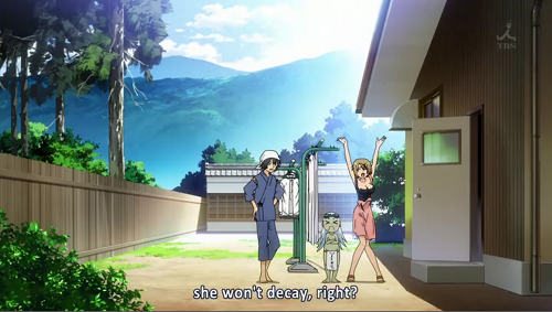
[IMG]http://i835.photobucket.com/albums/zz278/Jexhius/Sankarea6-1.png
Can you see how bad that looks? Yeah.
I must beg to differ. The mood being aimed for is quite different from the one in Kids on the Slope, and the scenery accurately reflects that. First and foremost, observe the plants in the foreground. The effect of various household plants is a large part of the show, and directly related to what the characters are discussing. It's place of prominence in the front of the frame, yet discretely to the side, ties it into the conversation and theme of the show, while remaining unobtrusive. Observe the open door: A door ajar can often represent a fair number of things. Haste, an invasion of privacy, carelessness... the list goes on. Here, it represents the laid back nature of the scene. These are people who are enjoying the moment, they aren't bothered with whether or not insects are going to fly in, or the cat escapes. Furthermore, it represents motion, or a change: They've just recently gone from the cool indoors to the hot outdoors. This change from "cool" to "warm" is also reflected in the conversation; the characters are rejoicing over a positive change that has occured. Again, the change from shadow by the door to the pool of sunlight they stand in is no accident. Now, let's focus on the characters themselves. They unnaturally face the viewer, and jexhius uses this as a complaint: but is that right? He himself observed on the effectiveness of unnaturalness in a visual media. Just look at the image from The Cabinet of Dr. Caligari that he provided. Extremely unnatural; but effective. In Sankarea, the scene captured by that screenshot is of an expository nature, and the characters directly facing the viewer, almost as if they were conversing with him or her, subtly reflects that. Each pose also has meaning, reflecting the more lighthearted nature of the scene, and the characters themselves. The hands-on-hips pose is a classic one of relaxation, and relaxation often springs from relief. In this case, the relief from the fact that Rea's situation is improving. The old man has a simplistic expression, reflecting his simplistic, almost senile personality. Wanko's is full of excitement and exuberance: again, a clear mirror of her personality. With all this said, I must respectfully disagree with Jexhius on his conclusion of that scene from Sankarea.
He's not comparing the respective animes, he's just comparing the quality of the scenes. Why wouldn't it make sense to contrast a well planned out scene with a poor throwaway one?It makes so much sense to compare a scene with important impact for the story with a normal scene of another anime.
PdotMichael
Banned
He's not comparing the respective animes, he's just comparing the quality of the scenes. Why wouldn't it make sense to contrast a well planned out scene with a poor throwaway one?
I think his post was more than good enough without the Sankarea bashing.
***,*12位 ○(***,895pt) [*,**1予約] 2012年06月06日 Sengoku Collection vol.1 (DVD)
***,*49位 ★(**2,942pt) [*,*21予約] 2012年06月29日 Hyouka vol.1
***,*76位 ★(***,318pt) [*,**1予約] 2012年06月06日 Sengoku Collection vol.1 [Blu-ray]
***,*98位 ★(**6,014pt) [*,399予約] 2012年06月22日 Haiyore! Nyaruko-san vol.1
***,123位 ★(**3,393pt) [*,*15予約] 2012年06月22日 EUREKA SEVEN AO vol.1
***,157位 ★(**1,554pt) [*,104予約] 2012年06月20日 Saki Achiga-hen vol.1
***,158位 ★(***,719pt) [*,**4予約] 2012年07月27日 Kuroko no Basuke vol.1
***,173位 ○(***,619pt) [*,*13予約] 2012年06月27日 Tsuritama vol.1 (DVD)
***,178位 ★(**1,421pt) [*,**3予約] 2012年06月27日 AKB0048 vol.1
***,189位 ★(**2,818pt) [*,*47予約] 2012年07月25日 Accel World vol.1
roflmao
gotoh smiles
i blame madpierrot
I think his post was more than good enough without the Sankarea bashing.
If-I don't-like-something-it-must-be-bad is in full effect sometimes.
roflmao
gotoh smiles
i blame madpierrot
Anime had a good run?
Regulus Tera
Romanes Eunt Domus
I believe we should be encouraging this type of discussion more regardless of the meaningfulness. It's a lot more interesting that just another circlejerk about how the newest lolishit show was teh best animu evar.I dunno, seems like nitpicking to me. Some people get a kick out of it I guess.
Wanko remains in that position for who knows how long. I understand it's being played for laughs, but the composition of the shot attenuates the comedy instead of highlighting it. Also: the whole scene is a big info-dump about zombies. It lasts for far longer that it's necessary, making an already dull exposition-heavy scene even more wearisome.Well in the context of that scene, it makes sense. Grandpa was groping Wanko, so she's still in the position she was in when that finished and he's just crazy, so he's looking away. Furuya is at least looking at the guy he's talking to.
http://i835.photobucket.com/albums/zz278/Jexhius/Sankarea6-1.png
I must beg to differ. The mood being aimed for is quite different from the one in Kids on the Slope, and the scenery accurately reflects that. First and foremost, observe the plants in the foreground. The effect of various household plants is a large part of the show, and directly related to what the characters are discussing. It's place of prominence in the front of the frame, yet discretely to the side, ties it into the conversation and theme of the show, while remaining unobtrusive. Observe the open door: A door ajar can often represent a fair number of things. Haste, an invasion of privacy, carelessness... the list goes on. Here, it represents the laid back nature of the scene. These are people who are enjoying the moment, they aren't bothered with whether or not insects are going to fly in, or the cat escapes. Furthermore, it represents motion, or a change: They've just recently gone from the cool indoors to the hot outdoors. This change from "cool" to "warm" is also reflected in the conversation; the characters are rejoicing over a positive change that has occured. Again, the change from shadow by the door to the pool of sunlight they stand in is no accident. Now, let's focus on the characters themselves. They unnaturally face the viewer, and jexhius uses this as a complaint: but is that right? He himself observed on the effectiveness of unnaturalness in a visual media. Just look at the image from The Cabinet of Dr. Caligari that he provided. Extremely unnatural; but effective. In Sankarea, the scene captured by that screenshot is of an expository nature, and the characters directly facing the viewer, almost as if they were conversing with him or her, subtly reflects that. Each pose also has meaning, reflecting the more lighthearted nature of the scene, and the characters themselves. The hands-on-hips pose is a classic one of relaxation, and relaxation often springs from relief. In this case, the relief from the fact that Rea's situation is improving. The old man has a simplistic expression, reflecting his simplistic, almost senile personality. Wanko's is full of excitement and exuberance: again, a clear mirror of her personality. With all this said, I must respectfully disagree with Jexhius on his conclusion of that scene from Sankarea.
I've taught you well.

You heard the man, dudes. We are no longer allowed to criticise Angel Beats' bad art because feelings.I think his post was more than good enough without the Sankarea bashing.
Crash Station
Member
Wanko remains in that position for who knows how long. I understand it's being played for laughs, but the composition of the shot attenuates the comedy instead of highlighting it. Also: the whole scene is a big info-dump about zombies. It lasts for far longer that it's necessary, making an already dull exposition-heavy scene even more wearisome.
This is more subjective than anything else. Some people find the delayed reaction while the exposition is going on amusing.
roflmao
gotoh smiles
i blame madpierrot
Japan loves their cutting satire of controversial American figures.
If-I don't-like-something-it-must-be-bad is in full effect sometimes.
I'm not seeing the personal vendetta against Sankarea here. That particular image has had previous discussion in the thread so it's a convenient example to use because it's already recognizable to many posters, not unlike the infamous image from Angel Beats that gets posted here so often.
PdotMichael
Banned
You heard the man, dudes. We are no longer allowed to criticise Angel Beats' bad art because feelings.
I dunno...
Are we talking more about his 874 words posing about Kids on the Slope or about a 500px × 283px image of Sankarea?
Oh, I don't mean to imply that at all, even if it looked like that at first glance. The quality of Sankarea has gone downhill a lot from the first few episodes, and comparing that screenshot to one from an earlier episode, you can see a big difference. At the same time, a brusque dismissal of that scene without even addressing lessens the point Jexhius was trying to make, as I see it.Japan loves their cutting satire of controversial American figures.
I'm not seeing the personal vendetta against Sankarea here. It's had previous discussion in the thread so it's a convenient example to use because it's already recognizable to many posters, not unlike the infamous image from Angel Beats that gets posted here so often.
Chet Rippo
Member
I've taught you well.
Why is that gif reversed? And why do people keep using it for congratulating people? Have any of you actually seen Citizen Kane?
I love how any attempt at actual discussion here is met with "nitpicking!!!!!!!!who cares!" from the same crowd over and over. Or downright repulsive [when in response to a serious, thought-out, and insightful post] posts like this:
Myself, I have nothing further to say in response because Jexhius made a fairly comprehensive post that I couldn't really add on to by replying so I won't.
--I see tits, which makes it infinitely better.
Myself, I have nothing further to say in response because Jexhius made a fairly comprehensive post that I couldn't really add on to by replying so I won't.
Jex
Member
It makes so much sense to compare a scene with important impact for the story with a normal scene of another anime.
All sequences in a show should look good, regardless of their 'narrative/character' importance.
Anyway, I think that shot from Sankarea looks 'off' for a number of reasons:

Firstly, why the hell is the camera so far back from the action? That's just terrible placement unless you're doing like, an establishing shot off a location or you're trying to portray a lot of action or you want to distance the audience from some event. It doesn't really have any place in your average conversation, unless you're SHAFT and you're trying to save money on animating facial animation.
Secondly, it's pretty clear that the character arrangement is incredibly lazy. Everyone is lined up on a straight line that goes all the way to do the door and they're generally facing towards the audience. What this reminds me of is a theatre, where the actors are taking place on a stage in front of the audience. Very old films used to have characters and backgrounds arranged that way because they were still transitioning ideas and techniques from the theatre. It doesn't really serve much point in this case beyond getting all the characters on screen in the easiest way possible. No thought or care has gone into it. You'd never see a shot like that in K-On!, for example.
Thirdly, the amount of 'dead space' in the image is astounding. Now, there's nothing particularly wrong with the background art, but why does it occupy so much of the image? How much of the image could you remove while still keeping all the relevant information. Quite a lot, it turns out:
Why is like, 70% of this image absolutely pointless?
I love how any attempt at actual discussion here is met with "nitpicking!!!!!!!!who cares!" from the same crowd over and over.
Myself, I have nothing further to say in response because Jexhius made a fairly comprehensive post that I couldn't really add on to by replying so I won't.
Please point out a single post saying that. Please.
Why is that gif reversed? And why do people keep using it for congratulating people? Have any of you actually seen Citizen Kane?
I know all too well what that scene is actually about.

Regulus Tera
Romanes Eunt Domus
But if we take it as a comedic scene then the content doesn't reflect the supposedly joking atmosphere. This, however, would be a problem with the writing and not the actual scene composition.This is more subjective than anything else. Some people find the delayed reaction while the exposition is going on amusing.
Don't see why we should exclude both.I dunno...
Are we talking more about his 874 words posing about Kids on the Slope or about a 500px × 283px image of Sankarea?
The beauty of the Citizen Kane gif is that it can be both congratulatory and damning.Why is that gif reversed? And why do people keep using it for congratulating people? Have any of you actually seen Citizen Kane?
Both purposes can be read in my post.
Dedication Through Light
Member
Thirdly, the amount of 'dead space' in the image is astounding. Now, there's nothing particularly wrong with the background art, but why does it occupy so much of the image? How much of the image could you remove while still keeping all the relevant information. Quite a lot, it turns out:
http://i835.photobucket.com/albums/zz278/Jexhius/Sankarea6information.png[/IM]
Why is like, 70% of this image absolutely pointless?[/QUOTE]
But then youre removing lots of the charm in the anime. I think they do the background shots well and photorealistically.
All sequences in a show should look good, regardless of their 'narrative/character' importance.
Anyway, I think that shot from Sankarea looks 'off' for a number of reasons:
Firstly, why the hell is the camera so far back from the action? That's just terrible placement unless you're doing like, an establishing shot off a location or you're trying to portray a lot of action or you want to distance the audience from some event. It doesn't really have any place in your average conversation, unless you're SHAFT and you're trying to save money on animating facial animation.
Secondly, it's pretty clear that the character arrangement is incredibly lazy. Everyone is lined up on a straight line that goes all the way to do the door and they're generally facing towards the audience. What this reminds me of is a theatre, where the actors are taking place on a stage in front of the audience. Very old films used to have characters and backgrounds arranged that way because they were still transitioning ideas and techniques from the theatre. It doesn't really serve much point in this case beyond getting all the characters on screen in the easiest way possible. No thought or care has gone into it. You'd never see a shot like that in K-On!, for example.
Thirdly, the amount of 'dead space' in the image is astounding. Now, there's nothing particularly wrong with the background art, but why does it occupy so much of the image? How much of the image could you remove while still keeping all the relevant information. Quite a lot, it turns out:
Why is like, 70% of this image absolutely pointless?
Since that is such an expository scene, the theateresque arrangement of the characters makes a fair amount of sense, actually.
Probably because it's an unnecessary dig in a post that praises this episode:I love how any attempt at actual discussion here is met with "nitpicking!!!!!!!!who cares!" from the same crowd over and over.


Ultimadrago
Member
With all this said, I must respectfully disagree with Jexhius on his conclusion of that scene from Sankarea.

Oh you.
hosannainexcelsis
Member
Please point out a single post saying that. Please.
Yeah, I have no idea where pizzaroll got "nitpicking" from.
I dunno, seems like nitpicking to me. Some people get a kick out of it I guess.
That seems like nitpicking to me. People talk side by side all the time.
Crash Station
Member
But if we take it as a comedic scene then the content doesn't reflect the supposedly joking atmosphere. This, however, would be a problem with the writing and not the actual scene composition.
The atmosphere doesn't have to reflect it though. Yeah, mood dissonance is a very ymmv thing, but it isn't an outright bad technique. Cromartie High is like that and it remains hilarious to many.
Apollon 6
Hey this episode is good, what is everyone comp-...oh....oh.
I feel like there is already enough drama in this show, that they have been building correctly over the course of the episodes so far, without the sudden appearance of manufactured drama. This new character feels completely out of place. This show is being ruined by the Beatles. I blame Jexhius.
Regulus Tera
Romanes Eunt Domus
He wasn't praising the episode, but rather a particular scene in said episode that managed to convey character mood through effective use of lighting and shot composition.Probably because it's an unnecessary dig in a post that praises this episode:
I've always meant to watch that. Fucking backlog.The atmosphere doesn't have to reflect it though. Yeah, mood dissonance is a very ymmv thing, but it isn't an outright bad technique. Cromartie High is like that and it remains hilarious to many.
Jex
Member
I didn't include a description for why I thought that shot was bad because I (wrongly) assumed it was obvious, much like various images from Angel Beats. Not obvious as in, I assume you can all read my mind, obvious as in, certain things are aesthetically pleasing and other things are not.
I think it's simply bad art.
I think it's simply bad art.
Picking the best of one thing and the worst of the other proves what though? It's just to stir stuff up. Apollon could be picked apart to a corpse if anyone cared.He wasn't praising the episodes, but rather particular scenes in said episodes.
He wasn't praising the episodes, but rather particular scenes in said episodes.
I would say he was being disingenuous when Sankarea has lots of great shots he could have compared it to, if he was using those scenes to compare the actual qualities of the shows.
Not that Kids on the Slope isn't better than Sankarea, but to try to show it in that fashion would be.... unethical.
But he wasn't, so I guess this is a pointless post. Yeah.
Yeah, I have no idea where pizzaroll got "nitpicking" from.
I stand corrected! Though that doesn't quite match the exact wording of Pizzaroll
>_>

Ultimadrago
Member
Apollon 6
Hey this episode is good, what is everyone comp-...oh....oh.
I feel like there is already enough drama in this show, that they have been building correctly over the course of the episodes so far, without the sudden appearance of manufactured drama. This new character feels completely out of place. This show is being ruined by the Beatles. I blame Jexhius.
Make sure to blame Fujiko too.
Regulus Tera
Romanes Eunt Domus
I would love to see in-depth analyses of Kids on the Slope's visual shortcomings, but nobody knowledgeable enough in the matter is coming up with such write-ups!Picking the best of one thing and the worst of the other proves what though? It's just to stir stuff up. Apollon could be picked to a corpse if anyone cared.
Jex
Member
[Fujiko] - 7
I've never seen such a high stakes, low tension episode before. It's not simply the case that the animation goes from sup-bar to non-existent (although it does), it's something to do with how you don't care for any of the characters or the situation they are in because you haven't been given any reason to care.
It's pretty bad.
I would love to see in-depth analysis of Kids on the Slope's visual shortcomings, but nobody knowledgeable enough in the matter is writing such analyses!
Here, I'll do it:
This shot absolutely sucks. It's composition is on par with that angel beats screen everyone loves to post.
Observe the hovering characters, everyone's standing in a line, the lazy background to avoid actually drawing a nice scene, the characters are poorly drawn. There's no sense of scale or perspective. How high is that wall? No one knows, because no one on the staff gave a shit about that background art. I can do more if you want, but I think that shot speaks for itself, and I just pointed out some of the glaring flaws.
Everyone got mad at pizzaroll when he did it. The filter that darkens characters gets pretty bad when there is flat and inconsistent lighting on the environment though. He was right. They don't even remember to use the shading effect on drawn objects sometimes.I would love to see in-depth analyses of Kids on the Slope's visual shortcomings, but nobody knowledgeable enough in the matter is coming up with such write-ups!
Part of it is people actually complaining about nitpicking, and part of it is people making fun of those complaining about nitpicking.I stand corrected! Though that doesn't quite match the exact wording of Pizzaroll
>_>
After all, the comparison to Kirino isn't supposed to be a kind one.
Crash Station
Member
I didn't include a description for why I thought that shot was bad because I (wrongly) assumed it was obvious, much like various images from Angel Beats. Not obvious as in, I assume you can all read my mind, obvious as in, certain things are aesthetically pleasing and other things are not.
I think it's simply bad art.
It's not obvious in them either.
Part of it is people actually complaining about nitpicking, and part of it is people making fun of those complaining about nitpicking.
After all, the comparison to Kirino isn't supposed to be a kind one.
So nitpicking about nitpicking?
Oh, I don't mean to imply that at all, even if it looked like that at first glance. The quality of Sankarea has gone downhill a lot from the first few episodes, and comparing that screenshot to one from an earlier episode, you can see a big difference. At the same time, a brusque dismissal of that scene without even addressing lessens the point Jexhius was trying to make, as I see it.
If someone finds nothing of merit in a particular scene, I don't know what they can do other than dismiss it offhand. I thought that it was pretty clear that Jexhius wasn't being flippant or dismissive but merely saying "this is an example of a scene that doesn't employ any of the techniques used in the Kids on the Slope scene" with the implication that the statement should be self-evident when comparing the two. One can disagree about it being self-evident, but I fail to see the source of all of this further outrage.
If someone finds nothing of merit in a particular scene, I don't know what they can do other than dismiss it offhand. I thought that it was pretty clear that Jexhius wasn't being flippant or dismissive but merely saying "this is an example of a scene that doesn't employ any of the techniques used in the Kids on the Slope scene" with the implication that the statement should be self-evident when comparing the two. One can disagree about it being self-evident, but I fail to see the source of all of this further outrage.
Originally i had the mistaken assumption that Jexhius was using those scenes to compare the shows, but even so, if you look for meaning in that scene you can find it.
Also the extremely dark outlines and shadow effects give it a really strange look, like an amateurish Photoshop painting with more competent drawing skills behind it. The dark lines especially keep the character elements from gelling with the background well in scenes with brighter lighting.Everyone got mad at pizzaroll when he did it. The filter that darkens characters gets pretty bad when there is flat and inconsistent lighting on the environment though. He was right. They don't even remember to use the shading effect on drawn objects sometimes.
Jex
Member
Here, I'll do it:
This shot absolutely sucks. It's composition is on par with that angel beats screen everyone loves to post.
Observe the hovering characters, everyone's standing in a line, the lazy background to avoid actually drawing a nice scene, the characters are poorly drawn. I can do more if you want, but I think that shot speaks for itself, and I just pointed out some of the glaring flaws.
Not to get into a discussion with a random attempt at 'trolling' a discussion but that's not quite right though. As you'll note, the characters on the far edge of either side of the line are actually tilted towards the middle, they're looking at Sen's brother, given the image a clear focal point that exists for both the characters and the audience.
More over, there's a clear layer to the image because Ritsuko is standing in front of everyone else, and they've all gathered around Sen's little brother because he cried out in pain. The arrangement of the characters is organic and makes sense given the context of the scene.
The art of the characters is a little weak, of course.
Ultimadrago
Member
Picking the best of one thing and the worst of the other proves what though? It's just to stir stuff up. Apollon could be picked apart to a corpse if anyone cared.
Heh, a stealthy Sankarea joke, I see.
Chet Rippo
Member
Why is like, 70% of this image absolutely pointless?
Cropping it up like that would not make it better at all. That would only further highlight the short comings of the shot. The large white space around the characters makes the shot more visually interesting.
No it doesn't -- it's essentially visual filler. The shot is very primitive to the point of being un-salvageable. You couldn't make an interesting shot out of it with any sort of reframing. The camera is just far too pulled back.Cropping it up like that would not make it better at all. That would only further highlight the short comings of the shot. The large white space around the characters makes the shot more visually interesting.
Picking the best of one thing and the worst of the other proves what though? It's just to stir stuff up. Apollon could be picked apart to a corpse if anyone cared.
He's not trying to prove any larger point, though. We know his respective opinions on Apollon and Sankarea as overall series, but I see nothing in his post that is putting an entire series on a pedestal while trashing another. It's as simple as "this is a well-composed scene" and "this is not a well-composed scene".
Not to get into a discussion with a random attempt at 'trolling' a discussion but that's not quite right though. As you'll note, the characters on the far edge of either side of the line are actually tilted. More over, there's a clear layer to the image because Ritsuko is standing in front of everyone else, and they've all gathered around Sen's little brother because he cried out in pain. The arrangement of the characters is organic and makes sense given the context of the scene.
The art of the characters is a little weak, of course.
I wasn't trolling, come on Jexhius, that shot is bad. Not sure what you mean by tilted, do you mean they're turned so their facing a central point on the screen?
It's a flat, lazy shot, you say they're crowding around the little brother, but due to the lack of depth that's not easily seeable. There is no attempt to mesh the characters with the background at all. There is no sense of scale or perspective. That's not trolling, that just pointing out the flaws in a bad shot.
- Status
- Not open for further replies.