• Hey, guest user. Hope you're enjoying NeoGAF! Have you considered registering for an account? Come join us and add your take to the daily discourse.

STEAM | March 2016 - This thread is badass

Status
Not open for further replies.

JaseC

gave away the keys to the kingdom.
PCGW said it was locked, but whatever. $15 is 15 and better an indie got it than Activision or something I guess. Lesson learned, don't bother with GOG unless I know the game is fun for me and is 75-90% off.

The GOG thread dedicated to cataloguing DRM-free games on Steam says otherwise, but I just bought the game myself to confirm and, yeah, it's DRM-free.

well it's 5 bucks cheaper so that's something

It's AUD$17, which I'm guessing means it's USD$15, which is also the Steam price. ;)
 

Rhaknar

The Steam equivalent of the drunk friend who keeps offering to pay your tab all night.
i think the visuals in papers please are very effective at conveying the game's setup so yeah, i'd say papers please has good art

I think its butt ugly.

I need to play some more if it tho, its so good
 

tmarg

Member
Stardew Valley at least looks way better than Dust, if we are comparing the visuals of single developer indie games.
 

Annubis

Member
Going through the posts at Stardew Valley OT, I am surprised that there is quite a bit of people that have never played a Harvest Moon/Rune Factory game at all.

I will get Stardew and never played any of those.
I'm not much into handhelds so that removes most of the games.
 
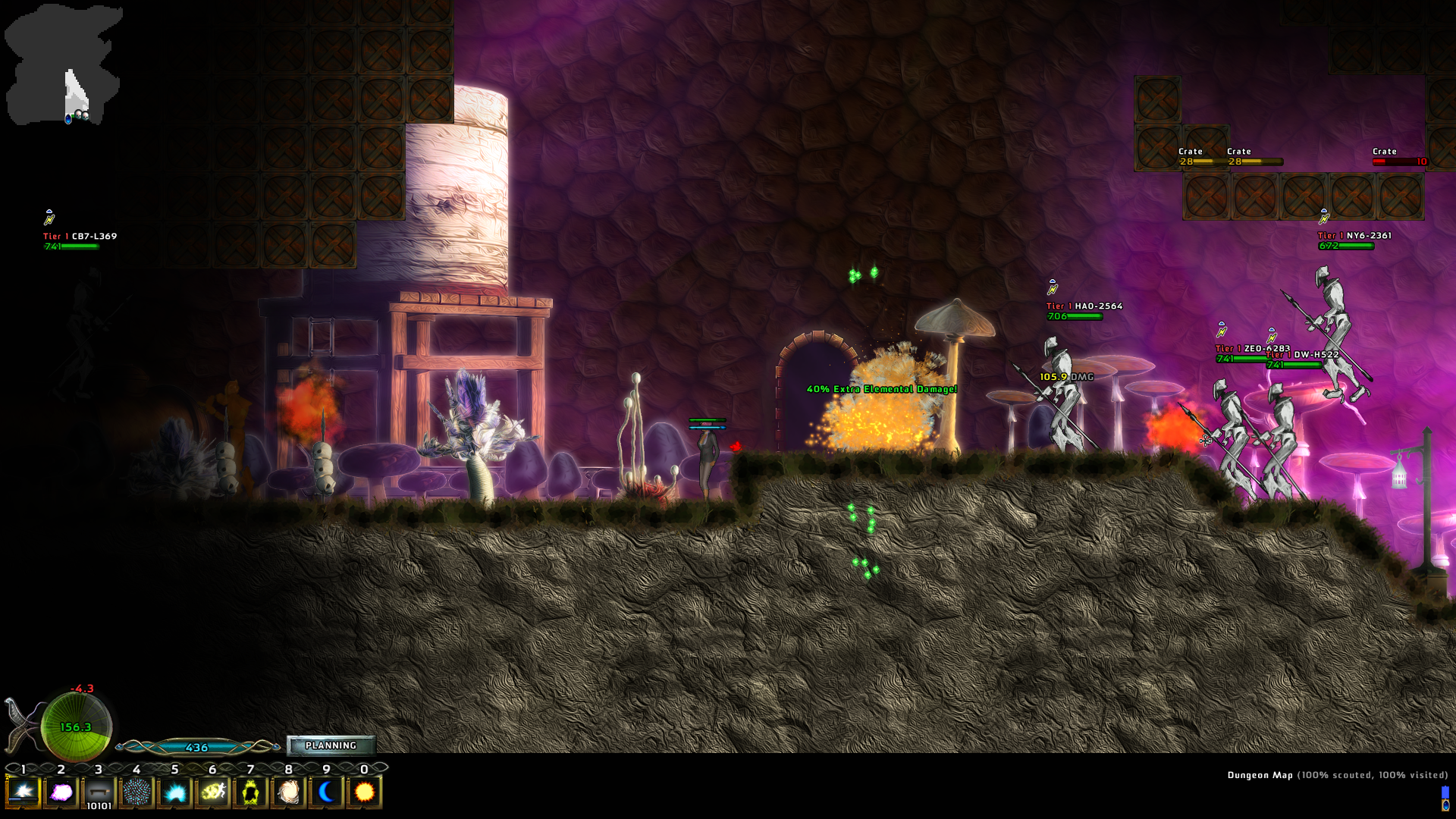
It's really easy to forget what truly ugly games look like, I think. I was going to link to Bear Simulator, but in the spirit of not bullying I'll find something else..

I present... A Valley Without Wind (aka, Programmer Art: The Game)
ss_c41588bc524bafc7a3d9375666fc388d6a407522.jpg

ss_2bafb41a0fe96f43cd5dc8817f3b7d5cf3aee39e.jpg

ss_4355126fda9fb2bfc086dd63e4835cf9aa72a293.jpg
A Valley Without Wind 2 (basically a Director's Cut to try and salvage the game) wasn't much better.
 

Rhaknar

The Steam equivalent of the drunk friend who keeps offering to pay your tab all night.
Ive bever even heard of Rune Factory until recently when the Stardew discussions started :/
 

Shahadan

Member
Going through the posts at Stardew Valley OT, I am surprised that there is quite a bit of people that have never played a Harvest Moon/Rune Factory game at all.

To be fair they're all butt ugly and not attractive at all. At least Stardew has good spritework and nice colors (but the portraits are ugly, yes).
 

tmarg

Member
I present... A Valley Without Wind (aka, Programmer Art: The Game)

[/URL]

Comparing things to Arcen games really isnt' fair.

I actually tried to get into AI War at one point, but I feel like I would really need someone to play it with, and I don't know anyone that crazy/ with that much free time.

To be fair they're all butt ugly and not attractive at all. At least Stardew has good spritework and nice colors (but the portraits are ugly, yes).

I actually thought about buying RF4 last time it was on sale, and I thought the art style was a turn off on that game too.
 
Does The Evil Within get any better? Finished the first 4 chapters but nothing about the game has gripped me so far and what's with the main guy running out of stamina after a 10m sprint? He must smoke 5 packs a day.


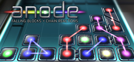
Nice little rouguetetris-like. The blocks come in fewer shapes but are made of five different colour pieces that join together. Once you get an exploding block, all the coloured blocks linked together explode clearing the field. 17 or so peeps on my friends list have it and many have "idled" but judging on the in game tables no one has actually played it, you should!

I think it's still available in one the bundlestars bundles.
 

zkylon

zkylewd
man watching band of brothers sure got me in the mood of a new brothers in arms game

i feel like i might be the only person in the world that absolutely loved that series but i so wish it was back

It's AUD$17, which I'm guessing means it's USD$15, which is also the Steam price. ;)
Kal7GYx.png


this is how it's showing for me at least

I think its butt ugly.

I need to play some more if it tho, its so good
i mean, you get into some complicated stuff when you use the word ugly

should all games be pretty? is "aesthetically pleasing" a sign of quality?

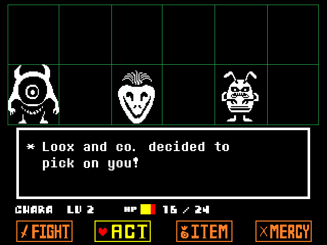
cos like, i raise you undertale to that

ss_a11393d4b437ca75c10521f6baf53fbba9006f0f.1920x1080.jpg


here you have stuff like bad pixelart, disparately used fonts, whiny colors, random abstract ui, etc., but how can anyone argue that ugly art is not the best way of saying what undertale has to say (or at least it does a fine job at it)?

so like while i can see what you mean i don't think a detailed pixelart style with lots of antialiasing and a less drab color palette and higher iq characters would make papers please work better. there's a dehumanizing aspect to papers please look, from the muddy and bleak and depressing color palette to the blurry id card picture look of its characters, i just can't imagine that game looking any other way
 

zkylon

zkylewd
i think stardew valley looks pretty good and it's pleasing and appropriate and everything

but it's not too special

edit: btw if they made another brothers in arms i'd love it to be drab and brown and bleak and everything

no more fancy schmancy colorful crap like in hells highway
 
Art.. art.. art... as a small developer it's a tricky thing to handle. When me and my team started outsourcing for art and seeing the results, we were very happy and amazed. We thought "yes, this is good let's go with this look". When our game (or at least part of it since it is still in development) were showcased to other users the main thing being criticized was our art and it left a bad feeling that maybe we chose incorrectly and that our money was wasted paying for many of these art assets. We are currently trying to think of other ways to improve our art without overhauling or starting from scratch because frankly we spent a huge amount of our savings on them. Here are some art from our game:

81T99le.gif


D9hsfMe.gif


aOYvB8Y.gif


I guess we are currently banking on the game's concept to carry the weak art (we were very encouraged by Undertale's success). Our game puts you in control of the monster as you battle the heroes and give them exciting battles while at the same time following standard RPG rules (like reacting on critical hits, dropping them loots, reacting to elemental weaknesses etc.).

The game was just recently greenlit on steam too. How do you find our art? :(
More importantly, how do you think we can improve our art?
This is our greenlight page: http://steamcommunity.com/sharedfiles/filedetails/?id=630899391

P.S. Stardew Valley looks sweet! You guys are crazy!
 

Anteater

Member
why do they keep dropping these ripper blade, i don't even know how to use that gun!

maybe i should sell the ammos

edit: sold them and bought things

chapter 10 here we go~!
 
Art.. art.. art... as a small developer it's a tricky thing to handle. When me and my team started outsourcing for art and seeing the results, we were very happy and amazed. We thought "yes, this is good let's go with this look". When our game (or at least part of it since it is still in development) were showcased to other users the main thing being criticized was our art and it left a bad feeling that maybe we chose incorrectly and that our money was wasted paying for many of these art assets. We are currently trying to think of other ways to improve our art without overhauling or starting from scratch because frankly we spent a huge amount of our savings on them. Here are some art from our game:

81T99le.gif


D9hsfMe.gif


aOYvB8Y.gif


I guess we are currently banking on the game's concept to carry the weak art (we were very encouraged by Undertale's success). Our game puts you in control of the monster as you battle the heroes and give them exciting battles while at the same time following standard RPG rules (like reacting on critical hits, dropping them loots, reacting to elemental weaknesses etc.).

The game was just recently greenlit on steam too. How do you find our art? :(
More importantly, how do you think we can improve our art?
This is our greenlight page: http://steamcommunity.com/sharedfiles/filedetails/?id=630899391

P.S. Stardew Valley looks sweet! You guys are crazy!
it looks neat
 

zkylon

zkylewd
idk if you're allowed to do a bit of advertising like that but considering how many times dusk golem's done it (tho his games are free so idk?)

of ur game, i feel like it mostly needs a personality injection. a desert can't be just yellow sand and green cacti, it needs more. a forest can't just be trees and grass, etc. backgrounds end up looking generic if they don't look distinctively like they're from ur game and no one else's. the characters have a similar problem, they just need a bit more of a unique look

like fancy skeleton and chill vampire from ur gif look awesome, i think that's the standard you should look into for the rest of ur characters

it's bad feedback but game needs to look more 'interesting'

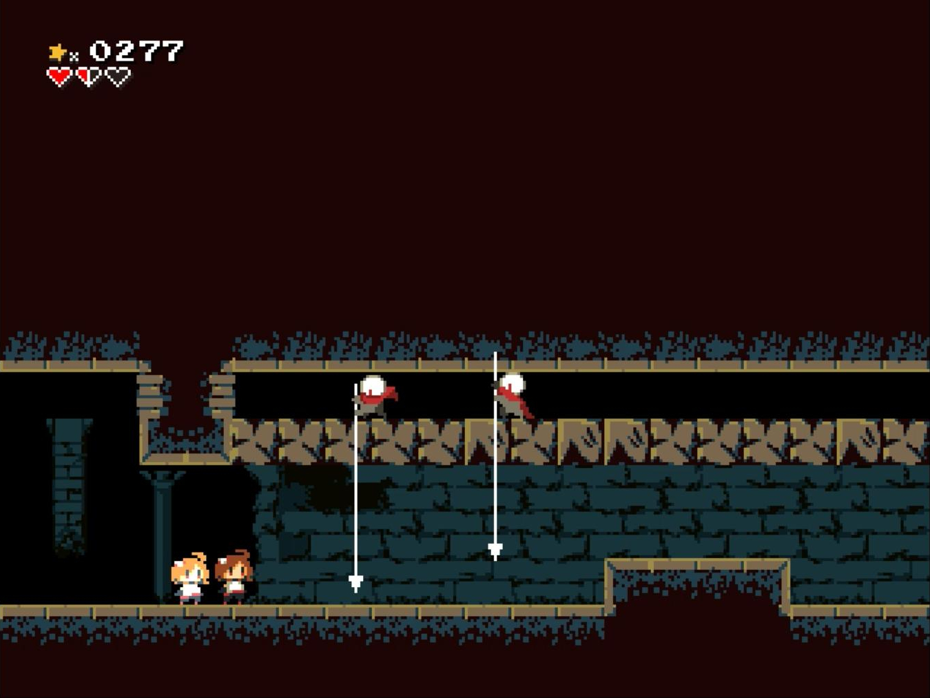
Momodora: RUtM looks really nice-
767C562057B19537B224E12D081C61B7EE1FC676
i played a little bit of momodora 3 today

it was ok, i didn't get really into it cos it seemed hard enough even on easy to have to put in some serious commitment to it and i'm not really sure i'm gonna go for that

it did look pretty tho, i love the colors
 

Lain

Member
Art.. art.. art... as a small developer it's a tricky thing to handle. When me and my team started outsourcing for art and seeing the results, we were very happy and amazed. We thought "yes, this is good let's go with this look". When our game (or at least part of it since it is still in development) were showcased to other users the main thing being criticized was our art and it left a bad feeling that maybe we chose incorrectly and that our money was wasted paying for many of these art assets. We are currently trying to think of other ways to improve our art without overhauling or starting from scratch because frankly we spent a huge amount of our savings on them. Here are some art from our game:

81T99le.gif


D9hsfMe.gif


aOYvB8Y.gif


I guess we are currently banking on the game's concept to carry the weak art (we were very encouraged by Undertale's success). Our game puts you in control of the monster as you battle the heroes and give them exciting battles while at the same time following standard RPG rules (like reacting on critical hits, dropping them loots, reacting to elemental weaknesses etc.).

The game was just recently greenlit on steam too. How do you find our art? :(
More importantly, how do you think we can improve our art?
This is our greenlight page: http://steamcommunity.com/sharedfiles/filedetails/?id=630899391

P.S. Stardew Valley looks sweet! You guys are crazy!
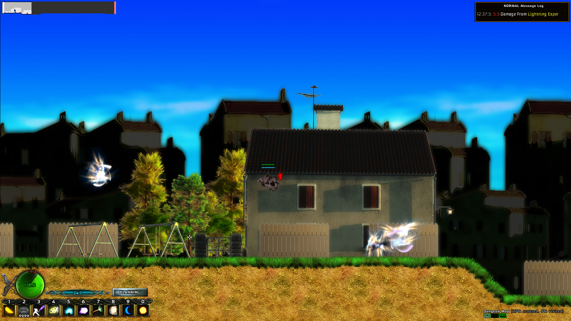
I just saw an highlight for your game today while I was going through some week old kickstarter activity. Feels like it's such a small world.

(From the little I can see) I think the character art in your game is fine but at the same time I feel that it lacks personality. A bit because of the way the character animate, a bit because of the difference between how they look in the portraits and how they look in game, a bit because I feel there is a certain lack of little details.
 

kagamin

Member
i played a little bit of momodora 3 today

it was ok, i didn't get really into it cos it seemed hard enough even on easy to have to put in some serious commitment to it and i'm not really sure i'm gonna go for that

it did look pretty tho, i love the colors

It's only about an hour long game though...
 
i feel like it mostly needs a personality injection. a desert can't be just yellow sand and green cacti, it needs more. a forest can't just be trees and grass, etc. backgrounds end up looking generic if they don't look distinctively like they're from ur game and no one else's. the characters have a similar problem, they just need a bit more of a unique look

like fancy skeleton and chill vampire from ur gif look awesome, i think that's the standard you should look into for the rest of ur characters

it's bad feedback but game needs to look more 'interesting'

This is very good feedback. Your critique about personality injection is spot on. Thanks. A lot of our criticisms come from it looking like a Flash game.
 

Tizoc

Member
Naruto 4 sitting on 70k owners, sf5 is nearing 130k owners
Saint seiya is sadly sitting on 8k owners :/


But in Rune Factory 4 you can romance a 10,000 year old dragon loli.

Checkmate.
These ancient dragons and their loli fetishes.....
 
Style eternal.
tumblr_o3hitlAPmx1uoh0afo1_500.gif

I think this was the exact moment I realised Cave Story was special.
Art.. art.. art... as a small developer it's a tricky thing to handle. When me and my team started outsourcing for art and seeing the results, we were very happy and amazed. We thought "yes, this is good let's go with this look". When our game (or at least part of it since it is still in development) were showcased to other users the main thing being criticized was our art and it left a bad feeling that maybe we chose incorrectly and that our money was wasted paying for many of these art assets. We are currently trying to think of other ways to improve our art without overhauling or starting from scratch because frankly we spent a huge amount of our savings on them. Here are some art from our game:

81T99le.gif


D9hsfMe.gif


aOYvB8Y.gif


I guess we are currently banking on the game's concept to carry the weak art (we were very encouraged by Undertale's success). Our game puts you in control of the monster as you battle the heroes and give them exciting battles while at the same time following standard RPG rules (like reacting on critical hits, dropping them loots, reacting to elemental weaknesses etc.).

The game was just recently greenlit on steam too. How do you find our art? :(
More importantly, how do you think we can improve our art?
This is our greenlight page: http://steamcommunity.com/sharedfiles/filedetails/?id=630899391

P.S. Stardew Valley looks sweet! You guys are crazy!
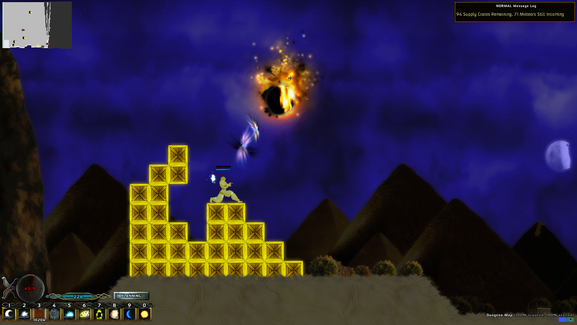
The first thing that comes to mind is "flash game" because of the low-detail character models, especially contrasted with the portraits. The UI also isn't helping things--it's too plain for modern tastes. Lampooning retro aesthetics is one thing, but I find that in most cases it just looks cheap. The frantic animation looping is also kinda budget. Basically, Mediocre Monsters is living up to it's name, I guess.

Artistically, and purely as a potential customer, I'd just recommend syncing up the character portraits with the models a bit more, like give the yeti glasses or drop it. I like some of the character art, like vampire guy and the goblin, but please give vampire guy a better shirt--his current one is like nothing at all, at least on first glance. And finally do something for the UI, to give it some flair beyond "we finished this last."

As far as gameplay, the idea has potential, but like zky says, it needs more personality beyond "classic JRPG." Make this game your own and don't rely on nostalgic references or mechanics to carry it--people have seen that before. And I'll be blunt--4th-wall breaking "players" spewing insipid jokes is tired, well-worn ground. I'd recommend looking at something like Paper Mario 64/Thousand Year Doors to look for inspiration on giving JRPGs a humorous tilt, with interesting enemies and clever writing.

But yeah, cool idea for a game. Good luck in your development, KS, and release!
 

zkylon

zkylewd
It's only about an hour long game though...
oh that's good to know

might push a bit longer then and finish it up

This is very good feedback. Your critique about personality injection is spot on. Thanks. A lot of our criticisms come from it looking like a Flash game.
it does look like a flash game because of the shading and animation, tho i don't think that's necessarily a bad thing.

i think basically u always want ur game to stand out, even if it's not gonna have the highest quality ever. it's not easy to come up with something that looks unique and is also doable on a low budget but you gotta be crafty, that's just how it is

like i think rpg monsters going to an office to work and having to answer to a manager and stuff is pretty cool but if it's just gonna be a regular office and a regular manager suit that's not very interesting, so maybe push the monster-y angle some more or something

Style eternal.
tumblr_o3hitlAPmx1uoh0afo1_500.gif

I think this was the exact moment I realised Cave Story was special.
cave story looked like an awesome game for someone other than me

i like the characters and art and stuff but too hard for my bones
 

tmarg

Member
cave story looked like an awesome game for someone other than me

i like the characters and art and stuff but too hard for my bones

Cave Story really isn't that hard. Unless you are going for the true ending, in which case you pretty much need to follow a bunch of spoilers all the way through the game, and fuck that shit. I still haven't gone back to do that.
 
The first thing that comes to mind is "flash game" because of the low-detail character models, especially contrasted with the portraits. The UI also isn't helping things--it's too plain for modern tastes. Lampooning retro aesthetics is one thing, but I find that in most cases it just looks cheap. The frantic animation looping is also kinda budget. Basically, Mediocre Monsters is living up to it's name, I guess.

Artistically, and purely as a potential customer, I'd just recommend syncing up the character portraits with the models a bit more, like give the yeti glasses or drop it. I like some of the character art, like vampire guy and the goblin, but please give vampire guy a better shirt--his current one is like nothing at all, at least on first glance. And finally do something for the UI, to give it some flair beyond "we finished this last."

The idea behind the Yeti being different from the portrait is this: At the monster town, he looks exactly like the portrait, shades and all because he's just being himself. During battle, they change their looks to be more natural looking or more monster like as they are acting up for the heroes. I think that might not be the best decision after all. Here is our Yeti during town:

5KCuxNm.gif


Also, our animator for the town is different for the animator in battle so their style is different. We thought FF7's Cloud's exploration model is different from Cloud's battle model so maybe we can also do that and it will be acceptable.

Lastly, Yeah I think we will hire a UI art specialist because right now all we have are placeholders. Thanks for the feedback.

On the other hand, what do you guys think about Hotline Miami's art? I can stand Papers Please art but not Hotline Miami. :(
 

zkylon

zkylewd
sometimes I feel like I don't even know you

what does that even meaan
well like my mom likes to say i should've come with an instructions manual

Cave Story really isn't that hard. Unless you are going for the true ending, in which case you pretty much need to follow a bunch of spoilers all the way through the game, and fuck that shit. I still haven't gone back to do that.
was really hard for me at least :T

also the "losing ur gun powers on taking dmg" mechanic was really frustrating for me. not like ragequit frustrating but made the game not so much to play
 
Yup, Kero Blaster (full game) , Pink Heaven (Kero Blaster Demo), and Pink Hour (Pink Heaven Demo) are all from Studio PIXEL, the First Indie Dev™.
The idea behind the Yeti being different from the portrait is this: At the monster town, he looks exactly like the portrait, shades and all because he's just being himself. During battle, they change their looks to be more natural looking or more monster like as they are acting up for the heroes. I think that might not be the best decision after all. Here is our Yeti during town:

5KCuxNm.gif


Also, our animator for the town is different for the animator in battle so their style is different. We thought FF7's Cloud's exploration model is different from Cloud's battle model so maybe we can also do that and it will be acceptable.

Lastly, Yeah I think we will hire a UI art specialist because right now all we have are placeholders. Thanks for the feedback.

On the other hand, what do you guys think about Hotline Miami's art? I can stand Papers Please art but not Hotline Miami. :(

Ah, that makes more sense. I guess the question should be, is the UI something the heroes see or no? Like, just how deep is this game-within-a-game charade going? It could be all Monsters Inc where it's a whole industry, or Toy Story where it's just... how things are. Really depends on what sort of thing you're going for.


And personally, I've never liked Hotline Miami's look. I just don't like that perspective, ever since I played Mission: Impossible on the NES. The unrepentant goriness and frenetic speed are both neat, though.
 
Status
Not open for further replies.
Top Bottom