Jawmuncher
Member
So apparently you can no longer post reviews for games you played through family sharing. That's new, right?
Valve doing the lords work.
So apparently you can no longer post reviews for games you played through family sharing. That's new, right?
So apparently you can no longer post reviews for games you played through family sharing. That's new, right?

So apparently you can no longer post reviews for games you played through family sharing. That's new, right?

So apparently you can no longer post reviews for games you played through family sharing. That's new, right?


Someone call Nick Knowles, this looks like a job for DIY SOS!
I'm trying to preorder Civ VI special edition off GMG and I wanted to use the referral 5% off code that I have but it's saying that it is invalid. I've never purchased anything from GMG but I've had an account for a while. Anyone know why it won't work?
I'm not sure how predictable it can be. Typing of the Dead just suddenly showed up in the Winter Sale way back when. Valkyria had a bit of a run up before releasing. I think that was announced in late October.
I mean, 4 weeks is certainly as good as any guess, but I think the safest bet is this last quarter of the year
ModBot said:Instructions for participants:
I am giving away 10 Steam keys. To enter this giveaway, send a PM to ModBot with any subject line. In the body, copy and paste the entire line from the message below that corresponds to the game you want. (if you include more than one game, you will be blocked from entering). Confused? Watch this GIF tutorial or ask for help.
Want to make your own ModBot giveaway? Click here for a quick tutorial thread. Please give generously.
ModBot Basics:
- I really appreciate thank you messages, but please send them to me (HowardRoark, not ModBot!) via PM instead of in thread.
- Do not trade keys you win off-site to enrich yourself. Don't try to claim games you have no interest in collecting or playing. Don't claim games to give them to friends off-site.
- If the key is already taken you will not receive a reply. Replies may take a minute or two.
Rules for this Giveaway:
- If you are a lurker you are not eligible for this giveaway. You need five or more posts in either the current Steam thread or the previous one to be eligible
- This giveaway is a raffle. The winners will be selected by random draw 24 hours after the draw was created. Any games not claimed after that point will be given away first come first serve.




KHOLAT --MB-7B5B7916D13DE51A- Taken by KainXVIII. 14 entrants total.
DISTRAINT --MB-83C1773AA9479191- Taken by MaxiLive. 4 entrants total.
Dawn of Magic 2 --MB-7D5586B61048E28B- Taken by texhnolyze. 2 entrants total.
A.I.M.2 Clan Wars --MB-6401558126D5812B- Taken by Mackenzie 92. 1 entrants total.
Star Wolves --MB-C6A5F82231D155AD- Taken by illusionary. 4 entrants total.
Apartment 666 --MB-A03FCB07557DDF18- Taken by ExoSoul. 1 entrants total.
Dead But Alive! Southern England --MB-E00A137A56783690- Taken by Purkake4. 3 entrants total.
Planet Alcatraz --MB-D3313F24A903084E- Taken by Henry Swanson. 6 entrants total.
Konung 2 --MB-4FEFCCEE8D1A99D7- Taken by bloke. 1 entrants total.
Konung 3: Ties of the Dynasty -- MB-E6210F6A4B160162

(rough sketch)
So I need your guy's opinion, which store header do you guys think is better?
A:
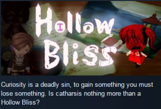
B;
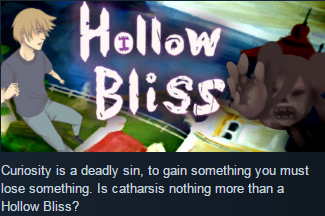
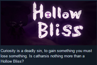
Opinions appreciated.
Imo "can't afford" is both unclear and redundant. People already know how much is in their wallet, and they might be interested in seeing games a bit above or below their wallet amount. The "Items' price above" filter should be enough (and is an excellent idea btw).In the next Enhanced Steam release, we're adding some more search filtering options
(rough sketch)
One of the options I'm looking at adding is something along the lines of "games you can't afford" (as in, hide games that cost more than your current wallet balance) but my question is: does that sound too presumptuous? Like - maybe you can afford a particular game, but you just don't have enough money in your wallet? Obviously in those cases you would simply enter your own amount below, but
Do you think people would "get it" if it's worded that way, or is there a better way it should be worded?
Imo "can't afford" is both unclear and redundant. People already know how much is in their wallet, and they might be interested in seeing games a bit above or below their wallet amount. The "Items' price above" filter should be enough (and is an excellent idea btw).
Maybe a button to autofill the filter with your wallet amount instead?
So I took your guy's advice, but did sprinkle a bit in myself. I did a take mostly inspired by Annubis's suggestion, and the big picture mentions. Curious to get your guy's take on this one?
https://i.gyazo.com/b1ab72e627204283ffc2c96d54bb3bd4.png
Part of me thinks I should put something more eye-catching to the side, but then the darker figure might work fine, but it might be less eye-catching. I've debated on a few different takes with this, but I think hearing people's thoughts has been helpful.
Don't mind opinions and critiques, it's why I ask and it is helpful. I saw some didn't want to offend me, but I take no offense at all. Collecting multiple people's opinions since it helps me as I definitely am not in marketing. I don't mind if I have to do several more takes either, and interesting to hear everyone's thoughts as the contrast of opinion is helpful to reflect on.
Ucchedavāda;220747929 said:While I like the purple, the image looks kind of muddy to me, for lack of a better term. Perhaps the figure should be a bit more clearly defined? Also, an alternative to the very minimalist banners could be option A, but without the 3 figures, if that is possible.
So apparently you can no longer post reviews for games you played through family sharing. That's new, right?

So a few pages back I got some interesting feedback from you guys that was quite helpful for this post:
So I took your guy's advice, but did sprinkle a bit in myself. I did a take mostly inspired by Annubis's suggestion, and the big picture mentions. Curious to get your guy's take on this one?
Graphics: Intel HD 4600
Luck was on my side for once:


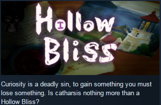
OKAY, so thank you for everyone sharing opinions, thinking on it this might be most reflective but I can touch-up more and such of course. What do you guys think of this one?
yup, that's what the gta 5's and the deus ex mankind divided's and the hotline miami 2's have done for all this time, don't revel on sensitive issues, but definitely be flippant and childish about how they portray themi'd say there is still a middleground between treating something without enough sensitivity and outright glorifying it like Hatred.
Put a dinosaur on it
I think it looks fine
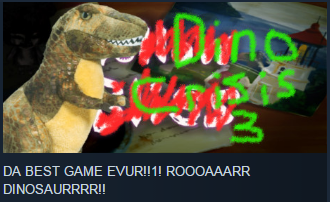
Much better.
OKAY, so thank you for everyone sharing opinions, thinking on it this might be most reflective but I can touch-up more and such of course. What do you guys think of this one?
NX - Tomorrow 7am PT - Teaser
#NX is gonna be trending for the next couple days at least.
What's RDR2?It'll have to beat #RDR2

OKAY, so thank you for everyone sharing opinions, thinking on it this might be most reflective but I can touch-up more and such of course. What do you guys think of this one?

OKAY, so thank you for everyone sharing opinions, thinking on it this might be most reflective but I can touch-up more and such of course. What do you guys think of this one?

I really hope Valve doesn't question these quick changes and then changes back I made to my store page.

Sega is ages backwards.
11.6 GB update for Doom?

You are very right. Scarabs are easy money but once a dark level comes up, I usually try to finish it quickly. Usually avoided deaths are a trouble in the dark for me.Well done! Watched up to the pitch black mine level so far and I was wondering why you didn't collect the gold scarabs. Aren't they worth like $5k each?
If a casual gamer like me can do it, you can do it too!! With lots of trial and errorAll your Spelunky talk lately has made me want to get back into it after like 3 years of not playing haha. Still can't beat it, though.
yea I deleted doom after it tried downloading a 12GB multiplayer patch
Shit, is it up to 60GB yet?
NX will get RDR2 before PC, woudln't even be surprised.
