• Hey, guest user. Hope you're enjoying NeoGAF! Have you considered registering for an account? Come join us and add your take to the daily discourse.

STEAM | September II 2014 - Ride the Lightning

Status
Not open for further replies.

Arthea

Member
No I'm not, why does it matter? I'm not saying the update is bad, I'm not bothered by the curators being featured on the pages, I'm saying the update is not enough to prevent the problems that will arise once they open the floodgates and let everyone publish on Steam. This is a discussion. In a thread about Steam.

But sure, let's go back to talking about what I had for lunch today and what an awesome group of superfriends we are instead of whining about every little thing (><)

Spockeyebrow.gif

I'm not against discussion, I was joking about pages of "how do I remove that pronto", and why is it so blue (><)

I think the language itself doesn't help. It's not really curating content but just one big old wishlist for a singular entity or a group of people. Is it wrong that professional critics are promoting their outlets? Not really, I kind of expected them to do so anyway but it's not really in the community spirit of things but that can't be helped when the tools Valve have given appear to be threadbare.

GOGMixes and even Amazon's stupidly old Listmania do a much, much better job at curating that what the Steam attempt does.

hey! I liked listmania, it was funny to check at times.
gog usually does a great job, that's gog for you

I don't think that curating idea itself is that bad, it's... that I can see how it can be abused and made irrelevant really easy, but looking from my standpoint, it can save me lots of time. If somebody with similar tastes as mine does all the work, for example (><)
 

RionaaM

Unconfirmed Member
So would this stop being a problem if for example IGN became a popular curator? That would basically be a back of the box quote then wouldn't it?

Do we dislike the feature in itself or the personality who's quote is getting to the top?
No, it wouldn't. It's only a back of the box quote as long as the dev chooses it themselves and adds it to the store page, just like any other thing that's there as advertisement, to sell the game.

spindoctor said:
So if the developer mandates the advertising it's okay but if Steam autogenerates the same it's icky? :p
Indeed. The dev is promoting their game. The curator who writes a recommendation is promoting his Youtube channel/personal website/whatever.

are you a developer? If yes, I can see why you could be somewhat concerned about this update, it's not necessary a bad thing, it might work over time.

All in all, it's great update, customization is there, limited sure, but it's there, searching got a lot better, that for the longest time was the worst thing about steam. And I don't see why would you be so bothered by curators thingie. I checked pages of many games on store, ya, it could be lower, but it really doesn't do any harm that I can see.
Nothing that happens on a games store will ever do any harm, as far as I can imagine, but yet that doesn't mean you have to like it.
 
For me it's a little bit of both. The focus should be on the quality of the curation and how that ties into your own interests but right now as it stands it's more about the popularity of said curator. This isn't helped by the lack of tools for filtering and poor curation management available. It might blossom in time but right now for me it has no use whatsoever. But hey some folks still obsess over review scores and play "guess the Metacritc" which outside of the body text of the review I couldn't give a toss about so I guess I'm out of touch.

I agree that they need to give us better tools to customize or remove the curation.

On a more philosophical note, I feel that we are kind of out of the purview of this feature anyway. I've been using this thread as my 'curator' for a long time now. Every notable release gets mentioned here so I never have to search the new releases list. There's almost always someone who has played a game so we can get a sense of how it is from them. We sometimes get thoughtful discussions about certain features or genres. We sometimes get anime and pigeons. We even tolerate all the Bioshock Infinite haters who are just wrong :p. It all adds up to the point where we don't need Steam curation as much.

For those who can benefit from the new features, I feel that Steam is making a lot of reasonable assumptions while throwing up their machine generated store content. For example, Dota 2 or Warframe are some of the most popular games on Steam so it's not unreasonable for it to show up on recommended queues. They can't know that an individual abhors F2P games but hopefully in time the system will learn not to recommend F2P tagged games. The same goes for curation. They default to showing blurbs from popular curators because they're working under the assumption that there's a reason they're popular to begin with. Otherwise they let you choose whose content you'd like to see. As and when they implement better filtering tools, I can see it becoming a useful feature for some folks. And for those like me who think it'll probably never be useful, they should implement a way to avoid it (although I suspect Enhanced Steam will get there first).
 

derExperte

Member
Why isn't the Community Hub button on the store pages a drop-down menu will all categories of the hub? Also I'd like small buttons on the top to jump directly to the reviews, sys reqs etc. Too much scrolling is needed and it's gotten worse with the curator stuff.
 

dmix90

Member
Oh, there's a way to disable Curator? How?! I want to turn it off.
Browser only i guess. You need to install stylebot extension ->
Stylebot - Chrome Extension | For using Chrome extensions in Opera

1.Go to store.steampowered.com
2.Press newly installed extension icon
3.Open Stylebot->Edit CSS
4.Copy-Paste code from this post and click save.

I believe you only need to copy-paste these lines to hide curator.
Code:
.apps_recommended_by_curators_ctn .home_page_content {
    display: none;
}

.steam_curators_block {
    display: none;
}
 
What are we bitching about today? new store stuff?

No one is bitching. This is a discussion, constructive criticism about how Valve yet again implemented something half-baked. Something that they apparently have put a lot of thought behind to solve the biggest problem Steam had in recent year (discoverability, curation), but currently it doesn't help that situation at all and is getting abused.
 

Nzyme32

Member
I think the language itself doesn't help. It's not really curating content but just one big old wishlist for a singular entity or a group of people. Is it wrong that professional critics are promoting their outlets? Not really, I kind of expected them to do so anyway but it's not really in the community spirit of things but that can't be helped when the tools Valve have given appear to be threadbare.

GOGMixes and even Amazon's stupidly old Listmania do a much, much better job at curating that what the Steam attempt does.

I thought you had to own game to recommend them in the first place? Anyway, what is definitely needed, is the ability to filter out certain curators, particularly some of the bigger journalists that I have no real yearning to see their opinions. I agree that they really are not "curators", but I also feel like this is something that should be out of the forefront of the store. I suppose though, I am just talking about sifting through the old review system which was fine for my needs for the most part.
 

Nzyme32

Member
No one is bitching. This is a discussion, constructive criticism about how Valve yet again implemented something half-baked. Something that they apparently have put a lot of thought behind to solve the biggest problem Steam had in recent year (discoverability, curation), but currently it doesn't help that situation at all and is getting abused.

Must admit, since this is pretty much the bread and butter of their business, I thought the design and features would be a bit more complete when they put it out. It's not bad at all, but there are clearly lots of areas needing work. I'd take a guess that they need to gather data to then decide how to move forward, but I guess this is what you come to expect from Valve in general. It's rarely a terrible thing but almost always not too great to start off with
 

JaseC

gave away the keys to the kingdom.
I'm surprised Greenlight wasn't binned along with the old store design. I'd always assumed the two would coincide: swap out the old for the new.
 

Arthea

Member
Not really.
All it takes is one single cookie.

Of course, you'd have to do it for every system/browser, but still.

I think you are wrong on this one, granted I haven't created a site in a long time, but as far as I can remember, you can't really make fully dynamic layout, at least I couldn't, if you let full customisation you end up with something looking like your worst nightmare most of the time.

I'm surprised Greenlight wasn't binned along with the old store design. I'd always assumed the two would coincide: swap out the old for the new.

ya, that's rather strange, now that you mention it
 

Saty

Member
And this will never change, unless they go public and restructure or something. Would people want that trade-off though? :p

No reason why Valve - the platform holder side shouldn't be more traditionally structured.

Didn't realized you can infinitely score the main store page for more recommendations.
 

Turfster

Member
I think you are wrong on this one, granted I haven't created a site in a long time, but as far as I can remember, you can't really make fully dynamic layout, at least I couldn't, if you let full customisation you end up with something looking like your worst nightmare most of the time.

You can these days ;)
Especially if it's just turning blocks on/off, blocks which are clearly delineated.
 
No one is bitching. This is a discussion, constructive criticism about how Valve yet again implemented something half-baked. Something that they apparently have put a lot of thought behind to solve the biggest problem Steam had in recent year (discoverability, curation), but currently it doesn't help that situation at all and is getting abused.

Yeah, I was expecting a bit more customization. I haven't had much time to play with it, but it looks like they added more things to scroll through without the option to remove what you don't want.

wouldn't that be somewhat hard to implement?

If Enhanced Steam can make some things appear/disappear, I imagine Steam should be able to do it for some of the 'larger' objects.
 

aku:jiki

Member
I'm surprised Greenlight wasn't binned along with the old store design. I'd always assumed the two (new design + new publishing system) would coincide.
The guy in charge of the new storefront wasn't in charge of Greenlight and the guy who was supposed to take down Greenlight is too busy building a sweet fort in the kitchen. Storefront guy didn't go the extra mile on the whole store thing because he had some ideas for badass additions to the fort. They even have a NERF catapult now!
 

Nzyme32

Member
I'm surprised Greenlight wasn't binned along with the old store design. I'd always assumed the two (new design + new publishing system) would coincide.

I think that is pretty much set to happen once they can be certain they have the store under control and where customers are happy and accepting of it. I can't imagine what this situation would be like with a large influx of new content being pumped through. Seems like many people are still trying to figure out how to use it in the first place and finding plenty of little nuisances that they are not too fond of
 
Must admit, since this is pretty much the bread and butter of their business, I thought the design and features would be a bit more complete when they put it out. It's not bad at all, but there are clearly lots of areas needing work. I'd take a guess that they need to gather data to then decide how to move forward, but I guess this is what you come to expect from Valve in general. It's rarely a terrible thing but almost always not too great to start off with

Yeah, this is how they roll :| I hope (for the sanity of lot of people) both L4D3 and HL3 (more so this) won't be "not terrible, but not too great to start off with" :p
 
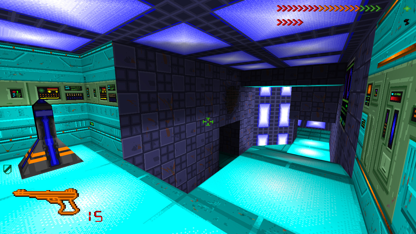
Relatively old news but someone is working on a remake of the first System Shock

http://www.indiedb.com/games/citadel

med1charge1.jpg

What is different in Citadel compared to the original?
The main differences in Citadel are going to be 3D models for all objects and enemies as opposed to flat 2D images, smooth natural lighting, improved controls, improved interface HUD, portability to Linux and Mac, increased complexity in level geometry, and support for multiplayer coop and deathmatch. The image textures and pixelated style will remain the same or very nearly the same, the main differences are an increase in geometry rather than an increase in resolution (although the video resolution on your monitor will be as high as your native screen resolution).

I have the resources, the skill, the time, and most importantly the motivation to see this through and will hopefully be able to build a small team to speed the process to see this finished by December 23. Further, Citadel has more progress than any other remake attempt. There is already a working inventory, working damage system, working menu, working enemy AI, and a vast majority of the code framework already completed in terms of gameplay. Also, I want to point out that the scope of Citadel is much more limited compared to the scope of others. Citadel is not going to be an HD remake of the original. Citadel will only have a more 3D world using the same textures as the original game but with better lighting.
 
I think the curator system is meant to be used as the two options people have described already. It's not one or the other. It's both.

Do you like a famous youtuber or gaming blog whose reviews you already use to know what games are worth or not? Well, now you can see directly their recommendations on Steam.

Do you want to use a expert on TBS games as curator for that type of games when you are interested in buying that new turn based game that was just released? Ok, do it.

The two options aren't exclusionary.
 

Jørdan

Member
The one night I go to bed early. Probably for the best, I'm going to be playing around the new storefront for a while. So pretty, love the blue theme. Was just commenting last night on how the blue highliting in the client made me giddy, this however is a whole new level of gorgeous. Layout is still a little funky, when I go to the home page I want to see what is new and on sale - that should be at the top with recommendations, Steam curators and so on below. Recently Updated in the middle buffering them.

As for the Steam Curators, neat idea but the name gives it a weight I don't think it carries yet. Still just a bunch of reviews of greatly varying quality. Maybe the idea is to build on that and have more features/customization implemented later. I can see that having your own page to promote games you enjoy with the ability to sort by genre, sale discount, rank or whatever could be useful. Currently the categories are far to few to narrow down specific interests in the more general curated pages. If you have $10 to spend during a sale and your looking for an RPG the current curator system isn't all that helpful.

Looking now at the reviews section of a games store page I feel there could be improvements made there too. I'd like to see a filter for playtime added with the ability to select multiple filters so you could sort by positive & playtime for example. Filtering out one liner reviews would be a plus.

Since you recently viewed recommendations is going to be a pain in the ass.
 

Jawmuncher

Member
Relatively old news but someone is working on a remake of the first System Shock

http://www.indiedb.com/games/citadel


What is different in Citadel compared to the original?
The main differences in Citadel are going to be 3D models for all objects and enemies as opposed to flat 2D images, smooth natural lighting, improved controls, improved interface HUD, portability to Linux and Mac, increased complexity in level geometry, and support for multiplayer coop and deathmatch. The image textures and pixelated style will remain the same or very nearly the same, the main differences are an increase in geometry rather than an increase in resolution (although the video resolution on your monitor will be as high as your native screen resolution).

I have the resources, the skill, the time, and most importantly the motivation to see this through and will hopefully be able to build a small team to speed the process to see this finished by December 23. Further, Citadel has more progress than any other remake attempt. There is already a working inventory, working damage system, working menu, working enemy AI, and a vast majority of the code framework already completed in terms of gameplay. Also, I want to point out that the scope of Citadel is much more limited compared to the scope of others. Citadel is not going to be an HD remake of the original. Citadel will only have a more 3D world using the same textures as the original game but with better lighting.

Might need to be more work than just 2D to 3D.
Trying to play SS1 is a hard task these days.
 

derExperte

Member
I think you are wrong on this one, granted I haven't created a site in a long time, but as far as I can remember, you can't really make fully dynamic layout, at least I couldn't, if you let full customisation you end up with something looking like your worst nightmare most of the time.

Google and others offered fully customizable portals. But I guess that went out of style for a reason. At least let me choose the order in which things are displayed, see the profile page.
 
No reason why Valve - the platform holder side shouldn't be more traditionally structured.

Until Gabe and other Valve veterans are there, this will never happen. This flat, cabal based structure has been their "marquee feature" from the get-go. For this to change there needs to be a huge shakeup. Even if something would happen to Gabe it's safe to assume they already made preparations for someone in-house to take over.
 

Phinor

Member
Damn discovery queue. I don't want to remove specific genres and titles completely from my interests just because I happen to own the game outside of Steam. We need a fourth button, "Already own elsewhere".

Also the amount of open world survival games? I haven't even heard of most of these and have zero interest in any of them. I knew about the ten or so most popular games but seems like every other game in the discovery queue is another one of these.
 

Sendou

Member
I'm surprised Greenlight wasn't binned along with the old store design. I'd always assumed the two would coincide: swap out the old for the new.

I'm thinking Valve wants to tweak their discovery features a bit before opening the floodgates.

Damn discovery queue. I don't want to remove specific genres and titles completely from my interests just because I happen to own the game outside of Steam. We need a fourth button, "Already own elsewhere".

Why not? "Not interested" doesn't remove genres or anything like that:

notinterestedt4k99.png
 

Arthea

Member
You can these days ;)
Especially if it's just turning blocks on/off, blocks which are clearly delineated.

well of course, but then layout has to be remodelled under new block composition, or it will look horrible, and that was major problem, unless it isn't now, only I kinda fail to see how.
OTOH if layout is simple enough, you can premake all possible configurations, but damn if it isn't a pain in asscreed. *shudders*

Google and others offered fully customizable portals. But I guess that went out of style for a reason. At least let me choose the order in which things are displayed, see the profile page.

I don't remember google ever being fully customizable, actually. When was it?
 
I think the curator system is meant to be used as the two options people have described already. It's not one or the other. It's both.

Do you like a famous youtuber or gaming blog whose reviews you already use to know what games are worth or not? Well, now you can see directly their recommendations on Steam.

Works perfectly for that!

Do you want to use a expert on TBS games as curator for that type of games when you are interested in buying that new turn based game that was just released? Ok, do it.

The two options aren't exclusionary.

Does not really do this at all. It basically lets you tweet about a bunch of games. For the second option to work, you need to be able to categorise, edit and enter a whole lot more information.
 
The Discovery Queue has been completely useless to me, as it keeps recommending me games in genres or with tags I'm absolutely not interested in (MMOs, F2P, co-op, Early Access) and I can't seem to find a way to make it better, except for going through queue after queue.

"VIEWED: 204
Titles Viewed In Queue
The titles that you viewed and then hit 'next in queue'"

Out of that, I found exactly 2 games I'm interested it. Is there no way to add or modify genres or tags I'm interested in?

e: Of course right after the post I found a way to get rid of the Early Access junk, which helps a little.
 

Saty

Member
Does not really do this at all. It basically lets you tweet about a bunch of games. For the second option to work, you need to be able to categorise, edit and enter a whole lot more information.
You can link to your Steam review of the game. That takes care of conveying in detail what you think of the game.
 

Turfster

Member
The Discovery Queue has been completely useless to me, as it keeps recommending me games in genres or with tags I'm absolutely not interested in (MMOs, F2P, co-op, Early Access) and I can't seem to find a way to make it better, except for going through queue after queue.

Everyone gets the f2p and mmo shit, sadly.
They also keep coming... especially the ones that break the fucking queue because they're for another region
 
This was posted on another forum that I occasionally visit (see message #7):


If there are any other Aussies with an unplayable game, mention the ACCC lawsuit and see how you go.

idk that seems like a pretty flimsy excuse for a refund to me. No inverted mouse for an MMO is a dealbreaker? It's a bog standard over the shoulder camera. Plus as the devs said it's over 30 days past the release day, which is a pretty standard statute of limitations for returns on consumer products. That much time after launch just seems like sour grapes to me. The 'This support is provided by some crappy third party we outsourced to so don't bitch when they screw up' bit is rich though.
 
Everyone gets the f2p and mmo shit, sadly.
They also keep coming... especially the ones that break the fucking queue because they're for another region

They should add the possibility to ignore entire franchises as well. Having to pass on all Call of Duty games gets annoying after a while.

e: Also, no need to recommend me games I already own.
 
Status
Not open for further replies.
Top Bottom