I've sometimes got trouble figuring out just what the complementary colors are for the colors I'm using. I know the basics of the primaries and secondaries, and even stuff between those, but then I get to certain colors like skin tone and have no idea which color is the opposite. Thanks to you I now know that for light skin it's a bluish hue, but how do you go about it when it's not a really obvious one?
-
Hey Guest. Check out your NeoGAF Wrapped 2025 results here!
You are using an out of date browser. It may not display this or other websites correctly.
You should upgrade or use an alternative browser.
You should upgrade or use an alternative browser.
The New Art Thread
- Thread starter Dagless M.D.
- Start date
- Status
- Not open for further replies.
Manabanana
Member
DarthWoo said:I've sometimes got trouble figuring out just what the complementary colors are for the colors I'm using. I know the basics of the primaries and secondaries, and even stuff between those, but then I get to certain colors like skin tone and have no idea which color is the opposite. Thanks to you I now know that for light skin it's a bluish hue, but how do you go about it when it's not a really obvious one?
Well, it's easy if you use painter. If you're using PS it's a bit harder. Just jump to the other side of the color wheel.

Since your skin tones are gonna be up around the orange area, parts of your shadow are going to be where the light blue and blue meet. Remember to move it over towards the gray area of the blues. Your eye will fill in most of the color it needs to with the correct use of grays. Use a light opacity or blend it with the existing color. This way you'll probably end up with a light gray-violet. You'll be able to pick out the blues from the shadow and the reds/oranges from the skin. It's like when you see trees in the distance, KNOW they're green, so you think you see green. If you really look at it, you'll see they're a light purple.
I'm not quite sure how color theory works... I know blue tint is a popular choice for shading the skin color, as they're after all, complementary colors...
but with the picture of the girl you posted, she's standing around green and and reddish/brownish background... how do those colors effect the shadow on her skin? It looks neat the picture, but the mood of the girl is that she's kinda ghostly and creepy.
Also the shadow that the picture frame casts onto the wall... why is that just a darkened tint, rather than using a complementary hue? What decides the use of opposing or adjacent colors on the color wheel?
robot
Member
Heres something different:
http://trevoraldinger.com/temp/matrix_flash.html
http://www.erlinteraction.com/nasacort
Those are 2 flash promos I just finished up.
http://trevoraldinger.com/temp/matrix_flash.html
http://www.erlinteraction.com/nasacort
Those are 2 flash promos I just finished up.
Manabanana
Member
Zaptruder said:I'm not quite sure how color theory works... I know blue tint is a popular choice for shading the skin color, as they're after all, complementary colors...
but with the picture of the girl you posted, she's standing around green and and reddish/brownish background... how do those colors effect the shadow on her skin? It looks neat the picture, but the mood of the girl is that she's kinda ghostly and creepy.
Also the shadow that the picture frame casts onto the wall... why is that just a darkened tint, rather than using a complementary hue? What decides the use of opposing or adjacent colors on the color wheel?
Since it's not a photograph, it's obviously not going to be perfect. I posted the picture because it illustrated the use of the opposite color in the shadow.
As for the wall, you can see plenty of blues in it, and there are even small touches of blues under the picture frame. I would assume that the brown in the wood reflects onto the wall to create a darker red/brown color. Since she is standing in front of a pink/beige picture the reflections on her skin are such.
Since I'm just getting in to color theory I can't explain everything
 Conceptart.org forums are a great place for tutorials on color theory.
http://www.conceptart.org/forums/showthread.php?t=15745
Manabanana
Member
robot said:Heres something different:
http://trevoraldinger.com/temp/matrix_flash.html
http://www.erlinteraction.com/nasacort
Those are 2 flash promos I just finished up.
Those were really cool!
robot said:Heres something different:
http://trevoraldinger.com/temp/matrix_flash.html
http://www.erlinteraction.com/nasacort
Those are 2 flash promos I just finished up.
definitely dug those, especially the nasacort one. good show!
Manabanana
Member
DarthWoo said:Would a very dark brown also work? Also, should a highlight on black hair ever be completely white, or just a lighter version of whatever base color I used?
Yup, a very dark brown is probably best. The highlights should reflect the color of the light source.
I do seem to have a habit of starting off my color assuming a normal white light source. If I wanted to quickly change the light color, would it work to create a new layer over everything with a mask of the colored areas, and fill that with the new light source color at a very light opacity?
Manabanana
Member
DarthWoo said:I do seem to have a habit of starting off my color assuming a normal white light source. If I wanted to quickly change the light color, would it work to create a new layer over everything with a mask of the colored areas, and fill that with the new light source color at a very light opacity?
Yup, that'd work! I've never done it, but the one time I've seen it done the tutorial showed first laying the color of the shadow, then erasing parts where the shadow wouldn't be, then highlighting. I have a tendency to start completely over if I'm not happy with something, so that's what I would do. The painting will come out better if you re-do it than it would if you try to fix it. I have proof open in painter 9 right now
 This is the sixth time I've done this painting I'm working on, but it's the best thing I've ever done. It's gotten better every time.
How much is Painter 9 right now anyway? I'd really like to try it, but not be restricted to the demo's time limit. I'm not sure if it's something I'd be able to find in the student discount stores as easily as the more traditional school stuff.
Shogmaster
Sloppy seconds
DarthWoo said:How much is Painter 9 right now anyway? I'd really like to try it, but not be restricted to the demo's time limit. I'm not sure if it's something I'd be able to find in the student discount stores as easily as the more traditional school stuff.
Painter 9 will be $199 for upgrade, and $499 for full version, but never get the full version since any Wacom owner can get it for upgrade price. And if you don't own a Wacom tablet, no reason for you to even launch Painter 9.
I suspect that if you look around, you'll find P8 upgrade for $130~$150 when it goes on sale.
BTW, P9 will be on sale around mid October (17th IIRC).
Manabanana
Member
DarthWoo said:Ouch, that's not quite in my budget. My next and probably final big expenditure for a while will be more ram when I can find 1GB in 2x512MB for substantially below $140.
There are other discounts available. *cough*
"Yup, a very dark brown is probably best"
Nope, very dark brown is good for brown hair, not black. (the cool deep blues and deep purples are what makes black hair black in contrast to skin which is an orangey color) dark brown is a warm color that plays with the skin and will lower the contrast of it.
Nope, very dark brown is good for brown hair, not black. (the cool deep blues and deep purples are what makes black hair black in contrast to skin which is an orangey color) dark brown is a warm color that plays with the skin and will lower the contrast of it.
I lightened the saturation levels to better show the difference... notice how light the brown shows up next to the blue or the purple?
Even if you take those values to near back, the same trend continues and even if they look 'similar' at a really dark level the contrasting colors in the rest of the image will invariably throw it off.

Even if you take those values to near back, the same trend continues and even if they look 'similar' at a really dark level the contrasting colors in the rest of the image will invariably throw it off.
Argh, decided to redo some of my drawings, and now they're looking even worse. I'm not sure which settings I might need to change in Painter, but trying to shade with complementary colors just doesn't look right. I end up with a big splotch of blue in the shadow that just doesn't match the skin at all.
Vark said:post of shot of it, you may have some simultanious contrast action fucking things up
Can't just yet, I deleted the new version in a fit of rage. Now I have a psychological block against doing it until I can get it right. Tis a character flaw of mine.
Edit: And if you're saying what I think you're saying, there wasn't a background yet, as I usually work on the focus of the picture first, and a background is mainly just a flat white or black (or even the checkerboard of a non-existant background) until the main focus is done.
Here is at least the old version (don't have any of the new work on this one) with my pencil sketch layer put back on as a guide. I dragged the point on the color wheel back to the opposite side of the base color I had for the skin, and used an airbrush on both cover and buildup mode, with low opacity, but nothing looked right. I also used both just the same color I had gotten from moving to the opposite side of the wheel, and also darkening it a bit.

Ah, the problem is your skin is the wrong tone. Right now your skin is wat too cool and pulling almost more towards a blue color. Thats fine for boney areas that are closer to the skin (most notably the chin) but even thats more subdued on women. Your overall skin tone should be on the red/orange end of things.
Remember, skin has blood vessels up against its surface, thats where most of the color comes from.
Remember, skin has blood vessels up against its surface, thats where most of the color comes from.
Wow, thanks Diablos. I remember speaking to you about this shortly on the other thread, but I forgot to mention that while working on this image it was actually part of a series of drawings I was working on. That's the only one I 'finished up' the rough draft for because class was wrapping up. I never got around to doing the rest, but I still have the ideas of how I want to continue it sometime in the future. For a time I was actually thinking about selling the painted version of these, provided I could execute it well enough -- but I don't have the skill to.
I'm really glad this thread came up. It's been a while since I really sat down and drew something and forget what it was like to really lose my mind; concentrating so heavily on sketching that I have no clue what's going on around me. Can't believe time has passed so much that I forgot how much of it is joy to create.
W00t!
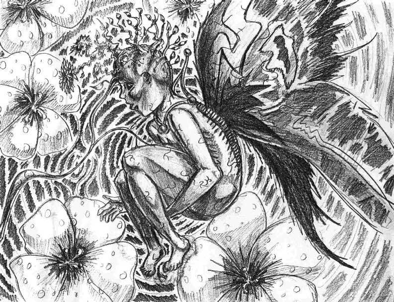
Off the subject of coloring, here is a rough sketch of something I was thinking of in class. I'm having a bit of trouble working out the pose. She's supposed to be in mid-stride as she's about to swing that axe. Is there anything I can do to improve the dynamics before I start a final version? (I think I'll do a line drawing and try some comic style coloring on it.)


heavy liquid
Member
Here's a quick caricature sketch of my brother I did recently. Haven't done one of these in a long time. I guess it's hard to judge it without seeing a picture of him normally, though...

Makura said:
I have to say, I adore this.


I personally use Maya, which you can download for free here http://www.alias.com/eng/products-services/maya/maya_ple/index.shtml (as a learning version only, though. I think it's pretty much complete but it does leave some ugly watermarks over your renders).
There are also tons of great resources on the net for beginners, such as http://www.learning-maya.com
There are also tons of great resources on the net for beginners, such as http://www.learning-maya.com
heavy liquid
Member
These are a few 5 min roughs I did before he decided that he wanted to go with something more exaggerated than these...


3pheMeraLmiX said:Nice advice going around. I really need to get myself an art pad and painter ^_^
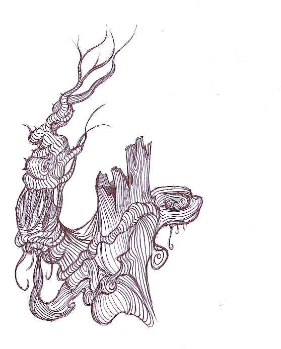
Here's a doodle I did on the back of syllabus while bored in soc. class. It's not finished yet:
I want to see more!
This is beautiful!
Here is some recent photography of mine.


Any chance you could let me know which program you used for that, and which tools therein (and any special settings if you know them offhand)?
Edit: Argh, I just wanna practice some more, but I'm trying to work on a paper that's due tomorrow, although I'm not making much progress on it. I just can't get too into something else before I finish this...
Edit: Argh, I just wanna practice some more, but I'm trying to work on a paper that's due tomorrow, although I'm not making much progress on it. I just can't get too into something else before I finish this...
Saturnman said:Among your very best, Jiggle.
How long did that one take?
Thanks
") This took around 6 hours I think?
This took around 6 hours I think? DarthWoo said:Any chance you could let me know which program you used for that, and which tools therein (and any special settings if you know them offhand)?
Photoshop 5 with the brush and erase tools and no special settings. Just a lot of layers.
Hmm...I'm starting to wonder if perhaps Photoshop is better for what I try to do. I think that from what I've done, the only remotely good ones came out of Photoshop instead of Painter.
Edit: Holy crap, I just noticed, using the post count thing that somebody noted a week or so ago, that I've got around twice as many posts in this thread as the next person down. I need to not post so much. I think I've gotten over half of my total posts in just the past month, although I suppose that's not unusual since for most of the summer I was on dialup, so I couldn't be online as much.
Edit: Holy crap, I just noticed, using the post count thing that somebody noted a week or so ago, that I've got around twice as many posts in this thread as the next person down. I need to not post so much. I think I've gotten over half of my total posts in just the past month, although I suppose that's not unusual since for most of the summer I was on dialup, so I couldn't be online as much.
DM_Uselink
Member
Great contributions to this thread! (that last one jiggle, is great)
I've been meaning to post something....so here goes...
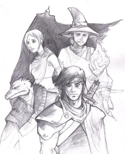
This is a sketch, that I'm currently cg'ing on photoshop...I'll post the finished version soon (or later most likely)
I've been meaning to post something....so here goes...
This is a sketch, that I'm currently cg'ing on photoshop...I'll post the finished version soon (or later most likely)
- Status
- Not open for further replies.