I’ve been thinking a bit about the size and form factor of the handheld over the last couple of days. Curious, I whipped out the old ruler and took to measuring up my trusty 3DS XL. The device is nearly 6” in length and actually very close in size to the widest portion of the Wii U Pro Controller (the grip bottoms). This is also quite similar to the lengths of both the Dual Shock 4 and Wii Remote. I was struck by what is probably obvious:
hardware designers have pretty much reached an agreement on how long a controller needs to be in order for the user to enjoy comfortable ergonomics. As most of us well know, what makes for a good handheld does not necessarily make for a good stationary console controller.
A handheld should be able to easily slip into one’s pocket. Thus, a slender body and low profile buttons are advantageous. Naturally, your average home console controller is expected to include full-sized analog sticks and a nice chunky grip portion.
Disclaimer: At this point, I’m pretty much convinced that Nintendo have opted to include the Free Form Displays from Sharp. We’ve got two independent sources on the topic (the initial reports from Kyodo and the much discussed patent) and it does seem like a very “Nintendo” thing to do. It also appears to be a realistic option, at least in terms of price, as Sharp are a current Nintendo partner and have also been struggling a bit as of late (much like AMD). These factors might allow Nintendo to get a decent price on this tech.
Speaking of the patent, a few tentative conclusions:
- The handheld will NOT feature the grip portion pictured—an attachment similar to the Circle Pad Pro makes more sense here.
- Without a Grip portion, the edges of the elliptical design, as pictured in the patent, may be too sharp for comfort.
- A track shaped design would resemble the PS Vita a bit too much.
With these points considered, we are left with the oval shape as the only remaining form mentioned by the patent (ignoring "square"—uqh).
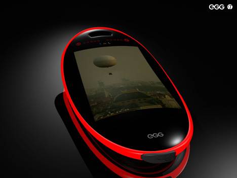
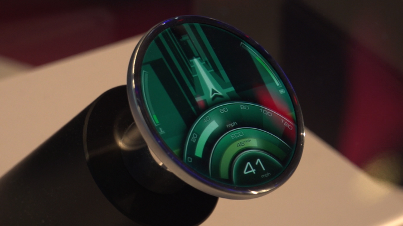
As I see it, the optimal design would include rounded but wide side portions (think Vita) for comfort and button placement while retaining the strikingly curved top portion of the device. That top is nice for displaying the “dome” of the skies above. Here is an example of an interesting egg-shaped phone design (disregard the curved screen). The base of an egg is somewhat wider than the top, but Nintendo might alternately opt for a true ellipse with equal ends. Sharp showed a similar design featuring their Free Form Display. Just picture it a bit longer.
This leads to the issue which has everyone worried: button placement.
In a handheld design, the lower inputs (in Nintendo’s case, the dpad and face buttons) are forced into a position almost directly beneath the upper inputs (analog sticks here) in order to provide enough space for the display. The free form patent stresses the importance of hiding traditional sticks and buttons underneath the thumbs of the user in order to create an immersive effect. This is generally accomplished if the lower inputs are directly beneath the sticks. Also mentioned is an unobstructed 16:9 viewing area between the inputs. This rules out the narrower placement of the lower inputs found in traditional controllers, such as the Wii U Pro and DS4. One must ask if there is truly room for all those inputs on the narrow ends of an elliptical or oval-shaped device.
I think some of these points are worth considering in future mockups. IHS apparently have sources which detail the NX handheld as including an LCD between 3” and 5”.
Something around the 4.88” 16:9 viewing area of the new 3DS XL is probably to be expected. The free form patent also mentions, as one of its core innovations, the ability to increase screen size without enlarging the overall device, so it would be somewhat contradictory of them to aim for a smaller display. Still, I wonder about the face buttons’ and dpad’s roles in such a device. If they are on there, they would need to be almost directly underneath the sticks and also quite small, as in current handhelds.
I'm interested in what shape(s) people can imagine as both suitably functional and attention-grabbing. I'd also like to hear opinions on which (if any) face inputs might be modified or discarded in the name of simplicity and elegance.


