• Hey, guest user. Hope you're enjoying NeoGAF! Have you considered registering for an account? Come join us and add your take to the daily discourse.

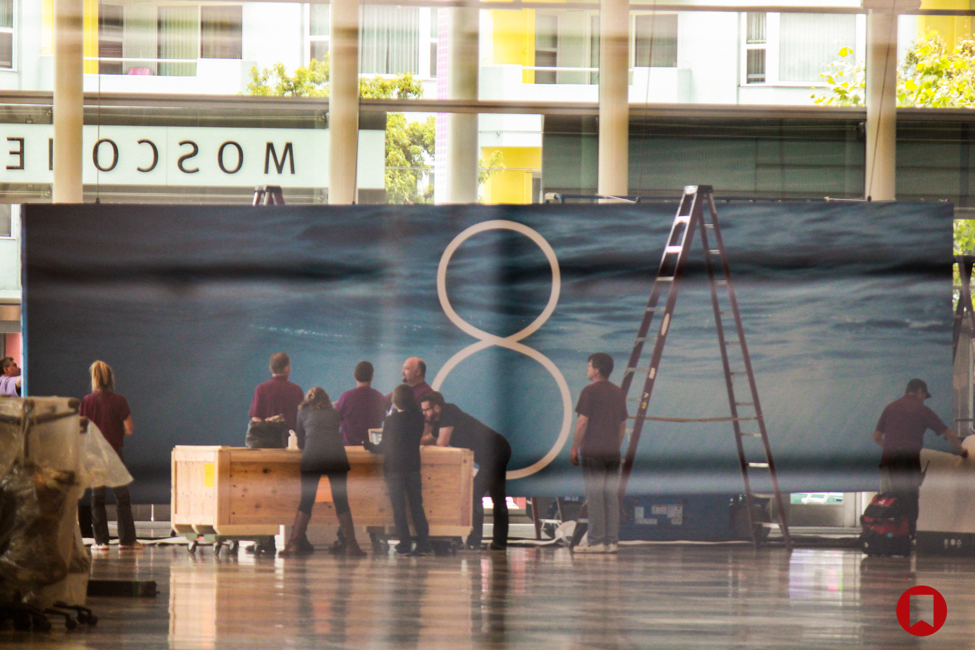
WWDC14 Thread of iOS 8 and Mac OSX 10.10

I kind of hope the home automation stuff is something like Carplay - or a hub app to integrate with a variety of smart devices in the home like the Hue, Nest, smart locks or various alarm systems. I find it hard to believe Apple would make home automation products themselves. Or that those products are even attractive to that wide an audience yet (maybe that's the point).

I can see an app + a hub that could be integrated into Apple TV or Airport line something revolv or SmartThings
 

kaskade

Member
This year is going to be a good one. I've been losing track of the days and forgot it was so close. Guess I should start saving up some money for whatever they end up coming out with.
 
Apple's 'Smart Home' Initiative Focused on 'Made for iPhone' Certification, Not Deep Integration

The program will not include an Apple-made software interface that overrides the existing apps tied to current iOS-compatible home accessories like the Philips Hue lighting system or the Nest thermometer, and will instead focus on connecting devices via WiFi. There's also the possibility for voice control using Bluetooth.

The MFi certification will essentially be used to notify consumers about which products will integrate well both with the iPhone and with other home automation accessories, suggesting the program introduced next week will feature several home automation product manufacturers that have agreed to work with the MFi standards for quality and compatibility.

http://www.macrumors.com/2014/05/29/apple-smart-home-initiative/
 

mackaveli

Member
Last year:

00m - 10 m: Usual updates on retail, number of developers, etc.
10 -14: Anki Drive demo
14 - 48: OS X Mavericks demo
48 - 1h: new Air + Mac Pro Sneak Peak
1h - 1h09: iCloud + iWork web demo
1h09 - 1h54: iOS 7 demo including iTunes Radio, App Store, CarPlay
1h54 - 1h58: Wrap up

Expect a similar structure this time with a different demo at the start, more time on OS X and likely less (if any) Mac hardware. Healthbook and smart home stuff will get a good chuck of time.

Thanks.

That Anki drive demo was the worst. Seemed longer than 4 minutes when I was watching.
 

Pachimari

Member
Not much to be hyped about anymore, at least for me but it's fine for me.

Hopefully they got some cool or surprising features for ios 8 to show off.
 
Lol they haven't even completed all the stuff promised in ios7. We never got synced read notifications between iOS and Mac
That was the biggest thing I was looking forward to, too. And the confusing way they presented iOS notifications coming to your Mac, which really just ended up being Mac push notifications on websites.
 
But still in iOS 8. May come in 8.1
I can't imagine this feature being done that well with an iPad's touchscreen/single-button interface. I'd much rather have better inter-app communication, interactive rich notifications, and a document-picking system and keep apps fullscreen-only.

Also, if this isn't shown at WWDC, that means it won't be in dev builds or available for visible/allowed APIs, meaning it'll likely only be for certain Apple apps and not open to third parties, if it happens at all.

Kinda thinking this is one of those things that has been prototyped (like iOS TextEdit and Preview) but won't make it into the final OS. Not sure how good Mark Gurman's sources are.
 
I'm somewhat excited for the OpenGL update that will be included in 10.10 (and the new drivers), because finally, we'll on either the newest version or only a slightly older version of OpenGL.

I would be curious to see what a lot of developers could do with the more modern OpenGLs. So many production applications even still seem to only be on OpenGL 2.0, with no plans in sight to move to a newer version. I wonder if the newer stacks don't offer any improvements for the common Pro apps that utilize OpenGL 2.0 since most don't utilize 3D effects.
 

Majine

Banned
Or, you know, use the notification/control center.

I dunno, I haven't seen the need for widgets the same way as others have. I think the homescreen is good as it is, maybe even a little too busy sometimes. I'd rather they not add more complexity to it.
 

Skunkers

Member

I'll preface this by saying, I've been an Apple guy for over 20 years. That said, while i don't care much for Metro, especially the way they shoehorned it into Windows, it is an absolutely awesome interface for a phone. The live tile concept for a phone screen is utterly brilliant, and I honestly do wish Apple would copy it (or at the least, just let devs make their app icons live). I haven't actually gotten the chance to spend much time with a Windows Phone to pick it apart and see where MS inevitably cocked it up (as they always seem to do); but from what I've seen, I consider it the ideal home screen UI for a smartphone. Shame it took them so long, and iOS and Android vacuumed up all the room for them in the marketplace.
 

SuperPac

Member
Or, you know, use the notification/control center.

I dunno, I haven't seen the need for widgets the same way as others have. I think the homescreen is good as it is.

I agree. Live icons where weather just says the temperature, sure. Widgets? Aside from weather and maybe music I don't see the need and as you said, Notification/Control Center do that job on both accounts.
 

Fuchsdh

Member
I saw that earlier - beautiful, I'd love to see it implemented. A mix between a widget and a metro tile with iOS design? Nice.

Think it'd be a mess, personally. He himself admits how it would collide with existing icons, reshuffle home screens, and deciding how to take up room would be immensely awkward—what happens when you have a 2x2 tile right above a 1x1 that you also want to expand? It'd be far worse than the already awkward slip-slide of rearranging icons. Looks pretty, but it's a usability nightmare as currently envisioned.
 

Altazor

Member
Think it'd be a mess, personally. He himself admits how it would collide with existing icons, reshuffle home screens, and deciding how to take up room would be immensely awkward—what happens when you have a 2x2 tile right above a 1x1 that you also want to expand? It'd be far worse than the already awkward slip-slide of rearranging icons. Looks pretty, but it's a usability nightmare as currently envisioned.

probably, but there's still time (?) to polish it*, I doubt it would be implemented as-is.

*: hypothetical.
 

Blackhead

Redarse
Think it'd be a mess, personally. He himself admits how it would collide with existing icons, reshuffle home screens, and deciding how to take up room would be immensely awkward—what happens when you have a 2x2 tile right above a 1x1 that you also want to expand? It'd be far worse than the already awkward slip-slide of rearranging icons. Looks pretty, but it's a usability nightmare as currently envisioned.

It looks pretty and ironically the usability issues has been solved on other platforms. Action Launcher, my favourite on Android, combines icons and widgets/tiles with better gestures and UI

The iOS slip-slide of rearranging icons is just horrible. Jon Siracusa was also complaining about it on the last episode of ATP lol. It's one of those examples that illustrate why I've became really disillusioned about Apple's UI design acumen. There were jailbreak alternatives for moving icons Four Years ago! Microsoft was making fun on Apple's icon moving UI when they introduced multitouch methods in Windows RT Two Years ago! Now time for iOS 8 and I bet Apple still won't bother fixing it. Argh
 

Erebus

Member
Think it'd be a mess, personally. He himself admits how it would collide with existing icons, reshuffle home screens, and deciding how to take up room would be immensely awkward—what happens when you have a 2x2 tile right above a 1x1 that you also want to expand? It'd be far worse than the already awkward slip-slide of rearranging icons. Looks pretty, but it's a usability nightmare as currently envisioned.

It's a work in progress. Furthermore, if Apple does indeed take cues from this I'm sure the final result will differ vastly.
 
If there's no Mac hardware announcements, does that mean no Schiller presentation ??

tumblr_mv39g2MQ7K1qz5w83o1_400.gif
 
Hey all, this is the first year where I won't be able to watch from the beginning the keynote. Do any of you know, can I start watching the stream half an hour in and rewind it to the start, or am I going to have to wait until the entire thing gets posted? I don't know how the stream buffering works on the Apple TV.
 

Nero3000

Member
Hey all, this is the first year where I won't be able to watch from the beginning the keynote. Do any of you know, can I start watching the stream half an hour in and rewind it to the start, or am I going to have to wait until the entire thing gets posted? I don't know how the stream buffering works on the Apple TV.

Meh the first half hour is usually the fluff piece and the fun with charts section.
 

DedValve

Banned
It looks pretty and ironically the usability issues has been solved on other platforms. Action Launcher, my favourite on Android, combines icons and widgets/tiles with better gestures and UI

The iOS slip-slide of rearranging icons is just horrible. Jon Siracusa was also complaining about it on the last episode of ATP lol. It's one of those examples that illustrate why I've became really disillusioned about Apple's UI design acumen. There were jailbreak alternatives for moving icons Four Years ago! Microsoft was making fun on Apple's icon moving UI when they introduced multitouch methods in Windows RT Two Years ago! Now time for iOS 8 and I bet Apple still won't bother fixing it. Argh

I agree, I hate arranging icons on my ipad. So infuriating.
 
I just wish the Notification Center had a little more color to it. Otherwise it's fine.

Need more info? tap on the text with the weather information and it takes you into the Weather App.
 

The Real Abed

Perma-Junior
I don't really need Widgets on my Home Screen, but if Apple were to implement them, I'd want them to look like that.

I'd probably keep just a couple of them. I wouldn't need every icon to be a widget. I'd really rather just have the current Weather icon just show the damn weather to match the clock and calendar for goodness sakes. But if I had a 4.7" iPhone and it let me use that space for some tasteful looking Widgets, sure I'd take advantage of it. Really all I'd want is weather and music for looks. But I don't require Widgets. Just a live weather icon is all really.

If they could have other shapes. Not just 1x1 or 2x2 but maybe some 4x1 or 3x1 or 3x2 depending on the content of the app.

Then again, I'm the kind of person who goes to the trouble of making sure all my icons are on one Homescreen. I did this when I was on Android and I do this on iOS and OS X now. One screen with folders. (And pages in folders helps a lot on iOS now) So I'd have to choose some icons to demote from the home screen.

The only problem would be on the iPad. When rotating the device, the icons reflow. Unlike on Android where it keeps the same grid and crams icons together. (At least last time I used it. Does Android have some magical widget reflowing algorithm now?) The concept video didn't show any way of reflowing correctly.

Of course there's probably no chance of Apple implementing them unless they watch this video and decide to hire the guy. Maybe it could become a Jailbreak hack instead.
 
Top Bottom