-
Hey Guest. Check out your NeoGAF Wrapped 2025 results here!
You are using an out of date browser. It may not display this or other websites correctly.
You should upgrade or use an alternative browser.
You should upgrade or use an alternative browser.
Spring Anime 2012 II | Welcome Home Eureka
- Thread starter duckroll
- Start date
- Status
- Not open for further replies.
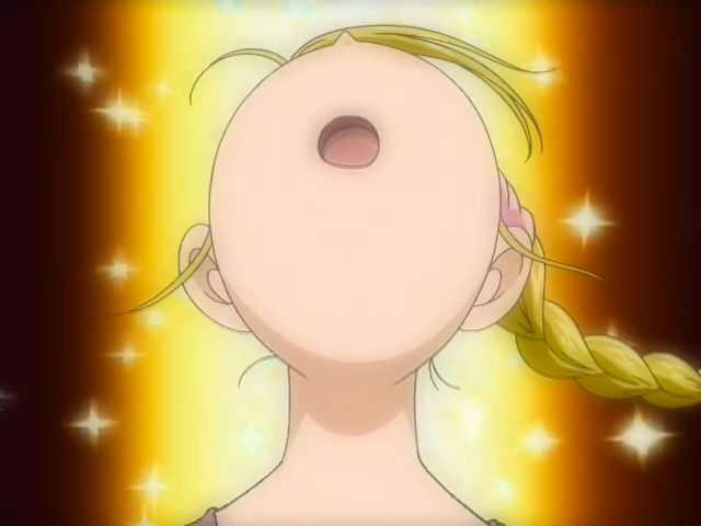
Both have their merits, really. There's just something about those 2006 faces that don't seem quite right. It's really touched up using CG, moe-ified and rounded; It looks artificial in a way, just slightly off. 2002's faces aren't proportionate at times but that just increases its cuteness. Shiori's picture (third picture down) just emanates cute from that oddly proportioned derpy face. Mai (fourth picture down) also is absurdly cute in that picture, even though her face is slightly squashed.
I agree with this person.
Here is how cajun and frostbyte probably think:
"This is not cute enough. How do we make it cuter?!"

"Ta-da!

"This is not cute enough. How do we make it cuter?!"
"Ta-da!
Here is how cajun and frostbyte probably think:
"This is not cute enough. How do we make it cuter?!"
"Ta-da!
Nah that ones cute enough as is.
50-63 I think.Yes, to everything in this post
How many episodes are planned?
Here is how cajun and frostbyte probably think:
"This is not cute enough. How do we make it cuter?!"
"Ta-da!
I can't deny how [REDACTED] the picture is. Other than the fact that the left side of her face has two parts but hey, I'm okay with that! Everyone has their flaws.
This place is filthywhy are people defending Kanon 2002? why????????
This place is filthy

PdotMichael
Banned

It's not that the KyoAni version looks so much better
Its drawn better but its just dull as fuck.
seriously though just look at this shit:


NONE OF THESE ARE PHOTOSHOPPED!!!!!
edit: it's rather telling the only time a face looks somewhat normal is when it's an incredibly off model inbetween and even then that's stretching it
NONE OF THESE ARE PHOTOSHOPPED!!!!!
edit: it's rather telling the only time a face looks somewhat normal is when it's an incredibly off model inbetween and even then that's stretching it
ahahhahahaaaaa i wish^ That's a photoshop yeah.....?
The eyes of KyoAni's Kanon girls also look lifeless and desolate. Toei's captures more personality and spirit into them.
This is true. The ones KyoAni draws look like dolls or something. There's just something about the art that looks superficial and bland. I mean, I enjoyyed Air, Kanon 2006, and Clannad and purchased all of them, but the art was definitely NOT the reason why. I have a pnechant for the dramatic in anime so these shows were exactly what I was looking for. but that art...
Here is how cajun and frostbyte probably think:
"This is not cute enough. How do we make it cuter?!"
"Ta-da!
Her eyes are way too far from the side of her head. Boring.
NONE OF THESE ARE PHOTOSHOPPED!!!!!
I choose to believe otherwise, so I can retain my sanity.
I choose to believe otherwise, so I can retain my sanity.

but the people must know before it's too lateDude you can't just post that much Kanon 2002. We could go blind.
Man I can't believe that there are people that defend Kanon 2002. Total and complete failure of basic artistic groundrules do not make things "charming" I'm afraid.
I like it better than Kanon 2006. that''s all I'm saying.
They both suffer from the uguuface which isn't all that attractive to the eye to begin with.

This Kanon conversation isn't really going anywhere and art is quite subjective anyway so I'd rather not go on.
I'll just say that, again, both have their merits and neither is superior to each other. Also, Kanon 2002 more closely mimics the original VN character designs and is more faithful an adaptation, design-wise.

I'll just say that, again, both have their merits and neither is superior to each other. Also, Kanon 2002 more closely mimics the original VN character designs and is more faithful an adaptation, design-wise.
This Kanon conversation isn't really going anywhere and art is quite subjective anyway so I'd rather not go on.
I'll just say that, again, both have their merits and neither is superior to each other. Also, Kanon 2002 more closely mimics the original VN character designs and is more faithful an adaptation, design-wise.
The middle ones are the cutest.
The middle ones are the cutest.
I can't believe a meaningful discussion like iM@S character rankings was usurped by a discussion on the merits of the artwork in Kanon '02!
I mean, isn't the correct answer that they're all kind of derpy? It's not exactly the first place I'm going to go for sound character design in any incarnation, at least not when AKB0048 exists, anyway.
I can't believe a meaningful discussion like iM@S character rankings was usurped by a discussion on the merits of the artwork in Kanon '02!
Yes, I'm just going to end myself. This is too much to take.

Yes, I'm just going to end myself. This is too much to take.
You must stay strong, AKB is just around the corner.
The middle ones are the cutest.

He means, the middle ones are the least terrible.
The middle ones are the cutest.
Too bad only we can appreciate the middle ones.
Their loss

You must stay strong, AKB is just around the corner.
Oh yeah, totally forgot, it's airing today isn't it?
He means, the middle ones are the least terrible.
Basically. But they really do look cute.


Ginga e Kickoff!! 1
I enjoyed this episode more than the first 5 episodes of The Knight in the Area combined!


I enjoyed this episode more than the first 5 episodes of The Knight in the Area combined!
Ultimadrago
Member
Fate/Zero speculation
More Fate/Zero stuff
Surely they have some plot armor laying around somewhere!
I knew my laughing at others getting snuffed would come back to bite me in the ass sooner or later! Lord Rider...
Let me live in my fantasy where the inevitable doesn't happen...
Let me live in my fantasy where the inevitable doesn't happen...
Jex
Member
This Kanon conversation isn't really going anywhere and art is quite subjective anyway so I'd rather not go on.
I'll just say that, again, both have their merits and neither is superior to each other. Also, Kanon 2002 more closely mimics the original VN character designs and is more faithful an adaptation, design-wise.
I really couldn't pick between the two.
As they're all terrible.
Space Brother 5
Another great episode.
Just as expected, the dynamic between Mutta and Hibito brings in delicious scenes and conversations. And the simple fact that Apo is there makes everything better by itself.
Next week...

Another great episode.
Just as expected, the dynamic between Mutta and Hibito brings in delicious scenes and conversations. And the simple fact that Apo is there makes everything better by itself.
Next week...
That guy really called JAXA to tell them about the headbutt? Yeah, ok. That's definitely something I'd expect from Materazzi.
Jex
Member
Sorry, I still choose 2002. The 2006 style is just...boring. Its a pretty style overall but its just so boring. The 2002 faces are all derpy but they have a charming look to them. I don't really care that 2006 was drawn better. To me it looks worse and it just reminds me too much of the look of visual novels. Thats what its supposed to look like and thats probably why I dontl ike it.
The Kanon 2002 faces are definitely cuter than the 2006 faces.
The 2006 style is just CGed to death and looks stupid.
Both have their merits, really. There's just something about those 2006 faces that don't seem quite right. It's really touched up using CG, moe-ified and rounded; It looks artificial in a way, just slightly off. 2002's faces aren't proportionate at times but that just increases its cuteness. Shiori's picture (third picture down) just emanates cute from that oddly proportioned derpy face. Mai (fourth picture down) also is absurdly cute in that picture, even though her face is slightly squashed.
why are people defending Kanon 2002? why????????
my god animegaf
Dude you can't just post that much Kanon 2002. We could go blind.

RurouniZel
Asks questions so Ezalc doesn't have to
"Ta-da!
Why does her face have two outlines on the right side?
Ultimadrago
Member
Why does her face have two outlines on the right side?
Because it's really a mask disguising her true identity!
In nearly ten minutes time the anime of the decade begins.
Dat.. expression
Dat.. expression

- Status
- Not open for further replies.